17. Network-Aware Portfolio Construction

This project turns the stock universe into a financial network and then asks whether network position can be used as a portfolio signal. The data and baseline backtests are familiar, so the center of the project is the graph layer: how we turn dependence into edges, how we filter a dense market graph into readable structures, how centrality scores describe the role of each stock, and how those scores become portfolio weights.

Main parts of this project:

The useful mental picture is simple: every stock is a node, and every relationship between two stocks is an edge. A pair of stocks with high dependence gets a strong edge. A stock that is connected to many important stocks becomes central. A stock that sits away from the core becomes peripheral. The portfolio question is whether we want to own the stocks sitting inside the market’s crowded center, the stocks sitting away from it, or a filtered mix that uses network position together with momentum and risk.

This is one of the places where finance starts to look like network science. We aren’t just ranking stocks one by one. We are asking how each stock sits inside the whole system.

A graph-first view of a stock market

The key change in this project is that we stop treating the stock universe as only a list of tickers. A list view says: stock 1 has return \(r_1\), stock 2 has return \(r_2\), and so on. A network view says: stock 1 is connected to stock 2, stock 2 is connected to stock 17, stock 17 is a bridge to another part of the market, and some stocks sit inside the center of the whole system.

That sounds abstract, but the finance meaning is very practical. If two stocks move together, owning both may add less diversification than their ticker count suggests. If twenty stocks all sit inside one common dependence cluster, a portfolio with twenty names can still behave like one crowded risk exposure. A network tries to expose that hidden structure.

A graph is written as

\[ G=(V,E) \]

where \(V\) is the set of nodes and \(E\) is the set of edges. In this project:

  • each node is a stock,
  • each edge is a dependence relationship between two stocks,
  • each edge has a weight showing dependence strength,
  • each edge can also have a distance showing how close the stocks are in dependence space.

The weighted adjacency matrix is

\[ A = \begin{bmatrix} 0 & A_{12} & \cdots & A_{1N} \\ A_{21} & 0 & \cdots & A_{2N} \\ \vdots & \vdots & \ddots & \vdots \\ A_{N1} & A_{N2} & \cdots & 0 \end{bmatrix} \]

The diagonal is zero because we don’t need a stock connected to itself. The off-diagonal elements are the relationships that drive centrality.

This is also why this project connects nicely to other research fields using network thinking. In a materials, biological, sensor, or chemical network, the important object is often not only the isolated node but its role in the system. Here the same idea is applied to equities. A central stock is like a highly connected component in a complex system. A peripheral stock is a component whose behavior is less tied to the dominant network structure. A bridge stock connects regions of the graph and can transmit shocks between them.

The portfolio problem becomes:

\[ \text{network structure} \rightarrow \text{node role} \rightarrow \text{portfolio weight} \]

That is the whole story of Project 17.

Network matrices and diversification intuition

There is another useful matrix behind the graph: the degree matrix. If \(s_i\) is the weighted degree of node \(i\), then

\[ D = \text{diag}(s_1,s_2,\ldots,s_N) \]

The graph Laplacian is

\[ L = D - A \]

We don’t directly optimize with the Laplacian in thisn’tebook, but it helps explain the intuition. The adjacency matrix \(A\) says which stocks are tied together. The degree matrix \(D\) says how much total connection each stock has. The Laplacian \(L\) summarizes the difference between a node and its connected neighborhood.

In many network problems, the Laplacian measures smoothness over the graph. A signal \(x\) is smooth over the graph if connected nodes have similar values. The quadratic form is

\[ x^\top Lx = \frac{1}{2}\sum_{i,j}A_{ij}(x_i-x_j)^2 \]

If connected stocks have similar scores, this quantity is small. If strongly connected stocks have very different scores, it is large. Even though the notebook doesn’t use this formula in optimization, it gives a useful mental model: a market graph tells us where the system wants stocks to behave similarly.

From a portfolio perspective, holding many highly connected nodes creates a portfolio that is smooth over the graph in a bad way: it loads heavily on one connected region. Holding less connected nodes can reduce common exposure, but only if those nodes have acceptable return and risk characteristics. That is why the final strategy uses periphery plus momentum and risk filters, rather than pure periphery alone.

So the network is doing two jobs at once:

  1. Risk map: it shows where common shocks can travel.
  2. Selection map: it ranks stocks by structural role.

This is why centrality is more informative than simply looking at a pairwise correlation table. A correlation table is pair-by-pair. Centrality is system-aware.

1) Setup, data, and baseline portfolios

We start by loading the tools needed for panel data, rolling universes, covariance estimation, graph construction, and portfolio backtesting. The new libraries in this project are mostly from networkx, because the object we build later is a graph rather than only a covariance matrix.

The data is the same broad NASDAQ stock panel that was already used earlier in the equity portfolio projects, so we don’t need to explain the stock universe from scratch again. The important reproducibility link is the folder that builds the data source: data/stooq_nasdaq. That folder is the right place to check the build script and raw-data instructions. We shouldn’t link to a final parquet file directly, because the repo data layer is organized around source folders and reproducible scripts, not redistributed final datasets.

For this project, the design choices are:

  • Start date: 2016-01-01.
  • Universe size: top 100 liquid stocks at each network date.
  • Network frequency: quarterly, sampled from monthly candidate rebalance dates.
  • Dependence lookback: 252 trading days, approximately one year.
  • Minimum history: 504 listing days and at least 220 usable observations.
  • Position cap: 10% per stock.
  • Trading cost: 10 bps per trade.

The quarterly frequency matters. Network construction is more expensive than a normal covariance update, especially when we build dense graphs, PMFGs, and t-copula tail-dependence matrices. Quarterly updates also make economic sense: centrality isn’t a daily trading signal. It describes the stock’s location inside the market structure, which usually moves slower than price momentum.

Imports and plotting settings

Show code
from pathlib import Path
import math
import warnings
from itertools import combinations

import matplotlib.pyplot as plt
import networkx as nx
import numpy as np
import pandas as pd
from cycler import cycler
from IPython.display import display
from scipy.special import gammaln
from scipy.stats import t as student_t
from sklearn.covariance import LedoitWolf

from quantfinlab.dataio.panel import load_yfinance_panel, prices_to_returns_panel
from quantfinlab.portfolio import covariance, expected_returns
from quantfinlab.portfolio.universe import (
    build_liquid_universe_by_date,
    clean_close_volume_panels,
    make_rebalance_dates,
)
from quantfinlab.portfolio.walkforward import run_walkforward_grid
from quantfinlab.portfolio.hrp import hrp_weight_frame
from quantfinlab.backtest.portfolio import run_many_weights_backtests
from quantfinlab.portfolio.selection import build_strategy_summary, performance_metrics
from quantfinlab.reports.risk_report import risk_report

warnings.filterwarnings("ignore")
pd.set_option("display.max_columns", 80)
pd.set_option("display.width", 160)
palette = ["#069AF3", "#FE420F", "#00008B", "#008080", "#CC79A7",
           "#9614fa", "#DC143C", "#7BC8F6", "#0072B2", "#04D8B2",
           "#800080", "#FF8072"]
plt.rcParams["axes.prop_cycle"] = cycler(color=palette)
plt.rcParams.update(
    {
        "figure.figsize": (6, 3),
        "figure.dpi": 200,
        "savefig.dpi": 300,
        "axes.grid": True,
        "grid.alpha": 0.20,
        "axes.spines.top": False,
        "axes.spines.right": False,
        "axes.titlesize": 12,
        "axes.labelsize": 12,
        "xtick.labelsize": 9,
        "ytick.labelsize": 9,
        "legend.fontsize": 7,
    }
)

Rolling universe design

The rolling universe is doing more than making the dataset realistic. It also prevents the network from being built on stale or illiquid names. Network centrality is sensitive to which nodes are included. If a very illiquid stock enters the graph with noisy returns, it can distort distances and create artificial peripheral positions. If a delisted or thinly traded name remains in the universe, its estimated dependence may look low simply because the data are bad. That would make it look diversifying even though the signal isn’t economically meaningful.

The top-100 liquidity filter gives the network a clean market interpretation. At each quarter we are asking: among the liquid NASDAQ names available at that time, which stocks are central to the dependence structure? That is different from asking the same question over a fixed modern universe. A fixed current universe would quietly introduce survivorship bias.

The quarterly dates also make the centrality signal less noisy. If we rebuilt the graph daily, many changes would be estimation noise. A stock’s graph position shouldn’t jump just because a few daily returns changed. With a one-year lookback and quarterly update, the network is allowed to move, but not so fast that it becomes a high-frequency ranking exercise.

The baseline models are included because network portfolios need a fair benchmark. Equal Weight is the simplest diversified allocation. MinVar tests whether ordinary covariance optimization already solves the risk problem. HRP is the closest baseline conceptually because it also uses dependence structure, but its connection is hierarchical allocation rather than centrality-based selection.

So the project doesn’t ask whether graph theory is interesting in isolation. It asks whether graph centrality adds something beyond equal weighting, variance minimization, and hierarchical dependence-aware allocation.

Liquidity and graph reliability

Liquidity matters more in a network project than it may first appear. A return series with stale prices can look artificially uncorrelated with the rest of the market. If a stock doesn’t trade actively, its price may adjust with delay. That delayed adjustment can make it look peripheral even though the stock’s true economic exposure isn’t peripheral.

The liquidity filter reduces this problem. By selecting the top 100 liquid names at each date, we make the graph more likely to reflect real market dependence rather than microstructure noise. This is especially important for peripheral portfolios. If we didn’t filter for liquidity, the peripheral portfolio could accidentally become a portfolio of stale-price artifacts.

There is still a tradeoff. A top-100 NASDAQ universe mostly captures the liquid part of the market. It doesn’t fully represent the long tail of small stocks. But that is acceptable here because the project is about a tradable network strategy. A graph that includes every tiny illiquid stock may look richer, but it would be much less useful for a realistic portfolio.

Show code
data_path = Path("../data")
if not (data_path / "nasdaq_close_volume.parquet").exists():
    data_path = Path("data")

primary_path = data_path / "nasdaq_close_volume.parquet"
start_date = "2016-01-01"
top_n = 100
lookback = 252
min_listing_days = 504
min_obs = 220
cost_bps = 10.0
w_min, w_max = 0.0, 0.10
annualization = 252
rf_annual = 0.04
rf_daily = (1.0 + rf_annual) ** (1.0 / annualization) - 1.0
Show code
panel = load_yfinance_panel(
    primary_path,
    fields=("close", "volume"),
    source="yfinance_export",
    start=start_date,
)
close, volume = clean_close_volume_panels(
    panel["close"],
    panel["volume"],
    start=start_date,
    min_price=1.0,
)
ret_d = prices_to_returns_panel(close).replace([np.inf, -np.inf], np.nan).dropna(how="all")

monthly_candidates = make_rebalance_dates(
    close.index,
    freq="M",
    min_history_days=min_listing_days,
)
sampled_candidates = pd.DatetimeIndex(monthly_candidates[::3])
universe_by_date = build_liquid_universe_by_date(
    close=close,
    volume=volume,
    rebalance_dates=sampled_candidates,
    top_n=top_n,
    liquidity_lookback=lookback,
    min_listing_days=min_listing_days,
    min_obs=min_obs,
    min_price=1.0,
)
rebalance_dates = pd.DatetimeIndex([dt for dt in sampled_candidates if dt in universe_by_date])
Show code
coverage = pd.DataFrame(
    {
        "value": [
            close.shape[0],
            close.shape[1],
            len(monthly_candidates),
            len(rebalance_dates),
            min(len(universe_by_date[dt]["tickers"]) for dt in rebalance_dates),
            max(len(universe_by_date[dt]["tickers"]) for dt in rebalance_dates),
        ]
    },
    index=[
        "trading days",
        "stocks after cleaning",
        "candidate monthly dates",
        "quarterly network dates",
        "minimum universe size",
        "maximum universe size",
    ],
)
display(coverage)
display(pd.DataFrame({"rebalance_date": rebalance_dates.date}))
value
trading days 2532
stocks after cleaning 4139
candidate monthly dates 97
quarterly network dates 33
minimum universe size 100
maximum universe size 100
rebalance_date
0 2018-01-31
1 2018-04-30
2 2018-07-31
3 2018-10-31
4 2019-01-31
5 2019-04-30
6 2019-07-31
7 2019-10-31
8 2020-01-31
9 2020-04-30
10 2020-07-31
11 2020-10-30
12 2021-01-29
13 2021-04-30
14 2021-07-30
15 2021-10-29
16 2022-01-31
17 2022-04-29
18 2022-07-29
19 2022-10-31
20 2023-01-31
21 2023-04-28
22 2023-07-31
23 2023-10-31
24 2024-01-31
25 2024-04-30
26 2024-07-31
27 2024-10-31
28 2025-01-31
29 2025-04-30
30 2025-07-31
31 2025-10-31
32 2026-01-28

The coverage table tells us that after cleaning, the NASDAQ panel contains 4,139 stocks and 2,532 trading days. The dynamic liquidity filter then gives exactly 100 stocks at every quarterly network date. That is important because many graph statistics depend mechanically on the number of nodes. If one date had 100 stocks and another date had 60, then changes in edge counts, centrality, and concentration would partly reflect universe-size changes. Here each network has the same number of nodes, so the comparison across dates is cleaner.

The rebalance-date table runs from January 2018 to January 2026. We lose the first part of the price history because each network date needs enough lookback observations. That is the right tradeoff: for graph estimation, a short or incomplete window would create unstable dependence estimates.

The baseline portfolios are included only for comparison:

  • Equal Weight gives a broad non-model benchmark across the selected 100 stocks.
  • MinVar uses Ledoit-Wolf covariance to reduce variance.
  • HRP enters because hierarchical risk allocation is naturally connected to dependence geometry, but we don’t re-explain HRP here.
Show code
grid = run_walkforward_grid(
    returns=ret_d,
    close=close,
    volume=volume,
    rebalance_dates=rebalance_dates,
    universe_by_date=universe_by_date,
    mu_models={"Momentum": expected_returns.momentum_mu},
    cov_models={"LedoitWolf": covariance.ledoit_wolf_covariance},
    strategy_specs=[
        {"name": "Equal Weight", "optimizer": "EW"},
        {"name": "MinVar", "optimizer": "MinVar", "cov_model": "LedoitWolf"},
    ],
    cov_lookback=lookback,
    mu_lookback=lookback,
    min_cov_observations=min_obs,
    min_mu_observations=min_obs,
    max_weight=w_max,
    min_weight=w_min,
    long_only=True,
    trading_cost_bps=cost_bps,
    turnover_penalty_bps=cost_bps,
    fallback="equal",
    rf_daily=rf_daily,
    annualization=annualization,
)
w_equal = grid.weights["Equal Weight"].copy()
w_minvar = grid.weights["MinVar"].copy()
w_hrp = hrp_weight_frame(
    grid.cache,
    grid.metadata["rebalance_dates"],
    cov_model="LedoitWolf",
    linkage_method="average",
    w_min=w_min,
    w_max=w_max,
)
Show code
baseline_construction = pd.DataFrame(
    {
        "rebalance rows": [len(w_equal), len(w_minvar), len(w_hrp)],
        "latest invested": [w_equal.iloc[-1].sum(), w_minvar.iloc[-1].sum(), w_hrp.iloc[-1].sum()],
        "latest maximum weight": [w_equal.iloc[-1].max(), w_minvar.iloc[-1].max(), w_hrp.iloc[-1].max()],
    },
    index=["Equal Weight", "MinVar", "HRP"],
)
display(baseline_construction.round(4))
rebalance rows latest invested latest maximum weight
Equal Weight 33 1.0 0.0100
MinVar 33 1.0 0.1000
HRP 32 1.0 0.0538

The baseline construction table confirms that Equal Weight, MinVar, and HRP are fully invested. Equal Weight has 1% in each of 100 stocks. MinVar can hit the 10% cap, which shows how much a variance optimizer can concentrate when it finds a low-volatility cluster. HRP’s latest maximum weight is around 5.4%, which is more balanced. That fits the usual HRP behavior: it respects hierarchical dependence and tends to avoid the sharp corner solutions that MinVar can produce.

2) From returns to dependence matrices

A network needs an edge definition. In this project we build two kinds of edges:

  1. Correlation dependence, based on a shrinkage correlation matrix.
  2. Tail dependence, based on a Student-t copula approximation.

The first layer is the standard correlation network. Suppose the cleaned return matrix in one rolling window is

\[ R = \begin{bmatrix} r_{1,1} & r_{1,2} & \cdots & r_{1,N} \\ r_{2,1} & r_{2,2} & \cdots & r_{2,N} \\ \vdots & \vdots & \ddots & \vdots \\ r_{T,1} & r_{T,2} & \cdots & r_{T,N} \end{bmatrix} \]

where \(T\) is the number of daily observations in the lookback window and \(N=100\) is the number of selected stocks. The sample covariance would be

\[ S = \frac{1}{T-1}(R - \bar{R})^\top(R - \bar{R}) \]

but raw sample covariance is noisy when \(N\) is large relative to \(T\). Here \(N=100\) and \(T\approx252\), so a raw covariance matrix can still be unstable. We use Ledoit-Wolf shrinkage:

\[ \hat{\Sigma}_{LW} = (1-\delta)S + \delta F \]

where \(S\) is the sample covariance, \(F\) is a structured target, and \(\delta\) is the shrinkage intensity. The formula says: don’t fully trust the raw sample covariance; pull it toward a more stable target. In network terms, that matters because a small correlation-estimation error can change whether an edge looks strong or weak.

After we estimate the covariance, we convert it to correlation:

\[ \hat{\rho}_{ij} = \frac{\hat{\Sigma}_{ij}}{\sqrt{\hat{\Sigma}_{ii}}\sqrt{\hat{\Sigma}_{jj}}} \]

The diagonal is \(\rho_{ii}=1\), because every stock is perfectly correlated with itself. The off-diagonal entries are the relationships that become edges.

For graph construction we also need a distance. We use the standard correlation distance:

\[ d_{ij}^{corr} = \sqrt{2(1-\rho_{ij})} \]

This distance has a clean interpretation:

  • if \(\rho_{ij}=1\), then \(d_{ij}=0\), so the stocks are basically on top of each other in correlation space;
  • if \(\rho_{ij}=0\), then \(d_{ij}=\sqrt{2}\), so they are unrelated;
  • if \(\rho_{ij}=-1\), then \(d_{ij}=2\), so they move in exact opposite directions.

For stocks in the same equity market, negative correlations are rare. Most distances are driven by how strong the positive correlations are, not by true opposite movement.

Matrix geometry behind correlation distance

The correlation distance formula comes from a geometric idea. If two standardized return vectors have correlation \(\rho_{ij}\), we can think of them as vectors on a unit sphere. The squared Euclidean distance between two unit vectors is

\[ \lVert \mathbf{x}_i - \mathbf{x}_j \rVert^2 = \lVert \mathbf{x}_i\rVert^2 + \lVert \mathbf{x}_j\rVert^2 - 2\mathbf{x}_i^\top\mathbf{x}_j \]

Since both standardized vectors have unit length, this becomes

\[ \lVert \mathbf{x}_i - \mathbf{x}_j \rVert^2 = 1 + 1 - 2\rho_{ij} \]

so

\[ \lVert \mathbf{x}_i - \mathbf{x}_j \rVert = \sqrt{2(1-\rho_{ij})} \]

This is why the distance formula is natural. It isn’t just a random transformation. It says that if two standardized return histories point in the same direction, they are close; if they point in unrelated directions, they are farther apart.

For example, if two software stocks have \(\rho=0.70\), the distance is

\[ d=\sqrt{2(1-0.70)}=\sqrt{0.60}\approx0.775 \]

If a software stock and a biotech stock have \(\rho=0.10\), the distance is

\[ d=\sqrt{2(1-0.10)}=\sqrt{1.80}\approx1.342 \]

The first pair is much closer in network space. A shortest-path algorithm will naturally prefer paths that go through high-correlation pairs because those have smaller distances.

The distance matrix is useful for MST and closeness/betweenness centrality. The adjacency matrix is useful for degree and eigenvector centrality. The same pair of stocks therefore has two related representations:

\[ \text{edge strength} = A_{ij} \]

and

\[ \text{edge length} = d_{ij} \]

A strong edge means the stocks are tightly connected. A short edge means the network can travel between them cheaply. Both are used later, but not always in the same centrality measure.

Shrinkage as network noise control

A noisy covariance matrix doesn’t only damage optimization. It also damages graph structure. If one pairwise correlation is overestimated, a false edge can enter the PMFG. If one important correlation is underestimated, a true connection can be excluded. Because PMFG and MST are based on ranked edge strengths or distances, small estimation errors can change the graph.

Ledoit-Wolf shrinkage reduces this problem by trading bias for variance reduction. The sample covariance \(S\) may be unbiased under ideal conditions, but it can have high estimation variance. The shrinkage estimator accepts a little structural bias toward a target \(F\) to lower estimation noise:

\[ E\left[\lVert \hat{\Sigma}_{LW}-\Sigma\rVert_F^2\right] < E\left[\lVert S-\Sigma\rVert_F^2\right] \]

where \(\lVert\cdot\rVert_F\) is the Frobenius norm. The exact inequality depends on the chosen shrinkage intensity and data, but the principle is that shrinkage can reduce matrix estimation error.

For a graph, this means the centrality scores are less likely to be driven by random sample noise. A stock becomes central because it has stable estimated dependence with other stocks, not because a few daily observations created an extreme sample correlation.

This is especially important with 100 stocks. There are 4,950 pairwise relationships. Even if each estimate is only slightly noisy, the graph filter has thousands of chances to pick up false edges. Shrinkage is one of the safeguards against that.

Show code
def clean_window(returns):
    out = returns.apply(pd.to_numeric, errors="coerce").replace([np.inf, -np.inf], np.nan)
    return out.dropna(axis=0, how="any").dropna(axis=1, how="any").astype(float)


def shrink_corr(returns):
    window = clean_window(returns)
    cov = LedoitWolf().fit(window.to_numpy()).covariance_
    sigma = np.sqrt(np.maximum(np.diag(cov), 1e-16))
    corr = np.clip(cov / np.outer(sigma, sigma), -1.0, 1.0)
    np.fill_diagonal(corr, 1.0)
    return pd.DataFrame(corr, index=window.columns, columns=window.columns)


def corr_distance(corr):
    values = np.sqrt(np.clip(2.0 * (1.0 - corr.to_numpy()), 0.0, 4.0))
    np.fill_diagonal(values, 0.0)
    return pd.DataFrame(values, index=corr.index, columns=corr.columns)


def matrix_heatmap(ax, matrix, title, cmap, vmin=None, vmax=None):
    image = ax.imshow(pd.DataFrame(matrix).to_numpy(dtype=float), aspect="auto", cmap=cmap, vmin=vmin, vmax=vmax)
    ax.set_title(title)
    ax.set_xticks([])
    ax.set_yticks([])
    ax.figure.colorbar(image, ax=ax, fraction=0.046, pad=0.04)
Show code
first_dt = rebalance_dates[0]
first_names = list(universe_by_date[first_dt]["tickers"])
first_window = clean_window(ret_d.loc[:first_dt, first_names].tail(lookback))
corr_first = shrink_corr(first_window)
corr_dist_first = corr_distance(corr_first)
Show code
tri = np.triu_indices_from(corr_first, k=1)
corr_description = pd.Series(
    {
        "window date": first_dt.date(),
        "observations": len(first_window),
        "stocks": first_window.shape[1],
        "mean pairwise correlation": corr_first.to_numpy()[tri].mean(),
        "maximum pairwise correlation": corr_first.to_numpy()[tri].max(),
        "mean correlation distance": corr_dist_first.to_numpy()[tri].mean(),
    },
    name="Ledoit-Wolf correlation",
)
display(corr_description.to_frame().round(4))
fig, axes = plt.subplots(1, 2, figsize=(12, 4))
matrix_heatmap(axes[0], corr_first, "First Shrinkage Correlation", "coolwarm", -1.0, 1.0)
matrix_heatmap(axes[1], corr_dist_first, "First Correlation Distance", "viridis_r")
fig.tight_layout()
plt.show()
Ledoit-Wolf correlation
window date 2018-01-31
observations 252
stocks 100
mean pairwise correlation 0.111351
maximum pairwise correlation 0.765615
mean correlation distance 1.330521

The first-window summary shows 252 observations and 100 stocks, with mean pairwise correlation around 0.111 and maximum pairwise correlation around 0.766. That is a useful starting point: the average NASDAQ stock pair isn’t extremely correlated, but the strongest pairs are very close. The maximum correlation is high enough that some local clusters clearly exist, likely among related technology, semiconductor, software, or similar-growth names.

The heatmap supports the same message. The correlation matrix has many light orange cells, meaning many pairs have positive but moderate dependence. It doesn’t look like one uniform block where every stock behaves the same. It has local structure. Some rows and columns are brighter, showing stocks that are more connected to many others. Some areas are darker, showing names that sit more independently.

The distance heatmap flips the interpretation. Strong correlations become short distances, so the darker regions in the distance view are the closest groups. This is the first step toward a network: we can treat each stock as a point in dependence space, where stocks that move together are close and stocks that behave differently are far.

A matrix view is still hard to read when there are 100 assets. A network gives us a more compressed view: it turns the matrix into nodes and edges, so we can ask which stocks sit in the center, which stocks form bridges, and which stocks sit at the edges of the system.

3) Student-t copula tail dependence

Correlation is useful, but it has a weakness: it measures average co-movement around the whole distribution. Portfolio risk often depends more on what happens in bad states. Two stocks can have moderate average correlation and still crash together. That is why we also build a tail-dependence network.

The tail-dependence layer starts by converting returns into pseudo-observations. For each asset \(i\), we rank its returns inside the rolling window:

\[ u_{t,i} = \frac{\text{rank}(r_{t,i})}{T+1} \]

The result \(u_{t,i}\) is between 0 and 1. A value near 0 means the return is near the low end of that asset’s own historical distribution. A value near 1 means it is near the high end. This rank transformation removes the marginal scale of each asset. A volatile stock and a quiet stock can be compared in distributional space, because both are mapped into their own empirical percentiles.

Then we use Kendall’s \(\tau\) to estimate dependence. Kendall’s \(\tau\) is rank-based, so it is less sensitive to outliers than Pearson correlation. The connection between Kendall’s \(\tau\) and the elliptical copula correlation parameter is

\[ \rho_{ij}^{copula} = \sin\left(\frac{\pi}{2}\tau_{ij}\right) \]

Here \(\rho_{ij}^{copula}\) isn’t the same object as Pearson correlation of returns. It is the dependence parameter used inside the Student-t copula. A t-copula lets us model joint extremes more directly than a Gaussian copula because the t-distribution has heavier tails.

The bivariate Student-t copula is built by transforming uniform pseudo-observations into t-quantiles:

\[ x_{t,i} = t_\nu^{-1}(u_{t,i}) \]

where \(t_\nu^{-1}\) is the inverse CDF of the univariate Student-t distribution with \(\nu\) degrees of freedom. The pair \((x_{t,i},x_{t,j})\) is then evaluated under a bivariate Student-t density with correlation \(\rho_{ij}^{copula}\).

The degrees of freedom parameter \(\nu\) controls tail heaviness:

  • smaller \(\nu\) means heavier tails and more extreme joint events,
  • larger \(\nu\) moves closer to Gaussian behavior,
  • \(\nu=4\) is very heavy-tailed,
  • \(\nu=15\) is much calmer.

The code searches over a small grid, \(\nu\in\{4,7,15\}\), and picks the value with the best average pairwise log likelihood. That is a practical compromise. Fitting a full high-dimensional t-copula exactly would be expensive and fragile for a rolling 100-stock universe. The pairwise approximation is lighter but still captures whether the window looks more crisis-like or calm.

Pairwise t-copula likelihood

The code doesn’t only set \(\nu\) by guessing. It scores candidate degrees of freedom by an approximate pairwise log likelihood. For a pair of assets \((i,j)\), the t-copula density can be written as

\[ c_{\nu,\rho}(u_i,u_j) = \frac{f_{\nu,\rho}^{(2)}(x_i,x_j)}{f_\nu(x_i)f_\nu(x_j)} \]

where

\[ x_i=t_\nu^{-1}(u_i), \qquad x_j=t_\nu^{-1}(u_j) \]

and \(f_{\nu,\rho}^{(2)}\) is the bivariate Student-t density with correlation \(\rho\), while \(f_\nu\) is the univariate Student-t density. The log copula likelihood for one observation is therefore

\[ \log c_{\nu,\rho}(u_i,u_j)=\log f_{\nu,\rho}^{(2)}(x_i,x_j)-\log f_\nu(x_i)-\log f_\nu(x_j) \]

The subtraction is important. We don’t want the marginal density of each asset to dominate the score. The copula is only about dependence after the marginal distributions have been stripped away.

For a bivariate t-density, the quadratic form is

\[ q_{ij,t}=\frac{x_{t,i}^2 - 2\rho_{ij}x_{t,i}x_{t,j}+x_{t,j}^2}{1-\rho_{ij}^2} \]

When both transformed returns are extreme in the same direction and \(\rho_{ij}\) is high, this term behaves differently than under weaker dependence. The likelihood comparison across \(\nu\) asks whether the observed rank co-movements look better under heavier tails or lighter tails.

The project uses a sample of pairs instead of every possible pair because a 100-stock universe has 4,950 pairs at each date. Evaluating every pair for every \(\nu\) and every rolling date would be heavier. A pair sample keeps the diagnostic practical while still tracking whether the window’s dependence looks crisis-like.

This makes the selected \(\nu\) a market-state diagnostic. It isn’t directly a portfolio weight, but it changes tail-dependence estimates, which changes distances, which changes centrality, which changes selection.

Tail dependence as a portfolio object

Tail dependence is especially useful because it captures something a variance model can miss. Variance asks how spread out returns are. Correlation asks how they co-move on average. Tail dependence asks how often they become extreme together.

A portfolio with weights \(w\) has variance

\[ \sigma_p^2 = w^\top\Sigma w \]

That formula depends on covariance. It is sensitive to average co-movement. But in a crash, the relevant question is closer to:

\[ P(r_i \le q_i(\alpha),\; r_j \le q_j(\alpha)) \]

where \(q_i(\alpha)\) is a low quantile of asset \(i\)’s return distribution. Tail dependence is the limiting version of this idea. It measures whether extreme losses occur together more often than they would under weak dependence.

In an equity universe, this matters because diversification often fails exactly when the investor needs it most. A portfolio of many stocks can look diversified in calm periods, but if those stocks share a tail cluster, they all fall together in stress. A tail-dependence network tries to identify that crash cluster before portfolio construction.

The t-copula is symmetric, so it doesn’t separately estimate downside and upside tail dependence. In equity applications, we care more about downside, but symmetric tail dependence is still useful because high co-extremes often reflect common stress channels. It isn’t perfect, but it is much richer than only using Pearson correlation.

A simple tail-dependence example

Suppose two stocks have the same ordinary correlation, say \(\rho=0.50\), but the market window is different. In a calm window, the t-copula may select \(\nu=15\). In a stressed window, it may select \(\nu=4\). The tail-dependence formula is

\[ \lambda = 2t_{\nu+1}\left(-\sqrt{\frac{(\nu+1)(1-\rho)}{1+\rho}}\right) \]

With the same \(\rho\), lower \(\nu\) creates heavier joint tails and larger \(\lambda\). That means the same average relation can have different crash-risk meaning depending on the market state.

This is exactly what happens in real markets. Two stocks may have a normal average relationship during calm periods. But when liquidity dries up, investors sell both together, and the joint tail becomes stronger. A t-copula network can reflect that by changing \(\nu\) and tail dependence through time.

Correlation alone would miss part of that change because it compresses all observations into one linear co-movement number. Tail dependence asks a more stress-focused question: when one stock is in an extreme move, how much does the other stock tend to be extreme too?

For portfolio construction, this is the difference between ordinary diversification and crash diversification. Ordinary diversification lowers day-to-day volatility. Crash diversification protects when the investor most needs the portfolio not to collapse.

The key output from the t-copula step is tail dependence. For a symmetric Student-t copula, the upper and lower tail-dependence coefficient has the closed form:

\[ \lambda_{ij} = 2t_{\nu+1}\left(-\sqrt{\frac{(\nu+1)(1-\rho_{ij})}{1+\rho_{ij}}}\right) \]

where:

  • \(\lambda_{ij}\) is the probability-strength of joint extreme movement between assets \(i\) and \(j\),
  • \(t_{\nu+1}(\cdot)\) is the Student-t CDF with \(\nu+1\) degrees of freedom,
  • \(\rho_{ij}\) is the copula correlation parameter,
  • \(\nu\) controls how heavy the joint tails are.

This formula is worth reading slowly. If \(\rho_{ij}\) is high, then \(1-\rho_{ij}\) is small, the square-root term is smaller, and the CDF argument is less negative. That increases \(\lambda_{ij}\). If \(\nu\) is low, the t-distribution has fatter tails, which also increases the chance that both assets move into the tail together. So tail dependence rises when assets are strongly linked and when the whole dependence structure looks heavy-tailed.

For example, two large semiconductor stocks might have high ordinary correlation and high tail dependence, because both are exposed to the same growth, AI, chip-cycle, and liquidity shocks. A biotech stock and a payment processor might have lower average correlation, and their tail dependence might also be low if their bad days are driven by different idiosyncratic catalysts.

We then turn tail dependence into a distance:

\[ d_{ij}^{tail} = \sqrt{2(1-\lambda_{ij})} \]

This mirrors the correlation distance. Strong tail dependence gives short distance. Weak tail dependence gives long distance. The resulting graph isn’t asking which stocks move together on average. It is asking which stocks share extreme-state risk.

Show code
def pseudo_observations(returns):
    window = clean_window(returns)
    return (window.rank(axis=0, method="average") / (len(window) + 1.0)).clip(1e-6, 1.0 - 1e-6)


def kendall_to_t_copula_corr(pseudo):
    tau = pseudo.corr(method="kendall").fillna(0.0)
    rho = np.sin(0.5 * np.pi * tau.to_numpy())
    rho = np.clip(0.5 * (rho + rho.T), -0.995, 0.995)
    np.fill_diagonal(rho, 1.0)
    return pd.DataFrame(rho, index=pseudo.columns, columns=pseudo.columns)


def pair_sample(n_assets, max_pairs=40):
    pairs = list(combinations(range(n_assets), 2))
    if len(pairs) <= max_pairs:
        return pairs
    locations = np.linspace(0, len(pairs) - 1, max_pairs, dtype=int)
    return [pairs[i] for i in np.unique(locations)]


def student_t_copula_loglik(pseudo, rho, nu, pairs=None):
    x = student_t.ppf(pseudo.to_numpy(), df=float(nu))
    rho_values = rho.to_numpy()
    selected_pairs = pairs or pair_sample(pseudo.shape[1])
    uni_const = gammaln((nu + 1.0) / 2.0) - gammaln(nu / 2.0) - 0.5 * np.log(nu * np.pi)
    bi_const = gammaln((nu + 2.0) / 2.0) - gammaln(nu / 2.0) - np.log(nu * np.pi)
    values = []
    for i, j in selected_pairs:
        correlation = float(np.clip(rho_values[i, j], -0.995, 0.995))
        det = max(1.0 - correlation**2, 1e-12)
        left, right = x[:, i], x[:, j]
        quad = (left**2 - 2.0 * correlation * left * right + right**2) / det
        bivariate = bi_const - 0.5 * np.log(det) - 0.5 * (nu + 2.0) * np.log1p(quad / nu)
        marginal_left = uni_const - 0.5 * (nu + 1.0) * np.log1p(left**2 / nu)
        marginal_right = uni_const - 0.5 * (nu + 1.0) * np.log1p(right**2 / nu)
        values.append(float(np.nanmean(bivariate - marginal_left - marginal_right)))
    return float(np.nanmean(values))


def select_t_copula_nu(pseudo, nu_grid=(4, 7, 15), max_pairs=40):
    rho = kendall_to_t_copula_corr(pseudo)
    pairs = pair_sample(pseudo.shape[1], max_pairs=max_pairs)
    scores = {nu: student_t_copula_loglik(pseudo, rho, nu, pairs=pairs) for nu in nu_grid}
    return float(max(scores, key=scores.get)), pd.Series(scores, name="average log likelihood")


def student_t_tail_dependence(rho, nu):
    values = np.clip(rho.to_numpy(), -0.995, 0.995)
    arg = -np.sqrt(np.maximum((nu + 1.0) * (1.0 - values) / np.maximum(1.0 + values, 1e-10), 0.0))
    tail = np.clip(2.0 * student_t.cdf(arg, df=nu + 1.0), 0.0, 1.0)
    np.fill_diagonal(tail, 1.0)
    return pd.DataFrame(tail, index=rho.index, columns=rho.columns)


def dependence_to_distance(dependence):
    values = np.sqrt(np.clip(2.0 * (1.0 - dependence.to_numpy()), 0.0, 2.0))
    np.fill_diagonal(values, 0.0)
    return pd.DataFrame(values, index=dependence.index, columns=dependence.columns)
Show code
u_first = pseudo_observations(first_window)
rho_t_first = kendall_to_t_copula_corr(u_first)
nu_first, nu_scores_first = select_t_copula_nu(u_first)
tail_first = student_t_tail_dependence(rho_t_first, nu_first)
tail_dist_first = dependence_to_distance(tail_first)
Show code
tri = np.triu_indices_from(tail_first, k=1)
display(nu_scores_first.to_frame().round(4))
display(
    pd.Series(
        {
            "selected nu": nu_first,
            "mean pairwise tail dependence": tail_first.to_numpy()[tri].mean(),
            "maximum pairwise tail dependence": tail_first.to_numpy()[tri].max(),
            "mean tail distance": tail_dist_first.to_numpy()[tri].mean(),
        },
        name="Student-t copula",
    ).to_frame().round(4)
)
fig, axes = plt.subplots(1, 2, figsize=(12, 4))
matrix_heatmap(axes[0], tail_first, f"First Tail Dependence | nu={nu_first:.0f}", "magma", 0.0, 1.0)
matrix_heatmap(axes[1], tail_dist_first, "First Tail-Dependence Distance", "viridis_r")
fig.tight_layout()
plt.show()
average log likelihood
4 0.0260
7 0.0310
15 0.0307
Student-t copula
selected nu 7.0000
mean pairwise tail dependence 0.0536
maximum pairwise tail dependence 0.8382
mean tail distance 1.3755

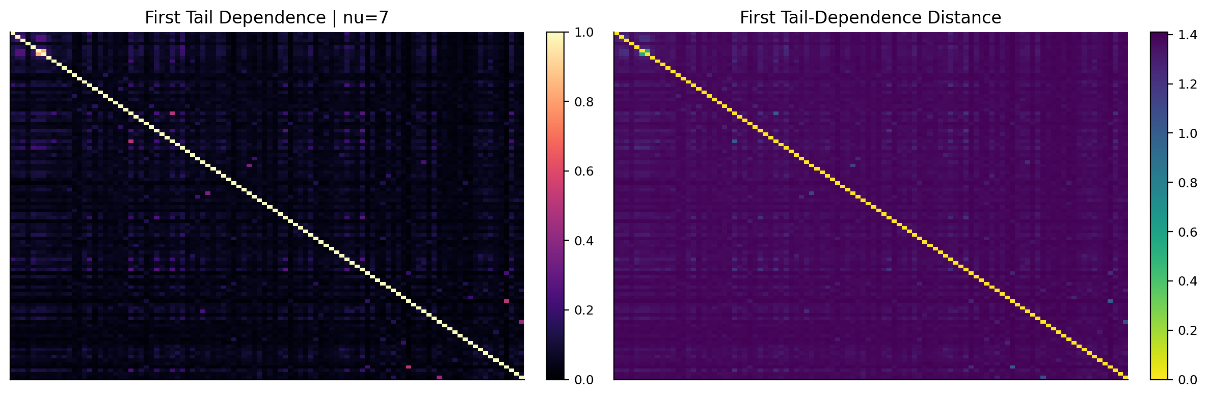
The first t-copula likelihood table selects \(\nu=7\), with average log likelihood slightly better than \(\nu=4\) and \(\nu=15\). This means the first network window is heavy-tailed, but not as extreme as the strongest crisis-like setting. The mean pairwise tail dependence is about 0.054, while the maximum is about 0.838. That gap is very informative. Most pairs don’t share much extreme dependence, but a few pairs behave almost like they belong to the same crash cluster.

The tail-dependence heatmap is much sparser than the ordinary correlation heatmap. That is exactly what we want from this layer. Ordinary correlations spread moderate dependence across many stock pairs. Tail dependence concentrates attention on pairs that are likely to break together during extreme moves. For portfolio construction, this distinction matters. A portfolio can look diversified under average correlation and still be fragile if its holdings are tied together in the tails.

The tail-distance heatmap is mostly high-distance with a few short-distance pockets. These pockets are the graph’s crash-risk neighborhoods. If the later centrality scores from the copula graph identify semiconductor and mega-cap growth names as central, that doesn’t only mean they are high-correlation names. It means they sit inside the extreme-risk backbone of the NASDAQ universe.

4) Adjacency matrices and dense networks

Once we have a dependence matrix, we convert it into an adjacency matrix. In graph notation, an adjacency matrix \(A\) stores edge strengths:

\[ A_{ij} = \begin{cases} \max(D_{ij},0), & i\ne j \\ 0, & i=j \end{cases} \]

where \(D_{ij}\) is the dependence measure, either correlation or tail dependence. The diagonal is set to zero because a self-edge doesn’t help us understand the network. We clip negative correlation to zero for the adjacency layer because a negative dependence would be hard to treat as a positive edge strength. In a long-only portfolio network, the interesting link is usually shared risk exposure, not hedge-like negative relation.

For \(N=100\) stocks, a dense undirected graph has

\[ \frac{N(N-1)}{2} = \frac{100\cdot99}{2}=4950 \]

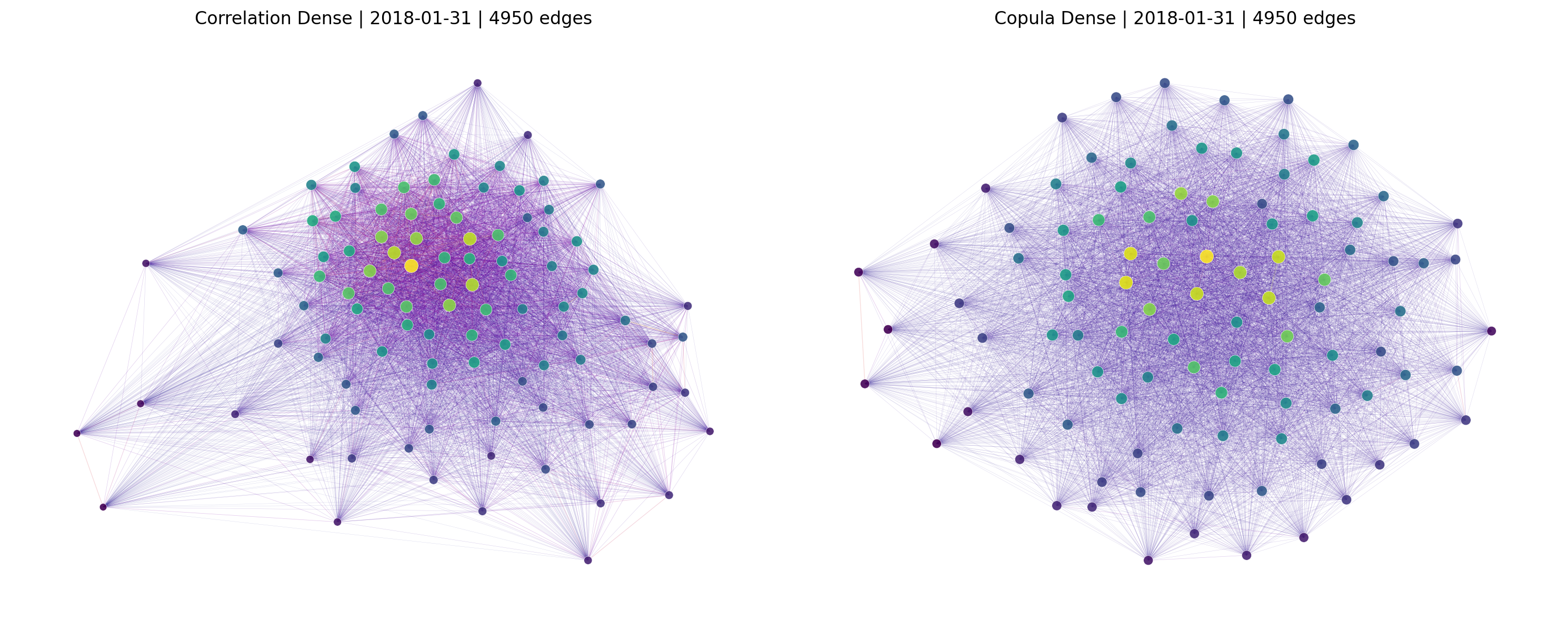
edges. That means every stock is connected to every other stock. This graph contains all information, but visually and analytically it is too crowded. It is like looking at the whole covariance matrix at once: technically complete, but hard to interpret.

The dense graph still helps at this stage because it shows the full system before filtering. Nodes with high weighted degree already start to appear more central, and highly connected neighborhoods pull together in the layout. But we need filtered graphs to make the structure readable.

Edge weights, edge distances, and graph attributes

The dense network stores both edge weight and edge distance. That design is important because different graph algorithms use different edge meanings.

For an edge \((i,j)\), the graph stores

\[ \text{weight}_{ij}=A_{ij} \]

and

\[ \text{distance}_{ij}=d_{ij} \]

Degree and eigenvector centrality use the weight because they ask how strongly a node is connected. Betweenness and closeness use distance because they ask how short the paths are through the graph.

This distinction prevents a common mistake. If we used correlation as a distance directly, high correlation would look like a long path, which is backwards. If we used distance as strength, weakly related stocks could look important. The project keeps the two concepts separate:

  • high dependence means strong edge weight,
  • high dependence also means short edge distance.

For a simple three-stock example, suppose A and B are highly correlated, B and C are moderately correlated, and A and C are weakly correlated. The graph may decide that the shortest path from A to C goes through B. If B lies on many such paths, betweenness centrality rises. That is how bridge stocks appear.

The dense graph contains all such paths, but because all pairs are connected directly, path-based centrality can become less informative. Filtering with MST or PMFG makes shortest-path structure more meaningful.

Show code
def dependence_adjacency(dependence):
    adjacency = dependence.clip(lower=0.0).copy()
    values = adjacency.to_numpy(copy=True)
    np.fill_diagonal(values, 0.0)
    return pd.DataFrame(values, index=adjacency.index, columns=adjacency.columns)


def dense_network(adjacency, distance):
    graph = nx.Graph()
    names = list(adjacency.index)
    graph.add_nodes_from(names)
    for i, left in enumerate(names):
        for j in range(i + 1, len(names)):
            right = names[j]
            graph.add_edge(
                left,
                right,
                weight=float(adjacency.iat[i, j]),
                distance=max(float(distance.iat[i, j]), 1e-8),
            )
    return graph


def draw_network(ax, graph, title, positions):
    strength = pd.Series(dict(graph.degree(weight="weight")), dtype=float)
    weights = np.asarray([attrs.get("weight", 0.0) for _, _, attrs in graph.edges(data=True)], dtype=float)
    high = max(float(weights.max()) if len(weights) else 1.0, 1e-12)
    dense = graph.number_of_edges() > 1000
    widths = 0.12 + (0.65 if dense else 2.1) * weights / high
    nx.draw_networkx_edges(
        graph,
        positions,
        ax=ax,
        width=widths,
        alpha=0.22 if dense else 0.70,
        edge_color=weights,
        edge_cmap=plt.cm.plasma,
        edge_vmin=0.0,
        edge_vmax=high,
    )
    nx.draw_networkx_nodes(
        graph,
        positions,
        ax=ax,
        node_size=[16 + 70 * strength.get(node, 0.0) / max(strength.max(), 1e-12) for node in graph.nodes()],
        node_color=[strength.get(node, 0.0) for node in graph.nodes()],
        cmap=plt.cm.viridis,
        edgecolors="white",
        linewidths=0.25,
        alpha=0.90,
    )
    ax.set_title(title)
    ax.set_axis_off()
Show code
corr_adjacency_first = dependence_adjacency(corr_first)
tail_adjacency_first = dependence_adjacency(tail_first)
corr_dense_first = dense_network(corr_adjacency_first, corr_dist_first)
tail_dense_first = dense_network(tail_adjacency_first, tail_dist_first)
Show code
fig, axes = plt.subplots(1, 2, figsize=(12, 4))
matrix_heatmap(axes[0], corr_adjacency_first, "Correlation Adjacency", "plasma", 0.0, 1.0)
matrix_heatmap(axes[1], tail_adjacency_first, "Tail-Dependence Adjacency", "plasma", 0.0, 1.0)
fig.tight_layout()
plt.show()

fig, axes = plt.subplots(1, 2, figsize=(15, 6))
draw_network(
    axes[0],
    corr_dense_first,
    f"Correlation Dense | {first_dt.date()} | {corr_dense_first.number_of_edges()} edges",
    nx.spring_layout(corr_dense_first, seed=17, weight="weight", iterations=45),
)
draw_network(
    axes[1],
    tail_dense_first,
    f"Copula Dense | {first_dt.date()} | {tail_dense_first.number_of_edges()} edges",
    nx.spring_layout(tail_dense_first, seed=17, weight="weight", iterations=45),
)
fig.tight_layout()
plt.show()

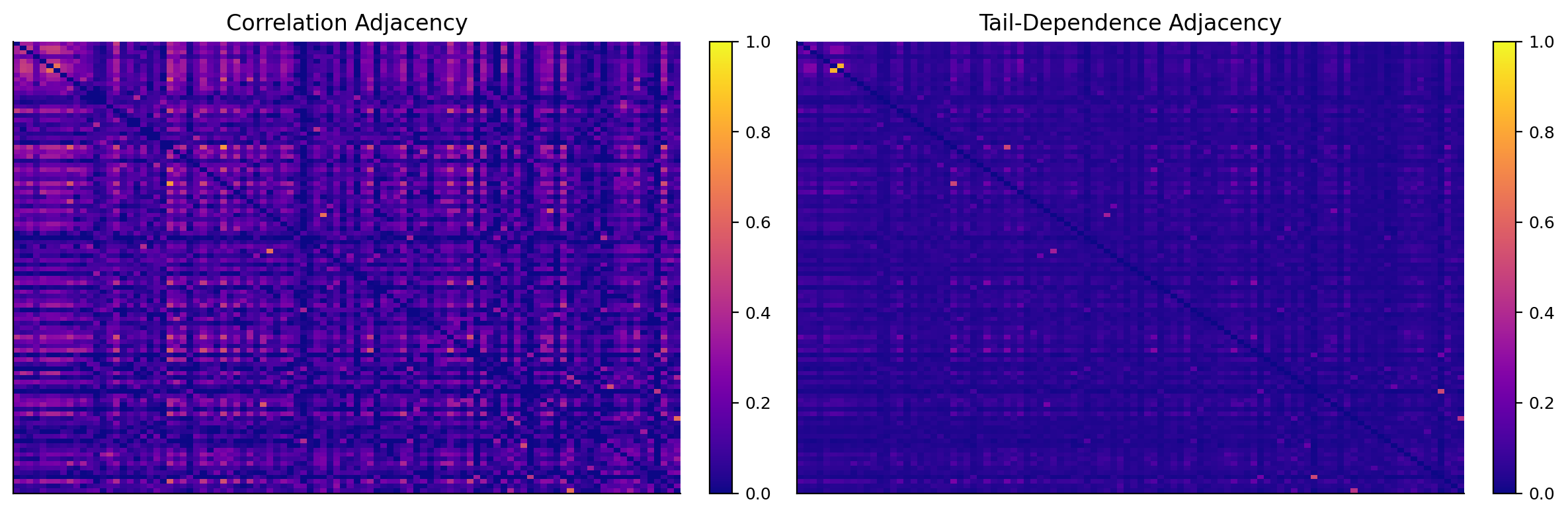
The adjacency heatmaps show the difference between correlation and copula dependence very clearly. The correlation adjacency has broad medium-strength connections. The tail-dependence adjacency is darker and more selective, with only a smaller subset of pairs carrying large edge weights. In market language, average dependence is widespread, but extreme co-crash dependence is concentrated.

The dense network plots look crowded because each graph has 4,950 edges. Still, the correlation dense graph forms a large cloud with a visible center, while the copula dense graph has a slightly different shape because tail-dependence edges emphasize crash-connected groups. The dense plots aren’t meant to be the final model. They are the raw market map before we filter it down.

This is similar to experimental network data in other complex systems: if we draw every possible relationship, the plot becomes a hairball. The useful information appears after we keep the relationships that carry the most structure.

5) PMFG and MST filtered networks

The next step is filtering. We keep the same nodes, but we reduce the number of edges. The two filters are PMFG and MST.

The minimum spanning tree keeps exactly \(N-1\) edges and connects all nodes without cycles. It solves:

\[ \min_{E_T}\sum_{(i,j)\in E_T} d_{ij} \]

subject to the graph being connected and acyclic. Here \(d_{ij}\) is the dependence distance. Because short distance means strong dependence, the MST keeps the strongest backbone needed to connect all stocks. For \(N=100\), the MST has exactly 99 edges.

The MST is very readable, but it is aggressive. It removes almost every edge. That makes it useful for seeing the backbone, but it can throw away meaningful secondary relationships.

The planar maximally filtered graph is less aggressive. It keeps adding the strongest available edges while preserving planarity. A planar graph can be drawn without crossing edges. For \(N\) nodes, a maximal planar graph has

\[ 3(N-2) \]

edges, so for \(N=100\) the PMFG keeps

\[ 3(100-2)=294 \]

edges. That is three times denser than the MST, but still far smaller than the 4,950-edge complete graph.

The PMFG has a useful middle position:

  • it keeps more local structure than the MST,
  • it removes most of the noisy weak edges,
  • it stays sparse enough for centrality measures to be meaningful,
  • it can reveal stocks that are central through multiple routes, not only through one tree path.

In this project, centrality is computed on both MST and PMFG versions, and on both correlation and copula dependence. That gives us four network representations per date:

Dependence layer Network filter Main information
Correlation MST average co-movement backbone
Correlation PMFG richer average co-movement map
Copula tail dependence MST extreme-risk backbone
Copula tail dependence PMFG richer extreme-risk map

The only ranking object used later is centrality. The four network constructions are used only to change the dependence layer and the graph filter behind those centrality scores.

Filter strength and information loss

The MST and PMFG differ in how much information they retain. With 100 stocks:

\[ \text{Complete graph edges}=4950 \]

\[ \text{MST edges}=99 \]

\[ \text{PMFG edges}=294 \]

So the MST keeps about

\[ \frac{99}{4950}\approx2.0\% \]

of all possible edges. The PMFG keeps about

\[ \frac{294}{4950}\approx5.9\% \]

of all possible edges. Both are sparse, but PMFG is roughly three times richer than MST.

That has consequences for centrality. In an MST, every edge is part of the unique backbone. Betweenness can become very strong for nodes that sit near the middle of the tree. A stock can look important simply because the tree has routed many paths through it. In a PMFG, there are more alternative routes, so betweenness is less tree-fragile. Degree and eigenvector also have more information because each node can have more meaningful local edges.

The MST is excellent for seeing the minimum backbone. The PMFG is often better for portfolio signals because it keeps more of the market’s local structure. This is why the central fixed portfolio uses copula PMFG combined centrality rather than a single MST measure.

Planarity also matters for interpretation. A planar filter doesn’t only keep the top 294 edges blindly. It keeps strong edges subject to a global structural constraint. That makes the graph sparse but still organized. It avoids a fully dense graph where every relationship exists and centrality becomes less informative.

PMFG and MST effects on centrality rankings

The same stock can have different centrality depending on the filter. This isn’t an error. It tells us that the stock’s role depends on how much network detail we allow.

In an MST, a stock can receive high betweenness if it sits near a major branch point. Because the tree has no cycles, many paths are forced through a small number of connectors. This can make bridge roles very sharp. The benefit is clarity. The risk is that one edge choice can strongly change path structure.

In a PMFG, the graph has more cycles and alternative paths. A node needs broader importance to stay central. Degree and eigenvector centrality are usually more meaningful in PMFG because each node has more local edge information. Betweenness is still useful, but it is less dominated by one forced tree route.

That is why the candidate grid includes both. MST centrality can identify the minimum backbone of dependence. PMFG centrality can identify richer market structure. The rolling selector then lets performance decide which representation is useful for the current market, rather than assuming one filter always dominates.

For a portfolio, this matters because MST peripheral stocks can be extremely far from the tree core, while PMFG peripheral stocks are peripheral even after allowing more alternative connections. PMFG periphery can be a stricter and more robust concept.

Reading filtered network plots

The filtered network plots are also useful visually. In a PMFG plot, a central node usually appears close to several strong neighborhoods, and its color/size reflects high weighted centrality. In an MST plot, long branches often represent stocks or small groups that are only weakly connected to the rest of the system. Those branch-end stocks are candidates for periphery.

But visual layout is only an aid. Spring layouts aren’t unique; if we rerun the layout with a different seed, the exact picture can rotate or stretch. The reliable information is in the graph object: edge weights, edge distances, and centrality scores. That is why the project doesn’t build portfolios from where the node appears in the drawing. It builds portfolios from numeric centrality.

The drawings help the reader understand the graph, but the backtest uses the actual matrices and network measures. This separation is important. Good visualizations are teaching tools; the portfolio needs reproducible numeric signals.

Show code
def pmfg_network(adjacency, distance):
    names = list(adjacency.index)
    graph = nx.Graph()
    graph.add_nodes_from(names)
    target_edges = max(0, 3 * (len(names) - 2))
    edges = []
    for i, left in enumerate(names):
        for j in range(i + 1, len(names)):
            right = names[j]
            edges.append(
                (float(adjacency.iat[i, j]), left, right, max(float(distance.iat[i, j]), 1e-8))
            )
    edges.sort(key=lambda row: row[0], reverse=True)

    embedding = None
    faces = []

    def refresh_faces(planar_embedding):
        seen, current = set(), []
        for left in planar_embedding.nodes():
            for right in planar_embedding.neighbors(left):
                if (left, right) in seen:
                    continue
                marked = set()
                current.append(set(planar_embedding.traverse_face(left, right, marked)))
                seen.update(marked)
        return current

    for strength, left, right, distance_value in edges:
        if graph.number_of_edges() >= target_edges:
            break
        if (
            embedding is not None
            and nx.has_path(graph, left, right)
            and not any(left in face and right in face for face in faces)
        ):
            continue
        graph.add_edge(left, right, weight=strength, distance=distance_value)
        planar, proposed = nx.check_planarity(graph, counterexample=False)
        if planar:
            embedding = proposed
            faces = refresh_faces(embedding)
        else:
            graph.remove_edge(left, right)

    edge_lookup = {
        frozenset((left, right)): (strength, left, right, distance_value)
        for strength, left, right, distance_value in edges
    }
    while graph.number_of_edges() < target_edges and faces:
        feasible = []
        for face in faces:
            for left, right in combinations(sorted(face), 2):
                if not graph.has_edge(left, right):
                    feasible.append(edge_lookup[frozenset((left, right))])
        if not feasible:
            break
        strength, left, right, distance_value = max(feasible, key=lambda row: row[0])
        graph.add_edge(left, right, weight=strength, distance=distance_value)
        planar, embedding = nx.check_planarity(graph, counterexample=False)
        if not planar:
            graph.remove_edge(left, right)
            break
        faces = refresh_faces(embedding)
    return graph


def mst_network(adjacency, distance):
    candidate = nx.Graph()
    names = list(adjacency.index)
    candidate.add_nodes_from(names)
    for i, left in enumerate(names):
        for j in range(i + 1, len(names)):
            right = names[j]
            candidate.add_edge(
                left,
                right,
                weight=float(adjacency.iat[i, j]),
                distance=max(float(distance.iat[i, j]), 1e-8),
            )
    return nx.minimum_spanning_tree(candidate, weight="distance")
Show code
corr_networks_first = {
    "PMFG": pmfg_network(corr_adjacency_first, corr_dist_first),
    "MST": mst_network(corr_adjacency_first, corr_dist_first),
}
copula_networks_first = {
    "PMFG": pmfg_network(tail_adjacency_first, tail_dist_first),
    "MST": mst_network(tail_adjacency_first, tail_dist_first),
}
network_sizes = pd.DataFrame(
    {
        "Correlation Dense": [corr_dense_first.number_of_nodes(), corr_dense_first.number_of_edges(), nx.check_planarity(corr_dense_first)[0]],
        "Correlation PMFG": [corr_networks_first["PMFG"].number_of_nodes(), corr_networks_first["PMFG"].number_of_edges(), nx.check_planarity(corr_networks_first["PMFG"])[0]],
        "Correlation MST": [corr_networks_first["MST"].number_of_nodes(), corr_networks_first["MST"].number_of_edges(), nx.check_planarity(corr_networks_first["MST"])[0]],
        "Copula Dense": [tail_dense_first.number_of_nodes(), tail_dense_first.number_of_edges(), nx.check_planarity(tail_dense_first)[0]],
        "Copula PMFG": [copula_networks_first["PMFG"].number_of_nodes(), copula_networks_first["PMFG"].number_of_edges(), nx.check_planarity(copula_networks_first["PMFG"])[0]],
        "Copula MST": [copula_networks_first["MST"].number_of_nodes(), copula_networks_first["MST"].number_of_edges(), nx.check_planarity(copula_networks_first["MST"])[0]],
    },
    index=["nodes", "edges", "planar"],
).T
display(network_sizes)
nodes edges planar
Correlation Dense 100 4950 False
Correlation PMFG 100 294 True
Correlation MST 100 99 True
Copula Dense 100 4950 False
Copula PMFG 100 294 True
Copula MST 100 99 True
Show code
fig, axes = plt.subplots(1, 2, figsize=(14, 5))
corr_positions = nx.spring_layout(corr_networks_first["PMFG"], seed=17, weight="weight")
for ax, (label, graph) in zip(axes, corr_networks_first.items()):
    draw_network(ax, graph, f"Correlation {label} | {graph.number_of_edges()} edges", corr_positions)
fig.tight_layout()
plt.show()

fig, axes = plt.subplots(1, 2, figsize=(14, 5))
copula_positions = nx.spring_layout(copula_networks_first["PMFG"], seed=17, weight="weight")
for ax, (label, graph) in zip(axes, copula_networks_first.items()):
    draw_network(ax, graph, f"Copula {label} | {graph.number_of_edges()} edges", copula_positions)
fig.tight_layout()
plt.show()

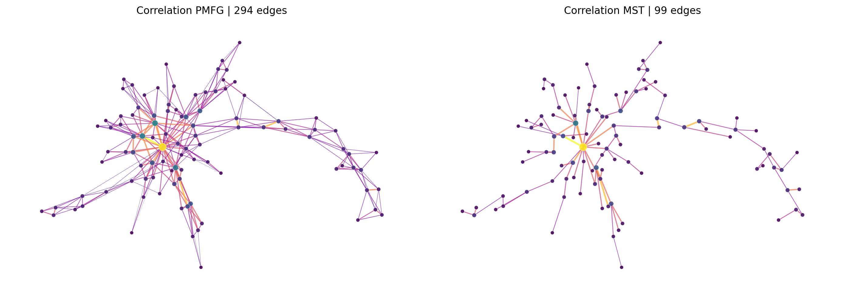
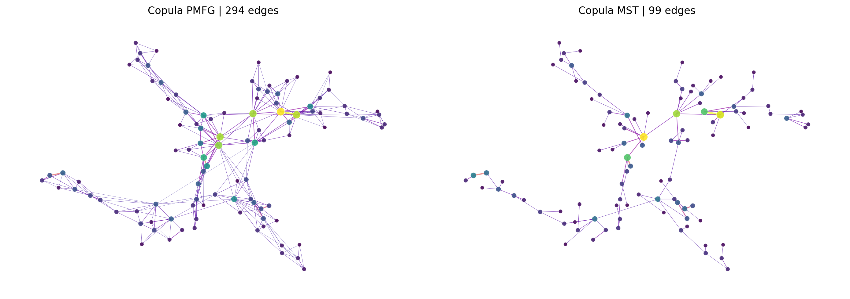
The network-size table confirms that the dense graphs have 4,950 edges, the PMFGs have 294 edges, and the MSTs have 99 edges. Both PMFG and MST are planar in the output. That confirms the filter logic works as intended.

The filtered network visuals are much more readable than the dense graphs. In the correlation PMFG, the center is fairly visible, with semiconductor and technology-related names forming a dense zone. The MST strips the network down to a single backbone. The branches make it easier to see which stocks are linked through only a few key paths, but some local structure disappears.

The copula PMFG and copula MST focus on tail-linked stocks. These graphs are especially important for risk. A stock that looks central in the copula PMFG isn’t just highly correlated with many stocks. It is connected to the market’s extreme-loss structure. That distinction is one of the main reasons this project is more interesting than a standard correlation-ranking exercise.

6) Centrality measures

Centrality is the main signal in the project. It turns a graph into one score per stock. Different centrality measures answer different structural questions.

Let the graph have adjacency matrix \(A\), where \(A_{ij}\) is the edge weight between stock \(i\) and stock \(j\). Let \(d_{ij}\) be the distance between the two stocks when shortest paths are computed. We use four centrality measures and then combine them.

6.1 Degree and weighted strength

For a weighted graph, degree is really strength:

\[ s_i = \sum_{j\ne i} A_{ij} \]

A high-strength stock has many strong connections. In finance, this often means the stock shares broad market or sector risk with many other names. A high-degree semiconductor stock is probably exposed to the same factors as many neighboring technology stocks: growth expectations, rate sensitivity, AI demand, supply-chain cycles, and risk appetite.

Degree is local. It only asks how strongly a node connects to its immediate neighbors.

6.2 Eigenvector centrality

Eigenvector centrality adds one more layer: being connected to important nodes matters more than being connected to unimportant nodes. It solves

\[ A\mathbf{c} = \lambda \mathbf{c} \]

or component-wise:

\[ c_i = \frac{1}{\lambda}\sum_j A_{ij}c_j \]

where \(c_i\) is the centrality of stock \(i\) and \(\lambda\) is the leading eigenvalue. This creates a recursive definition. A stock is important if it is linked to stocks that are themselves important.

In a market network, eigenvector centrality often highlights the core growth cluster. It can identify stocks that don’t merely have many links, but links to the network’s dominant risk neighborhood.

6.3 Betweenness centrality

Betweenness centrality measures how often a node lies on shortest paths between other nodes:

\[ b_i = \sum_{s\ne i\ne t}\frac{\sigma_{st}(i)}{\sigma_{st}} \]

where \(\sigma_{st}\) is the number of shortest paths between nodes \(s\) and \(t\), and \(\sigma_{st}(i)\) is the number of those paths that pass through node \(i\).

A high-betweenness stock acts like a bridge. It may connect two parts of the graph that otherwise don’t connect strongly. In finance, this can describe a company that links themes, sectors, or factor groups. For example, a stock exposed to both consumer demand and technology may become a path between consumer cyclicals and growth stocks.

Betweenness is especially interesting because it doesn’t require the stock to have the largest number of edges. A node can have moderate degree but high bridge importance.

6.4 Closeness centrality

Closeness centrality measures how near a node is to all other nodes in distance space:

\[ \ell_i = \frac{N-1}{\sum_{j\ne i}d(i,j)} \]

where \(d(i,j)\) is the shortest-path distance from node \(i\) to node \(j\). If a stock has high closeness, it can reach the rest of the graph through short paths. It sits near the network’s center in a geometric sense.

Closeness can behave differently from degree. A stock might not have the highest direct edge strength, but if it sits in the middle of the graph, it can still be close to many other stocks.

6.5 Combined centrality

Each centrality measure sees one part of network position. The combined score scales each centrality to \([0,1]\), ranks them, averages them, and scales again:

\[ C_i^{combined} = \text{scale}_{0,1}\left(\frac{1}{4}\sum_{m\in M}\text{rankpct}\left(C_{i,m}\right)\right) \]

where \(M=\{\text{degree},\text{eigenvector},\text{betweenness},\text{closeness}\}\). The combined score is useful because it avoids making the whole portfolio depend on a single centrality definition. A stock that is central under several views of the graph gets a high combined score.

Centrality in financial language

The four centrality measures can be read as four financial roles.

Degree or strength says: this stock is directly connected to many others. In a portfolio, high degree means the stock is likely to share broad shocks. A high-degree stock may be a good expression of a common theme, but it is rarely a pure diversifier.

Eigenvector centrality says: this stock is connected to the important part of the market. It can become high even if the stock doesn’t have the absolute largest number of edges, as long as its neighbors are central. This often fits mega-cap or theme-leading stocks.

Betweenness centrality says: this stock lies on many shortest paths. It can transmit shocks between clusters. In finance, bridge stocks can be interesting because they may connect themes that otherwise look separate.

Closeness centrality says: this stock is near the whole graph. A high-closeness stock sits in the middle of dependence space. It can respond to broad market structure, even if it isn’t the highest-strength stock.

The combined score isn’t a magic measure. It is a practical average. It says: if a stock is central in several reasonable ways, treat it as structurally central. If a stock is only extreme under one measure, be more cautious.

For example, a semiconductor equipment company might have high degree, high eigenvector centrality, and high closeness because it is tied to many chip names and the broader AI growth cluster. A stock like a biotech or food company might have low eigenvector and degree because it is driven by different catalysts. A platform company might have moderate degree but high betweenness if it connects several themes.

These are exactly the kinds of differences we want a network portfolio to detect.

Centrality scores as risk exposures

A centrality score can be read like a network exposure. If \(C_i\) is high, the stock is structurally close to the market’s main dependence channels. That can be useful in two opposite ways.

For a return-seeking strategy, high centrality may identify stocks that participate in the dominant market theme. In a NASDAQ growth rally, central stocks can be the ones investors keep buying together. Centrality then behaves like a theme-strength indicator.

For a risk-control strategy, high centrality can be a warning. If a stock is central in the copula tail-dependence PMFG, it may be tied to the market’s crash cluster. When stress hits, that stock can fall together with the rest of the core.

This creates a sign problem:

\[ \text{centrality} \rightarrow \text{return leadership in good regimes} \]

and

\[ \text{centrality} \rightarrow \text{systemic drawdown exposure in bad regimes} \]

The project handles this by testing both central and peripheral portfolios. It doesn’t assume centrality is always good or bad. It also builds a Network Diversifier that mostly uses periphery, but requires momentum and risk confirmation.

This is a cleaner design than forcing one interpretation. A central stock like NVDA can be a powerful return engine and a crowded systemic risk at the same time. A network model needs to respect both.

Crowding and shock transmission

Centrality is also a crowding indicator. If many investors hold the same central names for similar reasons, those names can transmit shocks quickly. A disappointing earnings report, a rate surprise, a regulatory headline, or an AI-capex concern can move the central cluster together. In a graph, that appears as high edge strength and short paths among related stocks.

A shock transmission path can be written informally as

\[ \Delta r_i \rightarrow \Delta r_j \rightarrow \Delta r_k \]

where the arrows aren’t causal proof, but dependence channels. If stock \(j\) lies on many shortest paths, it may be a bridge between groups. If stock \(i\) has high eigenvector centrality, it is embedded in an important neighborhood. These graph roles aren’t causal structural models, but they are useful summaries of how shocks are likely to spread through returns.

This is why the project uses multiple centrality measures. A crowded central stock and a bridge stock are both important, but for different reasons. Degree and eigenvector capture crowding inside the core. Betweenness captures path importance. Closeness captures geometric nearness to the whole graph.

Show code
def scale_01(values):
    if isinstance(values, pd.DataFrame):
        return values.apply(scale_01)
    series = pd.Series(values, dtype=float)
    low, high = series.min(), series.max()
    if not np.isfinite(low) or not np.isfinite(high):
        return pd.Series(0.0, index=series.index)
    if high - low <= 1e-12:
        return pd.Series(0.5, index=series.index)
    return ((series - low) / (high - low)).clip(0.0, 1.0)


def combined_centrality(scores):
    return scale_01(scores.apply(scale_01).rank(pct=True).mean(axis=1))


def centrality_table(graph):
    nodes = list(graph.nodes())
    strength = pd.Series(dict(graph.degree(weight="weight")), dtype=float).reindex(nodes).fillna(0.0)
    try:
        eigenvector = nx.eigenvector_centrality_numpy(graph, weight="weight")
    except Exception:
        eigenvector = nx.eigenvector_centrality(graph, weight="weight", max_iter=1000)
    betweenness = nx.betweenness_centrality(
        graph,
        k=min(16, len(nodes)) if len(nodes) > 32 else None,
        seed=17,
        weight="distance",
        normalized=True,
    )
    closeness = nx.closeness_centrality(graph, distance="distance")
    output = pd.DataFrame(
        {
            "degree": scale_01(strength),
            "eigenvector": scale_01(pd.Series(eigenvector)),
            "betweenness": scale_01(pd.Series(betweenness)),
            "closeness": scale_01(pd.Series(closeness)),
        }
    ).reindex(nodes)
    output["combined"] = combined_centrality(output)
    return output


def frame_heatmap(ax, frame, title, cmap="viridis"):
    image = ax.imshow(frame.to_numpy(dtype=float), aspect="auto", cmap=cmap, vmin=0.0, vmax=1.0)
    ax.set_title(title)
    ax.set_xticks(range(len(frame.columns)))
    ax.set_xticklabels(frame.columns, rotation=35, ha="right")
    ax.set_yticks(range(len(frame.index)))
    ax.set_yticklabels(frame.index.astype(str), fontsize=6)
    ax.figure.colorbar(image, ax=ax, fraction=0.046, pad=0.04)
Show code
first_centralities = {
    ("correlation", "pmfg"): centrality_table(corr_networks_first["PMFG"]),
    ("correlation", "mst"): centrality_table(corr_networks_first["MST"]),
    ("copula", "pmfg"): centrality_table(copula_networks_first["PMFG"]),
    ("copula", "mst"): centrality_table(copula_networks_first["MST"]),
}
first_central_summary = pd.DataFrame(
    {
        f"{dependence} {network}": scores["combined"].sort_values(ascending=False).head(5).index.tolist()
        for (dependence, network), scores in first_centralities.items()
    }
)
display(first_central_summary)

fig, axes = plt.subplots(1, 2, figsize=(14, 6))
for ax, key in zip(axes, [("correlation", "pmfg"), ("copula", "pmfg")]):
    shown = first_centralities[key].sort_values("combined", ascending=False).head(20)
    frame_heatmap(ax, shown, f"First {key[0].title()} PMFG Centrality")
fig.tight_layout()
plt.show()
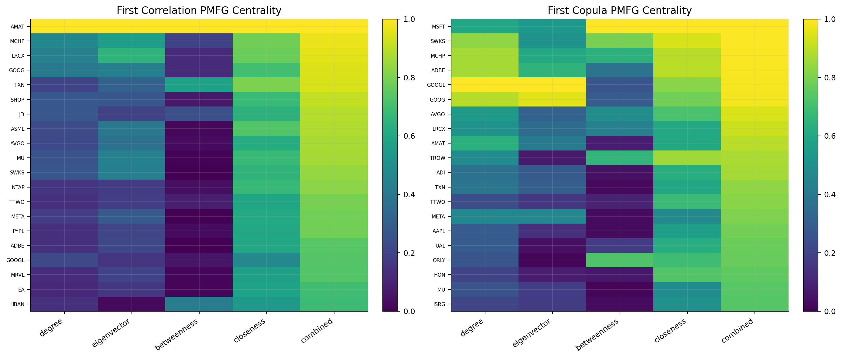
correlation pmfg correlation mst copula pmfg copula mst
0 AMAT AMAT MSFT ADBE
1 MCHP MCHP SWKS MCHP
2 LRCX TXN MCHP GOOG
3 GOOG MU ADBE GOOGL
4 TXN TTWO GOOGL MSFT

The first centrality summary shows semiconductor and large technology names at the top across several network constructions. In the first window, names like AMAT, MCHP, LRCX, GOOG, TXN, MSFT, ADBE, and GOOGL appear among the most central. That is economically intuitive. NASDAQ is structurally dominated by growth and technology exposure, and semiconductor firms tend to share strong common risk drivers.

The centrality heatmaps show that the centrality measures don’t always agree perfectly. Some names are strong in degree and eigenvector, while others are more visible in betweenness or closeness. That is exactly why the combined score is helpful. Degree alone would mostly reward crowded local clusters. Betweenness alone could overemphasize bridge names. Combined centrality gives a more stable ranking.

The difference between correlation PMFG and copula PMFG is also important. A name central under correlation is central in average co-movement. A name central under copula PMFG is central in tail co-movement. The second case is more relevant for crash-risk diversification.

7) Rolling centrality through time

A single network date is only a snapshot. The project then repeats the whole construction across all quarterly dates:

  1. select the 100-stock liquid universe for the date,
  2. take the trailing 252-day return window,
  3. estimate shrinkage correlation,
  4. build correlation distance and adjacency,
  5. construct PMFG and MST graphs,
  6. compute degree, eigenvector, betweenness, closeness, and combined centrality,
  7. repeat the same logic for t-copula tail dependence.

This gives a time series of network structures. The rolling design is important because the identity of the market center changes. In calm growth markets, mega-cap tech and semiconductors may dominate the centrality rankings. During stress, correlation and tail dependence can rise across the whole universe, and the network can become more compressed.

Show code
correlation_store = {}
for dt in rebalance_dates:
    names = list(universe_by_date[dt]["tickers"])
    window = clean_window(ret_d.loc[:dt, names].tail(lookback))
    if window.shape[0] < min_obs or window.shape[1] < 50:
        continue
    corr = shrink_corr(window)
    distance = corr_distance(corr)
    adjacency = dependence_adjacency(corr)
    graphs = {
        "pmfg": pmfg_network(adjacency, distance),
        "mst": mst_network(adjacency, distance),
    }
    correlation_store[pd.Timestamp(dt)] = {
        "window": window,
        "corr": corr,
        "distance": distance,
        "adjacency": adjacency,
        "graphs": graphs,
        "centralities": {name: centrality_table(graph) for name, graph in graphs.items()},
    }
Show code
display(
    pd.DataFrame(
        {
            "dates": [len(correlation_store)],
            "average PMFG edges": [np.mean([row["graphs"]["pmfg"].number_of_edges() for row in correlation_store.values()])],
            "average MST edges": [np.mean([row["graphs"]["mst"].number_of_edges() for row in correlation_store.values()])],
        },
        index=["rolling correlation centralities"],
    ).round(1)
)
dates average PMFG edges average MST edges
rolling correlation centralities 33 294.0 99.0
Show code
copula_store = {}
for dt, correlation_record in correlation_store.items():
    window = correlation_record["window"]
    pseudo = pseudo_observations(window)
    rho_t = kendall_to_t_copula_corr(pseudo)
    nu, _ = select_t_copula_nu(pseudo)
    tail = student_t_tail_dependence(rho_t, nu)
    distance = dependence_to_distance(tail)
    adjacency = dependence_adjacency(tail)
    graphs = {
        "pmfg": pmfg_network(adjacency, distance),
        "mst": mst_network(adjacency, distance),
    }
    copula_store[dt] = {
        "window": window,
        "tail": tail,
        "distance": distance,
        "adjacency": adjacency,
        "nu": nu,
        "graphs": graphs,
        "centralities": {name: centrality_table(graph) for name, graph in graphs.items()},
    }

network_store = {}
for dt in sorted(copula_store):
    network_store[dt] = {
        "window": correlation_store[dt]["window"],
        "corr": correlation_store[dt]["corr"],
        "tail": copula_store[dt]["tail"],
        "nu": copula_store[dt]["nu"],
        "centralities": {
            ("correlation", "pmfg"): correlation_store[dt]["centralities"]["pmfg"],
            ("correlation", "mst"): correlation_store[dt]["centralities"]["mst"],
            ("copula", "pmfg"): copula_store[dt]["centralities"]["pmfg"],
            ("copula", "mst"): copula_store[dt]["centralities"]["mst"],
        },
    }
model_dates = pd.DatetimeIndex(sorted(network_store))
Show code
copula_diagnostics = pd.DataFrame(
    {
        "nu": {dt: record["nu"] for dt, record in copula_store.items()},
        "mean tail dependence": {
            dt: float(np.mean(record["tail"].to_numpy()[np.triu_indices_from(record["tail"], k=1)]))
            for dt, record in copula_store.items()
        },
        "PMFG edges": {dt: record["graphs"]["pmfg"].number_of_edges() for dt, record in copula_store.items()},
    }
)
display(copula_diagnostics.round(4))

latest_dt = model_dates[-1]
default_centrality_setup = ("copula", "pmfg", "combined")
latest_centrality = network_store[latest_dt]["centralities"][default_centrality_setup[:2]]
display(pd.DataFrame({"centrality preview": ["Latest copula PMFG combined centrality"]}))
display(latest_centrality.sort_values("combined", ascending=False).head(20).round(3))
display(latest_centrality.sort_values("combined", ascending=True).head(20).round(3))
nu mean tail dependence PMFG edges
2018-01-31 7.0 0.0536 294
2018-04-30 7.0 0.0775 294
2018-07-31 7.0 0.0776 294
2018-10-31 7.0 0.0855 294
2019-01-31 7.0 0.1110 294
2019-04-30 7.0 0.0898 294
2019-07-31 7.0 0.0960 294
2019-10-31 7.0 0.1055 294
2020-01-31 7.0 0.0835 294
2020-04-30 4.0 0.2322 294
2020-07-31 4.0 0.2238 294
2020-10-30 4.0 0.2175 294
2021-01-29 4.0 0.2134 294
2021-04-30 7.0 0.0859 294
2021-07-30 7.0 0.0856 294
2021-10-29 7.0 0.0797 294
2022-01-31 7.0 0.0863 294
2022-04-29 7.0 0.1111 294
2022-07-29 7.0 0.1392 294
2022-10-31 7.0 0.1625 294
2023-01-31 7.0 0.1779 294
2023-04-28 7.0 0.1624 294
2023-07-31 7.0 0.1225 294
2023-10-31 7.0 0.1025 294
2024-01-31 15.0 0.0201 294
2024-04-30 15.0 0.0161 294
2024-07-31 15.0 0.0150 294
2024-10-31 15.0 0.0139 294
2025-01-31 15.0 0.0130 294
2025-04-30 7.0 0.0860 294
2025-07-31 7.0 0.0892 294
2025-10-31 7.0 0.0799 294
2026-01-28 7.0 0.0796 294
centrality preview
0 Latest copula PMFG combined centrality
degree eigenvector betweenness closeness combined
LRCX 1.000 1.000 0.986 0.949 1.000
ADI 0.975 0.745 0.515 0.801 0.981
NVDA 0.787 0.305 1.000 1.000 0.967
ON 0.669 0.700 0.386 0.727 0.937
AMAT 0.611 0.700 0.089 0.802 0.910
NXPI 0.786 0.585 0.418 0.605 0.902
MU 0.573 0.479 0.047 0.795 0.875
KLAC 0.754 0.797 0.022 0.654 0.867
COIN 0.649 0.037 0.624 0.755 0.864
CRWD 0.828 0.086 0.142 0.689 0.859
ZS 0.737 0.058 0.355 0.682 0.859
PYPL 0.423 0.148 0.460 0.596 0.823
MPWR 0.464 0.597 0.009 0.704 0.823
AMZN 0.454 0.052 0.159 0.749 0.818
META 0.494 0.050 0.103 0.736 0.812
CRDO 0.442 0.132 0.058 0.662 0.804
MCHP 0.492 0.552 0.001 0.709 0.802
AVGO 0.441 0.094 0.119 0.681 0.799
UAL 0.452 0.194 0.029 0.589 0.770
LITE 0.300 0.162 0.062 0.637 0.758
degree eigenvector betweenness closeness combined
EA 0.000 0.000 0.00 0.000 0.000
CME 0.021 0.000 0.00 0.106 0.016
REGN 0.072 0.000 0.00 0.024 0.043
VRTX 0.095 0.000 0.00 0.094 0.071
MDLZ 0.077 0.001 0.00 0.125 0.076
RIVN 0.045 0.001 0.00 0.265 0.101
ORLY 0.138 0.001 0.00 0.114 0.114
BKNG 0.084 0.001 0.00 0.210 0.120
SBUX 0.046 0.002 0.00 0.216 0.120
MELI 0.035 0.001 0.00 0.302 0.125
ASTS 0.135 0.001 0.00 0.159 0.128
NFLX 0.043 0.002 0.00 0.298 0.130
DASH 0.106 0.001 0.00 0.262 0.141
APLD 0.081 0.002 0.00 0.264 0.149
ABNB 0.147 0.002 0.00 0.212 0.187
TMUS 0.086 0.000 0.02 0.112 0.190
INTU 0.135 0.003 0.00 0.219 0.193
APP 0.141 0.002 0.00 0.280 0.198
EQIX 0.044 0.002 0.00 0.438 0.212
AAPL 0.050 0.004 0.00 0.409 0.215

The copula diagnostics table is one of the most useful macro-style outputs in thisn’tebook. The selected degrees of freedom \(\nu\) and the mean tail dependence tell us whether the rolling dependence structure looks calm or heavy-tailed.

When \(\nu\) drops to 4, the copula is saying the window has very heavy joint tails. In the output, this happens around the COVID period. Mean tail dependence jumps above 0.22 in 2020, compared with values around 0.05–0.11 in calmer windows. That is exactly what we expect. During COVID, many stocks sold off together, and dependence became more extreme.

Later, in 2024, selected \(\nu\) rises to 15 and mean tail dependence falls toward 0.01–0.02. That means the tail network becomes much less connected. The market still has correlations, but joint extreme dependence is lower. This matters for a network portfolio: when tail dependence is low, peripheral stocks may genuinely diversify better; when tail dependence is high, peripheral labels can become less reliable because everything can fall together.

Network compression during stress

The rolling tail-dependence table is a compact crisis indicator. When mean tail dependence rises, the market network is becoming more compressed. That means many stocks are moving into the same extreme-risk state together.

In calm periods, the graph can separate stocks by sector, theme, business model, and idiosyncratic drivers. In stress periods, those differences shrink. Investors sell risk, correlations rise, and tail dependence moves up. In the output, the COVID window shows this clearly: selected \(\nu\) drops to 4 and mean tail dependence jumps above 0.20. The network is saying that the market has entered a state where diversification is harder.

This has a direct portfolio implication. Peripheral stocks are most valuable when periphery is stable. If a stock is peripheral only in calm periods but becomes connected in stress, it may fail as a diversifier. The rolling copula network is useful because it allows periphery to be re-estimated under current tail conditions.

The 2024 period is almost the opposite. Selected \(\nu=15\) and mean tail dependence is very low. In that regime, the market has more differentiated behavior. A network diversifier may find more genuine separation because not all stocks are tied into the same crash structure.

This dynamic part is what makes the project more than one cross-sectional graph. We are watching the market’s dependence geometry breathe through time.

The latest copula PMFG combined centrality table is very concentrated in semiconductor and AI-linked growth names. LRCX is at the top with combined centrality of 1.000. ADI, NVDA, ON, AMAT, NXPI, MU, and KLAC are also near the top. This isn’t random. The current NASDAQ network is heavily structured around the semiconductor and AI supply chain. Those names share common shocks: chip demand, data-center capex, rates, growth valuation, export controls, and broad risk appetite.

The most peripheral list contains names like EA, CME, REGN, VRTX, MDLZ, ORLY, BKNG, SBUX, NFLX, and AAPL in the latest output. Peripheral doesn’t mean low-quality. It means these names sit away from the central tail-dependence structure under the selected graph and centrality measure. Some of them are defensive, idiosyncratic, regulated, consumer-facing, or business-model specific. They don’t load on the same semiconductor-centered network core as strongly.

This distinction is one of the project’s useful economic interpretations:

  • central stocks can be strong return engines during the right regime, but they are exposed to crowded common shocks;
  • peripheral stocks can diversify the portfolio, but they can also underperform if the central theme is driving the market;
  • a pure peripheral portfolio may miss rallies, while a pure central portfolio can suffer deep drawdowns;
  • a network diversifier tries to use periphery while also filtering for momentum and risk.

The concentration of the latest centrality list in semiconductors is also a good reminder that network centrality can reveal thematic crowding. LRCX, AMAT, KLAC, NVDA, ADI, ON, NXPI, and MU aren’t identical businesses, but their investors often trade them as part of the same broad semiconductor and AI infrastructure complex. When market expectations for AI capex, chip margins, export restrictions, or rate-sensitive growth valuations change, these names can move together.

This is why centrality has a portfolio meaning beyond sector classification. A sector label might tell us that two stocks are in technology. The network tells us whether they actually co-move in the current data. Two stocks can share a sector but not be equally central. A stock can also become central because it connects to several themes at once.

The low-centrality list is just as useful. A stock like a healthcare name can be peripheral because its return drivers are more company-specific or regulatory. A consumer or gaming name can be peripheral because it is exposed to different demand cycles. That doesn’t automatically make it a buy. It only means the stock may add a different dependence profile.

8) Network portfolio construction

The portfolio layer takes centrality scores and turns them into weights. We build three network portfolios.

8.1 Most Central 20

The central portfolio selects the stocks with the highest centrality score. If \(C_i\) is the selected centrality score for stock \(i\), then the set is

\[ \mathcal{S}_{central} = \text{Top}_{20}(C_i) \]

The raw weight is equal across selected names and zero elsewhere:

\[ \tilde{w}_i = \begin{cases} 1, & i\in \mathcal{S}_{central} \\ 0, & i\notin \mathcal{S}_{central} \end{cases} \]

Then weights are normalized and capped at 10%:

\[ w_i = \frac{\min(\tilde{w}_i,w_{max})}{\sum_j \min(\tilde{w}_j,w_{max})} \]

with a small redistribution loop if the cap binds. Since the portfolio selects 20 names and the cap is 10%, the cap usually doesn’t prevent investment, but it protects against more concentrated variants.

The central portfolio is a market-core strategy. It owns the stocks that sit inside the system’s strongest dependence structure. That can work well when the core theme keeps leading. It can hurt badly when the core unwinds.

8.2 Most Peripheral 20

The peripheral portfolio flips the signal:

\[ P_i = 1 - C_i \]

and selects the top 20 peripheral scores:

\[ \mathcal{S}_{peripheral} = \text{Top}_{20}(P_i) \]

This is a network-diversification idea. The portfolio tries to own stocks farther from the crowded center. In theory, this can reduce average pairwise correlation and tail exposure. In practice, it can also create return problems because the market’s center often contains the dominant growth winners.

8.3 Network Diversifier

The network-diversifier portfolio is the main active construction. It doesn’t use periphery alone. It combines periphery with momentum, volatility, and drawdown:

\[ \text{score}_i = 0.35\,\text{periphery}_i + 0.35\,\text{momentum}_i - 0.20\,\text{volatility}_i - 0.10\,\text{drawdown}_i \]

Each component is scaled to \([0,1]\) before combining. The signs are important:

  • high periphery helps because the stock is less central in the dependence network;
  • high momentum helps because we still want stocks with positive price behavior;
  • high volatility hurts because volatility can turn periphery into idiosyncratic risk;
  • high drawdown hurts because a stock far from the center can still be weak for a reason.

After ranking by this score, the model selects 25 stocks and scales by inverse volatility:

\[ \tilde{w}_i \propto \frac{\max(\text{score}_i,0)+\epsilon}{\sigma_i} \]

Then weights are capped and normalized. This makes the final portfolio less naive than pure periphery. It searches for stocks that are away from the network center but still have acceptable trend and risk characteristics.

Capped normalization in portfolio terms

The capped normalization step deserves some attention because it turns a ranking into a realistic portfolio. A raw score vector can be written as

\[ \tilde{w}_i = s_i^+ \]

where \(s_i^+\) is the positive part of the score. Normalization gives

\[ w_i^{(0)} = \frac{\tilde{w}_i}{\sum_j \tilde{w}_j} \]

Then the cap enforces

\[ w_i \le w_{max} \]

If some weights exceed \(w_{max}\), the excess mass is redistributed to assets that still have room under the cap. This continues until the portfolio is fully invested and no cap is violated.

This is a small implementation detail with a big effect. Without caps, a score-based portfolio can become too concentrated in a few names. With caps, the network signal still ranks stocks, but it can’t let one stock dominate.

The Network Diversifier has one more layer: inverse volatility scaling. If selected stock \(i\) has score \(s_i\) and recent volatility \(\sigma_i\), the raw weight is proportional to

\[ \frac{s_i}{\sigma_i} \]

This means two stocks with the same network score don’t receive the same weight if one is much more volatile. The more volatile stock receives less capital. In financial terms, the model isn’t only selecting diversifiers; it is trying to size them with risk awareness.

The drawdown penalty also matters. A peripheral stock with a deep drawdown might be disconnected because it has idiosyncratic problems, not because it is a clean diversifier. Penalizing drawdown avoids treating every isolated stock as attractive.

Show code
def capped_normalize(raw, max_weight=0.10):
    weights = pd.Series(raw, dtype=float).clip(lower=0.0)
    if weights.sum() <= 1e-12:
        weights[:] = 1.0
    weights = weights / weights.sum()
    for _ in range(50):
        over = weights > max_weight + 1e-12
        if not over.any():
            break
        extra = float((weights[over] - max_weight).sum())
        weights[over] = max_weight
        room = (max_weight - weights[~over]).clip(lower=0.0)
        if room.sum() <= 1e-12:
            break
        weights.loc[room.index] += extra * room / room.sum()
    return weights / weights.sum()


def central_peripheral_weights(score, returns, n_stocks=20, max_weight=0.10):
    available = pd.Series(score, dtype=float).reindex(returns.columns).dropna()
    chosen = available.sort_values(ascending=False).head(n_stocks).index
    return capped_normalize(pd.Series(1.0, index=chosen), max_weight=max_weight)


def network_score(
    peripheral,
    returns,
    momentum_window=126,
    volatility_window=126,
    drawdown_window=252,
    periphery_weight=0.35,
    momentum_weight=0.35,
    volatility_weight=-0.20,
    drawdown_weight=-0.10,
):
    window = clean_window(returns)
    periphery = scale_01(pd.Series(peripheral).reindex(window.columns).fillna(0.0))
    momentum = (1.0 + window.tail(momentum_window)).prod() - 1.0
    volatility = window.tail(volatility_window).std() * np.sqrt(252.0)
    nav = (1.0 + window.tail(drawdown_window)).cumprod()
    drawdown = (nav / nav.cummax() - 1.0).min().abs()
    return (
        periphery_weight * periphery
        + momentum_weight * scale_01(momentum)
        + volatility_weight * scale_01(volatility)
        + drawdown_weight * scale_01(drawdown)
    )


def network_diversifier_weights(score, returns, n_stocks=25, max_weight=0.10):
    selected = pd.Series(score).sort_values(ascending=False).head(n_stocks)
    volatility = returns[selected.index].tail(126).std().clip(lower=1e-8)
    positive_score = selected - min(float(selected.min()), 0.0) + 1e-6
    return capped_normalize(positive_score / volatility, max_weight=max_weight)


def pairwise_corr_for_weights(returns, weights, lookback=126):
    rows = {}
    for dt, row in weights.iterrows():
        active = row[row > 1e-6].index.intersection(returns.columns)
        window = returns.loc[:dt, active].tail(lookback).dropna(axis=0, how="any")
        if len(active) < 2 or len(window) < 20:
            rows[dt] = np.nan
            continue
        corr = window.corr().to_numpy()
        rows[dt] = float(np.nanmean(corr[np.triu_indices_from(corr, k=1)]))
    return pd.Series(rows)

9) Choosing the network specification

The project doesn’t assume one centrality design is always best. It builds 40 candidate network strategies:

\[ 2 \times 2 \times 2 \times 5 = 40 \]

The four dimensions are:

  • direction: central or peripheral,
  • dependence layer: correlation or copula,
  • graph filter: PMFG or MST,
  • centrality measure: degree, eigenvector, betweenness, closeness, or combined.

Each candidate is backtested. Then a rolling selector chooses the peripheral/network specification using recent performance. The selector uses a past 2-year window and keeps the rolling choice only if trailing Sharpe is at least 0.50. If the rolling evidence is weak, it falls back to a trained fixed choice.

This stability gate is important. A network method can overfit quickly because there are many ways to define centrality. Without a gate, the selector could chase noisy short-term winners. With the gate, the rolling choice only takes control when recent evidence is strong enough.

The central portfolio is fixed to central|copula|pmfg|combined. That choice is coherent with the project’s goal: if we want the market’s central names, the copula PMFG combined score gives a broad tail-risk centrality measure with enough edges to be informative.

Show code
comparison_weight_rows = {}

for dt in model_dates:
    record = network_store[dt]
    for (dependence, network_type), scores in record["centralities"].items():
        for measure in ["degree", "eigenvector", "betweenness", "closeness", "combined"]:
            central = scale_01(scores[measure])
            for direction, selection_score in {"central": central, "peripheral": 1.0 - central}.items():
                name = f"{direction}|{dependence}|{network_type}|{measure}"
                comparison_weight_rows.setdefault(name, {})[dt] = central_peripheral_weights(
                    selection_score, record["window"], 20, w_max
                )

comparison_weights = {
    name: pd.DataFrame.from_dict(rows, orient="index").fillna(0.0)
    for name, rows in comparison_weight_rows.items()
}

candidate_index = (
    model_dates.intersection(w_equal.index).intersection(w_minvar.index).intersection(w_hrp.index)
)
comparison_cols = sorted(set().union(*(set(frame.columns) for frame in comparison_weights.values())))
comparison_weights = {
    name: frame.reindex(index=candidate_index, columns=comparison_cols).fillna(0.0)
    for name, frame in comparison_weights.items()
}
comparison_results = run_many_weights_backtests(
    comparison_weights,
    returns=ret_d.reindex(columns=comparison_cols).fillna(0.0),
    cost_bps=cost_bps,
    w_min=w_min,
    w_max=w_max,
    long_only=True,
    weight_timing="next_close",
    rf_daily=rf_daily,
)

display(
    pd.DataFrame(
        {
            "candidate strategies": [len(comparison_weights)],
            "rolling selector lookback": ["past 2 years"],
            "early fallback": ["copula PMFG combined"],
            "stability gate": ["use rolling only if trailing Sharpe >= 0.50"],
        }
    )
)
candidate strategies rolling selector lookback early fallback stability gate
0 40 past 2 years copula PMFG combined use rolling only if trailing Sharpe >= 0.50

The output table confirms there are 40 candidate strategies. This is a model-design grid, not a hyperparameter search over thousands of noisy options. The choices are economically interpretable: average dependence vs tail dependence, sparse tree vs richer planar graph, local vs recursive vs bridge vs distance centrality.

Model-selection risk inside network portfolios

The 40-candidate grid creates a real model-selection problem. If we always picked the candidate with the best full-sample performance, the result would be biased. The project avoids that by choosing based on past information only.

At each date \(t\), the rolling choice looks back over a trailing window and computes performance metrics for each candidate. For candidate \(m\), let its net returns over the selection window be \(r_{m,s}\). Its trailing Sharpe is approximately

\[ \text{Sharpe}_{m,t}=\frac{\bar{r}_{m,t}-r_f}{\sigma_{m,t}}\sqrt{252} \]

where \(\bar{r}_{m,t}\) and \(\sigma_{m,t}\) are computed only using returns before date \(t\). The candidate with the best Sharpe, then drawdown, then lower turnover is selected, but only if the Sharpe passes the stability threshold.

The stability gate is:

\[ \text{use rolling choice if }\text{Sharpe}_{m,t}\ge0.50 \]

If the rolling evidence is weaker, the strategy uses a fixed training choice. This is a conservative design. It accepts that network centrality definitions are noisy. A method that wins over a short period but has weak Sharpe doesn’t automatically become the live method.

This is a good pattern for research notebooks: when we have many plausible model variants, we need some defense against selection noise. The defense doesn’t make the backtest perfect, but it makes the logic more realistic than full-sample winner picking.

Show code
def parse_choice_name(name):
    direction, dependence, network_type, measure = name.split("|")
    return direction, dependence, network_type, measure


def rolling_choice(results, dt, direction, lookback_years=2, min_obs=252):
    fallback = f"{direction}|copula|pmfg|combined"
    start = pd.Timestamp(dt) - pd.DateOffset(years=lookback_years)
    rows = []
    for name, result in results.items():
        if not name.startswith(f"{direction}|"):
            continue
        returns_window = result.net_returns.loc[
            (result.net_returns.index >= start) & (result.net_returns.index < dt)
        ].dropna()
        if len(returns_window) < min_obs:
            continue
        nav_window = (1.0 + returns_window).cumprod()
        metrics = performance_metrics(
            returns_window,
            nav_window,
            rf_daily=rf_daily,
            annualization=annualization,
        )
        turnover_window = result.turnover.loc[
            (result.turnover.index >= start) & (result.turnover.index < dt)
        ].dropna()
        rows.append(
            {
                "name": name,
                "Sharpe": metrics["Sharpe"],
                "Max Drawdown": metrics["Max Drawdown"],
                "Calmar": metrics["Calmar"],
                "turnover": float(turnover_window.mean()) if len(turnover_window) else np.nan,
            }
        )

    if not rows:
        return fallback, {"Sharpe": np.nan, "Max Drawdown": np.nan, "source": "fallback"}

    table = pd.DataFrame(rows).replace([np.inf, -np.inf], np.nan).dropna(subset=["Sharpe"])
    if table.empty:
        return fallback, {"Sharpe": np.nan, "Max Drawdown": np.nan, "source": "fallback"}

    best = table.sort_values(
        ["Sharpe", "Max Drawdown", "turnover"],
        ascending=[False, False, True],
    ).iloc[0]
    return best["name"], {
        "Sharpe": float(best["Sharpe"]),
        "Max Drawdown": float(best["Max Drawdown"]),
        "source": "rolling",
    }


def train_choice(results, direction, train_end, min_obs=252):
    fallback = f"{direction}|copula|pmfg|combined"
    rows = []
    for name, result in results.items():
        if not name.startswith(f"{direction}|"):
            continue
        returns_window = result.net_returns.loc[result.net_returns.index < train_end].dropna()
        if len(returns_window) < min_obs:
            continue
        nav_window = (1.0 + returns_window).cumprod()
        metrics = performance_metrics(
            returns_window,
            nav_window,
            rf_daily=rf_daily,
            annualization=annualization,
        )
        turnover_window = result.turnover.loc[result.turnover.index < train_end].dropna()
        rows.append(
            {
                "name": name,
                "Sharpe": metrics["Sharpe"],
                "Max Drawdown": metrics["Max Drawdown"],
                "turnover": float(turnover_window.mean()) if len(turnover_window) else np.nan,
            }
        )
    if not rows:
        return fallback
    table = pd.DataFrame(rows).replace([np.inf, -np.inf], np.nan).dropna(subset=["Sharpe"])
    if table.empty:
        return fallback
    return table.sort_values(["Sharpe", "Max Drawdown", "turnover"], ascending=[False, False, True]).iloc[0]["name"]


selector_train_end = candidate_index[min(8, len(candidate_index) - 1)]
central_fixed_choice = "central|copula|pmfg|combined"
peripheral_train_choice = train_choice(comparison_results, "peripheral", selector_train_end)


def stability_gated_choice(results, dt, direction, train_selection, threshold=0.50):
    if pd.Timestamp(dt) <= selector_train_end:
        return f"{direction}|copula|pmfg|combined", {"Sharpe": np.nan, "source": "fallback"}
    rolling_name, rolling_info = rolling_choice(results, dt, direction)
    if not np.isfinite(rolling_info["Sharpe"]) or rolling_info["Sharpe"] < threshold:
        return train_selection, {"Sharpe": rolling_info["Sharpe"], "source": "train-fixed"}
    return rolling_name, rolling_info


selection_records = []
w_central_rows, w_peripheral_rows, w_network_rows = {}, {}, {}
score_rows = {}

for dt in candidate_index:
    central_choice = central_fixed_choice
    central_info = {"Sharpe": np.nan, "source": "fixed"}
    peripheral_choice, peripheral_info = stability_gated_choice(
        comparison_results, dt, "peripheral", peripheral_train_choice
    )
    network_choice, network_info = stability_gated_choice(
        comparison_results, dt, "peripheral", peripheral_train_choice
    )
    selection_records.append(
        {
            "date": dt,
            "central_choice": central_choice,
            "central_sharpe": central_info["Sharpe"],
            "central_source": central_info["source"],
            "peripheral_choice": peripheral_choice,
            "peripheral_sharpe": peripheral_info["Sharpe"],
            "peripheral_source": peripheral_info["source"],
            "network_choice": network_choice,
            "network_sharpe": network_info["Sharpe"],
            "network_source": network_info["source"],
        }
    )

    record = network_store[dt]

    _, dependence, network_type, measure = parse_choice_name(central_choice)
    centrality = record["centralities"][(dependence, network_type)]
    central_score = scale_01(centrality[measure])
    w_central_rows[dt] = central_peripheral_weights(central_score, record["window"], 20, w_max)

    _, dependence, network_type, measure = parse_choice_name(peripheral_choice)
    centrality = record["centralities"][(dependence, network_type)]
    periphery_score = 1.0 - scale_01(centrality[measure])
    w_peripheral_rows[dt] = central_peripheral_weights(periphery_score, record["window"], 20, w_max)

    _, dependence, network_type, measure = parse_choice_name(network_choice)
    centrality = record["centralities"][(dependence, network_type)]
    periphery_score = 1.0 - scale_01(centrality[measure])
    score = network_score(periphery_score, record["window"])
    score_rows[dt] = score
    w_network_rows[dt] = network_diversifier_weights(score, record["window"], 25, w_max)

selection_history = pd.DataFrame(selection_records).set_index("date")
w_central = pd.DataFrame.from_dict(w_central_rows, orient="index").fillna(0.0)
w_peripheral = pd.DataFrame.from_dict(w_peripheral_rows, orient="index").fillna(0.0)
w_network = pd.DataFrame.from_dict(w_network_rows, orient="index").fillna(0.0)

latest_dt = candidate_index[-1]
latest_network_choice = selection_history.loc[latest_dt, "network_choice"]
_, latest_dependence, latest_network_type, latest_measure = parse_choice_name(latest_network_choice)
latest_centrality = network_store[latest_dt]["centralities"][(latest_dependence, latest_network_type)]
latest_central_score = scale_01(latest_centrality[latest_measure])
latest_scores = pd.concat(
    {
        "centrality": latest_central_score,
        "periphery": 1.0 - latest_central_score,
        "network score": score_rows[latest_dt],
        "network weight": w_network.loc[latest_dt],
    },
    axis=1,
).fillna(0.0)
latest_network_weights = pd.concat(
    {
        "Most Central 20": w_central.loc[latest_dt],
        "Most Peripheral 20": w_peripheral.loc[latest_dt],
        "Network Diversifier": w_network.loc[latest_dt],
    },
    axis=1,
).fillna(0.0)
selection_counts = pd.concat(
    {
        "Most Central 20": selection_history["central_choice"].value_counts(),
        "Most Peripheral 20": selection_history["peripheral_choice"].value_counts(),
        "Network Diversifier": selection_history["network_choice"].value_counts(),
    },
    axis=1,
).fillna(0).astype(int)
construction_check = pd.DataFrame(
    {
        "average holdings": [(w_central > 0).sum(axis=1).mean(), (w_peripheral > 0).sum(axis=1).mean(), (w_network > 0).sum(axis=1).mean()],
        "maximum weight": [w_central.max(axis=1).max(), w_peripheral.max(axis=1).max(), w_network.max(axis=1).max()],
    },
    index=["Most Central 20", "Most Peripheral 20", "Network Diversifier"],
)
display(selection_history.tail(10))
display(selection_counts)
display(construction_check.round(4))
display(latest_network_weights.loc[latest_network_weights.max(axis=1).sort_values(ascending=False).head(30).index].round(4))

fig, axes = plt.subplots(1, 2, figsize=(14, 7))
frame_heatmap(axes[0], latest_scores.sort_values("network score", ascending=False).head(25), "Latest Network Scores")
frame_heatmap(axes[1], latest_network_weights.loc[latest_network_weights.max(axis=1).sort_values(ascending=False).head(30).index], "Latest Network Weights", cmap="Blues")
fig.tight_layout()
plt.show()
central_choice central_sharpe central_source peripheral_choice peripheral_sharpe peripheral_source network_choice network_sharpe network_source
date
2023-07-31 central|copula|pmfg|combined NaN fixed peripheral|correlation|mst|eigenvector -0.307436 train-fixed peripheral|correlation|mst|eigenvector -0.307436 train-fixed
2023-10-31 central|copula|pmfg|combined NaN fixed peripheral|correlation|mst|eigenvector -0.501663 train-fixed peripheral|correlation|mst|eigenvector -0.501663 train-fixed
2024-01-31 central|copula|pmfg|combined NaN fixed peripheral|correlation|mst|eigenvector 0.201448 train-fixed peripheral|correlation|mst|eigenvector 0.201448 train-fixed
2024-04-30 central|copula|pmfg|combined NaN fixed peripheral|copula|pmfg|betweenness 0.589936 rolling peripheral|copula|pmfg|betweenness 0.589936 rolling
2024-07-31 central|copula|pmfg|combined NaN fixed peripheral|copula|pmfg|betweenness 0.825433 rolling peripheral|copula|pmfg|betweenness 0.825433 rolling
2024-10-31 central|copula|pmfg|combined NaN fixed peripheral|copula|pmfg|betweenness 1.224651 rolling peripheral|copula|pmfg|betweenness 1.224651 rolling
2025-01-31 central|copula|pmfg|combined NaN fixed peripheral|copula|pmfg|betweenness 1.321872 rolling peripheral|copula|pmfg|betweenness 1.321872 rolling
2025-04-30 central|copula|pmfg|combined NaN fixed peripheral|copula|pmfg|betweenness 0.960527 rolling peripheral|copula|pmfg|betweenness 0.960527 rolling
2025-07-31 central|copula|pmfg|combined NaN fixed peripheral|copula|pmfg|betweenness 1.008173 rolling peripheral|copula|pmfg|betweenness 1.008173 rolling
2025-10-31 central|copula|pmfg|combined NaN fixed peripheral|copula|pmfg|betweenness 1.575710 rolling peripheral|copula|pmfg|betweenness 1.575710 rolling
Most Central 20 Most Peripheral 20 Network Diversifier
central|copula|pmfg|combined 32 0 0
peripheral|copula|pmfg|combined 0 9 9
peripheral|copula|pmfg|betweenness 0 9 9
peripheral|correlation|mst|eigenvector 0 8 8
peripheral|correlation|mst|degree 0 3 3
peripheral|correlation|pmfg|betweenness 0 2 2
peripheral|correlation|pmfg|closeness 0 1 1
average holdings maximum weight
Most Central 20 20.0 0.0500
Most Peripheral 20 20.0 0.0500
Network Diversifier 25.0 0.0978
Most Central 20 Most Peripheral 20 Network Diversifier
MSFT 0.05 0.00 0.0616
CME 0.00 0.00 0.0586
COST 0.00 0.00 0.0568
WMT 0.00 0.00 0.0546
ORLY 0.00 0.00 0.0546
CSCO 0.00 0.05 0.0537
LRCX 0.05 0.00 0.0000
GOOGL 0.00 0.05 0.0351
AMAT 0.05 0.00 0.0000
AVGO 0.05 0.00 0.0000
KLAC 0.05 0.00 0.0000
SHOP 0.05 0.00 0.0000
NVDA 0.05 0.00 0.0000
TXN 0.00 0.05 0.0000
ADSK 0.05 0.00 0.0000
ASML 0.00 0.05 0.0295
MU 0.05 0.00 0.0000
META 0.00 0.05 0.0000
INTU 0.00 0.05 0.0390
REGN 0.00 0.05 0.0000
BKNG 0.00 0.05 0.0467
RGTI 0.00 0.05 0.0000
SMCI 0.00 0.05 0.0000
MSTR 0.00 0.05 0.0000
PANW 0.00 0.05 0.0319
COIN 0.05 0.00 0.0000
PYPL 0.05 0.00 0.0000
CDNS 0.05 0.00 0.0000
AFRM 0.05 0.00 0.0000
MPWR 0.05 0.00 0.0000

The latest selection and weight outputs show how the construction works in practice. The central choice is fixed at central copula PMFG combined. The peripheral and network-diversifier choices move over time. In the latest primary NASDAQ period, the rolling selector chooses peripheral copula PMFG betweenness. That is an interesting choice because betweenness favors stocks away from central crash clusters but still important as bridges. The strategy isn’t simply buying the least connected names. It is buying a particular kind of non-core network role.

The construction check shows that the central and peripheral portfolios hold about 20 names each, while the network diversifier averages around 22 holdings. The maximum weight stays at the 10% cap, so the strategy doesn’t become a single-name bet.

The latest network-score heatmap separates the components nicely. Some stocks are highly peripheral but don’t receive large weights because momentum, volatility, or drawdown penalizes them. Others receive a meaningful weight because they combine peripheral position with better price behavior and lower risk. That is the whole point of the diversifier score: periphery is useful, but it needs market confirmation.

The latest weight heatmap also shows the difference between the three portfolios. Most Central 20 owns the current network core. Most Peripheral 20 owns the opposite edge. Network Diversifier overlaps with peripheral names but filters them. It is the portfolio where the network signal becomes a portfolio model rather than only a ranking.

10) Backtest comparison

Now we compare six strategies:

  • Equal Weight,
  • MinVar,
  • HRP,
  • Most Central 20,
  • Most Peripheral 20,
  • Network Diversifier.

The baseline methods aren’t the teaching focus here. The comparison is about what the network signal adds.

A useful way to think about the three network portfolios is:

Portfolio Network idea Expected strength Expected risk
Most Central 20 own the network core captures dominant market leadership concentrated systemic exposure
Most Peripheral 20 own stocks away from the core lower dependence, possible diversification can miss market-led rallies
Network Diversifier periphery plus trend and risk filters better balance between diversification and return higher turnover and model-selection risk

One final implementation detail is the use of the same maximum weight across baselines and network portfolios. That keeps the comparison cleaner. If the Network Diversifier had looser caps than MinVar or HRP, stronger performance could come from more concentration rather than from the network signal. Here all models operate under the same 10% single-name cap, so differences in performance are more directly tied to the allocation logic.

The other clean comparison point is that all strategies are evaluated after trading costs. That matters because network strategies naturally rebalance more often than static or slow-moving baselines. A gross-performance table would make the network methods look better than they are. The costed comparison is more honest, especially because the Network Diversifier has meaningful turnover.

The interpretation therefore has to stay tied to net returns, not only signal quality. A centrality signal that looks good before costs but disappears after costs wouldn’t be useful in a live portfolio. This is why the model comparison keeps turnover, cost drag, and effective N visible beside return metrics.

Show code
common_index = (
    w_network.index.intersection(w_equal.index).intersection(w_minvar.index).intersection(w_hrp.index)
)
common_cols = sorted(
    set(w_equal.columns)
    | set(w_minvar.columns)
    | set(w_hrp.columns)
    | set(w_central.columns)
    | set(w_peripheral.columns)
    | set(w_network.columns)
)
weights = {
    "Equal Weight": w_equal.reindex(index=common_index, columns=common_cols).fillna(0.0),
    "MinVar": w_minvar.reindex(index=common_index, columns=common_cols).fillna(0.0),
    "HRP": w_hrp.reindex(index=common_index, columns=common_cols).fillna(0.0),
    "Most Central 20": w_central.reindex(index=common_index, columns=common_cols).fillna(0.0),
    "Most Peripheral 20": w_peripheral.reindex(index=common_index, columns=common_cols).fillna(0.0),
    "Network Diversifier": w_network.reindex(index=common_index, columns=common_cols).fillna(0.0),
}
returns_for_backtest = ret_d.reindex(columns=common_cols).fillna(0.0)
Show code
results = run_many_weights_backtests(
    weights,
    returns=returns_for_backtest,
    cost_bps=cost_bps,
    w_min=w_min,
    w_max=w_max,
    long_only=True,
    weight_timing="next_close",
    rf_daily=rf_daily,
)
Show code
summary = build_strategy_summary(results, rf_daily=rf_daily, annualization=annualization)
summary_columns = ["CAGR", "Vol", "Sharpe", "Max Drawdown", "Calmar", "Turnover", "Cost Drag", "Effective N"]
display(summary[summary_columns].round(4))

comparison_rows = []
for name, result in comparison_results.items():
    direction, dependence, network_type, measure = name.split("|")
    metrics = performance_metrics(result.net_returns, result.net_values, rf_daily=rf_daily, annualization=annualization)
    comparison_rows.append(
        {
            "direction": direction,
            "dependence": dependence,
            "network": network_type,
            "centrality": measure,
            "Sharpe": metrics["Sharpe"],
            "Max Drawdown": metrics["Max Drawdown"],
            "Calmar": metrics["Calmar"],
            "turnover": float(result.turnover.mean()),
            "avg_pairwise_corr": float(pairwise_corr_for_weights(ret_d, result.weights).mean()),
        }
    )
centrality_comparison = pd.DataFrame(comparison_rows)
display(selection_history.tail(8))
display(selection_counts)
CAGR Vol Sharpe Max Drawdown Calmar Turnover Cost Drag Effective N
Strategy
Equal Weight 0.1336 0.2631 0.4618 -0.4432 0.3015 0.1197 0.0022 100.0000
MinVar 0.0927 0.1811 0.3660 -0.3055 0.3036 0.1852 0.0042 25.8929
HRP 0.1135 0.2005 0.4433 -0.2834 0.4006 0.2141 0.0046 56.9152
Most Central 20 0.1791 0.3105 0.5610 -0.5164 0.3469 0.3789 0.0055 20.0000
Most Peripheral 20 0.1095 0.2496 0.3878 -0.4631 0.2365 0.4993 0.0104 20.0000
Network Diversifier 0.1349 0.1837 0.5716 -0.2783 0.4849 0.4070 0.0084 22.2679
central_choice central_sharpe central_source peripheral_choice peripheral_sharpe peripheral_source network_choice network_sharpe network_source
date
2024-01-31 central|copula|pmfg|combined NaN fixed peripheral|correlation|mst|eigenvector 0.201448 train-fixed peripheral|correlation|mst|eigenvector 0.201448 train-fixed
2024-04-30 central|copula|pmfg|combined NaN fixed peripheral|copula|pmfg|betweenness 0.589936 rolling peripheral|copula|pmfg|betweenness 0.589936 rolling
2024-07-31 central|copula|pmfg|combined NaN fixed peripheral|copula|pmfg|betweenness 0.825433 rolling peripheral|copula|pmfg|betweenness 0.825433 rolling
2024-10-31 central|copula|pmfg|combined NaN fixed peripheral|copula|pmfg|betweenness 1.224651 rolling peripheral|copula|pmfg|betweenness 1.224651 rolling
2025-01-31 central|copula|pmfg|combined NaN fixed peripheral|copula|pmfg|betweenness 1.321872 rolling peripheral|copula|pmfg|betweenness 1.321872 rolling
2025-04-30 central|copula|pmfg|combined NaN fixed peripheral|copula|pmfg|betweenness 0.960527 rolling peripheral|copula|pmfg|betweenness 0.960527 rolling
2025-07-31 central|copula|pmfg|combined NaN fixed peripheral|copula|pmfg|betweenness 1.008173 rolling peripheral|copula|pmfg|betweenness 1.008173 rolling
2025-10-31 central|copula|pmfg|combined NaN fixed peripheral|copula|pmfg|betweenness 1.575710 rolling peripheral|copula|pmfg|betweenness 1.575710 rolling
Most Central 20 Most Peripheral 20 Network Diversifier
central|copula|pmfg|combined 32 0 0
peripheral|copula|pmfg|combined 0 9 9
peripheral|copula|pmfg|betweenness 0 9 9
peripheral|correlation|mst|eigenvector 0 8 8
peripheral|correlation|mst|degree 0 3 3
peripheral|correlation|pmfg|betweenness 0 2 2
peripheral|correlation|pmfg|closeness 0 1 1

The backtest summary is strong for the Network Diversifier. It has CAGR around 13.49%, volatility around 18.37%, Sharpe around 0.572, and max drawdown around -27.83%. That is a strong combination relative to the other models.

Equal Weight earns a similar CAGR, around 13.36%, but with much higher volatility, about 26.31%, and deeper drawdown, around -44.32%. So Equal Weight captures NASDAQ upside, but it takes a lot of market-core risk to do it.

Most Central 20 has the highest CAGR at around 17.91%, and a Sharpe around 0.561, but its volatility is over 31% and max drawdown reaches about -51.64%. That is exactly the centrality tradeoff. Owning the core captures the winning theme, but the core can collapse together.

Most Peripheral 20 has weaker performance: CAGR around 10.95%, Sharpe around 0.388, and max drawdown around -46.31%. This tells us pure periphery isn’t enough. Some peripheral names diversify poorly or lack return strength. The market can reward the core for long periods.

HRP has lower drawdown around -28.34%, but Sharpe around 0.443 and CAGR around 11.35%. MinVar reduces volatility but underperforms on return. The Network Diversifier sits in the best part of the tradeoff: similar drawdown control to HRP, better Sharpe, and higher return.

Turnover is the honest caveat. Network Diversifier turnover is around 0.407, and cost drag is around 0.0084. That is meaningful. The strategy isn’t free. It needs enough gross edge from network selection to overcome trading cost. In this backtest, it does, but turnover is still one of the first implementation risks to watch.

Detailed model comparison

The comparison between Most Central 20 and Network Diversifier is the most informative pair. Most Central 20 has higher CAGR, around 17.9%, but it reaches more than 51% max drawdown. Network Diversifier has lower CAGR, around 13.5%, but max drawdown is around 27.8%. The Sharpe ratio is slightly higher for Network Diversifier.

That means the diversifier doesn’t win by being more aggressive. It wins by producing a cleaner risk-adjusted path. It gives up some central-cluster upside in exchange for much lower volatility and drawdown.

Against Equal Weight, Network Diversifier has almost the same CAGR but far lower volatility:

\[ \text{Vol}_{network}\approx18.4\%, \qquad \text{Vol}_{EW}\approx26.3\% \]

The Sharpe difference is therefore meaningful:

\[ 0.5716 - 0.4618 \approx 0.1098 \]

That isn’t a tiny difference in a long-only equity universe with trading costs included.

Against HRP, Network Diversifier has similar drawdown control but higher return:

\[ \text{CAGR}_{network}\approx13.5\%, \qquad \text{CAGR}_{HRP}\approx11.4\% \]

HRP is dependence-aware, but it doesn’t use centrality as a stock-selection signal. It allocates across a hierarchy. The network diversifier actively selects stocks whose graph role and price behavior look attractive.

Against MinVar, Network Diversifier takes more volatility but earns far more return. MinVar’s Sharpe is around 0.366, while Network Diversifier is around 0.572. This is a clear example where variance reduction alone isn’t enough. A portfolio can be stable but still not attractive if it gives up too much return.

Effective number and concentration

Effective number of holdings is another useful diagnostic. It is usually computed from weights as

\[ N_{eff}=\frac{1}{\sum_i w_i^2} \]

If a portfolio has 100 equal weights, then

\[ N_{eff}=\frac{1}{100(0.01)^2}=100 \]

If a portfolio has 20 equal weights, then

\[ N_{eff}=20 \]

The Network Diversifier has effective N around 22.3, close to its target holding count. That tells us the portfolio isn’t secretly dominated by only a few names. It is concentrated relative to Equal Weight, but not excessively concentrated.

This is important because a network strategy could accidentally become a concentrated factor bet. If the top network scores all belonged to one cluster and the cap didn’t work, the portfolio might hold only a few effective exposures. Here the effective N and cap together show that the final portfolio keeps a reasonable number of active positions.

Effective N doesn’t measure dependence, though. A 20-stock portfolio can still behave like a 5-stock portfolio if all names are highly correlated. That is why we need both effective N and average pairwise correlation. Effective N measures weight concentration. Pairwise correlation measures dependence concentration. Network Diversifier improves the second without collapsing the first.

Return, volatility, drawdown, and concentration together

This project is a good example of why portfolio comparison needs several metrics at once. If we only ranked by CAGR, Most Central 20 would look like the winner. If we only ranked by max drawdown, MinVar or HRP would look very strong. If we rank by Sharpe and Calmar together, Network Diversifier becomes the most balanced model.

The central portfolio’s behavior is economically clear. It owns the market’s core. In NASDAQ, the core is often the growth and semiconductor complex. That core has been a powerful return engine, especially in AI-driven periods. But the same stocks are crowded, rate-sensitive, and exposed to common shocks. This is why the central portfolio has both high CAGR and severe drawdowns.

The peripheral portfolio has lower dependence by construction, but the result shows that dependence isn’t the only thing that matters. Some peripheral stocks are peripheral because they are defensive or idiosyncratic. Others are peripheral because they are weak, stale, or disconnected from the market’s winning theme. The portfolio needs momentum and risk filters to separate useful periphery from unattractive isolation.

The network diversifier combines both sides:

\[ \text{use network periphery} + \text{require price support} + \text{penalize unstable risk} \]

That is why its volatility is much lower than Equal Weight while its CAGR is similar. The strategy doesn’t maximize raw return, but it improves the return per unit of risk.

Effective N also helps interpret the portfolios. Equal Weight has effective N of 100 by construction. Most Central and Most Peripheral have effective N of 20. Network Diversifier has effective N around 22.3, so it is concentrated compared with Equal Weight, yet still manages lower volatility. That tells us the selected names aren’t only fewer; they are structurally different in dependence space.

Cost drag is the main practical issue. Network Diversifier has higher turnover than HRP and MinVar, so implementation quality matters. The edge isn’t purely from holding static diversifiers. It comes from updating network position and price filters over time.

Holdings correlation as a direct validation

The average pairwise correlation of holdings is one of the cleanest diagnostics in the project. If a network diversifier claims to reduce dependence but its holdings remain highly correlated, then the graph signal isn’t doing its job.

For a portfolio holding set \(\mathcal{H}_t\), the average pairwise correlation is

\[ \bar{\rho}_{\mathcal{H},t} = \frac{2}{m(m-1)}\sum_{i<j,\; i,j\in\mathcal{H}_t}\rho_{ij,t} \]

where \(m\) is the number of active holdings.

Show code
def comparison_heatmap(ax, frame, value, title):
    plot_frame = frame.copy()
    plot_frame["setup"] = (
        plot_frame["dependence"] + " / " + plot_frame["network"] + " / " + plot_frame["direction"]
    )
    matrix = plot_frame.pivot_table(index="centrality", columns="setup", values=value, aggfunc="mean")
    image = ax.imshow(matrix.to_numpy(), aspect="auto", cmap="RdYlGn")
    ax.set_title(title)
    ax.set_xticks(range(len(matrix.columns)))
    ax.set_xticklabels(matrix.columns, rotation=50, ha="right", fontsize=6)
    ax.set_yticks(range(len(matrix.index)))
    ax.set_yticklabels(matrix.index)
    ax.figure.colorbar(image, ax=ax, fraction=0.046, pad=0.04)


nav = pd.concat({name: result.net_values for name, result in results.items()}, axis=1)
drawdowns = nav / nav.cummax() - 1.0
turnover = pd.concat({name: result.turnover for name, result in results.items()}, axis=1)
pair_corr = pd.DataFrame(
    {name: pairwise_corr_for_weights(ret_d, result.weights) for name, result in results.items()}
)

fig, axes = plt.subplots(2, 2, figsize=(17, 10))
nav.plot(ax=axes[0, 0], title="Costed NAV")
drawdowns.plot(ax=axes[0, 1], title="Drawdowns")
pair_corr.rolling(3, min_periods=1).mean().plot(ax=axes[1, 0], title="Average Pairwise Correlation Of Holdings")
turnover.rolling(3, min_periods=1).mean().plot(ax=axes[1, 1], title="Rolling Turnover")
fig.tight_layout()
plt.show()

fig, axes = plt.subplots(1, 2, figsize=(18, 5))
comparison_heatmap(axes[0], centrality_comparison, "Sharpe", "Centrality Comparison: Sharpe")
comparison_heatmap(axes[1], centrality_comparison, "Max Drawdown", "Centrality Comparison: Max Drawdown")
fig.tight_layout()
plt.show()

The rolling plot shows that Most Central 20 tends to have higher average pairwise correlation, while Network Diversifier is lower. That is exactly consistent with construction.

This metric is helpful because it checks the portfolio after selection, not just the signal before selection. A strategy can have a good-looking score but still produce a correlated portfolio if many selected names overlap in hidden exposure. The pairwise-correlation diagnostic shows whether the final holdings actually diversify.

Network Diversifier doesn’t always have the lowest pairwise correlation, because it also cares about momentum and risk. That is fine. The goal isn’t to minimize correlation at all costs. The goal is to improve the return-risk tradeoff by selecting names with better structural and price characteristics.

The centrality-comparison heatmap adds another layer. Some centrality setups have strong Sharpe but poor drawdown. Others have better drawdown but low return. This is why the project doesn’t pick a centrality measure from theory alone. It builds a candidate set and uses rolling historical evidence with a stability gate.

The performance plots tell the same story visually. Most Central 20 rises the most during strong NASDAQ regimes, especially when the central technology cluster leads. But its drawdowns are also the deepest. Network Diversifier has a smoother NAV path. It doesn’t catch every upside burst, but it avoids much of the deepest damage.

The rolling average pairwise correlation of holdings is especially important. Equal Weight naturally holds the whole 100-stock universe, so its average pairwise correlation reflects the universe. Most Central 20 tends to hold names with stronger internal connections, so its holding-correlation line is higher. Network Diversifier keeps a lower correlation profile because periphery is part of the score and high-volatility/drawdown names are penalized.

The turnover plot shows the cost of active network selection. The network methods move more than Equal Weight and usually more than MinVar. That isn’t automatically bad, but it means the strategy needs to be run with realistic liquidity assumptions. Since the universe is top liquid NASDAQ names and trading cost is set to 10 bps, the test isn’t absurd, but a live version would need slippage monitoring.

The centrality-comparison heatmaps are useful diagnostics. They show that performance depends on the centrality definition and graph construction. The fact that copula PMFG and betweenness/combined variants appear often in the selected strategies suggests that tail-dependence structure and filtered network richness are more useful than raw dense correlation alone. The exact winner can change over time, so the selector uses rolling performance with a stability gate instead of treating one definition as permanently best.

11) Risk report and stress windows

Tail metrics and drawdown duration

The VaR and ES table gives another view of portfolio quality. Historical VaR at 5% estimates a bad daily loss threshold:

\[ VaR_{5\%}=\inf\{x:P(L\le x)\ge0.95\} \]

where \(L=-r_p\) is portfolio loss. Expected shortfall averages losses beyond that threshold:

\[ ES_{5\%}=E[L\mid L\ge VaR_{5\%}] \]

Expected shortfall is usually more informative because it tells us how bad losses are once we are already in the tail.

Show code
stress_windows = {
    "2018_q4": ("2018-10-01", "2018-12-31"),
    "2020_covid": ("2020-02-20", "2020-04-30"),
    "2022_inflation": ("2022-01-03", "2022-10-31"),
    "2023_rebound": ("2023-01-01", "2023-12-31"),
}
risk = risk_report(
    objects={name: result.net_returns for name, result in results.items()},
    rf_daily=rf_daily,
    include={
        "performance_tables": False,
        "shape_tables": False,
        "drawdowns": False,
        "drawdown_episodes": True,
        "var_es": True,
        "var_backtest": False,
        "stress": True,
        "capm": False,
        "rolling_beta": False,
        "correlation": False,
        "attribution": False,
        "exec_bullets": False,
    },
    var_settings={"alpha": 0.05, "methods": ["hist", "cf"], "lookback": 252},
    stress_settings={"windows": stress_windows, "worst_only": False},
    output={"display_tables": True, "show_figures": False, "round_tables": 4},
)
object start end depth duration
0 Equal Weight 2021-11-09 2024-11-05 -0.4432 752
1 MinVar 2020-02-21 2020-09-01 -0.3055 135
2 HRP 2020-02-20 2020-06-02 -0.2834 72
3 Most Central 20 2021-11-17 2024-03-06 -0.5164 577
4 Most Peripheral 20 2021-11-04 2025-10-01 -0.4631 980
5 Network 2020-02-21 2020-05-28 -0.2783 68
hist_var5 hist_es5 cf_var5 cf_es5
object
Equal Weight 0.0269 0.0387 0.0252 0.0498
HRP 0.0180 0.0299 0.0167 0.0519
MinVar 0.0154 0.0268 0.0134 0.0595
Most Central 20 0.0324 0.0450 0.0294 0.0545
Most Peripheral 20 0.0250 0.0368 0.0240 0.0554
Network 0.0169 0.0274 0.0167 0.0469
object cum_return max_dd worst_day worst_week
window
2018_q4 Equal Weight -0.1480 -0.2010 -0.0424 -0.0778
2018_q4 HRP -0.1007 -0.1451 -0.0289 -0.0659
2018_q4 MinVar -0.0625 -0.1164 -0.0288 -0.0567
2018_q4 Most Central 20 -0.1805 -0.2386 -0.0555 -0.0815
2018_q4 Most Peripheral 20 -0.1449 -0.1835 -0.0342 -0.0732
2018_q4 Network -0.1010 -0.1425 -0.0289 -0.0552
2020_covid Equal Weight -0.1139 -0.3194 -0.1252 -0.1361
2020_covid HRP -0.0947 -0.2833 -0.1141 -0.1302
2020_covid MinVar -0.1195 -0.3055 -0.1156 -0.1469
2020_covid Most Central 20 -0.1127 -0.3110 -0.1374 -0.1405
2020_covid Most Peripheral 20 -0.1063 -0.3698 -0.1457 -0.1566
2020_covid Network -0.0840 -0.2783 -0.1127 -0.1330
2022_inflation Equal Weight -0.3267 -0.3886 -0.0600 -0.0884
2022_inflation HRP -0.1782 -0.2534 -0.0431 -0.0559
2022_inflation MinVar -0.0672 -0.1617 -0.0399 -0.0436
2022_inflation Most Central 20 -0.4121 -0.4719 -0.0634 -0.0924
2022_inflation Most Peripheral 20 -0.2627 -0.3326 -0.0488 -0.1099
2022_inflation Network -0.1132 -0.2053 -0.0424 -0.0579
2023_rebound Equal Weight 0.4147 -0.1604 -0.0273 -0.0610
2023_rebound HRP 0.1959 -0.0966 -0.0170 -0.0400
2023_rebound MinVar 0.0582 -0.0724 -0.0185 -0.0303
2023_rebound Most Central 20 0.6754 -0.1293 -0.0386 -0.0644
2023_rebound Most Peripheral 20 -0.0656 -0.3164 -0.0440 -0.0849
2023_rebound Network 0.1000 -0.0822 -0.0187 -0.0318

The risk report gives a more honest view than CAGR alone. The drawdown-episode table shows that Network Diversifier’s worst drawdown is about -27.83%, with a much shorter duration than Equal Weight’s long drawdown episode. Equal Weight’s worst drawdown is around -44.32% and lasts 752 days. Most Central 20 suffers the deepest drawdown at about -51.64%. That fits the interpretation: central stocks can lead the market, but when the market core breaks, the portfolio breaks with it.

The VaR/ES table also favors Network Diversifier. Its historical 5% VaR is about 0.0169 and historical ES is about 0.0274, which are close to the better defensive baselines. Most Central 20 has the worst tail values among the listed models. The central strategy earns return, but it carries sharper downside.

Stress windows add more economic detail:

  • In 2018 Q4, MinVar has the smallest loss, while Network Diversifier and HRP are close. Central stocks fall harder than defensive portfolios.
  • In the COVID crash, Network Diversifier has the best cumulative return among the group, around -8.4%, while Equal Weight and MinVar lose more. This is an important validation point for tail-aware networking: the model avoided part of the crash exposure.
  • In the 2022 inflation/rate shock, MinVar is best because low-volatility defensive positioning matters most. Network Diversifier loses about -11.3%, far better than Equal Weight and Most Central 20, but not as defensive as MinVar.
  • In the 2023 rebound, Most Central 20 explodes upward with about 67.5% cumulative return, while Equal Weight gains about 41.5%. Network Diversifier gains around 10%, so it doesn’t fully capture the AI/growth rebound.

That final point is important. The network diversifier improves the risk-adjusted profile, but it gives up some explosive upside when the central cluster is exactly the right place to be. This is a real portfolio tradeoff, not a defect. Centrality can be a return signal and a risk signal at the same time. The project shows how to separate those two uses.

Stress behavior by market regime

The stress windows show how the network idea behaves under different kinds of market pain.

In 2018 Q4, the market sold off sharply as growth fears and Fed tightening pressured equities. MinVar performs best because low-volatility selection matters in a broad risk-off move. Network Diversifier is close to HRP and much better than Most Central. That is consistent with the idea that central names carry common risk.

In COVID, the crash was fast and highly systemic. A pure network model could easily fail because almost everything sold off together. The Network Diversifier still performs best on cumulative return in the table. That likely comes from two features together: tail-aware network selection and risk filters. Periphery alone doesn’t fully protect during COVID, but periphery plus volatility and drawdown control helps.

In 2022, inflation and rates created a long valuation shock. NASDAQ’s central growth cluster was hit hard. Most Central 20 loses more than 41% in the stress window, while Network Diversifier loses around 11%. MinVar performs best, but Network Diversifier avoids most of the central-growth collapse. This is one of the clearest validations of centrality as a risk signal.

In 2023, centrality becomes a return signal. Most Central 20 gains about 67.5% as the AI/growth core rallies. Network Diversifier gains only around 10%. That is the cost of avoiding the core. The model protects well in stress but doesn’t fully participate when the market’s central cluster becomes the winning trade.

So the strategy’s investor profile is clear. Network Diversifier isn’t built for maximum upside capture in a narrow leadership rally. It is built for a better risk-adjusted path across changing dependence regimes.

Network Diversifier has historical ES around 0.0274, compared with Equal Weight around 0.0387 and Most Central 20 around 0.0450. That is a large improvement in realized tail severity.

The drawdown episode table also matters because investors experience drawdowns through time, not only through maximum depth. Equal Weight’s worst drawdown lasts 752 days. Most Peripheral 20’s worst drawdown lasts 980 days. Network Diversifier’s worst drawdown lasts only 68 days in the table. That short duration is important. A strategy can have a similar maximum drawdown but be much easier to hold if it recovers faster.

Network Diversifier’s shorter drawdown episode suggests that the portfolio doesn’t get stuck in the same damaged market cluster for as long. The rolling network score can shift away from weak names as centrality, momentum, and drawdown information update.

Centrality through the stress windows

The stress-window results can be read through the central/peripheral lens.

During 2018 Q4 and 2022, central growth exposure was punished. That is why Most Central 20 suffers. In those windows, centrality mainly acts as a risk warning. The market’s core is where the valuation pressure is concentrated.

During 2023, centrality flips into a return engine. The same central-growth structure that hurt in 2022 becomes the source of the rebound. Most Central 20 dominates because the market rewards the core cluster again.

Network Diversifier avoids the extreme downside of centrality, but it also gives up the full upside when central names rally. This is exactly what a risk-adjusted strategy usually does. It doesn’t try to maximize exposure to the winning cluster. It tries to avoid being trapped in the wrong cluster for too long.

The risk report therefore validates the model in a balanced way. Network Diversifier isn’t universally best in every window. It is strongest when we care about the full path: tail loss, drawdown depth, drawdown duration, turnover, and return together.

12) Secondary HKEX implementation

The secondary implementation repeats the same network process on Hong Kong stocks. The data source is the HKEX Stooq folder: data/stooq_hkex. This is the correct folder-level reproducibility link because the script there builds the HKEX panel and handles security-name mapping.

The HKEX market is different from NASDAQ in several ways:

  • sector composition is more exposed to financials, property, Chinese internet, consumer, and China macro risk;
  • liquidity and listing structure are different;
  • macro and policy risk can dominate stock-specific fundamentals;
  • drawdowns can be longer because China/Hong Kong equity regimes can remain depressed for years;
  • a broad equal-weight basket can carry a large common China/Hong Kong risk factor even when it looks diversified by ticker count.

That makes HKEX a useful second test. If a network model only works in NASDAQ because NASDAQ had a strong central tech rally, it may fail in HKEX. If the network diversifier still improves risk-adjusted performance, the graph idea is more portable.

The secondary code uses the packaged quantfinlab.portfolio.network implementation for the same logic: shrinkage correlation, t-copula tail dependence, PMFG/MST, centrality tables, central/peripheral selection, network-diversifier scores, and risk reporting.

Show code
from pathlib import Path
import warnings

import matplotlib.pyplot as plt
import numpy as np
import pandas as pd

from quantfinlab.dataio.panel import load_yfinance_panel, prices_to_returns_panel
from quantfinlab.portfolio import covariance, expected_returns
from quantfinlab.portfolio.universe import (
    build_liquid_universe_by_date,
    clean_close_volume_panels,
    make_rebalance_dates,
)
from quantfinlab.portfolio.walkforward import run_walkforward_grid
from quantfinlab.portfolio.hrp import hrp_weight_frame
from quantfinlab.backtest.portfolio import run_many_weights_backtests
from quantfinlab.portfolio.selection import build_strategy_summary, performance_metrics
from quantfinlab.reports.risk_report import risk_report
from quantfinlab.portfolio.network import (
    central_peripheral_weights,
    centrality_table,
    corr_distance,
    dense_network,
    dependence_to_distance,
    kendall_to_t_copula_corr,
    mst_network,
    network_diversifier_weights,
    network_score,
    pairwise_corr_for_weights,
    pmfg_network,
    pseudo_observations,
    scale_01,
    select_t_copula_nu,
    shrink_corr,
    student_t_tail_dependence,
)
from quantfinlab.plotting.portfolio import (
    corr_heatmap,
    distance_heatmap,
    network_graph,
    performance_heatmap,
    score_heatmap,
    tail_heatmap,
    weight_heatmap,
)

annualization_hk = 252
rf_annual_hk = 0.04
rf_daily_hk = (1.0 + rf_annual_hk) ** (1.0 / annualization_hk) - 1.0
w_max_hk = 0.10

data_path = Path("../data")
if not (data_path / "hkex_close_volume.parquet").exists():
    data_path = Path("data")

panel = load_yfinance_panel(
    data_path / "hkex_close_volume.parquet",
    fields=("close", "volume"),
    source="hkex_close_volume",
    start="2016-01-01",
)
close_hk, volume_hk = clean_close_volume_panels(
    panel["close"], panel["volume"], start="2016-01-01", min_price=1.0
)
ret_hk = prices_to_returns_panel(close_hk).replace([np.inf, -np.inf], np.nan).dropna(how="all")
monthly_candidates_hk = make_rebalance_dates(close_hk.index, freq="M", min_history_days=504)
sampled_dates_hk = pd.DatetimeIndex(monthly_candidates_hk[::3])
universe_hk = build_liquid_universe_by_date(
    close=close_hk,
    volume=volume_hk,
    rebalance_dates=sampled_dates_hk,
    top_n=100,
    liquidity_lookback=252,
    min_listing_days=504,
    min_obs=220,
    min_price=1.0,
)
dates_hk = pd.DatetimeIndex([dt for dt in sampled_dates_hk if dt in universe_hk])

grid_hk = run_walkforward_grid(
    returns=ret_hk,
    close=close_hk,
    volume=volume_hk,
    rebalance_dates=dates_hk,
    universe_by_date=universe_hk,
    mu_models={"Momentum": expected_returns.momentum_mu},
    cov_models={"LedoitWolf": covariance.ledoit_wolf_covariance},
    strategy_specs=[
        {"name": "Equal Weight", "optimizer": "EW"},
        {"name": "MinVar", "optimizer": "MinVar", "cov_model": "LedoitWolf"},
    ],
    cov_lookback=252,
    mu_lookback=252,
    min_cov_observations=220,
    min_mu_observations=220,
    max_weight=w_max_hk,
    min_weight=0.0,
    trading_cost_bps=10,
    turnover_penalty_bps=10,
    fallback="equal",
    rf_daily=rf_daily_hk,
)
w_equal_hk = grid_hk.weights["Equal Weight"].copy()
w_minvar_hk = grid_hk.weights["MinVar"].copy()
w_hrp_hk = hrp_weight_frame(
    grid_hk.cache,
    grid_hk.metadata["rebalance_dates"],
    cov_model="LedoitWolf",
    linkage_method="average",
    w_min=0.0,
    w_max=w_max_hk,
)

first_hk = dates_hk[0]
window_first_hk = ret_hk.loc[:first_hk, universe_hk[first_hk]["tickers"]].tail(252).dropna(axis=0, how="any")
corr_first_hk = shrink_corr(window_first_hk)
dist_first_hk = corr_distance(corr_first_hk)
u_first_hk = pseudo_observations(window_first_hk)
nu_first_hk = select_t_copula_nu(u_first_hk, nu_grid=(4, 7, 15), max_pairs=40)
tail_first_hk = student_t_tail_dependence(kendall_to_t_copula_corr(u_first_hk), nu_first_hk)
tail_dist_first_hk = dependence_to_distance(tail_first_hk)
first_networks_hk = {
    "Correlation Dense": dense_network(corr_first_hk, distance=dist_first_hk),
    "Correlation PMFG": pmfg_network(corr_first_hk, distance=dist_first_hk),
    "Correlation MST": mst_network(corr_first_hk, distance=dist_first_hk),
    "Copula Dense": dense_network(tail_first_hk, distance=tail_dist_first_hk),
    "Copula PMFG": pmfg_network(tail_first_hk, distance=tail_dist_first_hk),
    "Copula MST": mst_network(tail_first_hk, distance=tail_dist_first_hk),
}

store_hk, comparison_rows_hk = {}, {}
for dt in dates_hk:
    window = ret_hk.loc[:dt, universe_hk[dt]["tickers"]].tail(252).dropna(axis=0, how="any")
    if window.shape[0] < 220 or window.shape[1] < 50:
        continue
    corr = shrink_corr(window)
    corr_dist = corr_distance(corr)
    pseudo = pseudo_observations(window)
    nu = select_t_copula_nu(pseudo, nu_grid=(4, 7, 15), max_pairs=40)
    tail = student_t_tail_dependence(kendall_to_t_copula_corr(pseudo), nu)
    tail_dist = dependence_to_distance(tail)
    graphs = {
        ("correlation", "pmfg"): pmfg_network(corr, distance=corr_dist),
        ("correlation", "mst"): mst_network(corr, distance=corr_dist),
        ("copula", "pmfg"): pmfg_network(tail, distance=tail_dist),
        ("copula", "mst"): mst_network(tail, distance=tail_dist),
    }
    centralities = {key: centrality_table(graph) for key, graph in graphs.items()}
    for (dependence, network_type), centrality in centralities.items():
        for measure in ["degree", "eigenvector", "betweenness", "closeness", "combined"]:
            central = scale_01(centrality[measure])
            for direction, selection_score in {"central": central, "peripheral": 1.0 - central}.items():
                key = f"{direction}|{dependence}|{network_type}|{measure}"
                comparison_rows_hk.setdefault(key, {})[dt] = central_peripheral_weights(
                    selection_score, returns=window, n_stocks=20, max_weight=w_max_hk
                )
    store_hk[dt] = {
        "window": window,
        "corr": corr,
        "corr_dist": corr_dist,
        "tail": tail,
        "tail_dist": tail_dist,
        "nu": nu,
        "graphs": graphs,
        "centralities": centralities,
    }

model_dates_hk = (
    pd.DatetimeIndex(sorted(store_hk))
    .intersection(w_equal_hk.index)
    .intersection(w_minvar_hk.index)
    .intersection(w_hrp_hk.index)
)
comparison_weights_hk = {
    key: pd.DataFrame.from_dict(rows, orient="index").fillna(0.0)
    for key, rows in comparison_rows_hk.items()
}
comparison_cols_hk = sorted(set().union(*(set(frame.columns) for frame in comparison_weights_hk.values())))
comparison_weights_hk = {
    name: frame.reindex(index=model_dates_hk, columns=comparison_cols_hk).fillna(0.0)
    for name, frame in comparison_weights_hk.items()
}
comparison_results_hk = run_many_weights_backtests(
    comparison_weights_hk,
    returns=ret_hk.reindex(columns=comparison_cols_hk).fillna(0.0),
    cost_bps=10,
    w_min=0.0,
    w_max=w_max_hk,
    long_only=True,
    weight_timing="next_close",
)
comparison_table_hk = []
for name, result in comparison_results_hk.items():
    direction, dependence, network_type, measure = name.split("|")
    metrics = performance_metrics(result.net_returns, result.net_values, rf_daily=rf_daily_hk, annualization=annualization_hk)
    comparison_table_hk.append(
        {
            "direction": direction,
            "dependence": dependence,
            "network": network_type,
            "centrality": measure,
            "Sharpe": metrics["Sharpe"],
            "Max Drawdown": metrics["Max Drawdown"],
            "Calmar": metrics["Calmar"],
            "turnover": float(result.turnover.mean()),
            "avg_pairwise_corr": float(pairwise_corr_for_weights(ret_hk, result.weights).mean()),
        }
    )
comparison_hk = pd.DataFrame(comparison_table_hk)
comparison_hk["sharpe"] = comparison_hk["Sharpe"]
comparison_hk["max_drawdown"] = comparison_hk["Max Drawdown"]


def parse_hk_choice(name):
    direction, dependence, network_type, measure = name.split("|")
    return direction, dependence, network_type, measure


def rolling_hk_choice(results, dt, direction, lookback_years=2, min_obs=252):
    fallback = f"{direction}|copula|pmfg|combined"
    start = pd.Timestamp(dt) - pd.DateOffset(years=lookback_years)
    rows = []
    for name, result in results.items():
        if not name.startswith(f"{direction}|"):
            continue
        returns_window = result.net_returns.loc[
            (result.net_returns.index >= start) & (result.net_returns.index < dt)
        ].dropna()
        if len(returns_window) < min_obs:
            continue
        nav_window = (1.0 + returns_window).cumprod()
        metrics = performance_metrics(
            returns_window,
            nav_window,
            rf_daily=rf_daily_hk,
            annualization=annualization_hk,
        )
        turnover_window = result.turnover.loc[
            (result.turnover.index >= start) & (result.turnover.index < dt)
        ].dropna()
        rows.append(
            {
                "name": name,
                "Sharpe": metrics["Sharpe"],
                "Max Drawdown": metrics["Max Drawdown"],
                "Calmar": metrics["Calmar"],
                "turnover": float(turnover_window.mean()) if len(turnover_window) else np.nan,
            }
        )

    if not rows:
        return fallback, {"Sharpe": np.nan, "Max Drawdown": np.nan, "source": "fallback"}

    table = pd.DataFrame(rows).replace([np.inf, -np.inf], np.nan).dropna(subset=["Sharpe"])
    if table.empty:
        return fallback, {"Sharpe": np.nan, "Max Drawdown": np.nan, "source": "fallback"}

    best = table.sort_values(
        ["Sharpe", "Max Drawdown", "turnover"],
        ascending=[False, False, True],
    ).iloc[0]
    return best["name"], {
        "Sharpe": float(best["Sharpe"]),
        "Max Drawdown": float(best["Max Drawdown"]),
        "source": "rolling",
    }


def train_hk_choice(results, direction, train_end, min_obs=252):
    fallback = f"{direction}|copula|pmfg|combined"
    rows = []
    for name, result in results.items():
        if not name.startswith(f"{direction}|"):
            continue
        returns_window = result.net_returns.loc[result.net_returns.index < train_end].dropna()
        if len(returns_window) < min_obs:
            continue
        nav_window = (1.0 + returns_window).cumprod()
        metrics = performance_metrics(
            returns_window,
            nav_window,
            rf_daily=rf_daily_hk,
            annualization=annualization_hk,
        )
        turnover_window = result.turnover.loc[result.turnover.index < train_end].dropna()
        rows.append(
            {
                "name": name,
                "Sharpe": metrics["Sharpe"],
                "Max Drawdown": metrics["Max Drawdown"],
                "turnover": float(turnover_window.mean()) if len(turnover_window) else np.nan,
            }
        )
    if not rows:
        return fallback
    table = pd.DataFrame(rows).replace([np.inf, -np.inf], np.nan).dropna(subset=["Sharpe"])
    if table.empty:
        return fallback
    return table.sort_values(["Sharpe", "Max Drawdown", "turnover"], ascending=[False, False, True]).iloc[0]["name"]


selector_train_end_hk = model_dates_hk[min(8, len(model_dates_hk) - 1)]
central_fixed_hk = "central|copula|pmfg|combined"
peripheral_train_hk = train_hk_choice(comparison_results_hk, "peripheral", selector_train_end_hk)


def stability_gated_hk_choice(results, dt, direction, train_selection, threshold=0.50):
    if pd.Timestamp(dt) <= selector_train_end_hk:
        return f"{direction}|copula|pmfg|combined", {"Sharpe": np.nan, "source": "fallback"}
    rolling_name, rolling_info = rolling_hk_choice(results, dt, direction)
    if not np.isfinite(rolling_info["Sharpe"]) or rolling_info["Sharpe"] < threshold:
        return train_selection, {"Sharpe": rolling_info["Sharpe"], "source": "train-fixed"}
    return rolling_name, rolling_info


selection_records_hk = []
central_rows_hk, peripheral_rows_hk, diversifier_rows_hk = {}, {}, {}
for dt in model_dates_hk:
    central_choice = central_fixed_hk
    central_info = {"Sharpe": np.nan, "source": "fixed"}
    peripheral_choice, peripheral_info = stability_gated_hk_choice(
        comparison_results_hk, dt, "peripheral", peripheral_train_hk
    )
    network_choice, network_info = stability_gated_hk_choice(
        comparison_results_hk, dt, "peripheral", peripheral_train_hk
    )
    selection_records_hk.append(
        {
            "date": dt,
            "central_choice": central_choice,
            "central_sharpe": central_info["Sharpe"],
            "central_source": central_info["source"],
            "peripheral_choice": peripheral_choice,
            "peripheral_sharpe": peripheral_info["Sharpe"],
            "peripheral_source": peripheral_info["source"],
            "network_choice": network_choice,
            "network_sharpe": network_info["Sharpe"],
            "network_source": network_info["source"],
        }
    )

    record = store_hk[dt]

    _, dependence, network_type, measure = parse_hk_choice(central_choice)
    centrality = record["centralities"][(dependence, network_type)]
    central_score = scale_01(centrality[measure])
    central_rows_hk[dt] = central_peripheral_weights(
        central_score, returns=record["window"], side="central", n_stocks=20, max_weight=w_max_hk
    )

    _, dependence, network_type, measure = parse_hk_choice(peripheral_choice)
    centrality = record["centralities"][(dependence, network_type)]
    periphery = 1.0 - scale_01(centrality[measure])
    peripheral_rows_hk[dt] = central_peripheral_weights(
        periphery, returns=record["window"], side="peripheral", n_stocks=20, max_weight=w_max_hk
    )

    _, dependence, network_type, measure = parse_hk_choice(network_choice)
    centrality = record["centralities"][(dependence, network_type)]
    periphery = 1.0 - scale_01(centrality[measure])
    scores = network_score(
        periphery,
        returns=record["window"],
        momentum_window=126,
        momentum_skip=0,
        volatility_window=126,
        drawdown_window=252,
    )
    diversifier_rows_hk[dt] = network_diversifier_weights(
        scores, returns=record["window"], n_stocks=25, max_weight=w_max_hk
    )

selection_hk = pd.DataFrame(selection_records_hk).set_index("date")
w_central_hk = pd.DataFrame.from_dict(central_rows_hk, orient="index").fillna(0.0)
w_peripheral_hk = pd.DataFrame.from_dict(peripheral_rows_hk, orient="index").fillna(0.0)
w_diversifier_hk = pd.DataFrame.from_dict(diversifier_rows_hk, orient="index").fillna(0.0)
common_index_hk = (
    w_diversifier_hk.index.intersection(w_equal_hk.index).intersection(w_minvar_hk.index).intersection(w_hrp_hk.index)
)
columns_hk = sorted(
    set(w_equal_hk.columns)
    | set(w_minvar_hk.columns)
    | set(w_hrp_hk.columns)
    | set(w_central_hk.columns)
    | set(w_peripheral_hk.columns)
    | set(w_diversifier_hk.columns)
)
weights_hk = {
    "Equal Weight": w_equal_hk.reindex(index=common_index_hk, columns=columns_hk).fillna(0.0),
    "MinVar": w_minvar_hk.reindex(index=common_index_hk, columns=columns_hk).fillna(0.0),
    "HRP": w_hrp_hk.reindex(index=common_index_hk, columns=columns_hk).fillna(0.0),
    "Most Central 20": w_central_hk.reindex(index=common_index_hk, columns=columns_hk).fillna(0.0),
    "Most Peripheral 20": w_peripheral_hk.reindex(index=common_index_hk, columns=columns_hk).fillna(0.0),
    "Network Diversifier": w_diversifier_hk.reindex(index=common_index_hk, columns=columns_hk).fillna(0.0),
}
results_hk = run_many_weights_backtests(
    weights_hk,
    returns=ret_hk.reindex(columns=columns_hk).fillna(0.0),
    cost_bps=10,
    w_min=0.0,
    w_max=w_max_hk,
    long_only=True,
    weight_timing="next_close",
    rf_daily=rf_daily_hk,
)
summary_hk = build_strategy_summary(results_hk, rf_daily=rf_daily_hk, annualization=annualization_hk)
display(summary_hk[["CAGR", "Vol", "Sharpe", "Max Drawdown", "Calmar", "Turnover", "Cost Drag", "Effective N"]].round(4))
display(selection_hk.tail(8))
display(
    pd.concat(
        {
            "Most Central 20": selection_hk["central_choice"].value_counts(),
            "Most Peripheral 20": selection_hk["peripheral_choice"].value_counts(),
            "Network Diversifier": selection_hk["network_choice"].value_counts(),
        },
        axis=1,
    ).fillna(0).astype(int)
)

latest_dt_hk = common_index_hk[-1]
latest_hk = store_hk[latest_dt_hk]
latest_network_choice_hk = selection_hk.loc[latest_dt_hk, "network_choice"]
_, latest_dependence_hk, latest_network_type_hk, latest_measure_hk = parse_hk_choice(latest_network_choice_hk)
centrality_hk = latest_hk["centralities"][(latest_dependence_hk, latest_network_type_hk)]
central_score_hk = scale_01(centrality_hk[latest_measure_hk])
periphery_hk = 1.0 - central_score_hk
network_scores_hk = network_score(periphery_hk, returns=latest_hk["window"])
score_frame_hk = pd.concat(
    {
        "centrality": central_score_hk,
        "periphery": periphery_hk,
        "network score": network_scores_hk,
        "weight": weights_hk["Network Diversifier"].loc[latest_dt_hk],
    },
    axis=1,
).sort_values("network score", ascending=False).head(25)
weight_frame_hk = pd.concat(
    {
        "Most Central 20": weights_hk["Most Central 20"].loc[latest_dt_hk],
        "Most Peripheral 20": weights_hk["Most Peripheral 20"].loc[latest_dt_hk],
        "Network Diversifier": weights_hk["Network Diversifier"].loc[latest_dt_hk],
    },
    axis=1,
).fillna(0.0)

nav_hk = pd.concat({name: result.net_values for name, result in results_hk.items()}, axis=1)
drawdowns_hk = nav_hk / nav_hk.cummax() - 1.0

fig, axes = plt.subplots(2, 4, figsize=(22, 9))
axes = axes.ravel()

network_graph(
    axes[0],
    latest_hk["graphs"][("correlation", "pmfg")],
    title="HKEX Latest Correlation PMFG",
)
network_graph(
    axes[1],
    latest_hk["graphs"][("copula", "pmfg")],
    title="HKEX Latest Copula PMFG",
)
score_heatmap(axes[2], score_frame_hk, title="HKEX Diversifier Scores")
weight_heatmap(axes[3], weight_frame_hk, title="HKEX Latest Network Weights")
nav_hk.plot(ax=axes[4], title="HKEX Costed NAV")
drawdowns_hk.plot(ax=axes[5], title="HKEX Drawdowns")
performance_heatmap(axes[6], comparison_hk, value="sharpe", title="HKEX Centrality Sharpe")
performance_heatmap(axes[7], comparison_hk, value="max_drawdown", title="HKEX Centrality Max Drawdown")

for ax in axes[4:6]:
    ax.grid(True, alpha=0.25)

fig.tight_layout()
plt.show()

warnings.filterwarnings("ignore", message="obj.round has no effect with datetime, timedelta, or period dtypes.*", category=UserWarning)
risk_hk = risk_report(
    objects={name: result.net_returns for name, result in results_hk.items()},
    rf_daily=rf_daily_hk,
    include={
        "performance_tables": False,
        "shape_tables": False,
        "drawdowns": False,
        "drawdown_episodes": True,
        "var_es": True,
        "var_backtest": False,
        "stress": True,
        "capm": False,
        "rolling_beta": False,
        "correlation": False,
        "attribution": False,
        "exec_bullets": False,
    },
    var_settings={"alpha": 0.05, "methods": ["hist", "cf"], "lookback": 252},
    stress_settings={
        "windows": {
            "2018_q4": ("2018-10-01", "2018-12-31"),
            "2020_covid": ("2020-02-20", "2020-04-30"),
            "2022_inflation": ("2022-01-03", "2022-10-31"),
            "2023_rebound": ("2023-01-01", "2023-12-31"),
        },
        "worst_only": False,
    },
    output={"display_tables": True, "show_figures": False, "round_tables": 4},
)
plt.close("all")
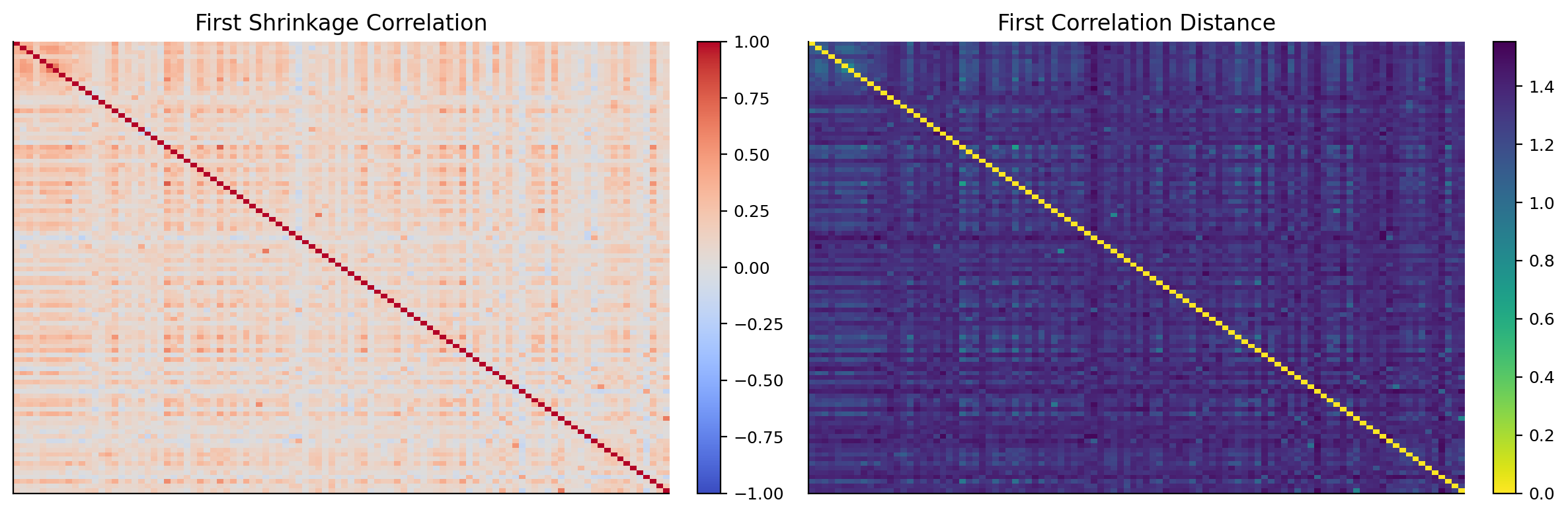
CAGR Vol Sharpe Max Drawdown Calmar Turnover Cost Drag Effective N
Strategy
Equal Weight 0.0524 0.2188 0.1679 -0.3768 0.1391 0.0979 0.0019 100.0000
MinVar 0.0188 0.1415 -0.0691 -0.3281 0.0572 0.1334 0.0031 17.0087
HRP 0.0499 0.1693 0.1459 -0.3030 0.1647 0.1814 0.0037 56.1880
Most Central 20 0.0464 0.2516 0.1523 -0.3975 0.1167 0.3210 0.0058 20.0000
Most Peripheral 20 0.0713 0.2031 0.2543 -0.4361 0.1635 0.4844 0.0089 20.0000
Network Diversifier 0.0869 0.1669 0.3564 -0.3010 0.2887 0.3903 0.0070 21.8950
central_choice central_sharpe central_source peripheral_choice peripheral_sharpe peripheral_source network_choice network_sharpe network_source
date
2023-07-31 central|copula|pmfg|combined NaN fixed peripheral|correlation|pmfg|closeness 0.044366 train-fixed peripheral|correlation|pmfg|closeness 0.044366 train-fixed
2023-10-31 central|copula|pmfg|combined NaN fixed peripheral|correlation|pmfg|closeness -0.174725 train-fixed peripheral|correlation|pmfg|closeness -0.174725 train-fixed
2024-01-31 central|copula|pmfg|combined NaN fixed peripheral|correlation|pmfg|closeness -0.141265 train-fixed peripheral|correlation|pmfg|closeness -0.141265 train-fixed
2024-04-30 central|copula|pmfg|combined NaN fixed peripheral|correlation|pmfg|closeness 0.128197 train-fixed peripheral|correlation|pmfg|closeness 0.128197 train-fixed
2024-07-31 central|copula|pmfg|combined NaN fixed peripheral|correlation|pmfg|closeness 0.170768 train-fixed peripheral|correlation|pmfg|closeness 0.170768 train-fixed
2024-10-31 central|copula|pmfg|combined NaN fixed peripheral|correlation|mst|closeness 0.730215 rolling peripheral|correlation|mst|closeness 0.730215 rolling
2025-01-28 central|copula|pmfg|combined NaN fixed peripheral|correlation|pmfg|closeness 0.069512 train-fixed peripheral|correlation|pmfg|closeness 0.069512 train-fixed
2025-04-30 central|copula|pmfg|combined NaN fixed peripheral|correlation|pmfg|closeness 0.208290 train-fixed peripheral|correlation|pmfg|closeness 0.208290 train-fixed
Most Central 20 Most Peripheral 20 Network Diversifier
central|copula|pmfg|combined 30 0 0
peripheral|correlation|pmfg|closeness 0 11 11
peripheral|copula|pmfg|combined 0 9 9
peripheral|correlation|mst|degree 0 4 4
peripheral|copula|pmfg|degree 0 3 3
peripheral|correlation|pmfg|combined 0 1 1
peripheral|copula|mst|closeness 0 1 1
peripheral|correlation|mst|closeness 0 1 1

object start end depth duration
0 Equal Weight 2021-06-28 2025-07-10 -0.3768 991
1 MinVar 2019-04-04 2025-06-23 -0.3281 1528
2 HRP 2022-02-14 2024-09-30 -0.3030 646
3 Most Central 20 2018-02-05 2024-09-30 -0.3975 1636
4 Most Peripheral 20 2021-06-29 2025-11-11 -0.4361 1075
5 Network 2022-02-14 2024-07-03 -0.3010 585
hist_var5 hist_es5 cf_var5 cf_es5
object
Equal Weight 0.0209 0.0308 0.0224 0.0447
HRP 0.0167 0.0245 0.0178 0.0357
MinVar 0.0135 0.0208 0.0152 0.0277
Most Central 20 0.0231 0.0333 0.0244 0.0457
Most Peripheral 20 0.0206 0.0300 0.0216 0.0374
Network 0.0164 0.0248 0.0178 0.0319
object cum_return max_dd worst_day worst_week
window
2018_q4 Equal Weight -0.0592 -0.0918 -0.0371 -0.0372
2018_q4 HRP -0.0373 -0.0746 -0.0282 -0.0340
2018_q4 MinVar -0.0243 -0.0685 -0.0243 -0.0322
2018_q4 Most Central 20 -0.0565 -0.0861 -0.0373 -0.0443
2018_q4 Most Peripheral 20 -0.0202 -0.0766 -0.0335 -0.0410
2018_q4 Network -0.0388 -0.0723 -0.0284 -0.0447
2020_covid Equal Weight -0.1100 -0.2510 -0.0512 -0.1016
2020_covid HRP -0.1066 -0.2401 -0.0489 -0.0953
2020_covid MinVar -0.1071 -0.2427 -0.0593 -0.0957
2020_covid Most Central 20 -0.0734 -0.2113 -0.0476 -0.0785
2020_covid Most Peripheral 20 -0.0987 -0.2477 -0.0582 -0.1013
2020_covid Network -0.0723 -0.2272 -0.0507 -0.0996
2022_inflation Equal Weight -0.3079 -0.3459 -0.0646 -0.0636
2022_inflation HRP -0.2504 -0.3030 -0.0511 -0.0574
2022_inflation MinVar -0.2774 -0.3068 -0.0418 -0.0583
2022_inflation Most Central 20 -0.3057 -0.3971 -0.0744 -0.1084
2022_inflation Most Peripheral 20 -0.3688 -0.3812 -0.0570 -0.0738
2022_inflation Network -0.2464 -0.3010 -0.0492 -0.0641
2023_rebound Equal Weight -0.1070 -0.2421 -0.0282 -0.0587
2023_rebound HRP -0.0477 -0.1904 -0.0259 -0.0478
2023_rebound MinVar -0.0222 -0.1933 -0.0248 -0.0438
2023_rebound Most Central 20 -0.1655 -0.3057 -0.0361 -0.0762
2023_rebound Most Peripheral 20 -0.0318 -0.1848 -0.0280 -0.0458
2023_rebound Network 0.0411 -0.1661 -0.0257 -0.0457

HKEX network interpretation

The HKEX network has a different economic structure from NASDAQ. NASDAQ centrality often points toward technology growth and semiconductors. HKEX centrality can be driven by Chinese policy risk, property cycles, financial conditions, internet regulation, mainland growth expectations, and Hong Kong liquidity.

This changes how central and peripheral portfolios behave. In NASDAQ, the center can be a strong growth engine. In HKEX, the center may sometimes be a macro-risk cluster. If the whole market is under pressure from China growth concerns or property-sector stress, central names may share that pressure and fail to deliver the same upside premium.

That is why the HKEX result is important. Network Diversifier does better than Equal Weight and HRP on Sharpe, even though the market background is harder. The strategy’s lower volatility and drawdown show that network selection is useful beyond a US technology rally.

The pure peripheral HKEX portfolio earns higher CAGR than Equal Weight, but with deep drawdown and high turnover. Network Diversifier improves the profile by filtering peripheral names through momentum and volatility. That is again the core lesson: periphery is a raw structural feature, not a complete investment rule.

The latest HKEX multi-panel plot supports this. The correlation and copula PMFGs show market structure. The score heatmap shows which names have the best network-diversifier profile. The weight heatmap shows the final allocation. The NAV and drawdown panels show that the final portfolio isn’t just an academic graph statistic; it changes realized performance.

HKEX comparison to the NASDAQ result

The HKEX result is weaker in absolute return than NASDAQ, but that is expected given the market environment. What matters is the relative comparison. Network Diversifier still improves Sharpe and Calmar relative to the available alternatives.

In NASDAQ, centrality often captures a strong growth engine. In HKEX, centrality can capture exposure to China macro, property stress, financial conditions, and policy cycles. That makes central names less attractive as a simple return bet. The HKEX Most Central 20 has CAGR around 4.64% and Sharpe around 0.152, weaker than the Network Diversifier.

Network Diversifier’s HKEX volatility is around 16.7%, lower than Equal Weight’s 21.9% and Most Central 20’s 25.2%. Its drawdown is around -30.1%, close to HRP and better than Equal Weight, Most Central, and Most Peripheral. This shows that the network score isn’t just a NASDAQ-specific growth signal.

The HKEX selector also relies more on correlation PMFG closeness in the later period. Closeness can be useful in a market where broad macro pressure dominates. A peripheral closeness strategy selects stocks far from the center of the network’s distance geometry. That can help avoid the main macro cluster.

The secondary implementation therefore strengthens the project. It shows the network framework adapts to a different market structure without changing the main logic.

HKEX stress-window interpretation

The HKEX stress table shows why secondary applications matter. In the 2022 inflation window, many global equity markets struggled, but Hong Kong also carried China-specific weakness. Network Diversifier loses less than Equal Weight and Most Peripheral 20, but it doesn’t eliminate the drawdown. That is realistic. A long-only network model can reduce common exposure, but it can’t fully hedge a broad regional bear market.

In the 2023 rebound window, Network Diversifier is positive while Equal Weight, HRP, and MinVar are weaker or negative in the HKEX output. This is interesting because 2023 was not a simple broad recovery for Hong Kong equities. The model seems to select a better subset rather than relying on market beta.

The HKEX result also warns against overusing centrality as a pure return signal. In a market where the central cluster is tied to macro pressure or policy risk, central names may not lead the way NASDAQ central names did. The network framework stays useful because it doesn’t force the same economic interpretation across markets. It measures structure first, then lets the portfolio test decide how to use that structure.

The HKEX summary shows a clear result. Network Diversifier has CAGR around 8.69%, volatility around 16.69%, Sharpe around 0.356, and max drawdown around -30.10%. It beats Equal Weight, MinVar, HRP, Most Central 20, and Most Peripheral 20 on Sharpe. It also has the best Calmar ratio at about 0.289.

Equal Weight earns about 5.24% CAGR with volatility around 21.88%, Sharpe around 0.168, and max drawdown around -37.68%. MinVar has lower volatility but a negative Sharpe. That is a common problem in depressed equity markets: the lowest-volatility stocks may avoid some drawdown but may also fail to generate enough return.

Most Peripheral 20 has decent return at about 7.13%, but its max drawdown is deep at about -43.61% and turnover is high. Pure periphery again isn’t enough. Network Diversifier improves on it by adding momentum, volatility, and drawdown filters.

The HKEX stress table gives a different economic picture than NASDAQ. During 2023 rebound, many HKEX strategies still struggle. The Network Diversifier is positive at about 4.1%, while several other portfolios are negative. This suggests the model isn’t merely buying beta. It is finding a subset of stocks with better network-adjusted and price-adjusted behavior inside a difficult market.

The HKEX centrality-selection counts also differ from NASDAQ. Peripheral correlation PMFG closeness is selected often, while copula PMFG combined appears as a fixed/fallback choice in some periods. This makes sense because HKEX may have broader macro-driven dependence where distance-to-market-center matters more than a pure AI/semiconductor-style tail cluster.

The secondary output supports the main lesson: network structure is useful when it becomes a disciplined portfolio input. The raw central portfolio can be too exposed to the market’s dominant cluster. The raw peripheral portfolio can be too weak or too noisy. The network diversifier works better because it treats network position as one component of allocation, alongside momentum and risk controls.

Full project interpretation

This project adds a different kind of information to the portfolio series. Earlier portfolio models mostly asked how to allocate given expected returns, covariance, tail risk, or regimes. Here we ask how the stocks are connected to each other as a system.

The main mathematical path is:

\[ R \rightarrow \hat{\Sigma} \rightarrow \hat{\rho} \rightarrow d_{ij} \rightarrow G=(V,E) \rightarrow C_i \rightarrow w_i \]

For the copula version, the path is:

\[ R \rightarrow u_{t,i} \rightarrow \rho_{ij}^{copula} \rightarrow \lambda_{ij} \rightarrow d_{ij}^{tail} \rightarrow G^{tail} \rightarrow C_i^{tail} \rightarrow w_i \]

Each arrow has meaning:

  • returns become dependence estimates,
  • dependence becomes graph distance,
  • graph distance and adjacency become filtered networks,
  • filtered networks produce centrality,
  • centrality becomes selection and weight signals,
  • weights are tested under costs and stress windows.

The strongest finding is that centrality is two-sided. Central stocks can be return leaders because they sit inside the market’s dominant theme. In this sample, central NASDAQ names are often semiconductor and large-growth names, and they perform very strongly in the rebound. But central stocks also share systemic drawdown risk. Peripheral stocks reduce some network crowding, but pure periphery can miss upside or select weak idiosyncratic names. The Network Diversifier is the most practical design because it adds price behavior and risk filters to the network score.

The project also shows why tail-dependence networks matter. Correlation centrality is about average co-movement. Copula centrality is about extreme co-movement. In portfolio construction, the second can be more important because the investor cares about what happens when diversification breaks.

The final result isn’t that one centrality measure is universally best. The result is that network position contains usable information, especially when it is filtered, measured through multiple centrality concepts, and combined with ordinary portfolio risk controls.

Practical limitations inside the same framework

The project is strong, but the limitations are important.

First, network estimates are only as good as the rolling window. A 252-day window gives enough data for stable estimation, but it can lag sudden regime shifts. COVID-style shocks can change the network faster than the lookback updates.

Second, centrality depends on the selected graph filter. PMFG and MST are both defensible, but they don’t give identical rankings. The candidate grid and rolling selector help, but they don’t remove model uncertainty.

Third, the t-copula tail-dependence layer is an approximation. It uses rank transforms, Kendall-based correlation, a small \(\nu\) grid, and pairwise likelihood sampling. That is practical for a rolling 100-stock universe, but it isn’t a full high-dimensional copula calibration.

Fourth, network portfolios can be turnover-heavy. The strategy must trade when centrality, momentum, or risk scores change. The cost drag is already included, but live implementation would need liquidity checks, borrow constraints if ever extended to long-short, and slippage monitoring.

Fifth, centrality has no universal sign. In some regimes central stocks are winners. In other regimes central stocks are systemic risk carriers. That is why the project doesn’t end with a simple statement like “buy central” or “buy peripheral.” The better result is the Network Diversifier: combine structural network position with market confirmation and risk control.

The main contribution is that we now have a portfolio method where dependence structure itself becomes a signal. The graph isn’t a visualization add-on. It becomes part of the allocation rule.

Main lesson for the series

This project extends the portfolio series by adding a structural layer between raw data and portfolio weights. Instead of going directly from returns to covariance or returns to forecasts, we go through a graph:

\[ \text{returns} \rightarrow \text{dependence} \rightarrow \text{network role} \rightarrow \text{allocation} \]

That makes Project 17 complementary to the earlier optimization projects. Mean-variance models care about expected return and covariance. Tail-risk models care about downside distribution. Regime models care about changing market states. Network portfolios care about where each asset sits inside the market’s dependence system.

The most practical version isn’t the pure central or pure peripheral portfolio. It is the network diversifier because it uses centrality information without ignoring ordinary investment evidence. The score combines graph position, momentum, volatility, and drawdown. That is a realistic design: a stock can be structurally diversifying but still unattractive if its price behavior is terrible.

The result is a method that can be explained visually, mathematically, and economically. The heatmaps show dependence. The graphs show structure. The centrality tables show node roles. The portfolio weights show how those roles become positions. The backtest and risk report show whether the translation worked.

That is the clean research story of thisn’tebook.

This also makes the project easy to extend later. The same graph layer could be combined with factor exposure, regime probabilities, or tail-risk objectives, but the current notebook keeps the implementation focused on centrality and long-only portfolio construction.