Build a clean monthly zero-rate curve from reused Treasury yield data, without redoing the fixed-income basics from Project 1.
Estimate and diagnose short-rate models: Vasicek, CIR, and rolling term-premium proxies.
Move from short-rate models to curve-level models: HW1F, G2-style two-factor dynamics, and PCA level/slope/curvature diagnostics.
Convert model-implied curve views into a dynamic duration ladder strategy using KRD exposure, carry, active risk, and transition costs.
Teach fixed-for-floating swaps carefully, then build a synthetic swap overlay that adjusts duration without rebuilding the cash bond ladder.
Repeat the full framework on Japan JGB curves, where the economics are very different from the US rate market.
This project is about one central problem: how do we turn a yield curve into a model-driven trading decision?
A yield curve is not one number. It is a whole function of maturity. The 3-month rate can move because the central bank changes policy. The 10-year rate can move because growth expectations, inflation uncertainty, or term premium changes. The 30-year rate can move because investors change their required compensation for long-horizon duration risk. So a term-structure model has to answer more than “are rates high or low?” It has to describe which part of the curve is moving, why it might move next, and how a bond portfolio will react if that view is wrong.
The earlier fixed-income project already built the core bond mechanics: discounting, duration, convexity, key-rate duration, ladder construction, and scenario PnL. We use those tools here, but we don’t re-teach them. The new work starts where those mechanics become inputs to a bigger model. We ask how a statistical model of rates can produce a one-month curve view, how that view can choose between lower, neutral, and higher duration, and how the same duration view can be implemented either by moving cash bonds or by adding a swap overlay.
The important shift is this: in Project 1 we measured fixed-income risk. Here we model the term structure and use that model to decide how much duration risk we want to hold.
1) Setup and reused fixed-income data
The first code cell only prepares the numerical and plotting environment and imports the fixed-income tools from the library. The important point is not the imports themselves. The important point is the project structure:
Curve data gives us the observed Treasury term structure.
Bootstrapping turns par yields into continuous zero rates.
Short-rate and curve-factor models estimate rate dynamics.
Bond ladder backtests turn curve views into portfolio returns.
Swap analytics add synthetic duration exposure on top of a cash ladder.
We use the same US Treasury yield data family that was already used in Project 1. For reproducibility, check the corresponding folder inside the repository data directory, where the README and script explain how the file is created: US Treasury yields data folder.
Later we also use the ACM term premium, SOFR, and Japan MOF yield datasets. The same rule applies there too: we reference the data folder and its reproduction script, not an individual raw file link.
The latest rows of the daily Treasury par-yield panel show the curve around January 2026. The front end is near 3.6–3.8%, while the 10-year is around 4.26% and the 30-year is close to 4.85%. So the latest observed curve is upward sloping from the 1-year area to the long end, but the very front end is still relatively high compared with the 2-year and 3-year region.
This matters for the rest of the project because term-structure models react differently to this shape. A one-factor short-rate model mainly reads the curve through the current short rate and a mean-reversion target. A PCA or G2-style factor model can separate a front-end move from a long-end move. That difference becomes important when the strategy decides whether to extend duration or stay closer to neutral.
2) Monthly curve construction and zero rates
We resample the daily curves to month-end because the strategy rebalances monthly. The selected curve starts in February 2006 and ends in January 2026, giving us 240 monthly observations. That is a reasonable sample for rolling curve estimation: long enough to include the pre-GFC tightening cycle, the zero-rate period, the 2020 shock, and the 2022–2025 rate-normalization regime.
The selected tenors are:
very short rates: 1M, 3M, 6M,
policy-sensitive rates: 1Y, 2Y, 3Y,
intermediate rates: 5Y, 7Y, 10Y,
long rates: 20Y, 30Y.
We keep this explanation short because the curve construction and basic bond pricing ideas were already covered earlier. What changes here is why we need the zero curve. A term-structure model doesn’t work directly on a table of par yields as if each tenor were an unrelated series. It needs discount factors, zero rates, and maturity-dependent loadings so model parameters can connect to bond prices and curve moves.
The selected monthly block runs from 2006-02-28 to 2026-01-31. That means all later rolling models start even later because we need estimation windows before taking strategy decisions. This is exactly what we want: no model should trade before it has enough history to estimate rate dynamics.
The block also starts after enough of the long-end Treasury data is available. The 20-year point has a later first valid date than most of the curve, and the selected window avoids a lot of early missing-value problems.
For model estimation we bootstrap zero rates from the par-yield curve. A par yield is the coupon rate that makes a bond price equal to par. A zero rate is the continuously compounded rate for a single maturity cash flow. If \(P(0,T)\) is the discount factor for maturity \(T\), the continuously compounded zero rate is:
\[
R(0,T) = -\frac{\log P(0,T)}{T}
\]
and the discount factor is:
\[
P(0,T) = e^{-R(0,T)T}
\]
We need zero rates because affine term-structure models usually price zero-coupon bonds first. Coupon bonds and par swap rates can then be built from the same discount curve. So the zero curve is the common language that connects:
short-rate model equations,
yield-curve factor loadings,
bond ladder valuation,
swap fixed-leg annuities,
and scenario PnL.
We use PCHIP interpolation when bootstrapping. The useful property of PCHIP is that it is shape-preserving. It gives a smooth enough curve for interpolation while avoiding the wild oscillations that can appear with high-order splines when the curve has humps, inversions, or sparse long-end tenors.
The latest zero-rate table has the same economic shape as the par curve: the front end is around 3.6–3.8%, the 10-year zero is around 4.27%, and the 20Y/30Y area is near 4.96%. The curve is not flat. It has a low point around the 1Y–2Y region and then rises into the long end.
That shape is already giving us a modeling warning. If we try to explain the whole curve only with one short-rate state, the model has to force one hidden variable to explain front-end policy rates, intermediate rates, and long-horizon term premium at the same time. It can do something useful, but it will be limited. This is why we later compare short-rate models with curve-factor models and PCA diagnostics.
The coverage tables are a quick data-quality checkpoint. We have 9023 daily observations, 240 monthly curve dates, and selected tenors from 1M to 30Y. The tenor coverage table confirms that most Treasury tenors have long history, while the 1M and 20Y points start later.
This tells us two things before modeling:
the monthly US sample is long enough for rolling 60-month model fits,
but the curve panel is still a constructed object, not a perfectly homogeneous raw market quote series.
The second point matters because model diagnostics later shouldn’t be read as pure theory failures. Sometimes a model looks imperfect because the observed data is a stitched historical yield curve with changing market structure, Fed regimes, and post-crisis liquidity conditions.
3) Curve snapshots, short rates, and slopes
Before fitting models, we visualize several curve snapshots. This is not just a pretty plot. A term-structure model is trying to compress a full curve into a small number of states or factors. If the curve has gone through radically different shapes, then a model with too few factors will struggle.
The main curve shapes we care about are:
high and inverted front end, usually connected to tight monetary policy,
steep upward curve, often connected to recession recovery or very low short rates,
flat curve, when short and long rates are similar,
humped curve, when intermediate maturities trade above both front and long end.
A one-factor short-rate model is good at describing a parallel-ish shift driven by the front end. It is weaker when the curve twists. A PCA or two-factor model is designed to handle twist and curvature more naturally.
3.1 Why curve shape matters more than a single yield
A lot of basic fixed-income discussion talks about “the 10-year yield” as if it summarizes the whole rate market. That is useful for headlines, but it is not enough for portfolio construction. A bond ladder has exposures at several maturity points. A 2Y/5Y/10Y/30Y ladder can gain or lose for completely different reasons depending on which part of the curve moves.
A parallel shift has all elements moving in the same direction. A steepener has the long end rising relative to the front end. A flattener has the front end rising relative to the long end. A curvature move changes the belly differently from the wings.
The strategy later uses this vector view of curve changes. That is why PCA, G2, and KRD are central to this project. They let us move beyond a single-rate story and ask how the whole maturity structure affects portfolio risk.
Show code
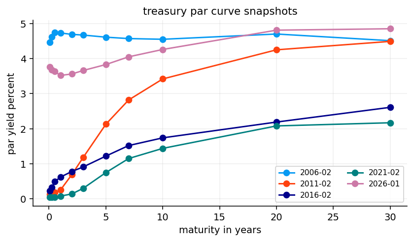
curve_years = np.array([1/12, 0.25, 0.5, 1, 2, 3, 5, 7, 10, 20, 30], dtype=float)sample_locs = [0, len(curve_dates) //4, len(curve_dates) //2, 3*len(curve_dates) //4, len(curve_dates) -1]sample_dates = [curve_dates[i] for i in sample_locs]fig, ax = plt.subplots()for date in sample_dates: ax.plot(curve_years, par_yields.loc[date, selected_tenors].to_numpy(float) *100, marker="o", label=date.strftime("%Y-%m"))ax.set_title("treasury par curve snapshots")ax.set_xlabel("maturity in years")ax.set_ylabel("par yield percent")ax.legend(ncol=2)plt.show()
The curve snapshots show several very different US rate regimes. The 2006 curve is high and fairly flat/inverted, which matches the late tightening-cycle environment before the global financial crisis. The 2011 curve is extremely steep: short rates were pinned close to zero, while the long end still had meaningful yield. The 2016 and 2021 curves are lower, but with different slope patterns. The 2026 curve is much higher across the curve, especially compared with the 2010s.
This is a great visual reason for using model diagnostics. If one model parameter set tries to summarize all these regimes, it will either average away the regime changes or produce unstable parameters. Rolling estimation gives the model a chance to adapt as the rate environment changes.
We now isolate a few simple curve summaries:
a short-rate proxy from the front-end yield,
selected zero rates such as 2Y, 5Y, 10Y, and 30Y,
slope measures like \(10Y - 2Y\) and \(30Y - 5Y\).
The slope variables are not new fixed-income concepts, so we don’t spend space re-teaching them. Here they are used as diagnostic summaries of the curve environment. A positive \(10Y - 2Y\) means the 10-year yield is above the 2-year yield. A negative value means inversion. In strategy terms, slope helps explain whether longer bonds are compensating us more than shorter bonds, but it doesn’t fully determine whether extending duration is attractive because expected rate changes and carry also matter.
The latest table shows a short-rate proxy near 3.76%, a 2-year zero near 3.53%, a 10-year near 4.27%, and a 30-year near 4.96%. The \(2s10s\) slope is about 75 bps, and the \(5s30s\) slope is about 116 bps.
So by the final date, the curve is no longer deeply inverted. The front end has moved down from the tightest policy levels, and the long end remains elevated. That is the kind of environment where a duration model can easily disagree with a simple “rates are high, buy duration” rule. If the long end has a persistent term premium component, long duration can still be risky even after the front end falls.
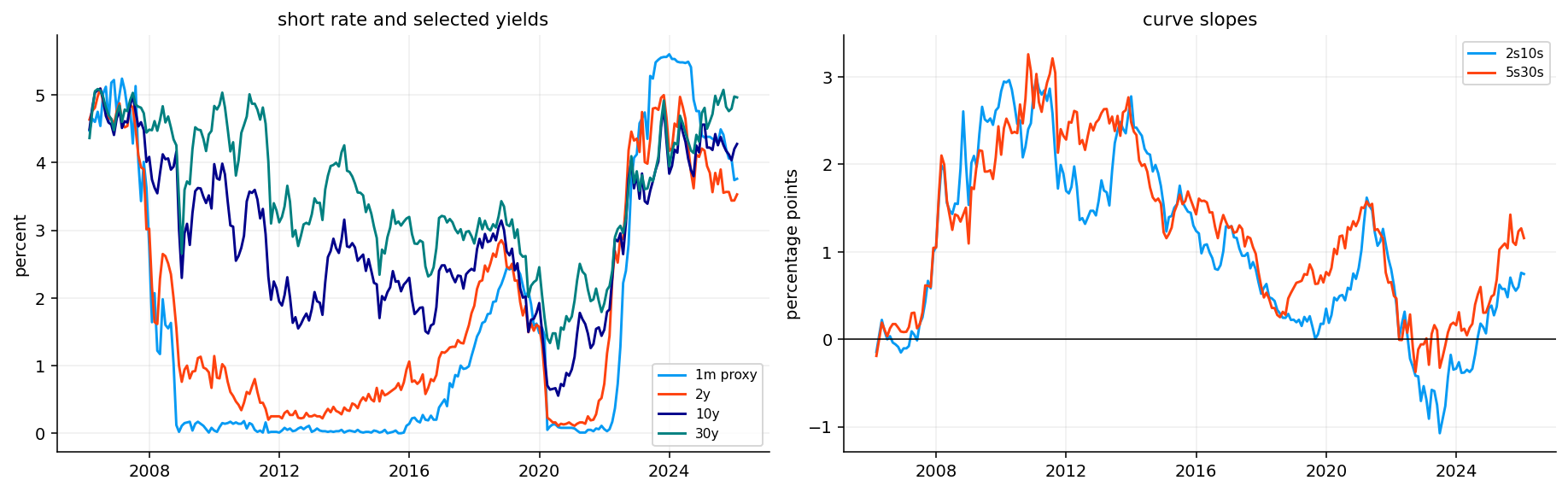
The short-rate and slope plot gives the time-series version of the same story. It lets us see the regimes instead of just the final row.
The most important regimes are:
2006–2007: high front-end rates and a flat/inverted curve.
2008–2015: the front end collapses close to zero, while longer rates move around more gradually.
2020–2021: another zero-rate period after the pandemic shock.
2022–2024: the front end reprices upward very aggressively as the Fed tightens.
2025–2026: the front end begins to come down, while the long end stays relatively firm.
This sequence is exactly why static duration rules are dangerous. The same 10-year yield can mean different things depending on whether the front end is at zero, the Fed is cutting, inflation is rising, or term premium is repricing.
Show code
fig, axes = plt.subplots(1, 2, figsize=(13, 4), constrained_layout=True)axes[0].plot(short_rate.index, short_rate *100, label=f"{short_tenor.lower()} proxy")for col in ["2y", "10y", "30y"]: axes[0].plot(selected_yields.index, selected_yields[col] *100, label=col)axes[0].set_title("short rate and selected yields")axes[0].set_ylabel("percent")axes[0].legend()for col in slope_series.columns: axes[1].plot(slope_series.index, slope_series[col] *100, label=col)axes[1].axhline(0, color="black", linewidth=0.8)axes[1].set_title("curve slopes")axes[1].set_ylabel("percentage points")axes[1].legend()plt.show()
The plot confirms that the short rate is much more policy-driven than the long end. It collapses rapidly in 2008, stays near zero for years, spikes after 2022, and then starts moving lower. The 10Y and 30Y rates move more gradually and don’t always follow the front end one-for-one.
The slope panel shows the large steepening after the GFC, the long flattening/inversion before and around the recent hiking cycle, and the later re-steepening. These slope cycles are important because a duration strategy isn’t just betting on the level of rates. It is implicitly choosing where on the curve to hold risk, and different slope environments reward different maturity exposures.
4) ACM term premium and SOFR cash return
A Treasury yield can be decomposed roughly into two components:
where \(y_t^{(n)}\) is the \(n\)-year yield, the average expected short-rate term is the market’s expected path of policy rates, and \(TP_t^{(n)}\) is the term premium. The term premium is the extra compensation investors demand for holding a long-duration bond instead of rolling short bills.
The ACM term premium is a well-known model-based estimate of that second component. We use it as an external benchmark for the term-premium proxies produced later by Vasicek and CIR. The point is not to perfectly replicate ACM. The point is to check whether our simpler model-implied proxies move in the same broad direction.
acm_csv_path ="../data/acm_term_premium.csv"def load_acm_10y(csv_path): raw = pd.read_csv(csv_path) clean = raw.copy() clean.columns = [str(c).strip().lower() for c in clean.columns] date_col =next((c for c in clean.columns if c in {"date", "dates"} or"date"in c), clean.columns[0]) tp_col =next((c for c in clean.columns if c.replace("_", "") in {"acmtp10", "tp10"}), None)if tp_col isNone: tp_col =next(c for c in clean.columns if"tp"in c and"10"in c) out = clean[[date_col, tp_col]].rename(columns={date_col: "date", tp_col: "acm 10y term premium"}) out["date"] = pd.to_datetime(out["date"], errors="coerce") out["acm 10y term premium"] = pd.to_numeric(out["acm 10y term premium"], errors="coerce") out = out.dropna().drop_duplicates("date").set_index("date").sort_index()if out["acm 10y term premium"].abs().median() >1: out["acm 10y term premium"] = out["acm 10y term premium"] /100return outacm_term_premium = load_acm_10y(acm_csv_path)acm_term_premium.tail()
acm 10y term premium
date
2025-12-31
0.007612
2026-01-30
0.007742
2026-02-27
0.006072
2026-03-31
0.006626
2026-04-30
0.007269
The ACM tail shows the 10-year term premium around 60–77 bps during late 2025 and early 2026. That is a very different world from the deeply negative term-premium estimates of some earlier post-GFC years.
Economically, a positive term premium means long yields are not just reflecting expected future short rates. Investors are also demanding extra compensation for bearing inflation uncertainty, fiscal supply risk, duration volatility, or other long-horizon risks. This matters for a duration strategy because extending duration is more attractive when term premium is high and expected rate changes are favorable. It is less attractive if high term premium exists because the market is demanding compensation for a real risk that may keep yields elevated.
The next step aligns ACM to the monthly curve dates. The alignment is intentionally simple: we resample monthly and forward-fill to the curve date. Since the term premium is not used as an input to the trading model here, small alignment details are less dangerous. We use it mainly as a diagnostic comparison.
The summary confirms no missing aligned values over the selected curve period. This is useful because the later correlation comparison between ACM and model-implied proxies won’t be distorted by a small overlapping sample.
The aligned ACM series ends at 0.774% in January 2026 after rising from about 0.57–0.76% in the previous months. The exact monthly movement is less important than the broad positive level. It says the long end of the US Treasury curve contains a meaningful risk-premium component at the final date.
This also gives us an interpretation checkpoint for the later models: if a simple short-rate model says the 10-year yield is far above the expected average short rate, that spread can be interpreted as a model-implied term-premium proxy. It won’t be a full no-arbitrage term-premium decomposition like ACM, but it is economically related.
We also load SOFR because the modern performance section evaluates bond returns relative to a cash benchmark. SOFR is the Secured Overnight Financing Rate. For a fixed-income strategy, raw return alone can be misleading when cash yields are high. A 3% annual return is impressive when cash is zero, but weak when cash earns 5%.
The monthly SOFR cash return is constructed from the SOFR index. If \(I_t\) is the index level at month-end, the monthly cash return is:
\[
R_{cash,t} = \frac{I_t}{I_{t-1}} - 1
\]
This gives a realistic cash baseline for the post-2020 sample. We don’t use SOFR for the full 2006–2026 backtest because the published SOFR index has a shorter history. For reproducibility, check: SOFR data folder.
Show code
sofr_path ="../data/sofr.csv"sofr_start_date = pd.Timestamp("2020-03-02")sofr_raw = pd.read_csv(sofr_path)sofr_clean = sofr_raw.copy()sofr_clean.columns = [str(c).strip().lower().replace(" ", "_") for c in sofr_clean.columns]sofr_date_col =next(c for c in sofr_clean.columns if"date"in c)sofr_index_col =next(c for c in sofr_clean.columns if"sofr"in c and"index"in c)sofr_clean = sofr_clean[[sofr_date_col, sofr_index_col]].rename(columns={sofr_date_col: "date", sofr_index_col: "sofr_index"})sofr_clean["date"] = pd.to_datetime(sofr_clean["date"], errors="coerce")sofr_clean["sofr_index"] = pd.to_numeric(sofr_clean["sofr_index"], errors="coerce")sofr_daily = sofr_clean.dropna().drop_duplicates("date").set_index("date").sort_index()sofr_daily = sofr_daily.loc[sofr_daily.index >= sofr_start_date]sofr_monthly_index = sofr_daily["sofr_index"].resample("ME").last()sofr_cash_return = sofr_monthly_index.pct_change()first_month = sofr_monthly_index.index.min()sofr_cash_return.loc[first_month] = sofr_monthly_index.loc[first_month] / sofr_daily["sofr_index"].iloc[0] -1sofr_cash_return = sofr_cash_return.reindex(curve_dates).dropna().rename("sofr cash return")sofr_summary = pd.DataFrame({"item": ["source", "first sofr date", "first aligned cash return", "last aligned cash return", "monthly returns"],"value": ["data/sofr.csv", sofr_daily.index.min().date(), sofr_cash_return.index.min().date(), sofr_cash_return.index.max().date(), int(sofr_cash_return.notna().sum())],})display(sofr_summary)sofr_cash_return.tail()
The SOFR-aligned sample starts in March 2020 and runs through January 2026, with 71 monthly returns. The latest monthly cash returns are around 0.31–0.38%, which annualizes to a high cash-rate environment.
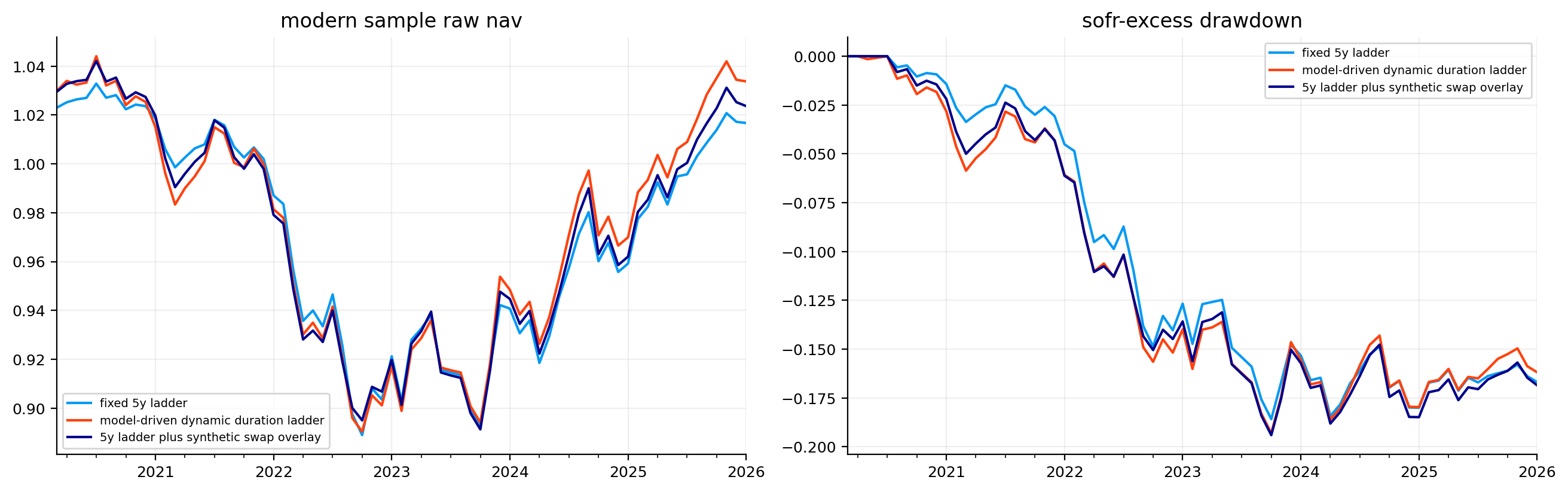
This is important for interpretation later. Some Treasury ladder strategies look positive on raw returns, but negative on SOFR-excess returns. That doesn’t mean the strategy is useless. It means duration exposure struggled to beat a very attractive cash rate during the modern tightening and high-rate period.
5) Vasicek model: one Gaussian short-rate state
The first formal term-structure model we estimate is the Vasicek short-rate model. It assumes the instantaneous short rate \(r_t\) follows an Ornstein-Uhlenbeck mean-reverting process:
\[
dr_t = \kappa(\theta - r_t)dt + \sigma dW_t
\]
Each parameter has a specific economic meaning:
\(r_t\) is the short rate state.
\(\kappa\) is the speed of mean reversion. Larger \(\kappa\) means the short rate is pulled back to its long-run level faster.
\(\theta\) is the long-run mean level.
\(\sigma\) is the volatility of rate shocks.
\(W_t\) is a Brownian motion shock.
The drift term \(\kappa(\theta-r_t)\) is the model’s force of gravity. If \(r_t\) is above \(\theta\), the drift is negative and the model expects rates to fall. If \(r_t\) is below \(\theta\), the drift is positive and the model expects rates to rise.
The exact discrete transition over a time step \(\Delta\) is:
This transition is useful because we observe monthly data. We can estimate \(\kappa\), \(\theta\), and \(\sigma\) by maximizing the likelihood of observed short-rate transitions.
Vasicek has one major weakness: rates are Gaussian, so negative rates are possible. That is not automatically fatal. US short rates rarely went deeply negative, and many rate models used in practice allow negative rates for tractability. But it means Vasicek is better viewed as a tractable benchmark, not as a perfect description of policy rates.
5.0 Physical dynamics, pricing dynamics, and why this project keeps them practical
One subtle point in term-structure modeling is the difference between the physical measure and the risk-neutral measure. Under the physical measure, we try to describe how rates actually move through time. Under the risk-neutral measure, we price bonds and derivatives by discounting expected cash flows using adjusted dynamics. In a full no-arbitrage term-structure model, this distinction matters a lot because the market price of risk changes the drift.
In symbolic form, a short-rate model under the physical measure could be written as:
\[
dr_t = \mu_P(r_t,t)dt + \sigma(r_t,t)dW_t^P
\]
while the risk-neutral version is:
\[
dr_t = \mu_Q(r_t,t)dt + \sigma(r_t,t)dW_t^Q
\]
The volatility term is usually the same, but the drift changes because investors demand compensation for bearing rate risk. The difference between \(\mu_P\) and \(\mu_Q\) is tied to the market price of risk.
For this project, we mostly need model-driven curve views, not full derivative calibration. We estimate models from historical curve movements and use their implied expected changes and covariances to drive duration decisions. So the models are used in a practical physical-measure forecasting sense. When we use affine bond-pricing formulas, we use them mainly to create coherent yield loadings and term-premium proxies, not to claim we have fully calibrated a risk-neutral pricing model to caps, floors, or swaptions.
This distinction keeps the interpretation clean. Vasicek, CIR, HW1F, G2-style factors, and PCA are not all used for the same job. Vasicek and CIR teach short-rate dynamics and give simple term-premium proxies. HW1F and G2-style models provide curve-change scenarios. PCA diagnoses how many empirical curve factors are needed. The portfolio strategy then asks which of those views has worked recently.
5.1 Affine bond pricing and yield loadings
Vasicek is an affine term-structure model. Zero-coupon bond prices take the form:
This equation is important because it turns the hidden short rate into a whole curve. The term \(B(\tau)/\tau\) is the yield loading on the short rate. For short maturities, the loading is close to one. For long maturities, it is smaller because a one-month change in the short rate doesn’t mechanically move the 30-year average rate one-for-one.
For example, if the 1-month short rate jumps by 100 bps, a very short zero rate should react strongly. A 30-year zero rate may react much less because it reflects the average of future short rates over a much longer horizon. This is exactly what the loading function captures.
A useful way to understand the affine structure is to read the zero yield as a regression-like equation where maturity controls the intercept and loading:
The loading \(\beta(\tau)\) is usually between 0 and 1. Short maturities have \(\beta(\tau)\) close to 1 because a short bond mostly reflects the current short rate. Long maturities have smaller \(\beta(\tau)\) because the current short rate is only one point in a long future average.
This is the mathematical reason a one-factor short-rate model creates a very specific curve shape. If \(r_t\) increases, every maturity changes in the same direction, but short maturities change more than long maturities. The model can create level movement with a short-end tilt, but it cannot freely create a steepener, flattener, or belly-only movement. That limitation will show up later when PCA says slope and curvature are important.
For example, if the 3-month yield rises because the central bank hikes, Vasicek can represent that through a higher \(r_t\). But if the 30-year yield rises while the 2-year yield falls, one short-rate state can’t explain that move well. It would need to move \(r_t\) up and down at the same time. This is why the later G2/PCA sections are not optional decorations; they fix a real structural weakness in one-factor short-rate models.
5.2 Filtering a hidden short rate from observed yields
Even though we have a front-end yield proxy, the model doesn’t have to treat it as the exact true short rate. The observed curve contains noise, interpolation error, liquidity effects, and maturity-specific premia. So we use a Kalman filter to infer a latent short-rate state from several observed zero rates.
Here \(\mathbf{y}_t\) is the vector of observed zero rates at selected maturities, \(\mathbf{a}\) contains the affine intercept terms \(-A(\tau)/\tau\), \(\mathbf{b}\) contains the loadings \(B(\tau)/\tau\), and \(\boldsymbol{\epsilon}_t\) is observation noise.
The Kalman filter has two jobs:
Prediction: use yesterday’s filtered short rate to predict today’s hidden short rate.
Correction: compare the predicted curve to the observed curve and update the hidden state.
The notation \(t|t-1\) means “our belief about time \(t\) before observing time \(t\) data.” The variance increases because the state may have moved during the month.
It also helps to compare the Kalman filter with ordinary regression. In ordinary regression, we estimate one static coefficient vector. In the Kalman filter, we estimate a state that changes through time. The hidden state has its own dynamics, and observations only give noisy information about it.
In this one-state Vasicek case, the hidden state is \(r_t\). The curve observations are several yields at time \(t\). The filter combines two sources of information:
the model transition, which says where \(r_t\) probably moved from last month,
the cross-section of observed yields, which says what value of \(r_t\) best explains today’s curve.
If the model transition says the short rate should be 3.7%, but the observed 2Y/5Y/10Y/30Y curve implies something closer to 3.4%, the filter doesn’t simply choose one. It weights the difference by the Kalman gain. The gain is high when state uncertainty is large or observation noise is small. It is low when the state is already estimated tightly or the observed curve is noisy.
That is why the innovation variance \(S_t\) is so important. It is the model’s estimate of how large the forecast error could reasonably be before we call it surprising. A 10 bp innovation is meaningful if \(S_t\) is small. The same 10 bp innovation is less meaningful if the curve is volatile and observation noise is high.
So the Kalman update is not “just an update formula.” It is a statistical trust mechanism. It asks how much we should trust the new curve relative to yesterday’s state estimate.
The correction step starts by asking what curve the predicted state would imply:
If observed yields are higher than predicted yields, \(\mathbf{v}_t\) is positive. If they are lower, it is negative. The model then asks how surprising that innovation is. The innovation covariance is:
\[
S_t = P_{t|t-1}\mathbf{b}\mathbf{b}^\top + R
\]
where \(R\) is the observation-noise covariance. The first term says uncertainty in the hidden short rate creates uncertainty in every observed yield through the loading vector \(\mathbf{b}\). The second term says each market quote also has its own noise.
The Kalman gain is:
\[
K_t = P_{t|t-1}\mathbf{b}^\top S_t^{-1}
\]
This is the weight placed on the innovation. A high Kalman gain means the filter trusts the observed curve a lot and moves the hidden short rate strongly. A low gain means the observed curve is noisy or the state is already estimated precisely, so the filter updates only slightly.
Financially, this is a disciplined way to smooth the short-rate state. If one yield point jumps for a noisy reason, the filter doesn’t automatically treat it as a full policy-rate shock. If the whole curve moves in a way consistent with a short-rate change, the filter reacts more.
def fit_vasicek_ar(short_history): x = pd.Series(short_history).dropna().astype(float)iflen(x) <12:return {"kappa": 0.35,"theta": float(x.mean()) iflen(x) else0.03,"sigma": 0.01,"obs_sd": 0.001,"method": "ar fallback","optimizer success": False, } y = x.iloc[1:].to_numpy() lag = x.iloc[:-1].to_numpy() slope, intercept = np.polyfit(lag, y, 1) phi =float(np.clip(slope, 0.02, 0.995)) dt =1/12 kappa =-np.log(phi) / dt theta = intercept /max(1- phi, 1e-6) resid = y - (intercept + slope * lag) sigma =float(np.std(resid, ddof=1) * np.sqrt(2* kappa /max(1- phi**2, 1e-8)))return {"kappa": kappa,"theta": theta,"sigma": max(sigma, 1e-5),"obs_sd": 0.0015,"method": "ar fallback","optimizer success": False, }def vasicek_kalman(yields, maturities, params, state_hint=None): data = np.asarray(yields, dtype=float) maturities = np.asarray(maturities, dtype=float) affine_level, b = vasicek_loadings(params, maturities)if state_hint isnotNone: hint = np.asarray(state_hint, dtype=float)iflen(hint) ==len(data): a = np.nanmean(data - hint[:, None] * b[None, :], axis=0)else: a = affine_levelelse: a = np.asarray(params.get("obs_alpha", affine_level), dtype=float) kappa =max(float(params["kappa"]), 1e-8) theta =float(params["theta"]) sigma =max(float(params["sigma"]), 1e-8) obs_sd =max(float(params.get("obs_sd", 0.001)), 1e-8) dt =1/12 phi = np.exp(-kappa * dt) q = sigma**2* (1- phi**2) / (2* kappa) mean =float(state_hint[0]) if state_hint isnotNoneandlen(state_hint) else theta var = sigma**2/ (2* kappa) filtered = [] nll =0.0if np.isfinite(data).all(): eye = np.eye(data.shape[1]) outer_b = np.outer(b, b) log_const = data.shape[1] * np.log(2* np.pi)for row in data: mean_pred = theta + phi * (mean - theta) var_pred = phi**2* var + q innov = row - (a + b * mean_pred) s = var_pred * outer_b + obs_sd**2* eye sign, logdet = np.linalg.slogdet(s) inv_s = np.linalg.pinv(s) nll +=0.5* (logdet + innov @ inv_s @ innov + log_const) if sign >0else1e6 gain = var_pred * b @ inv_s mean = mean_pred + gain @ innov var =max(float((1- gain @ b) * var_pred), 1e-10) filtered.append(mean)returnfloat(nll), np.asarray(filtered)for row in data: mean_pred = theta + phi * (mean - theta) var_pred = phi**2* var + q mask = np.isfinite(row)if mask.any(): obs = row[mask] aa = a[mask] bb = b[mask] innov = obs - (aa + bb * mean_pred) s = var_pred * np.outer(bb, bb) + obs_sd**2* np.eye(mask.sum()) sign, logdet = np.linalg.slogdet(s) inv_s = np.linalg.pinv(s) nll +=0.5* (logdet + innov @ inv_s @ innov + mask.sum() * np.log(2* np.pi)) if sign >0else1e6 gain = var_pred * bb @ inv_s mean = mean_pred + gain @ innov var =max(float((1- gain @ bb) * var_pred), 1e-10)else: mean, var = mean_pred, var_pred filtered.append(mean)returnfloat(nll), np.asarray(filtered)
5.3 Vasicek estimation results
The Vasicek fit combines short-rate transition likelihood with the Kalman-filtered curve observation equation. The parameter table is the first real model diagnostic.
The output reports:
\(\kappa\), the mean-reversion speed,
\(\theta\), the long-run mean short rate,
\(\sigma\), the short-rate volatility,
observation noise,
optimizer success,
Hessian condition number,
and residual autocorrelation.
These are not cosmetic diagnostics. They tell us whether the model is numerically stable and whether the one-factor state has removed enough structure from the data.
The likelihood used for the short-rate transition comes directly from the discrete Gaussian transition. If we observe \(r_t\) and \(r_{t+\Delta}\), the conditional density is:
This objective rewards parameter sets that predict the next short rate with small residuals, but it also penalizes unrealistically tiny volatility through the \(\log(v)\) term. Without that penalty, the optimizer could try to make volatility too small and overfit the mean path.
The Hessian condition number then tells us how sharply the likelihood identifies the parameters. A very high condition number means the objective is flat or stretched in some direction. That usually means parameters are hard to estimate separately. In rate models, this often happens because \(\kappa\), \(\theta\), and \(\sigma\) can compensate for each other over short samples.
The Vasicek fit succeeds, but the parameter estimates are telling. The estimated \(\kappa\) is about 0.099, which is slow mean reversion. The long-run level \(\theta\) is about 1.19%, far below the final short-rate environment. The monthly short-rate volatility parameter is around 0.73% in annualized model units.
The low \(\theta\) reflects the long zero-rate and low-rate sample from 2008 through 2021. Because the full sample includes many years near zero, the model’s long-run gravity sits much lower than the 2022–2026 rate regime. That is not “wrong” mechanically, but it reveals why rolling estimation is needed later.
The residual autocorrelation is around 0.27, which is not ideal. A good transition model would leave less serial dependence in residuals. This tells us the short-rate process has structure the simple OU transition doesn’t fully capture, especially across regime changes and policy cycles.
Show code
fig, ax = plt.subplots()ax.plot(short_rate.index, short_rate *100, label="observed short proxy", alpha=0.8)ax.plot(vasicek_filtered.index, vasicek_filtered *100, label="filtered vasicek short rate", linewidth=2)ax.set_title("vasicek filtered short rate")ax.set_ylabel("percent")ax.legend()plt.show()
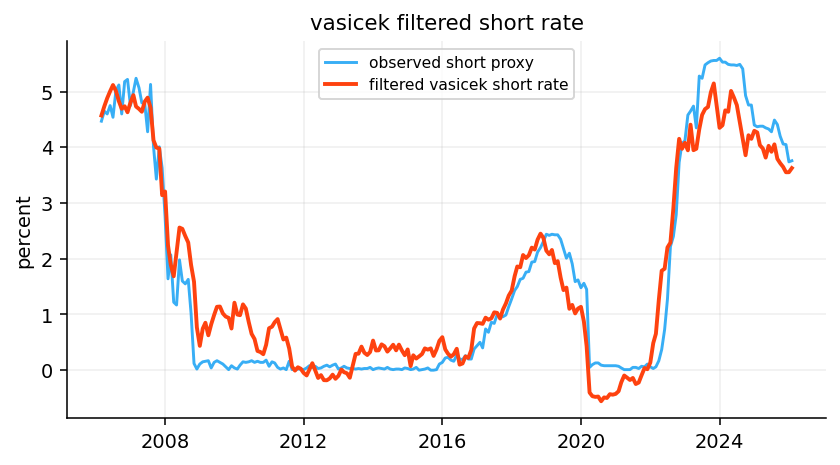
The filtered short-rate plot compares the observed short proxy with the latent Vasicek short rate. The filter tracks the big regimes well: the pre-GFC high-rate period, the post-GFC near-zero period, the COVID zero-rate period, and the sharp hiking cycle after 2022.
The filtered line is smoother than the observed proxy. That is exactly what filtering is supposed to do. The model treats the short rate as a hidden state that evolves gradually according to the transition equation, while the observed curve can contain quote noise and maturity-specific distortions.
The largest gap appears around rapid policy transitions. When the Fed cuts or hikes quickly, a slow mean-reverting one-factor model reacts with delay. That delay is economically important because it can cause the model to underestimate how fast the front end has repriced.
6) CIR model: square-root volatility and rate positivity
The Cox-Ingersoll-Ross model modifies Vasicek by making volatility proportional to the square root of the short rate:
The drift has the same interpretation as Vasicek: \(\kappa\) pulls the rate toward \(\theta\). The difference is the diffusion term. When \(r_t\) is low, \(\sqrt{r_t}\) is small, so rate volatility is lower. When \(r_t\) is high, volatility increases. This is often more realistic for interest rates because the level of rates and the volatility of rate changes tend to be connected.
CIR is also famous for its positivity condition. A sufficient condition for the process to stay strictly positive is the Feller condition:
\[
2\kappa\theta \geq \sigma^2
\]
The quantity
\[
2\kappa\theta - \sigma^2
\]
is the Feller margin. A positive margin means the zero boundary is less likely to be hit. A negative margin means the boundary can be reached in the continuous-time model.
Because US rates touched the zero lower bound for years, we use a small shift in the implementation. The model is fitted to shifted rates \(r_t + s\) so the square-root term is well-defined. The reported shift is not an economic claim that the true short rate has an extra component. It is a numerical device that makes the CIR structure usable with near-zero historical data.
6.1 CIR estimation in this project
The exact CIR transition has a noncentral chi-square distribution. That exact likelihood is mathematically elegant, but it is more complicated and less transparent for a learning-focused project. Here we use a quasi-likelihood based on the Euler approximation:
The variance depends on \(r_t\), so observations at high rates receive different statistical treatment than observations near zero. Near zero, the model expects smaller absolute rate changes. At higher rates, it allows larger moves.
The implementation also penalizes violations of the Feller condition. The optimizer can still end near the boundary, especially when the data includes near-zero rates, but the penalty discourages parameter combinations that make the process numerically unstable.
This is why CIR needs careful interpretation. It can fit short-rate residuals better than Vasicek, but the parameter estimates can be more fragile. A lower residual autocorrelation doesn’t automatically mean the model is safer for trading. We still need rolling diagnostics and strategy validation.
The CIR fit succeeds, but it looks very different from the Vasicek fit. The estimated \(\kappa\) is about 0.130, slightly faster than the full-sample Vasicek estimate. The estimated long-run shifted mean \(\theta\) is around 1.55%, and the volatility parameter \(\sigma\) is much larger at about 6.35% because CIR volatility is multiplied by \(\sqrt{r_t}\).
The shift is 0.20%, which reflects the near-zero periods in the data. The Feller margin is slightly negative, very close to zero. So the fitted process is almost at the positivity boundary, but not strongly inside the strict Feller region. This is realistic for a dataset that includes years at or near zero.
The residual autocorrelation is much lower than Vasicek, around 0.04. That is a meaningful diagnostic improvement. The CIR transition captures short-rate dynamics better in this sample, partly because volatility changes with the rate level. The Hessian condition number is very high, though, which warns us that the likelihood surface is numerically ill-conditioned. In simple terms, multiple parameter combinations can fit the data similarly well.
7) Short-rate simulation fan charts
After estimating Vasicek and CIR, we simulate future short-rate paths. The goal is not to forecast the exact policy path. The goal is to understand what distribution each model implies from the latest rate environment.
and then floors the shifted rate at a small positive value. This is less elegant than the exact noncentral chi-square transition, but it is stable and transparent for simulation diagnostics.
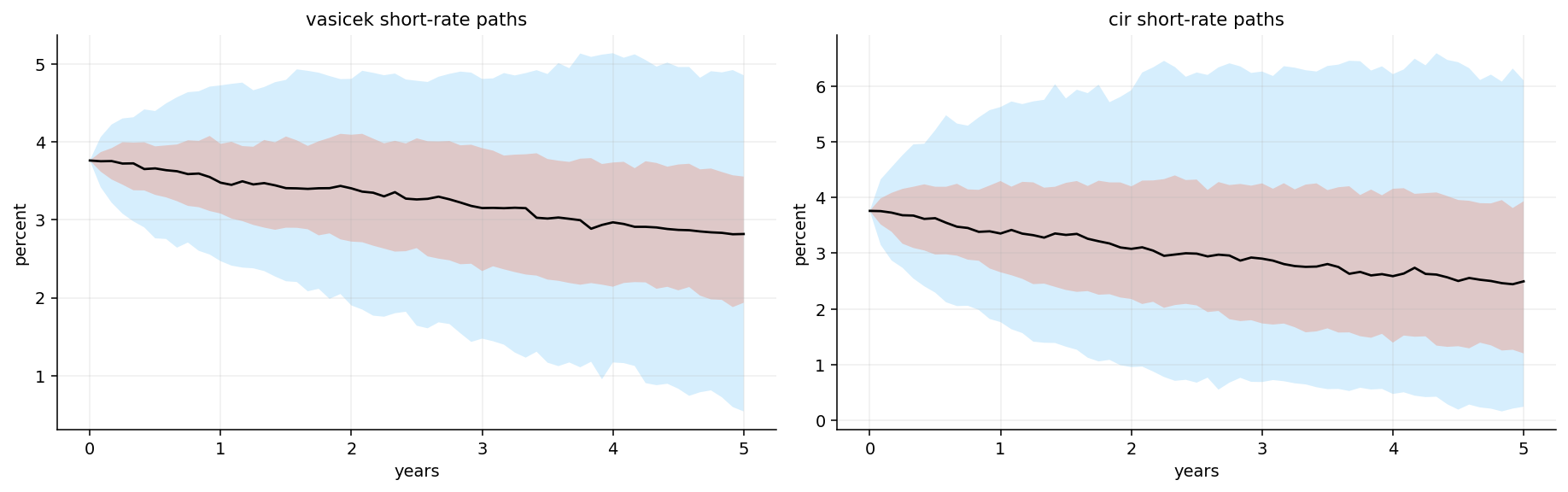
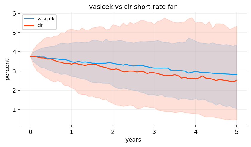
The fan charts summarize uncertainty by showing quantile bands rather than every simulated path. The median tells us the central model path. The 5–95% and 25–75% bands show the range of plausible outcomes.
There is another reason to simulate paths: it makes parameter estimates interpretable. A table with \(\kappa=0.13\) and \(\sigma=0.063\) is abstract. A fan chart shows what those numbers imply for future rates.
Mean reversion controls the median path. If the current short rate is above the estimated long-run mean, the median path drifts lower. Volatility controls the width of the fan. In CIR, the starting rate also controls the width because volatility is scaled by \(\sqrt{r_t}\).
The fan chart is not a confidence interval around the true future Fed path. It is a distribution under the fitted model. If the model is structurally wrong, the fan can be misleading. For example, a sudden policy pivot, fiscal shock, or inflation surprise can move rates outside the model-implied bands. So we read the fan as a model diagnostic, not as a forecast guarantee.
The Vasicek and CIR fan charts both slope downward from the latest high-rate environment. That follows directly from their estimated long-run means being below the current short rate. The models read the latest short rate as above equilibrium, so the drift points lower.
CIR produces a wider and more asymmetric fan because volatility depends on the rate level. At higher starting rates, the square-root diffusion allows larger absolute moves. Vasicek produces a more symmetric Gaussian band. The comparison plot makes this clearer: the CIR lower tail reaches lower levels, while the upper band remains broad.
Economically, this says the fitted short-rate models believe the front end should mean-revert lower, but they disagree about uncertainty. The CIR model says uncertainty is more state-dependent. That becomes important when we later use models to decide whether extending duration is worth the risk.
8) Rolling short-rate models and model-implied term premium
A single full-sample fit is useful for teaching, but it is not enough for trading. Interest-rate dynamics change across regimes. A model fitted on 2006–2026 data averages together the GFC, the zero-rate decade, the pandemic shock, and the inflation hiking cycle.
So we estimate Vasicek and CIR on a rolling 60-month window. The rolling window creates time-varying parameters:
\[
\kappa_t, \theta_t, \sigma_t
\]
These parameters are then used to construct a simple model-implied 10-year term-premium proxy:
where \(\bar{r}^{model}_{10,t}\) is the model’s expected average short rate over the next 10 years. For Vasicek, the expected average short rate has a closed form:
This expression is easy to interpret. If the current short rate \(r_0\) is above \(\theta\), the expected average short rate is above \(\theta\) but below \(r_0\), because mean reversion pulls it down over the horizon. The difference between the observed 10-year yield and this expected average short-rate path is the proxy for term premium.
8.1 Why rolling parameters can look economically strange
Rolling short-rate parameters are useful, but they can look strange because the model is deliberately local. A 60-month window doesn’t know the full history of the rate market. It only sees the last five years. If those five years contain a hiking cycle, the estimated long-run mean can move upward. If they contain a zero-rate period, the long-run mean can collapse.
This is not necessarily a bug. A strategy doesn’t trade using the unconditional historical average from 1990 onward. It trades in the current regime. But a rolling model also has a weakness: it can mistake a temporary regime for a permanent equilibrium.
For example, after several years of high short rates, a rolling Vasicek fit may estimate a high \(\theta_t\). Then the model expects the average future short rate to remain high, so the 10-year yield can look low relative to that expected short-rate path. That creates a negative term-premium proxy. If the high short-rate regime is actually temporary and policy cuts are coming, that proxy may be misleading.
This is why we compare model-implied proxies with ACM and why we don’t directly trade only on those proxies. We use rolling short-rate models as one part of a broader framework that also includes HW1F, G2, PCA, carry, KRD risk, and validation.
The latest rolling parameter table shows a very different picture from the full-sample estimates. By late 2025 and early 2026, Vasicek \(\kappa\) rises toward 0.34, and \(\theta\) rises toward 5.6%. CIR \(\theta\) is even higher, around 8.9% on the shifted scale, while CIR \(\kappa\) remains slow.
This is exactly why rolling estimation matters. The recent window is dominated by the post-2022 higher-rate regime. The model’s local long-run mean is no longer around 1%. It rises sharply because recent rates have been high. But the rolling residual diagnostics are still imperfect. Vasicek residual autocorrelation is around 0.64 in the latest window, while CIR residual autocorrelation is closer to 0.29. CIR is again better on that diagnostic, but neither model is fully capturing the policy-cycle structure.
The latest model-implied term-premium proxies are negative, around -82 bps for Vasicek and -90 bps for CIR. That contrasts with the positive ACM estimate. This is a very important limitation: a simple short-rate model can confuse a high expected path of short rates with term premium, especially when the recent estimation window has a high local mean. The proxy is useful, but it is not a substitute for a full no-arbitrage macro-finance decomposition.
Show code
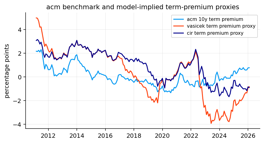
term_premium_plot = term_premium_comparison.dropna()term_premium_correlation = term_premium_plot.corr().loc[["acm 10y term premium"], ["vasicek term premium proxy", "cir term premium proxy"]]fig, ax = plt.subplots()for col in term_premium_plot.columns: ax.plot(term_premium_plot.index, term_premium_plot[col] *100, label=col)ax.set_title("acm benchmark and model-implied term-premium proxies")ax.set_ylabel("percentage points")ax.legend()plt.show()display(term_premium_correlation)
vasicek term premium proxy
cir term premium proxy
acm 10y term premium
0.541233
0.528921
The term-premium comparison plot shows that the simple Vasicek/CIR proxies move in the same broad direction as ACM during some periods, but not perfectly. The reported correlations with ACM are about 0.54 for Vasicek and 0.53 for CIR. That is meaningful but not strong enough to treat these proxies as clean replicas.
The model proxies fall sharply negative around 2022–2024, while ACM behaves differently. This divergence is economically interpretable. The rolling short-rate models see the high recent short-rate environment and infer a high expected short-rate path. If the expected average short rate is high, then the observed 10-year yield can look low relative to that path, producing a negative term-premium proxy. ACM, by contrast, uses a richer term-structure model and estimates risk premia separately.
So the useful takeaway is not “Vasicek and CIR estimate term premium accurately.” The useful point is that simple short-rate models give a transparent but fragile decomposition. They are good for intuition and strategy inputs, but they need diagnostics and comparison against richer benchmarks.
9) HW1F: one-factor curve scenarios with mean reversion
The Hull-White one-factor model is often written as:
It looks similar to Vasicek, but the key difference is \(\theta(t)\): a time-dependent drift chosen so the model can fit the current initial yield curve. That makes HW1F a no-arbitrage extension of Gaussian short-rate modeling. Instead of forcing a constant long-run mean to explain the whole curve, the deterministic drift term fits today’s curve exactly, while the stochastic factor describes future curve movements.
For yield changes, the one-factor loading has the familiar mean-reverting shape:
\[
L(T) = \frac{1-e^{-aT}}{aT}
\]
This loading is high at the short end and lower at the long end. If the factor shock is positive, short maturities move more than long maturities. That means HW1F is mainly a level/front-end dominated curve model. It can create parallel-ish shifts with stronger short-end response, but it can’t independently create slope and curvature shocks.
In this implementation, we estimate a practical HW1F-style model from recent curve changes. We estimate \(a\) from short-rate mean reversion, estimate the monthly factor volatility from historical yield changes, and compute how much of total curve-change variance the one factor explains.
9.1 Why HW1F is more curve-consistent than plain Vasicek
Plain Vasicek with constant \(\theta\) has a problem: one set of parameters has to explain both the current curve shape and future dynamics. Hull-White fixes this by allowing the drift to be time-dependent. The function \(\theta(t)\) is chosen so the model fits today’s observed discount curve.
That means the current curve is not an output the model struggles to match; it is an input the model is built around. The stochastic part then describes how the curve moves from today’s fitted curve.
In a full HW1F no-arbitrage setup, the drift function is tied to the initial instantaneous forward curve \(f(0,t)\) and the volatility structure. The exact formula can get heavy, but the intuition is simple: \(\theta(t)\) bends the model’s deterministic path so that model-implied zero-coupon prices match market zero-coupon prices at time zero.
This is why HW1F is widely used for rate derivatives as a first model. It has only one stochastic factor, so it is simple, but it can fit the initial curve. Its weakness is not curve fitting at time zero. Its weakness is future curve movement: one stochastic factor can’t produce enough independent slope and curvature behavior.
The HW1F diagnostic table reports mean reversion around 0.342, monthly factor volatility around 30.6 bps, annualized factor volatility around 106 bps, and a curve-change variance share of about 54%.
That variance share is the main result. One factor explains a little more than half of recent curve-change variance. That is useful, but not enough to describe the whole curve. The remaining variance is slope and curvature movement. If the strategy only used HW1F, it would tend to interpret curve risk as mostly one common rate shock. That can work when the whole curve is moving together, but it will miss environments where the front end and long end move in opposite directions.
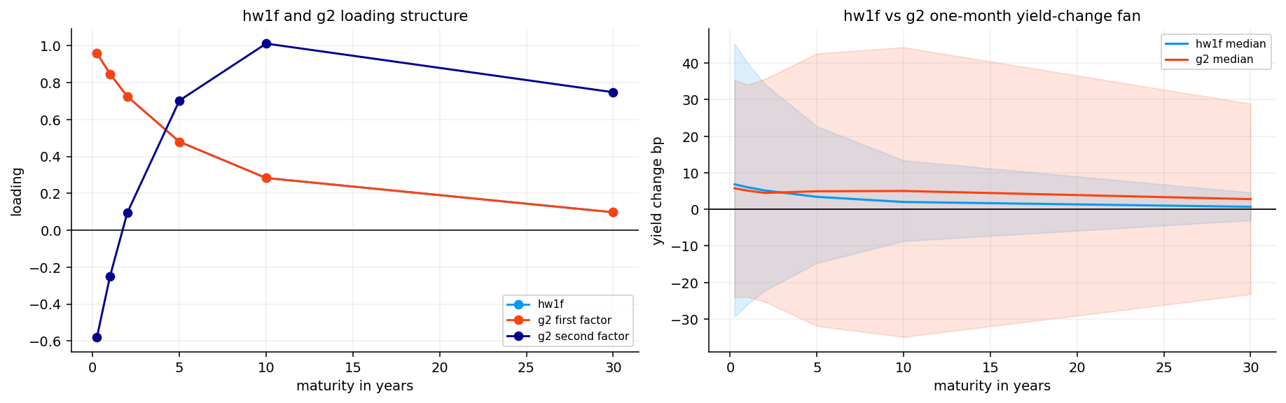
The one-month HW1F scenario summary shows a large short-end distribution and a much smaller long-end distribution. The 10% to 90% range is about -29 to +45 bps at the 3-month maturity, but only about -3 to +5 bps at the 30-year maturity.
This is exactly what the loading formula implies. The factor is strongest near the front end and decays with maturity. Economically, the model is saying recent curve dynamics are dominated by short-rate/policy movement rather than long-end term-premium shocks.
This is useful for strategy design, but it has a clear limitation: if the next month’s move is a long-end selloff caused by fiscal supply or term premium repricing, HW1F will likely underestimate that risk.
10) G2-style two-factor curve model
A two-factor Gaussian term-structure model gives the curve more flexibility. A common G2-style structure is:
\[
r_t = x_t + y_t + \varphi(t)
\]
with two mean-reverting factors:
\[
dx_t = -a x_t dt + \sigma dW_t^{(1)}
\]
\[
dy_t = -b y_t dt + \eta dW_t^{(2)}
\]
and correlated shocks:
\[
dW_t^{(1)}dW_t^{(2)} = \rho dt
\]
The first factor and second factor can have different speeds of mean reversion. A faster factor tends to load more heavily on short/intermediate maturities. A slower factor can influence the longer end more. Together they can produce richer curve shapes than HW1F.
In this project we use a practical G2-style curve-factor model rather than a full market-calibrated swaption model. The implementation creates two maturity loadings based on HW-style exponential decay shapes, orthogonalizes the second loading relative to the first, estimates the two factor returns by least squares, and uses their covariance matrix for scenario generation.
The useful object is the curve-change covariance implied by the factors:
\[
\Sigma_{\Delta y} = L\Sigma_f L^\top
\]
where \(L\) is the matrix of maturity loadings and \(\Sigma_f\) is the factor covariance matrix. This covariance is what the duration strategy later uses to estimate active risk.
10.1 Why two factors matter for strategy risk
A duration strategy’s active risk depends on the whole curve covariance, not just the volatility of the 10-year yield. Suppose a candidate ladder is long 30Y KRD and short 5Y KRD relative to neutral. If the curve steepens, that candidate can lose even if the average rate level barely moves. A one-factor model may understate this risk because it treats most moves as a single loading pattern.
\(\Delta KRD\) says what maturities the strategy is exposed to.
\(L\) maps factor shocks into yield changes at those maturities.
\(\Sigma_f\) says how volatile and correlated the factors are.
The outer quadratic form turns curve-factor covariance into active portfolio risk.
So G2-style modeling doesn’t just make prettier scenarios. It changes the denominator of the strategy score. A candidate that looks attractive under a one-factor model may become unattractive once slope risk is priced correctly.
The G2-style diagnostic table shows first-factor mean reversion around 0.342 and second-factor mean reversion around 0.085. The first monthly factor volatility is about 30.6 bps, and the second is about 24.5 bps. The factor correlation is about 0.65, so the two factors are not independent, but the model is not degenerate.
The slower second factor is important. It gives the model a way to create longer-horizon curve movement that HW1F can’t capture with one decaying loading. The positive correlation says level and slope-like moves have tended to occur together in the latest 60-month window.
The loading plot shows why the two-factor model is more useful than HW1F. HW1F has one smooth decaying loading. G2 has a first loading similar to HW1F and a second loading that changes sign across maturities. A sign-changing loading is exactly what we need for slope/twist moves.
The scenario fan also shows the difference. HW1F produces a curve-change distribution dominated by the short end. G2 allows a richer distribution across the curve because two correlated factors can move the short and long end in different proportions.
This matters directly for KRD-based strategy selection. If we compare a lower-duration ladder with a higher-duration ladder, the active KRD vector is not just exposed to a parallel shift. It has exposure to different key rates. A one-factor model may understate or misallocate that risk. A two-factor model can price active risk more realistically.
11) PCA level, slope, and curvature diagnostics
PCA is not a no-arbitrage model. It is an empirical decomposition of yield-curve changes. But it is one of the most useful diagnostics in fixed income because it tells us how many curve factors we actually need.
Start with a matrix of demeaned monthly yield changes:
\[
X_t = \Delta y_t - \bar{\Delta y}
\]
The sample covariance matrix is:
\[
\Sigma_X = \frac{1}{T-1}X^\top X
\]
PCA solves the eigenvalue problem:
\[
\Sigma_X v_j = \lambda_j v_j
\]
where \(v_j\) is the \(j\)th loading vector and \(\lambda_j\) is the variance explained by that component. The score for date \(t\) is:
\[
f_{t,j} = X_t v_j
\]
In yield-curve data, the first three PCs usually have intuitive shapes:
PC1 level: most maturities move in the same direction.
PC2 slope: short and long maturities move in opposite directions.
PC3 curvature: the belly moves differently from the wings.
This tells us how much of total curve-change variance each factor captures. A good two-factor model should be judged partly against PCA: if PCA says slope is important, but a model only has one level factor, that model is structurally incomplete.
11.1 PCA sign conventions and why orientation matters
PCA loadings are only identified up to sign. If \(v_j\) is an eigenvector, then \(-v_j\) is also an eigenvector with the same variance explained. That means a raw PCA routine can randomly flip signs across windows. For interpretation, we orient the components consistently:
PC1 is oriented so its average loading is positive.
PC2 is oriented so it has the expected slope direction.
PC3 is oriented so the belly curvature has a consistent sign.
This orientation doesn’t change the model mathematically. It only makes plots and rolling diagnostics readable. Without orientation, a component could appear to jump from positive to negative even though the factor structure didn’t actually change.
PCA also helps diagnose HW1F and G2. If PC1 explains 95% of curve moves, a one-factor model may be enough. If PC2 and PC3 explain meaningful variance, a one-factor model will miss important risk. In this sample, PC2 and PC3 together are too large to ignore.
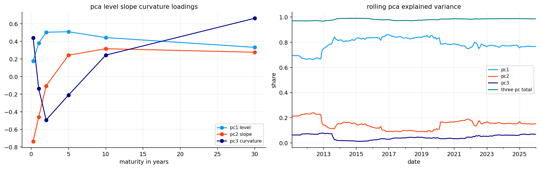
The latest PCA diagnostics are exactly what we expect from a developed-market yield curve. PC1 explains about 76.8% of variance, PC2 about 15.0%, and PC3 about 6.8%. Together the first three PCs explain more than 98% of recent curve-change variance.
The loading plot shows the classic structure: PC1 is level-like, PC2 is slope-like, and PC3 is curvature-like. The rolling explained-variance panel shows that PC1 is not constant through time. Some regimes are more level-dominated, while others need more slope and curvature.
The AR(1) rho values also have interpretation. PC2 has the highest clipped persistence at 0.35, suggesting slope dynamics have been more persistent than level or curvature in the latest window. That helps explain why a model that can represent slope, like G2 or PCA itself, can matter for strategy decisions.
12) Duration ladder candidates and KRD exposure
We now connect the curve models to an implementable bond strategy. The cash-bond core is a ladder across 2Y, 5Y, 10Y, and 30Y buckets. We compare three duration targets:
lower duration: target around 3 years,
neutral duration: target around 5 years,
higher duration: target around 7 years.
We already built the mechanics of duration and KRD earlier, so we don’t repeat the full derivation. The only formula we need for the strategy is the first-order curve PnL approximation:
This active KRD vector is what the term-structure model evaluates. If the model expects rates to fall, positive active duration is attractive. If the model expects rates to rise, lower duration is safer. If the model expects a curve twist, the maturity distribution of KRD matters, not just total duration.
The ladder comparison table confirms that the target portfolios behave as intended. The fixed/neutral ladder has average duration close to 5.0. The lower-duration ladder has average duration around 4.29, and the higher-duration ladder around 6.98.
The higher-duration ladder has much higher convexity, around 88.4 compared with 42.2 for neutral. That is expected because adding long-maturity exposure increases both duration and convexity. The KRD profile also shifts strongly toward the 30-year bucket for the higher-duration ladder, with latest 30Y KRD around 2.38. The lower-duration ladder has zero latest 30Y KRD and concentrates more in the 2Y/5Y/10Y area.
This table is the bridge between modeling and trading. A model doesn’t choose “duration” abstractly. It chooses between real ladder structures with different KRD vectors, convexity, turnover, and trading costs.
13) Turning model curve views into duration decisions
Each model produces two objects for the next month:
\[
E_t[\Delta y]
\]
and
\[
\Sigma_t^{\Delta y}
\]
The first is the expected curve change. The second is the covariance matrix of curve changes. For a candidate ladder, the active expected curve return relative to neutral is approximately:
This score is deliberately practical. It doesn’t pick the biggest expected return blindly. It compares expected active return to active risk and subtracts a risk penalty. If no candidate has positive expected active return, we stay neutral.
13.1 A concrete KRD scoring example
Imagine the neutral ladder has KRD vector:
\[
KRD^{neutral} = [0.5,\;2.1,\;1.5,\;0.7]
\]
at the 2Y, 5Y, 10Y, and 30Y key rates. A higher-duration ladder might have:
\[
KRD^{high} = [0.3,\;2.2,\;2.1,\;2.4]
\]
Then the active KRD is:
\[
\Delta KRD = [-0.2,\;0.1,\;0.6,\;1.7]
\]
This candidate is mostly adding long-end exposure. If the model expects the 10Y and 30Y yields to fall, the curve-return term is positive:
\[
-\Delta KRD^\top E[\Delta y] > 0
\]
But if the model covariance says long-end shocks are very volatile, active risk rises too. So the strategy doesn’t choose higher duration only because expected return is positive. It chooses it only if the expected active return is high enough relative to active risk and transition cost.
This is the portfolio logic behind the whole project. The term-structure model doesn’t directly say “buy bonds.” It says “given this expected curve move and this curve covariance, this active KRD profile is or isn’t worth taking.”
13.2 Carry, roll, and curve return are different pieces
The strategy score separates carry/roll from expected curve return because they are not the same thing.
Carry is the income earned from holding the bonds over the period, including coupons and financing/cash effects. Roll is the price effect from the bond aging down the curve if the curve shape stays the same. A steep curve can make roll attractive because a bond moves toward a lower-yield maturity as time passes. Curve return is the mark-to-market effect from the model’s expected yield changes.
A simple approximate active return decomposition is:
In the implementation, carry and roll are computed through the reference ladders rather than manually separated in the markdown. But the economic logic is the same: a higher-duration ladder may have better carry/roll in one environment and worse rate exposure in another.
This is why a strategy can choose higher duration even if the model doesn’t strongly expect rates to fall. If the carry/roll advantage is positive and active risk is controlled, higher duration can still have a better score. Conversely, if expected curve return is favorable but transition costs and active risk are too high, the strategy can stay neutral.
The latest target table shows clear model disagreement. In the last few months, CIR stays mostly neutral at 5 years, HW1F wants higher duration at 7 years, and G2 wants lower duration at 3 years after August 2025.
This disagreement is not a problem. It is the point of the model comparison. CIR is driven by a short-rate mean-reversion view. HW1F is driven by a one-factor front-end-heavy scenario. G2 can see a richer curve twist and may decide that long-end exposure is less attractive even if the one-factor model likes duration.
A serious term-structure strategy shouldn’t hide this disagreement. It should measure which model has recently worked better and allocate decision authority accordingly. That is what the validation layer does next.
14) Model selection by rolling validation
Instead of permanently choosing CIR, HW1F, or G2, we use a rolling validation rule. Each model has its own candidate target series. We backtest those model-specific decisions, compare their recent active returns against the neutral ladder, and select the model with the best recent information ratio-like score.
computed over the trailing validation window. This is not a full hyperparameter optimization. It is a model-selection layer that asks a simple question: which model has recently converted its duration calls into active return most efficiently?
The selected model then supplies the target duration for the next decision date. This structure is useful because rate regimes change. A one-factor model can work in level-shift regimes. A two-factor model can work better in twist regimes. CIR can work better when the front-end rate level dominates. Rolling validation lets the strategy adapt instead of forcing one model forever.
The model-selection table shows CIR selected for 84 months, HW1F for 46 months, and G2 for 13 months. CIR dominates the selected sample, but G2 has the highest average validation score among selected months. That suggests G2 is used less often, but when it is selected, it has recently been useful.
The target-count table shows higher duration selected most often: 100 months. Neutral duration appears 32 months, and lower duration only 11 months. So the strategy has a structural tendency to extend duration over this sample. That makes sense in a long period where falling or low rates rewarded duration, but it also creates vulnerability during rising-rate shocks.
This is an important honest point: a model-driven strategy can have an economic bias. Here the bias is toward higher duration, and the later stress/risk diagnostics have to tell us whether the extra return compensates for that extra exposure.
Show code
fig, axes = plt.subplots(1, 2, figsize=(13, 4), constrained_layout=True)nav_series(baseline_returns.reindex(dynamic_duration_returns.index).dropna(), start_value=1).plot(ax=axes[0], label="fixed 5y ladder")nav_series(dynamic_duration_returns.dropna(), start_value=1).plot(ax=axes[0], label="dynamic duration ladder")axes[0].set_title("fixed ladder vs dynamic duration ladder")axes[0].set_ylabel("nav")axes[0].legend()dynamic_active_returns.dropna().cumsum().plot(ax=axes[1], color=colors[1])axes[1].axhline(0, color="black", linewidth=0.8)axes[1].set_title("dynamic ladder active return")axes[1].set_ylabel("cumulative active return")plt.show()
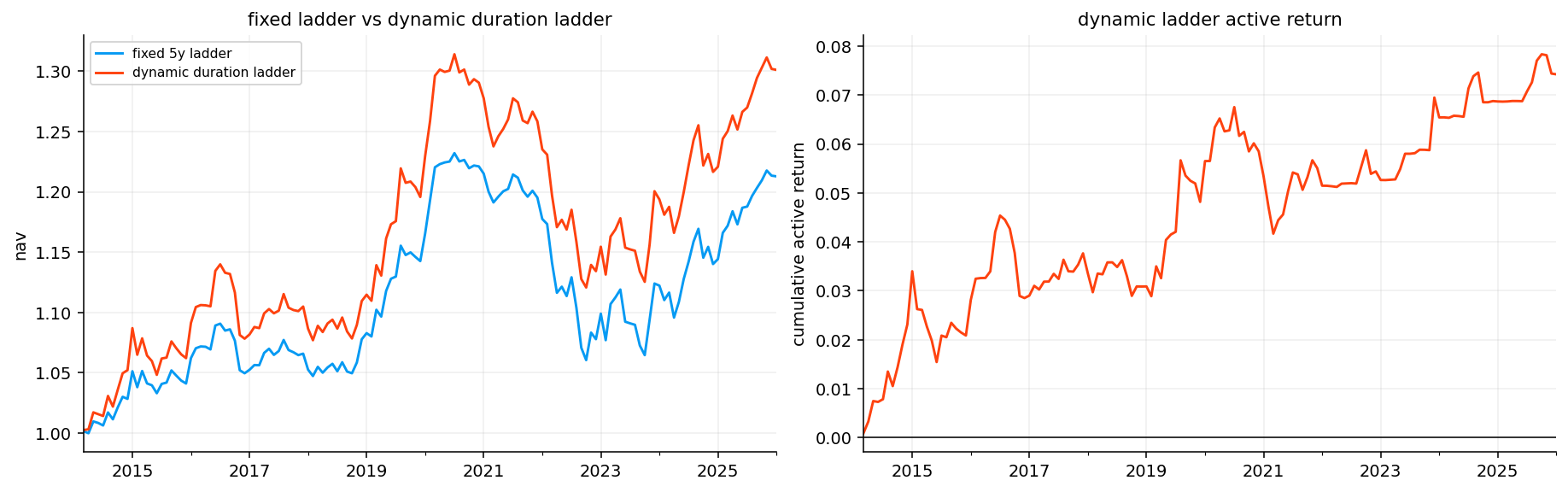
The NAV plot shows the dynamic duration ladder outperforming the fixed 5-year ladder over the evaluation period. The active return plot is mostly positive and trends upward, with setbacks during difficult rate periods.
This behavior matches the target-count table. Since the model often chose higher duration, it benefited during periods where duration was rewarded. But the active-return line is not smooth. It shows that model-driven duration timing is noisy. The strategy improves long-run performance, but it doesn’t avoid every drawdown.
The long-sample performance table shows the dynamic duration ladder with annualized return around 2.23%, compared with 1.63% for the fixed 5-year ladder. Volatility rises from about 3.91% to 4.68%, and the max drawdown worsens slightly from -13.94% to -14.72%.
So the improvement is not free. The strategy earns a higher return and slightly better Sharpe, but it accepts more volatility and a somewhat deeper drawdown. The active performance table is cleaner: the dynamic ladder earns about 0.62% annual active return with active volatility around 1.22%, giving an active Sharpe around 0.51.
That is a realistic fixed-income result. We are not seeing magical timing. We are seeing a moderate active edge from model-based duration allocation.
15) Fixed-for-floating swaps as a duration overlay
Before building the overlay, we need to understand what a swap is. A plain-vanilla interest-rate swap is a contract where two parties exchange cash flows:
one side pays a fixed rate on a notional amount,
the other side pays a floating rate tied to a short-rate benchmark.
The notional is not exchanged. It is only used to compute cash flows. For a $100 million notional swap with a 4% annual fixed rate and semiannual fixed payments, the fixed payer owes roughly $2 million every six months on the fixed leg, while receiving floating payments that reset with the benchmark.
There are two standard positions:
Receiver swap: receive fixed, pay floating.
Payer swap: pay fixed, receive floating.
A receiver swap behaves like receiving the cash flows of a fixed-rate bond financed by floating-rate borrowing. Its value rises when swap rates fall because the fixed coupon you receive becomes more attractive. A payer swap behaves like short duration. Its value rises when swap rates rise because paying the old fixed rate becomes cheaper relative to the new market fixed rate.
For example, suppose you enter a 10-year receiver swap at a fixed rate of 4%. If one month later the market 10-year swap rate falls to 3.5%, your right to receive 4% fixed is valuable. The receiver swap gains. If the market rate rises to 4.5%, receiving 4% is unattractive and the receiver loses.
That is exactly why swaps are useful for duration overlays. We can add or reduce rate sensitivity without buying and selling the whole bond ladder.
15.1 Receiver and payer intuition through rate moves
The receiver/payer distinction becomes much easier if we think in scenarios.
For a receiver swap, we receive fixed and pay floating. If market swap rates fall after we enter, receiving the old fixed rate becomes valuable. The receiver gains. If market swap rates rise, receiving the old fixed rate becomes unattractive. The receiver loses.
For a payer swap, we pay fixed and receive floating. If market swap rates rise, paying the old fixed rate is valuable because new market participants have to pay a higher fixed rate. The payer gains. If market swap rates fall, the payer loses.
So the sign mapping is:
Position
Gains when rates
Duration sign
Portfolio use
Receiver swap
fall
positive duration
add duration
Payer swap
rise
negative duration
reduce duration
This is why a receiver swap can substitute for buying longer bonds. It has positive rate duration without requiring us to sell the existing ladder and buy new bonds. But it also has mark-to-market risk. If the rate view is wrong, the overlay loses money immediately.
A par swap rate is the fixed rate that makes the swap value zero at initiation. Let payment times be \(t_1,\ldots,t_n\), accrual fractions be \(\alpha_i\), and discount factors be \(P(0,t_i)\). The fixed-leg annuity is:
\[
A = \sum_{i=1}^{n}\alpha_i P(0,t_i)
\]
The present value of the fixed leg for fixed rate \(K\) and notional \(N\) is:
\[
PV_{fixed} = NKA
\]
For a standard par floating leg, the value is approximately:
\[
PV_{float} = N(1-P(0,T))
\]
The par swap rate \(K^*\) sets fixed and floating leg values equal:
The swap PV01 measures the change in swap value for a 1 bp move in rates. Receiver PV01 is positive in the convention used here because a downward rate shift increases receiver value. Payer PV01 is negative because a downward rate shift hurts the payer.
A swap overlay is a duration tool. It doesn’t give us free return. It gives us a cheaper and more targeted way to change interest-rate exposure.
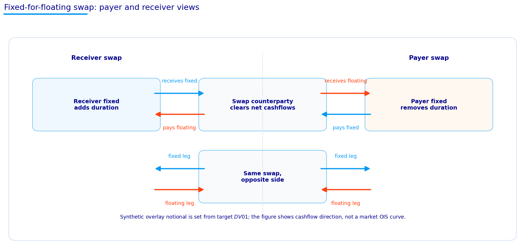
The diagram shows the two sides clearly. In a receiver swap, our position receives fixed and pays floating. In a payer swap, our position pays fixed and receives floating. The same swap has two sides, so one investor’s receiver position is another investor’s payer position.
The diagram is especially useful because swaps can sound abstract when we only write formulas. The economic picture is simple: one side wants fixed-rate exposure, the other side wants floating-rate exposure. The value changes when the market fixed rate changes after the contract is initiated.
16) Swap valuation functions and the 10-year overlay instrument
We now build the swap analytics from the zero curve. The core functions are:
interpolate zero rates at payment times,
convert zero rates to discount factors,
build a semiannual fixed-payment schedule,
compute the fixed-leg annuity,
compute the par swap rate,
compute receiver/payer mark-to-market value,
compute PV01 by bumping the curve up and down.
The discount factor for a payment time \(t\) is:
\[
P(0,t) = e^{-R(0,t)t}
\]
The annuity is:
\[
A = \sum_i \alpha_i P(0,t_i)
\]
The par rate is:
\[
K^* = \frac{1-P(0,T)}{A}
\]
The project uses a 10-year synthetic swap overlay. Ten years is a natural choice because it is liquid, meaningful for duration exposure, and close to the center of many macro rate views. We use it to add or remove duration on top of the cash ladder.
16.1 Swap duration versus bond duration
A swap’s PV01 acts like duration exposure, but the cash-flow structure is different from a bond. A fixed-rate bond has an upfront price and coupon/principal cash flows. A par swap starts near zero value and exchanges fixed versus floating cash flows over time.
The receiver swap’s PV01 is close to the PV01 of the fixed leg because the floating leg resets. The fixed leg has long-duration exposure. The floating leg has much shorter duration because its coupon resets to current rates. So receiving fixed and paying floating leaves us with positive duration.
A rough intuition is:
\[
PV01_{receiver} \approx N \times A \times 0.0001
\]
where \(A\) is the swap annuity. This is why the annuity appears everywhere in swap analytics. It is not just a denominator for the par rate. It is also the scale of fixed-leg rate sensitivity.
For the overlay, this is very convenient. If we know the PV01 we want to add, and we know the PV01 per unit notional, we can solve for notional directly. That makes the overlay more targeted than buying a mix of bonds and hoping the KRD exposure comes out right.
overlay_tenor =10.0overlay_slippage_bp =0.5overlay_duration_budget =1.5overlay_dv01_fraction_cap =0.40example_swap = pd.DataFrame([ {"side": side, "par rate": par_swap_rate(curve_dates[-1], overlay_tenor), "annuity": swap_annuity(curve_dates[-1], overlay_tenor), "pv01 per 1 notional": swap_pv01(curve_dates[-1], overlay_tenor, side=side)}for side in ["receiver", "payer"]])display(example_swap)
side
par rate
annuity
pv01 per 1 notional
0
receiver
0.042576
8.169869
0.000822
1
payer
0.042576
8.169869
-0.000822
The swap example table shows a latest 10-year par rate of about 4.26% and an annuity around 8.17. The receiver PV01 per unit notional is about 0.000822, while the payer PV01 is the negative of that.
That sign is exactly what we want. A receiver swap adds positive duration exposure. A payer swap subtracts duration exposure. Since the overlay is synthetic, we can adjust duration without physically selling 2Y/5Y/10Y/30Y ladder positions.
The magnitude also matters. A unit-notional 10-year receiver has about 8.22 bps of value change for a 1 bp yield move under this normalization. The strategy later scales notional so the overlay PV01 stays inside a duration budget and doesn’t dominate the cash ladder.
17) Swap overlay strategy
The overlay uses the dynamic duration signal, but implements it through swaps instead of changing the cash ladder target directly.
The signal is:
\[
s_t = \begin{cases} +1 & \text{if target duration is above neutral} \\ -1 & \text{if target duration is below neutral} \\ 0 & \text{if target duration is close to neutral} \end{cases}
\]
A positive signal means we want more duration, so we enter a receiver swap. A negative signal means we want less duration, so we enter a payer swap. A zero signal means flat overlay.
The overlay target PV01 is capped two ways:
\[
PV01^{target}_t = s_t \cdot \min\left(BD_t,\; c \cdot |PV01^{base}_t|\right)
\]
where \(B\) is the overlay duration budget, \(D_t\) scales by NAV, and \(c\) is the fraction cap relative to the base ladder’s DV01. The notional is then:
This cap is important. Without it, the overlay could turn a moderate bond ladder into a leveraged rate bet. With it, swaps adjust duration but remain tied to the size of the underlying portfolio.
17.1 Overlay PnL and why implementation risk still matters
At each decision date, the swap is initiated near par, so its starting value is approximately zero. Over the next month, its PnL comes from revaluing the remaining swap at the new curve. If the fixed rate locked at initiation is \(K_t\), then one month later the receiver value is approximately:
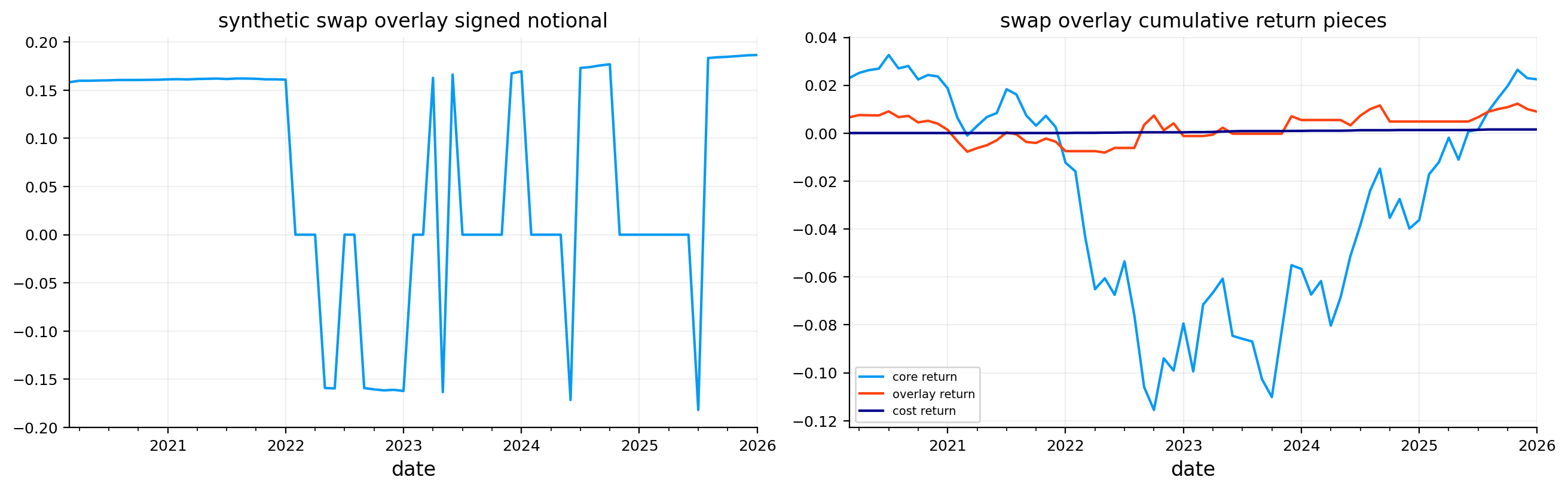
The cost term is based on the change in signed notional, not just whether a position exists. If we go from receiver to payer, the signed notional changes a lot, so the trade cost is larger. If we slightly resize an existing receiver, cost is smaller.
This is one of the reasons swaps are useful but not magic. They reduce the need to rebalance the cash ladder, but they introduce their own implementation choices: tenor, notional cap, slippage assumption, reset frequency, collateral/cash treatment, and whether the synthetic Treasury-implied swap curve is a good proxy for real swap-market pricing.
The latest overlay log shows that the strategy is in a receiver position through late 2025 and January 2026. That means it is adding duration on top of the fixed 5-year ladder. The notional is around 0.184–0.186 relative to NAV, and the overlay PV01 is around 0.00015.
The overlay contributed positively in September, October, and November 2025, then lost money in December and January as rates moved against the receiver position. This is exactly how receiver swaps behave: they gain when rates fall and lose when rates rise. The core ladder return and overlay return are shown separately, which is useful because we can see whether the overlay is truly adding value or simply increasing total volatility.
The overlay summary shows the modern swap overlay runs from March 2020 to January 2026, with 47 active months. Average absolute notional is around 0.11, and average cost return is only about 2.2 bps per month in decimal units around 0.000022.
The signed notional plot shows frequent switching between receiver, payer, and flat/near-flat states. The cumulative return-pieces plot shows the overlay return is small relative to the core ladder but still meaningful. It adds a separate source of active duration timing without requiring the cash bond ladder itself to move as aggressively.
18) Raw, SOFR-excess, and active performance
We evaluate three versions of performance:
Raw returns: total portfolio returns.
SOFR-excess returns: returns minus the monthly SOFR cash return.
Active returns: returns minus the fixed 5-year ladder benchmark.
The SOFR-excess view is especially important after 2020 because cash became competitive. The formula is simple:
These answer different questions. SOFR-excess asks whether the strategy beat cash. Active return asks whether the strategy beat the fixed ladder. A duration strategy can beat the fixed ladder while still failing to beat cash in a high-cash-rate period.
18.1 Why SOFR-excess can look harsh
SOFR-excess returns are not designed to make duration strategies look good. They ask a strict question: did the strategy earn more than overnight secured cash?
During a high-rate period, the cash benchmark compounds at a meaningful monthly rate. If the bond ladder earns coupon income but loses price value because rates rise, its raw return can be positive while its cash-excess return is negative. This is exactly what happened in many fixed-income portfolios during the recent rate-normalization period.
The decomposition is useful because it separates three performance questions:
Did the strategy make money at all? Raw return answers that.
Did it beat cash? SOFR-excess return answers that.
Did the model improve on a passive duration benchmark? Active return answers that.
For model evaluation, the active return is the cleanest measure. For investor opportunity cost, SOFR-excess is the harsher and more realistic measure.
The raw modern-sample results are modest because this period includes the brutal bond-market drawdown after 2021. The fixed 5-year ladder earns about 0.28% annualized with volatility around 4.49%. The dynamic ladder improves raw return to about 0.56% and the swap overlay version to about 0.40%.
The SOFR-excess table is more severe. All strategies are negative versus SOFR because cash was extremely competitive during the high-rate period. The dynamic ladder has the least negative SOFR-excess annual return, around -2.24%, compared with -2.52% for fixed. So the active model helps, but it doesn’t overcome the cash hurdle.
The active table is the cleanest comparison against the fixed ladder. The dynamic ladder has annual active return around 0.29% with active volatility around 1.04%, producing an active Sharpe near 0.29. The swap overlay has smaller active return around 0.12%, but also slightly lower active volatility. The dynamic cash-ladder implementation is stronger here than the synthetic overlay.
Show code
fig, axes = plt.subplots(1, 2, figsize=(13, 4), constrained_layout=True)for col in modern_returns.columns: nav_series(modern_returns[col].dropna(), start_value=1).plot(ax=axes[0], label=col)axes[0].set_title("modern sample raw nav")axes[0].legend()for col in modern_excess_returns.columns: drawdown_series(modern_excess_returns[col].dropna(), input_kind="returns").plot(ax=axes[1], label=col)axes[1].set_title("sofr-excess drawdown")axes[1].legend()plt.show()
The NAV and SOFR-excess drawdown plots make the modern fixed-income pain very visible. Raw NAVs decline heavily during the 2022 rate shock and then recover gradually. The dynamic strategy does somewhat better, but it doesn’t avoid the main drawdown because its duration exposure still suffers when rates reprice upward.
The SOFR-excess drawdown plot is even more important. It shows that the opportunity cost of holding duration instead of cash was persistent. In a zero-rate world, bond carry looks attractive. In a high-SOFR world, the hurdle rate is high, and a bond strategy has to earn enough price return or carry advantage to beat cash. During much of this sample, that was difficult.
The VaR/ES tables show that the dynamic ladder and swap overlay don’t materially reduce tail risk relative to the fixed ladder. Historical 5% VaR is around 2.2% monthly across the strategies, and expected shortfall is around 2.6%. The Cornish-Fisher numbers are similar.
The cost/turnover table shows the cash ladder has average turnover around 0.33, while the dynamic target changes about 0.23 of months. The swap overlay’s notional change is much smaller on average, and its average cost return is low. That is the practical advantage of a swap overlay: it can adjust duration with low transaction cost. But in this sample, cheaper implementation doesn’t automatically mean better active performance.
19) Parallel-rate scenario diagnostics
The scenario diagnostic uses the KRD approximation:
\[
\Delta NAV \approx -\sum_j KRD_j \Delta y_j
\]
For a parallel shift, every selected key rate moves by the same amount. A +100 bp shock means:
\[
\Delta y_j = 0.01 \quad \text{for all } j
\]
so the PnL is approximately minus total key-rate duration times 1%. This is not a full repricing with convexity, but it is a clean diagnostic of current rate exposure.
Scenario diagnostics are useful because backtests tell us what happened historically, while KRD scenarios tell us what the current portfolio would lose or gain under a simple shock. A strategy with higher recent return can still be dangerous if it has too much current duration.
The scenario table shows the dynamic duration ladder has the largest current parallel-rate sensitivity. A -100 bp shock would add about +6.99%, while a +100 bp shock would cost about -6.99%. The fixed 5-year ladder has about ±4.91%, and the synthetic swap overlay ladder sits in between at about ±6.45%.
So the dynamic model is currently taking more duration than the fixed benchmark. That explains why it benefits more if rates fall, but loses more if rates rise. The swap overlay also adds duration, but less than the full dynamic ladder.
This is exactly the kind of honest risk view we need. The strategy improved return historically, but its current state is not conservative. It is positioned to benefit from falling rates.
20) Model stability and diagnostic plots
The final US diagnostic block checks whether the estimated models are stable through time. We look at:
rolling Vasicek and CIR mean reversion,
rolling Vasicek and CIR volatility,
HW1F and G2 scenario-factor volatilities,
G2 factor correlation,
PCA three-factor explained variance,
success rates and residual autocorrelation.
These diagnostics matter because a model can have a good backtest for the wrong reason. If parameters jump wildly, residuals remain autocorrelated, or factor covariance becomes degenerate, then the model’s trading signals are fragile.
20.1 Reading residual autocorrelation correctly
Residual autocorrelation is one of the most useful diagnostics in this project. If a model has done a good job describing conditional dynamics, the residuals should have little remaining serial structure. In a one-step transition model, the residual is roughly:
\[
e_{t+1} = r_{t+1} - E_t[r_{t+1}]
\]
The first-order autocorrelation is:
\[
\rho_1 = Corr(e_t,e_{t-1})
\]
If \(\rho_1\) is strongly positive, the model is missing persistence. If it is strongly negative, the model may be overreacting or creating reversal errors. Values close to zero are better.
In rate data, some residual autocorrelation is hard to avoid because central-bank policy is persistent. Rate changes are not independent coin flips. Hiking cycles and cutting cycles create serial dependence. So we shouldn’t expect perfect white noise. But comparing residual autocorrelation across models still tells us which model absorbs more structure.
That is why CIR’s lower median residual autocorrelation matters. It suggests level-dependent volatility and the shifted square-root structure are capturing some dynamics Vasicek leaves behind. But we still treat CIR carefully because numerical conditioning and parameter stability are separate issues.
Show code
stability_rows = []for date in model_parameters.index[::2]: history = zero_rates.loc[:date].tail(rolling_window) hfit = estimate_hw1f(history, scenario_maturities) gfit = estimate_g2(history, scenario_maturities) pfit = estimate_pca(history, scenario_maturities, n_components=3) cov = gfit["factor covariance"] stability_rows.append({"date": date,"hw1f sigma": hfit["sigma monthly"] * np.sqrt(12),"hw1f mean reversion": hfit["a"],"g2 first vol": np.sqrt(cov[0, 0]) * np.sqrt(12),"g2 second vol": np.sqrt(cov[1, 1]) * np.sqrt(12),"g2 correlation": gfit["factor correlation"],"pca three pc total": pfit["explained"].sum(), })scenario_parameters = pd.DataFrame(stability_rows).set_index("date")fit_diagnostic_summary = pd.DataFrame({"metric": ["vasicek success rate", "cir success rate", "median vasicek residual acf1", "median cir residual acf1", "median pca three pc explained"],"value": [fit_diagnostics["vasicek success"].mean(), fit_diagnostics["cir success"].mean(), fit_diagnostics["vasicek residual acf1"].median(), fit_diagnostics["cir residual acf1"].median(), pca_parameters["three pc total"].median()],})fig, axes = plt.subplots(2, 2, figsize=(13, 7), constrained_layout=True)model_parameters[["vasicek kappa", "cir kappa"]].plot(ax=axes[0, 0], title="rolling short-rate mean reversion")model_parameters[["vasicek sigma", "cir sigma"]].plot(ax=axes[0, 1], title="rolling short-rate volatility")scenario_parameters[["hw1f sigma", "g2 first vol", "g2 second vol"]].plot(ax=axes[1, 0], title="scenario factor volatilities")scenario_parameters[["g2 correlation", "pca three pc total"]].plot(ax=axes[1, 1], title="factor diagnostics")plt.show()display(fit_diagnostic_summary)
metric
value
0
vasicek success rate
1.000000
1
cir success rate
1.000000
2
median vasicek residual acf1
0.143875
3
median cir residual acf1
-0.060870
4
median pca three pc explained
0.984549
The diagnostic plots show that short-rate parameter instability is real. CIR volatility starts very high in earlier windows, falls during low-rate regimes, and rises again in the higher-rate period. Vasicek volatility is much more stable but also less flexible. Mean reversion spikes around some regime transitions and then settles.
The scenario factor volatility panel shows elevated factor risk around crisis periods and again during the recent hiking cycle. The PCA diagnostic is strong: the median three-PC explained variance is about 98.45%, which confirms that level, slope, and curvature are a compact but powerful description of curve changes.
The fit diagnostic summary reports 100% success rates for both Vasicek and CIR rolling fits. Median Vasicek residual autocorrelation is about 0.144, while CIR’s is about -0.061. CIR again looks better on residual autocorrelation, although the earlier Hessian diagnostics warn us that CIR parameters can be numerically delicate.
21) Secondary application: Japan JGB term-structure market
The secondary implementation applies the same logic to Japan government bond yields. This is not just a repeated dataset. Japan is economically one of the most interesting term-structure cases in the world because its rate regime has been structurally different from the US.
For many years, Japan lived with near-zero or negative policy rates, quantitative easing, and yield curve control. In that environment, the meaning of duration is different. A 10-year yield moving from 0.05% to 0.50% can be a huge relative regime change even though the absolute yield level still looks low compared with the US. Long periods of suppressed yields also affect model estimation: mean reversion, volatility, and factor dynamics are all shaped by policy constraints.
We use the Japan MOF yield data through the library workflow. For reproducibility, check the corresponding repository folder: Japan MOF yields data folder.
The Japan run reuses the same broad structure:
prepare monthly JGB curves and zero rates,
fit Vasicek/CIR-style short-rate diagnostics,
estimate HW1F, G2-style, and PCA curve factors,
build fixed and dynamic duration ladders,
evaluate a synthetic JGB-implied swap overlay,
compare strategy NAV, active return, scenario exposure, and rolling active return.
We don’t repeat every formula again. The important part is how the same machinery behaves in a market where rates were pinned for years and long-end moves can be heavily policy-influenced.
21.1 Why Japan is not just a smaller-rate version of the US
Japan’s yield curve history forces the models to work in a different environment. The US sample contains large policy cycles and a violent repricing after 2021. Japan’s sample contains long periods where rates were compressed near zero and policy frameworks constrained the curve.
This changes model interpretation in several ways:
A small move in JGB yields can be economically meaningful because the starting level is low.
Mean-reversion estimates can be dominated by policy anchoring instead of market-driven cycles.
Long-end yield changes can reflect changes in policy credibility or curve-control expectations, not just inflation risk.
Duration carry can look stable for long periods, then reprice quickly when the market questions the anchor.
So the Japan application is a stress test of the framework. It asks whether the same machinery can adapt to a market where the absolute rate level, volatility scale, and policy regime are completely different.
The Japan data summary shows 13,129 daily observations and 316 monthly dates, from September 1999 to December 2025. That gives a longer monthly sample than the US run, but the economic regime is more unusual.
The JGB curve snapshots show low-rate history and later upward movement. Unlike the US curve, where the front end and long end experienced dramatic tightening after 2022, Japan’s curve has been more constrained and gradual for much of the sample. The short-rate fan comparison reflects this: simulated paths are tighter in absolute terms than the US rate fans.
The Japan PCA diagnostics are especially important. In a low-rate, policy-managed market, curve changes may be less freely distributed across maturities. The PCA and HW/G2 loading panels help diagnose whether a one-factor model is enough or whether slope/long-end dynamics matter.
The Japan performance tables show a much cleaner active result than the modern US SOFR period. The dynamic duration ladder earns about 0.68% annualized with volatility around 1.43%, compared with about 0.38% annualized and 1.25% volatility for the fixed 5-year ladder. The dynamic ladder’s Sharpe is about 0.48, versus 0.31 for fixed.
The active performance table is more impressive: the dynamic ladder earns about 0.30% annual active return with active volatility around 0.33%, giving an active Sharpe around 0.91. That is a strong result for a bond-duration timing overlay. It means the model-driven target changes added meaningful return relative to their active risk.
The JGB-implied swap overlay also adds value versus fixed, but it underperforms the dynamic cash-ladder implementation. Its annual active return is about 0.19% with active volatility around 0.27%, giving an active Sharpe around 0.70. So the overlay is smoother and lower risk, but it captures less of the dynamic ladder’s active return.
The model-selection counts are balanced between G2 and HW1F: G2 is selected 123 months and HW1F 108 months. That is very different from the US run, where CIR dominated selection. Japan’s secondary implementation uses HW/G2 for the target-selection layer, and the market seems to alternate between one-factor and two-factor curve behavior.
The target-count table shows only higher duration and neutral duration selected: 118 months higher and 113 months neutral. There are no lower-duration target months in the final selected log. That makes economic sense for much of Japan’s sample. In a low-rate but policy-supported bond market, the model often finds positive carry/roll or favorable expected curve movement from holding duration, but doesn’t often see enough reason to go structurally short duration.
This also means we need to be careful. If Japan fully exits its historical low-rate regime, a past bias toward higher duration may become less reliable. The model worked in the historical sample, but its future usefulness depends on whether Japan’s rate dynamics remain partially anchored or become more like other developed markets.
The Japan scenario table shows the latest parallel-rate exposure is identical across fixed, dynamic, and swap-overlay strategies: about +5.02% for a -100 bp shock and -5.02% for a +100 bp shock. This doesn’t mean the strategies were identical through history. It means their latest effective KRD exposure ended up essentially the same under the scenario diagnostic.
That is a useful detail. In the US, the latest dynamic strategy was taking more duration than fixed. In Japan, by the final date, the strategies converge to a similar current parallel-shift risk. The historical active return therefore came from timing through the sample, not from ending with a dramatically different current duration exposure.
The overlay setting comparison also shows why the conservative overlay was selected over the stronger one. The stronger overlay has higher annual active return, but it also has higher active volatility and deeper drawdown. The Sharpe ratios are almost identical, and the conservative overlay has the smaller drawdown. The selection is therefore risk-aware rather than purely return-maximizing.
The 12-panel Japan figure is dense, but it tells a coherent story:
The JGB curve snapshots show the long period of low yields and the later steepening/upward shift.
The short-rate fan charts show low absolute volatility compared with US rates.
PCA and HW/G2 panels show that curve shape still matters even in a low-rate market.
Model counts show a real alternation between HW1F and G2, not one model dominating mechanically.
Target counts confirm the strategy mostly chooses neutral or higher duration.
Strategy NAV shows dynamic duration leading fixed duration over time.
Active NAV versus fixed 5Y rises steadily, with some drawdowns but no collapse.
Scenario bars converge across strategies at the final date, which matches the equal KRD scenario table.
The rolling 12-month active return plot shows that the active edge is episodic, not constant.
The strongest economic interpretation is that Japan’s curve market rewarded controlled duration timing over a long sample, but mostly through decisions between neutral and higher duration rather than aggressive duration reduction. This is a completely different regime from the modern US SOFR period, where beating cash was extremely difficult and high duration created much larger drawdown risk.
The Japan result is also a good reminder that model transfer is never automatic. The same modeling framework can work differently across markets because the economic constraints are different. In the US, the post-2020 sample is dominated by a high cash hurdle and a large duration drawdown. In Japan, the long sample has lower absolute volatility and a different policy anchor, so controlled duration timing can look much more attractive on an active-risk basis.
The most useful comparison is not “US model good or Japan model good.” The useful comparison is about where the edge comes from. In the US, the active edge is modest and partly overwhelmed by the cash benchmark during the SOFR period. In Japan, the active edge is more visible versus the fixed ladder because the strategy times duration inside a lower-volatility curve environment.
This is why the secondary application is not just a library demo. It shows that term-structure models must be interpreted through the local market regime. A curve model is mathematical, but its output is economic. A higher-duration signal in Japan doesn’t mean the same thing as a higher-duration signal in the US because the distribution of rate moves, policy reaction function, and long-end risk premium are different.