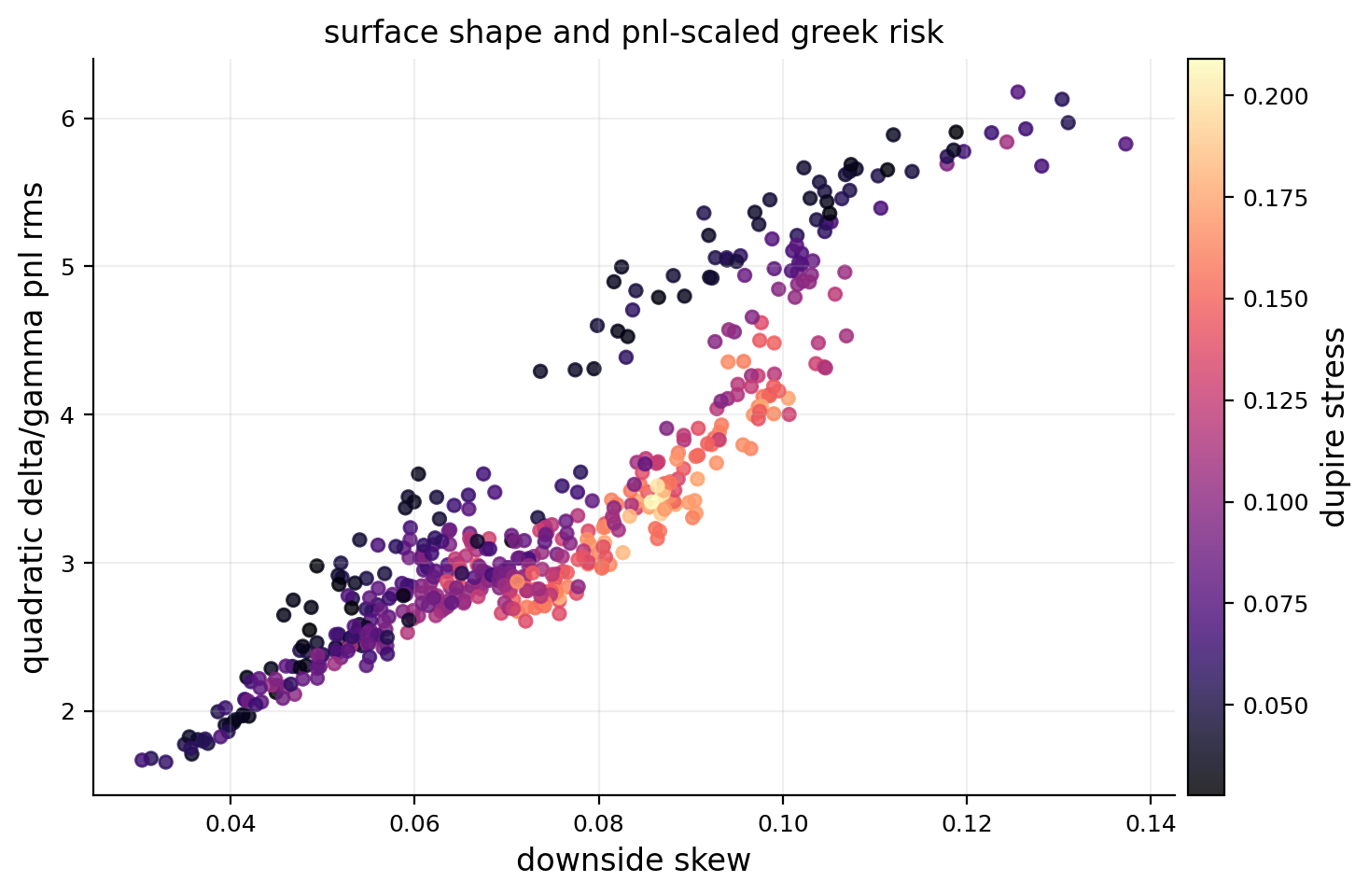
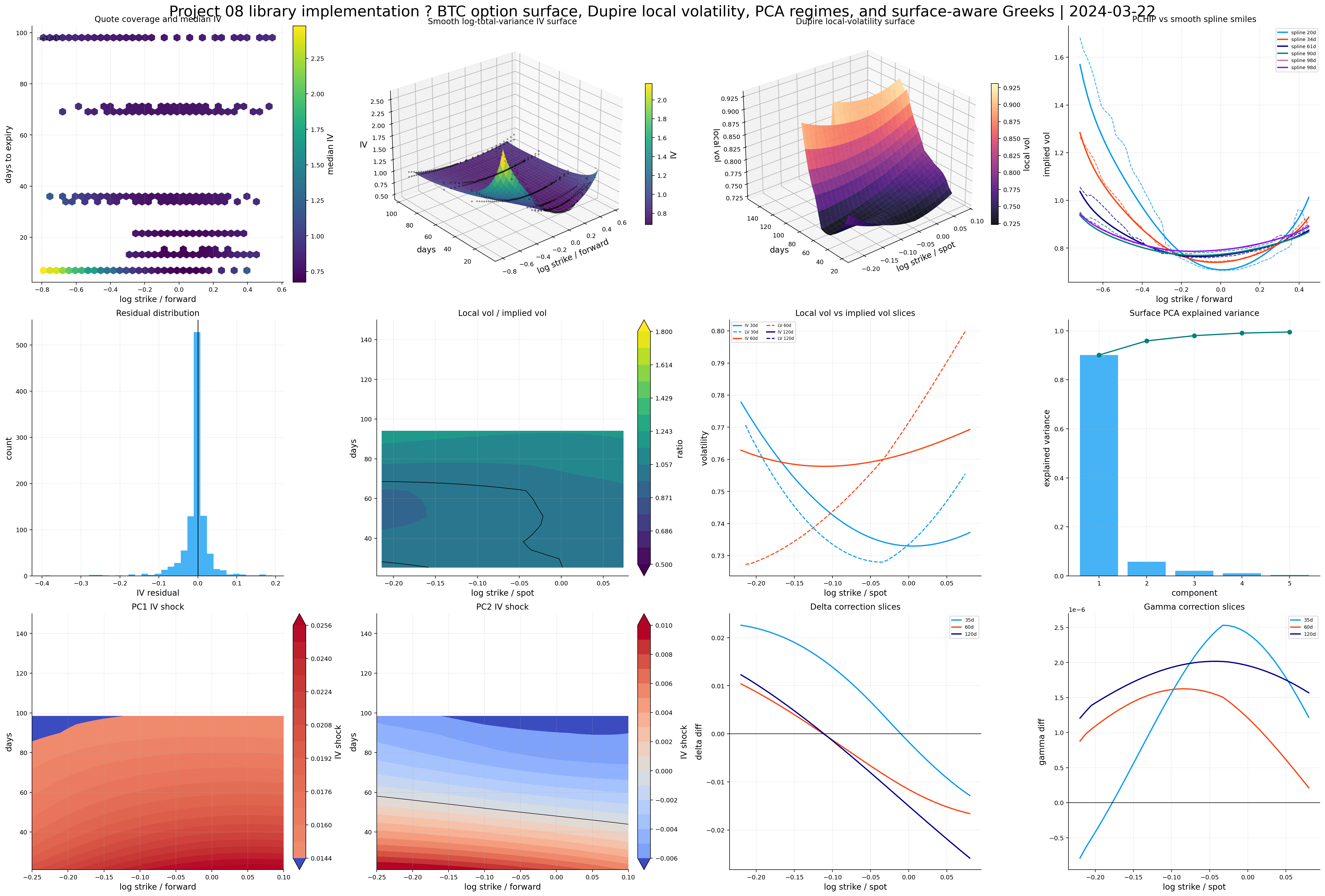
A clean SPX option surface dataset from paired call and put quotes, treasury rates, parity-implied forwards, and bid-ask-aware implied volatility.
A raw PCHIP benchmark surface first, then a smoother tensor-product B-spline surface fitted on log total variance.
A Dupire local-volatility surface, with real no-arbitrage diagnostics instead of only a pretty 3D plot.
A historical panel of fitted volatility surfaces, surface-shape features, local-vol stress metrics, and PCA factors of surface changes.
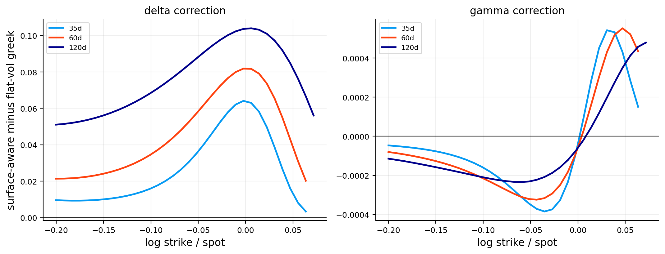
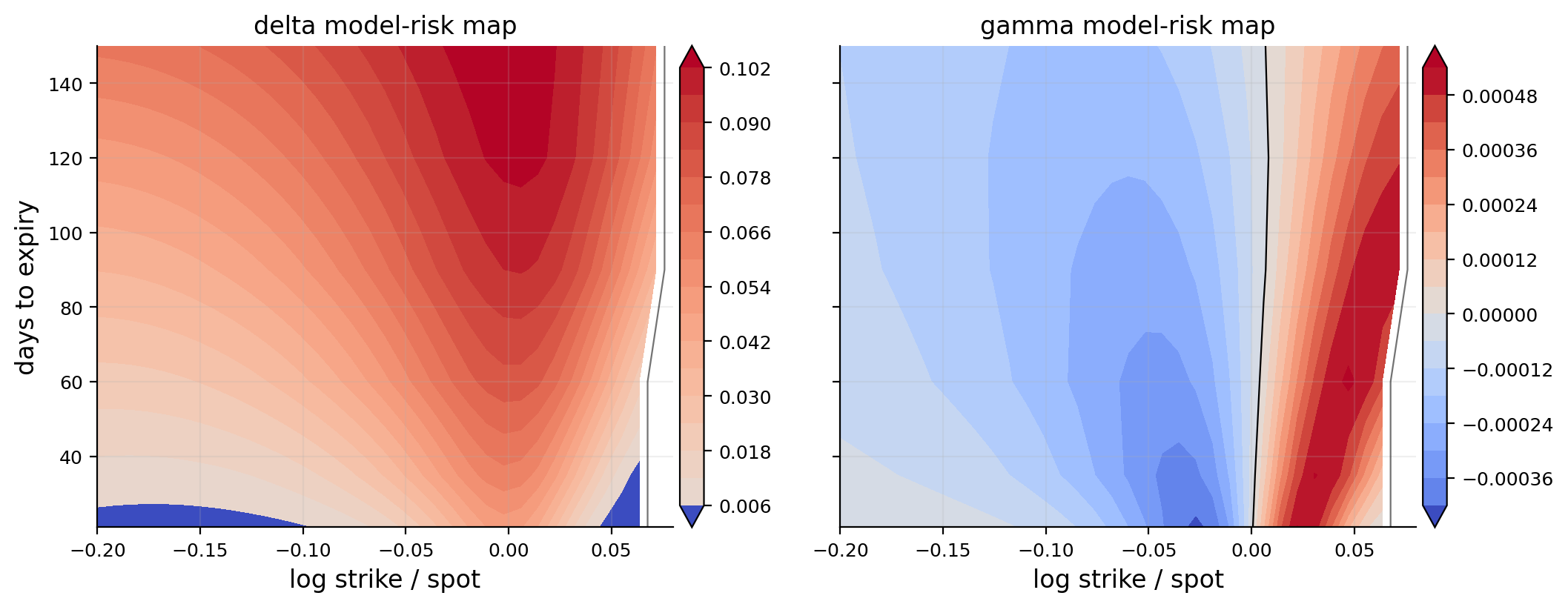
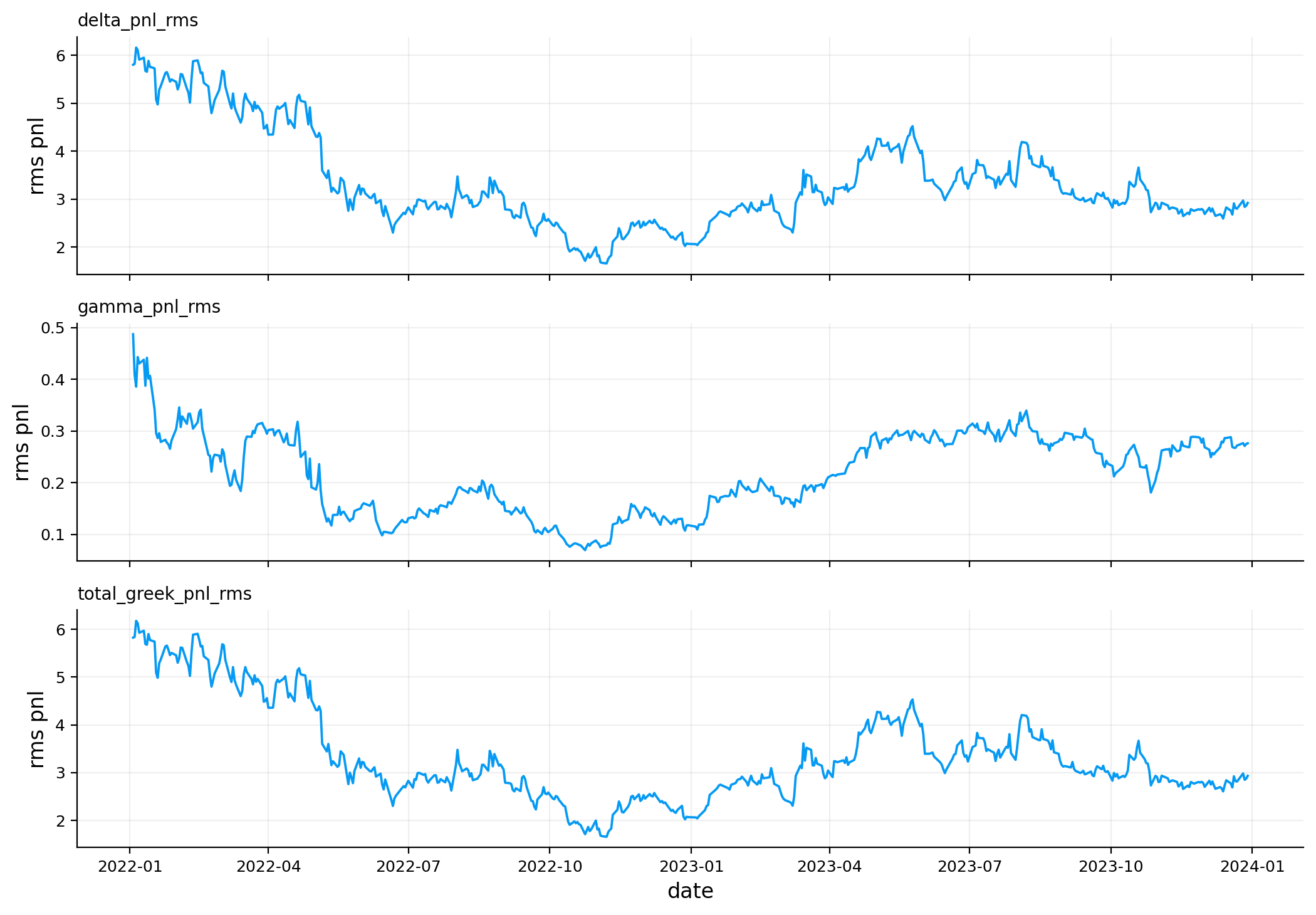
Surface-aware Greeks, where delta and gamma are recomputed while allowing implied volatility to move with spot.
A secondary BTC option-surface implementation using the library, where the same machinery is tested on a much rougher and more nonlinear option market.
This project is math-heavy because volatility surfaces are one of the first places where option theory stops being a single formula and becomes a full object. In the earlier implied-vol work, we learned how to invert an option price into one volatility number. Here that isn’t enough. One option gives one IV. A whole chain gives a surface. Once we have a surface, we can ask much deeper questions:
How does implied volatility change across strike and maturity? Is the surface smooth enough to differentiate? Does it imply a valid risk-neutral density? What local volatility process can reproduce the market option prices? How much are Greeks wrong if we treat volatility as flat?
So the central object is no longer just \(\sigma\). The central object is a function:
\[
\sigma_{imp}(k,T)
\]
where \(k\) is log-moneyness and \(T\) is time to expiry. If we use forward log-moneyness, then:
\[
k = \log\left(\frac{K}{F_T}\right)
\]
where \(K\) is strike and \(F_T\) is the forward price for maturity \(T\). This is cleaner than using raw strike because an option with strike 4,500 means something different when SPX is at 4,800 versus 3,800. Log-moneyness normalizes the strike relative to the forward level.
The important shift in this project is this: we need a surface that is accurate enough to match market quotes, but smooth enough that its derivatives are meaningful. Local volatility and surface-aware Greeks both depend on derivatives. A surface can look visually good and still produce useless derivatives if it’s too noisy. That tradeoff is the main theme of this project.
This is a derivative-sensitive project, so every smoothing decision matters for the next result.
A better starting intuition: IV is an average, local vol is a map
A good way to start this project is to separate three ideas that are often mixed together.
First, realized volatility is what the underlying actually did over a time period. If SPX daily returns over the next month are volatile, realized volatility will be high.
Second, implied volatility is the volatility number that makes an option-pricing model match a market option price. It is not a direct forecast. It contains expected volatility, risk premium, supply/demand, skew demand, and liquidity effects.
Third, local volatility is a model-implied function. It answers: if the underlying followed a diffusion where volatility depended only on spot and time, what volatility function would reproduce the current option surface?
The project moves from the middle object to the third object. We start with market implied volatility at many strikes and maturities. We smooth that into a surface. Then we differentiate that surface through option prices to infer local volatility.
The reason this is hard is that differentiation amplifies noise. A surface can look visually acceptable, but if it contains tiny wiggles, local volatility can become nonsense. So the whole project is built around a practical tension:
Stay close enough to market quotes to be meaningful, but smooth enough that derivatives and risk measures don’t explode.
That is why we keep separate views of the same surface: raw PCHIP for market shape, visual spline for interpretation, Dupire spline for derivatives, PCA factors for time-series behavior, and Greek corrections for risk management.
1) Setup and Model Objects
The setup cell loads the numerical tools we need for three different jobs:
Option pricing and implied volatility inversion using Black-76 and the same fast LBR-lite style solver idea from the implied-vol project.
Surface construction using PCHIP and cubic B-splines.
Automatic differentiation using JAX, which becomes important when we compute Dupire local volatility and surface-aware Greeks.
The main mathematical objects are:
Object
Meaning
Why we need it
\(C(K,T)\)
Call price as a function of strike and maturity
Dupire local volatility differentiates call prices
\(\sigma_{imp}(k,T)\)
Implied volatility surface
Market’s volatility map across moneyness and maturity
\(w(k,T)=\sigma_{imp}^2(k,T)T\)
Total implied variance
Better behaved for surface fitting than raw IV
\(\sigma_{loc}(K,T)\)
Local volatility
Instantaneous volatility function that reproduces the option surface
Needed for slope, curvature, local-vol stability, and Greeks
We use \(365.25\) days for annualization in the SPX part. That’s a practical calendar-time convention for options, especially when maturities are counted in calendar days. The BTC secondary part uses \(365\) because crypto trades every day and the code explicitly treats the BTC chain with a 365-day year.
The first cell doesn’t need much interpretation. It just prepares the tools and fixes plotting style. The real theory starts when we turn raw option quotes into forward-consistent implied volatility observations.
Show code
import warningsimport timefrom pathlib import Pathimport numpy as npimport pandas as pdimport matplotlib.pyplot as pltfrom cycler import cyclerfrom matplotlib.colors import TwoSlopeNorm as two_slope_normfrom scipy.interpolate import PchipInterpolator as pchip_interpolatorfrom scipy.interpolate import BSpline as bsplinefrom scipy.linalg import LinAlgError as linear_errorfrom scipy.linalg import lstsq as linear_lstsqfrom scipy.linalg import solve as linear_solvefrom scipy.stats import normfrom sklearn.decomposition import PCA as pca_estimatorfrom sklearn.preprocessing import StandardScaler as standard_scalerimport jaximport jax.numpy as jnpfrom IPython.display import displayfrom quantfinlab.dataio import load_par_yield_curve, load_spx_option_pairsfrom quantfinlab.fixed_income.bootstrap import build_zero_curve_panel_from_par_yieldsfrom quantfinlab.fixed_income.discounting import discount_factor_from_rate, map_curve_rates_to_dates_and_tausfrom quantfinlab.options.bsm import black76_pricefrom quantfinlab.options.greeks import compute_greeks_jaxfrom quantfinlab.options.iv import compute_iv_tablefrom quantfinlab.options.parity import infer_forwards_from_paired_quotesfrom quantfinlab.plotting import LAB_COLORS as lab_colors, set_plot_stylefrom quantfinlab.plotting.options import plot_forward_vs_spotjax.config.update("jax_enable_x64", True)warnings.filterwarnings("ignore")pd.set_option("display.float_format", lambda x: f"{x:,.6f}")pd.set_option("display.max_columns", 120)set_plot_style(lab_colors)plt.rcParams["axes.prop_cycle"] = cycler(color=lab_colors)plt.rcParams.update({"figure.figsize": (7.4, 4.2), "figure.dpi": 180, "savefig.dpi": 300})seed =7rng = np.random.default_rng(seed)
2) SPX Option Data and Paired Call-Put Quotes
We start from SPX option-chain data and restrict the raw chain before doing anything complicated. For reproducibility, the relevant source folder is the spx_optionsdx folder inside the repository’s data/ directory, and the rate curve comes from the us_treasury_yields folder. The important point is that we shouldn’t think of these as redistributed final files. Each data source has its own folder with a README/script workflow that explains how the local file is produced.
The first cleaning layer keeps:
maturities from about 7 to 180 calendar days,
strikes inside a broad moneyness range,
option pairs with both call and put quotes,
reasonably liquid quotes based on relative spreads,
enough strike pairs per expiry to estimate a forward.
This pairing matters because a volatility surface isn’t only about option quotes. We also need the correct forward level \(F_T\) for each maturity. If the forward is wrong, then log-moneyness is wrong, and the smile is shifted sideways.
The paired quote table has one row per call-put pair at the same strike and expiry. The important columns are:
spot: the current SPX index level,
strike: the option strike,
dte_days: days to expiry,
c_mid, p_mid: call and put mid prices,
c_rel_spread, p_rel_spread: bid-ask spread as a fraction of mid price.
The first displayed rows are all from 2022-01-03 with around 8.3 days to expiry. They show strikes slightly below spot and a clear call-put asymmetry: calls are expensive in dollar price because they are in the money, while puts are cheap because they are out of the money. That doesn’t mean calls have higher implied vol. Price level and volatility aren’t the same object. We later invert both sides to IV so quotes can be compared on a common volatility scale.
2.1 Why paired quotes are the right starting point
There is a subtle but important reason we start from paired call-put observations instead of directly taking every option quote and fitting IV. The volatility surface is usually drawn against moneyness, but moneyness isn’t a raw field in the option chain. We have to define it. For options, the clean definition is forward moneyness:
\[
k=\log\left(\frac{K}{F_T}\right)
\]
If \(F_T\) is too high, the same strike looks more out-of-the-money than it really is. If \(F_T\) is too low, the same strike looks more in-the-money. That shift changes the estimated skew.
For example, suppose SPX is near 4,800 and a 60-day strike is 4,500. If the correct forward is 4,790, then:
That difference looks small, but when we take derivatives of the surface, small horizontal shifts can matter. A local-volatility calculation differentiates the call price surface. If the strike coordinate is slightly misaligned across maturities, the derivative field can become contaminated by carry/forward error.
Put-call parity is the most direct way to estimate the forward from the option chain itself. We aren’t forcing an external dividend estimate into the surface. We let calls and puts reveal the maturity-specific forward, then we use treasury rates for discounting. This is more internally consistent for an options-based surface.
Before IV inversion, we need the risk-free discount factor and the forward price. We use treasury par yields, bootstrap/interpolate a zero curve, map each option maturity to a rate, and then compute:
\[
D(T)=e^{-r(T)T}
\]
where:
\(D(T)\) is the discount factor to maturity \(T\),
\(r(T)\) is the continuously compounded zero rate for that maturity,
\(T\) is time to expiry in years.
Then we infer the forward from put-call parity. In a forward-based notation, European call and put prices satisfy:
\[
C(K,T)-P(K,T)=D(T)\big(F_T-K\big)
\]
Solving for the forward gives:
\[
F_T = K + \frac{C(K,T)-P(K,T)}{D(T)}
\]
For one expiry, we have many strikes. In perfect frictionless markets, every strike would imply the same \(F_T\). Real quotes have bid-ask noise, discrete strikes, stale quotes, and microstructure errors, so we use the cross-section of paired quotes and summarize the implied forward robustly. The parity_error_iqr column is useful because it tells us how noisy the parity relationship is across strikes.
Once \(F_T\) is estimated, we can infer an implied carry rate:
where \(b(T)\) is the forward carry. For an equity index, \(q(T)\) is mostly the market-implied dividend yield plus other small carry effects. We don’t need this to be a perfect dividend model. We need it to make pricing internally consistent: the forward used in moneyness and the discount factor used in pricing must agree with the call-put data.
For example, if SPX is near 4,795 and the parity-implied 8-day forward is around 4,794, the forward is slightly below spot. That means the short-term carry is negative, which corresponds to an implied dividend yield/carry effect above the short risk-free rate. This is normal for an index with dividends.
3.1 Why rate and carry curves are functions of maturity
It is tempting to use one risk-free rate for every option, but that is too crude for a surface project. A 9-day option and a 174-day option don’t have the same discount horizon. We write the rate as \(r(T)\) because the rate is maturity-dependent:
\[
D(T)=\exp(-r(T)T)
\]
The forward is also maturity-dependent:
\[
F_T=S_0\exp(b(T)T)
\]
where \(b(T)\) is the implied carry. For an equity index, if dividends are expected before expiry, the forward can be below the spot even when the risk-free rate is positive. The carry rate packages this into one curve:
\[
b(T)=r(T)-q(T)
\]
The code later needs \(r(T)\) and \(b(T)\) at arbitrary grid maturities, not only at quoted expiries. That is why helper routines interpolate these curves over \(T\). When local volatility is computed, the call price derivative with respect to maturity uses the rate and carry at each maturity node. If those curves were discontinuous, the Dupire numerator could jump for no real market reason.
So this is not just data preparation. It is part of the mathematical consistency of the surface. Smooth rates and smooth carry help prevent artificial discontinuities in model prices.
Show code
def curve_on_tau(q, value_col, tau_values, fallback=np.nan): tau_values = np.asarray(tau_values, dtype=float) out = np.full(tau_values.shape, float(fallback), dtype=float)if q isNoneorlen(q) ==0or value_col notin q.columns or"tau"notin q.columns:return out z = q[["tau", value_col]].copy() z["tau"] = pd.to_numeric(z["tau"], errors="coerce") z[value_col] = pd.to_numeric(z[value_col], errors="coerce") z = z[np.isfinite(z["tau"]) & np.isfinite(z[value_col]) & (z["tau"] >0)].copy()if z.empty:return out g = z.groupby("tau", as_index=False)[value_col].median().sort_values("tau") x = g["tau"].to_numpy(dtype=float) y = g[value_col].to_numpy(dtype=float)iflen(x) ==1:return np.full(tau_values.shape, float(y[0]), dtype=float)return np.interp(tau_values, x, y, left=y[0], right=y[-1])def rate_on_tau(q, tau_values): r = curve_on_tau(q, "rate", tau_values, fallback=np.nan)if np.isfinite(r).any(): fill =float(np.nanmedian(r[np.isfinite(r)]))return np.where(np.isfinite(r), r, fill)return np.zeros_like(np.asarray(tau_values, dtype=float))def carry_on_tau(q, tau_values, spot_value): tau_values = np.asarray(tau_values, dtype=float) b = curve_on_tau(q, "implied_carry", tau_values, fallback=np.nan)if np.isfinite(b).any(): fill =float(np.nanmedian(b[np.isfinite(b)]))return np.where(np.isfinite(b), b, fill)if q isnotNoneandlen(q) and"forward"in q.columns: z = q[["tau", "forward"]].copy() z["tau"] = pd.to_numeric(z["tau"], errors="coerce") z["forward"] = pd.to_numeric(z["forward"], errors="coerce") z = z[np.isfinite(z["tau"]) & np.isfinite(z["forward"]) & (z["tau"] >0) & (z["forward"] >0)].copy()ifnot z.empty and np.isfinite(spot_value) and spot_value >0: z["carry"] = np.log(z["forward"] /float(spot_value)) / z["tau"] b = curve_on_tau(z.rename(columns={"carry": "implied_carry"}), "implied_carry", tau_values, fallback=np.nan)if np.isfinite(b).any(): fill =float(np.nanmedian(b[np.isfinite(b)]))return np.where(np.isfinite(b), b, fill)return np.zeros_like(tau_values)def quote_support(q, k_q=(0.01, 0.99)): z = q[np.isfinite(q["k"]) & np.isfinite(q["tau"])].copy()if z.empty:return {"k_lo": np.nan, "k_hi": np.nan, "tau_lo": np.nan, "tau_hi": np.nan}return {"k_lo": float(z["k"].quantile(k_q[0])),"k_hi": float(z["k"].quantile(k_q[1])),"tau_lo": float(z["tau"].min()),"tau_hi": float(z["tau"].max()), }def support_mask_from_limits(limits, k_values, tau_values): k_arr, tau_arr = np.broadcast_arrays(np.asarray(k_values, dtype=float), np.asarray(tau_values, dtype=float))return ( np.isfinite(k_arr)& np.isfinite(tau_arr)& (k_arr >= limits["k_lo"])& (k_arr <= limits["k_hi"])& (tau_arr >= limits["tau_lo"])& (tau_arr <= limits["tau_hi"]) )def support_mask_for_grid(q, k_values, tau_values): limits = quote_support(q) kk, tt = np.meshgrid(np.asarray(k_values, dtype=float), np.asarray(tau_values, dtype=float))return support_mask_from_limits(limits, kk, tt)def masked_grid(arr, mask): out = np.asarray(arr, dtype=float).copy() out[~mask] = np.nanreturn outdef robust_abs_limit(arr, mask=None, q=0.98, floor=1e-10): x = np.asarray(arr, dtype=float)if mask isnotNone: x = x[np.asarray(mask, dtype=bool)] x = np.abs(x[np.isfinite(x)])iflen(x) ==0:returnfloat(floor) lim =float(np.nanquantile(x, q))return lim if np.isfinite(lim) and lim > floor elsefloat(floor)def xlim_from_mask(x_values, mask=None, pad=0.03): x = np.asarray(x_values, dtype=float)if mask isnotNone: m = np.asarray(mask, dtype=bool)if m.ndim >1: m = m.any(axis=0) x = x[m] x = x[np.isfinite(x)]iflen(x) ==0:returnNone lo =float(np.nanmin(x)) hi =float(np.nanmax(x)) span =max(hi - lo, 1e-6)return lo - pad * span, hi + pad * spandef set_supported_xlim(ax, x_values, mask=None, pad=0.03): lim = xlim_from_mask(x_values, mask=mask, pad=pad)if lim isnotNone: ax.set_xlim(*lim)
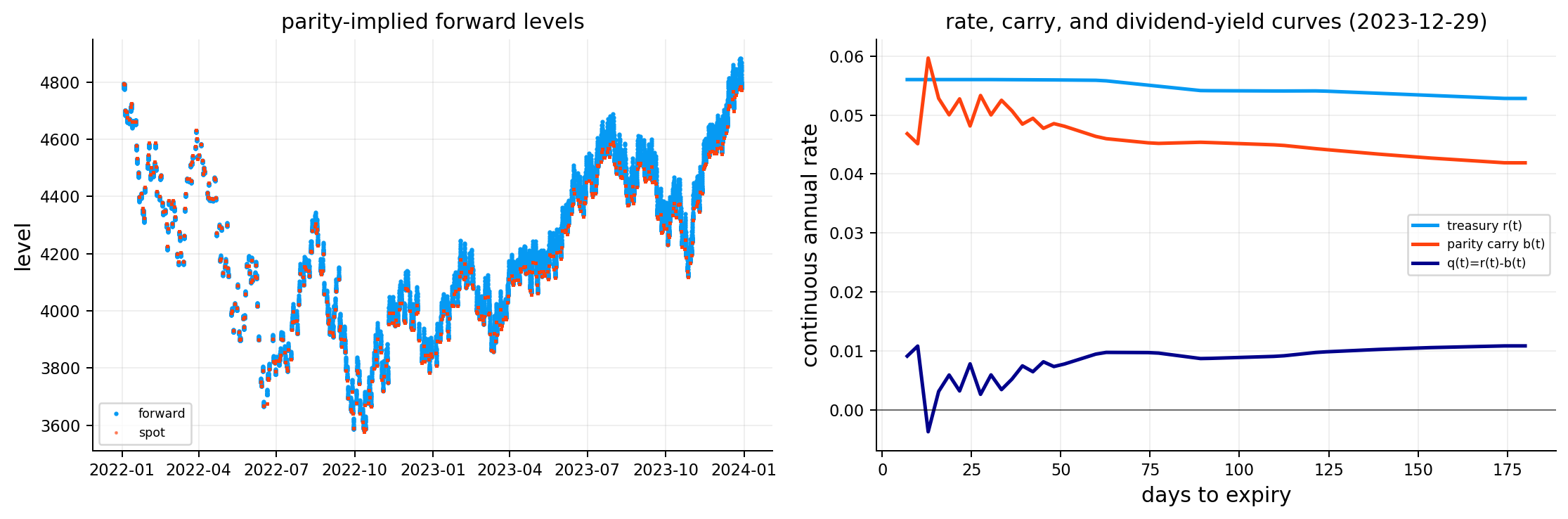
From the forward/carry table, the first maturity on 2022-01-03 has spot around 4,795.57, rate around 0.05%, forward around 4,794.05, and implied carry around \(-1.39\%\) annualized. The forward is extremely close to spot in level terms because the maturity is only about 8 days, but annualizing the small difference still gives a visible carry number.
The forward-vs-spot plot shows that the parity-implied forwards track the spot index closely through time. That’s exactly what we want. If the forward series were jumping far away from spot for short maturities, it would be a warning that parity extraction is broken or the quotes are too noisy.
The rate/carry/dividend-yield plot for the latest date shows three curves:
\(r(T)\), the treasury rate curve,
\(b(T)\), the parity-implied carry curve,
\(q(T)=r(T)-b(T)\), the implied dividend-yield curve.
The economic interpretation is simple but important: the option surface is built in forward space, not raw spot space. Once the forward curve is estimated, a 30-day option and a 150-day option can be placed on the same moneyness language. That makes the later smile and surface plots much cleaner.
4) From Paired Quotes to an Option Market Table
After extracting forwards, we split each call-put pair into two option rows: one call row and one put row. This gives a normal option-market table where every row is one traded option quote with:
date,
expiry,
option type,
spot,
forward,
strike,
time to expiry,
rate,
implied carry,
bid, mid, and ask.
This transformation is useful because implied volatility inversion is done quote by quote. A call and a put at the same strike can both be valid, but they can also disagree slightly because of bid-ask noise. Keeping them as separate rows lets the surface fitting process see both observations and weight them by their quality.
The summary table is already one of the first big checks:
about 2,407,888 option rows,
505 dates,
502 expiries,
exactly half calls and half puts,
maturity range around 7.3 to 179.3 days.
This is a large surface dataset. The size matters because local-volatility estimation is derivative-sensitive. A few thousand quotes on one day are helpful, but the historical part becomes much stronger when we can fit surfaces across 505 trading dates.
We compute implied volatility using a Black-76 style formula because the pricing input is the forward \(F_T\), not just the spot \(S_0\). The call price under Black-76 is:
\[
C = D(T)\left(F_T\Phi(d_1)-K\Phi(d_2)\right)
\]
We solve this for bid, mid, and ask prices. The mid IV is used as the main surface observation, while the bid-ask IV range becomes part of the uncertainty measure later. The LBR-lite solver is fast enough to invert the entire 2.4 million-row option table in about 24 seconds using the accelerated engine.
A useful example: two options can have very different dollar prices but similar IVs. An in-the-money call can cost hundreds of index points because most of its value is intrinsic value. A far out-of-the-money put can cost only a few points. IV removes that mechanical price-level difference and asks, “what volatility would make this price fair?” That is why all later surface work is done in IV or total variance, not raw option price.
5.1 IV existence, bounds, and why failures are meaningful
An implied volatility exists only if the market price sits inside the no-arbitrage price interval. For a forward-discounted call, the basic lower bound is:
\[
C \ge D(T)\max(F_T-K,0)
\]
and the upper bound is:
\[
C \le D(T)F_T
\]
For puts:
\[
P \ge D(T)\max(K-F_T,0)
\]
and:
\[
P \le D(T)K
\]
If a bid, mid, or ask violates these bounds because of stale quotes, rounding, or a very wide market, the IV solver can fail or produce a nonsensical volatility. This is why a few missing IVs are not alarming. They are a data-quality diagnostic.
The sensitivity of IV to price also depends on vega. Newton-style IV solvers rely on the derivative:
When \(\mathcal{V}\) is near zero, the price-volatility curve is almost flat. A tiny price change can imply a huge volatility change. This is common for deep ITM/OTM short-dated options. That is why the project later downweights low-vega observations instead of pretending every inverted IV is equally reliable.
For example, if an option has vega of 2 index points per 100 vol points, a 1-point bid-ask noise can imply a 50-vol-point IV width. But if another option has vega of 500, the same 1-point price noise implies only 0.2 vol points. The surface should trust the second quote more.
5.2 Why we still keep bid, mid, and ask IVs
The mid IV is the main point estimate, but the bid and ask IVs are not wasted. They tell us how uncertain the volatility observation is.
If the bid IV is \(\sigma_{bid}\) and the ask IV is \(\sigma_{ask}\), then the width:
\[
\Delta\sigma_{ba}=\sigma_{ask}-\sigma_{bid}
\]
is a direct market-implied uncertainty band. A tight band means market makers agree fairly closely about the volatility level. A wide band means the quote is less informative.
This matters because a surface fit is not only about location. It is also about confidence. Suppose two options have the same mid IV of 20%, but one has a bid-ask IV width of 0.5 vol points and the other has a width of 20 vol points. Treating them equally would be a serious mistake. The first quote is a strong observation. The second is barely pinned down.
This is also why deep wing quotes can be tricky. They sometimes carry important information about tail pricing, but their bid-ask bands can be huge. We don’t want to delete all of them because then the surface loses tail information. We also don’t want to let them dominate. The weighting system is the compromise.
The root-finding process itself also gives information. If bid IV fails but mid and ask succeed, that often means the bid is near the no-arbitrage floor. If ask IV is extremely high, it can mean the market maker is quoting a protective ask rather than a true fair value. These details are exactly why we carry quality fields into the surface-ready table instead of only saving the final IV column.
The IV output confirms that most quotes invert successfully, but not every price has a clean implied volatility. The IV summary shows:
2,407,888 total rows,
505 dates,
502 expiries,
IV range from about 4.57% to about 100.69% before final surface filtering,
6,460 missing mid IV values.
The missing values are tiny relative to the full dataset, but they are still important. They usually come from quotes near arbitrage bounds, very stale bid/ask combinations, or prices whose implied volatility is outside a stable numerical range.
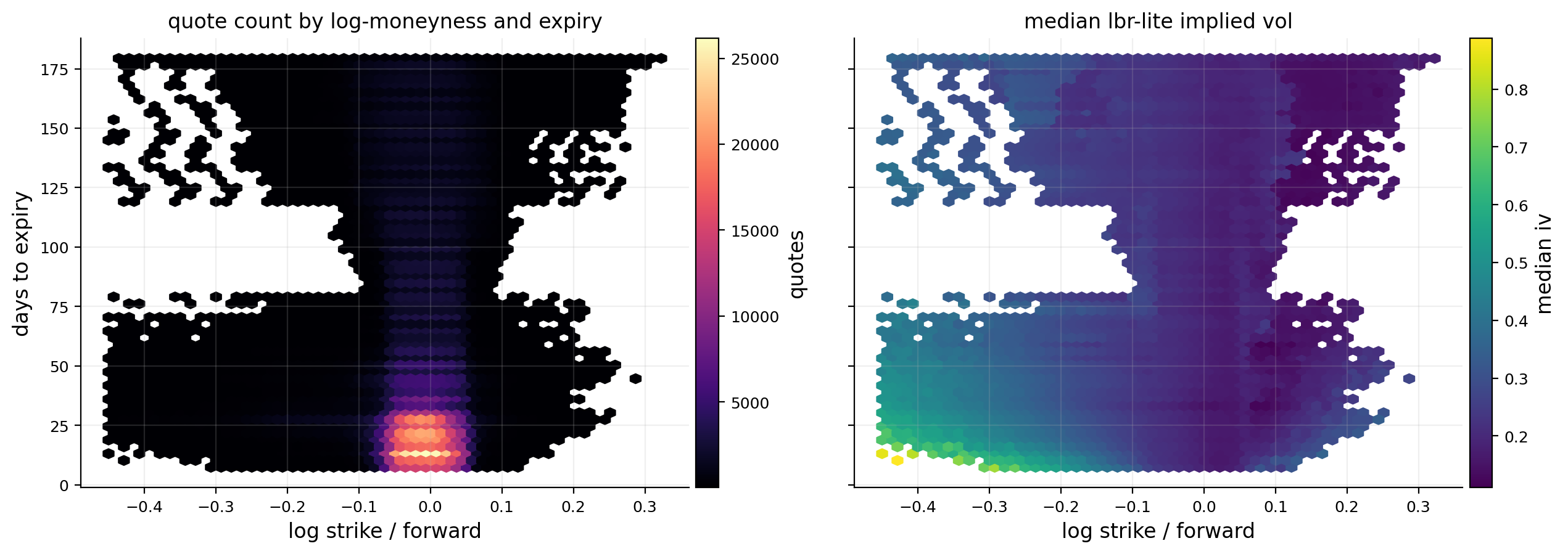
The hexbin coverage plot makes the geometry of the dataset clear. The left panel shows quote density across log-moneyness and maturity. The dataset is densest near the money and in the shorter-to-medium maturity region, which is expected because SPX options trade most heavily near relevant strikes. The right panel shows median implied volatility. The strongest feature is the equity-index skew: downside strikes have higher IV than ATM and upside strikes. This is the market price of crash protection.
The plot also reminds us why we later use a support mask. The surface shouldn’t be trusted equally everywhere. A node inside dense quote support is a market-informed estimate. A node outside the quote cloud is mostly extrapolation.
6) Surface-Ready Quotes and Observation Weights
Raw IV observations still need a surface-cleaning layer. We keep quotes with reasonable IV, maturity, strike, forward, rate, discount factor, and log-moneyness. The main log-moneyness filter is:
\[
-0.40 \le k \le 0.40
\]
This is broad enough to include deep wings, but it removes extreme points that are usually too illiquid for stable surface fitting.
The more interesting part is the observation weight. We don’t want every IV quote to count equally. Some quotes are more informative than others. The weight combines four ideas:
6.1 Bid-ask quality
A quote with a tight relative spread is more reliable than a quote with a wide spread. If:
\[
s_i=\frac{ask_i-bid_i}{mid_i}
\]
then a basic inverse-spread weight is:
\[
w_{spread,i}\propto \frac{1}{s_i^2+c^2}
\]
where \(c\) prevents the weight from exploding when the spread is very small.
6.2 Vega information
Option prices are most sensitive to volatility near the money. The Black-76 dollar vega is roughly:
If vega is tiny, a small price error can create a huge IV error. That is why very deep ITM/OTM options can produce unstable IVs even if their price looks harmless. We give more weight to observations with meaningful vega.
6.3 Wing penalty
Even after filtering, far-wing quotes are less reliable and less dense. We still want them because they define skew and curvature, but we don’t want them to dominate the fit. So we gently penalize observations as \(|k|\) moves far from the center.
6.4 IV uncertainty
When bid, mid, and ask IVs are available, the bid-ask IV width gives a direct uncertainty measure:
\[
u_i = \sigma_{ask,i}-\sigma_{bid,i}
\]
If IV width isn’t available, price spread divided by vega gives an approximate IV uncertainty:
The final observation weight is a clipped and normalized combination of spread quality, vega information, wing penalty, and uncertainty penalty. The goal isn’t to produce a perfect statistical likelihood. The goal is to make the fit listen more to reliable quotes and less to noisy wing quotes.
6.5 What the observation weight is trying to approximate
A formal statistical surface fit would start with a measurement model:
\[
y_i=f(k_i,T_i)+\epsilon_i
\]
where \(y_i\) is observed log total variance or implied volatility, \(f(k_i,T_i)\) is the true smooth surface, and \(\epsilon_i\) is observation noise. If we knew the variance of the noise, the efficient weighted least-squares weight would be:
We don’t know \(\operatorname{Var}(\epsilon_i)\) directly, so we approximate it from market microstructure. Wide spreads, low vega, very far wings, and wide bid-ask IV intervals all imply larger observation noise.
This is why the weight construction combines several imperfect but economically meaningful proxies. The final weight isn’t supposed to be a pure probability model. It is a practical information score.
A useful mental model is:
near-ATM, tight-spread, high-vega options are the surface anchors,
moderately OTM options shape the skew,
far-wing options inform tail behavior but get less authority,
extremely noisy quotes remain in the dataset only if they pass filters, but their weight is small.
This is also why the median weight is normalized to 1. The scale of the weights matters less than their relative values. Weighted least squares only needs the fit to know which observations are more reliable.
The surface-ready table shows how this weighting logic behaves. Some put quotes have very low iv_uncertainty clipped at 0.003 and low observation weights because they are far-wing or low-vega. Some call quotes have much larger IV uncertainty, including values clipped at 0.50, and get low weights.
The final weight summary is sensible:
median relative spread is about 1.48%,
median IV uncertainty is clipped at 0.003,
median dollar vega is around 395,
median observation weight is normalized to 1.0,
95th percentile observation weight is about 2.34.
This is good behavior. The weights aren’t dominated by a few massive values. They give more influence to clean, liquid, informative quotes without completely deleting the wings.
The date-level table shows that recent dates have around 5,500 quotes per day and more than 30 expiries. The latest date, 2023-12-29, has 5,554 surface-ready quotes, 33 expiries, median IV around 11.79%, and a very wide downside log-moneyness range. This is enough coverage for a serious surface fit.
7) Main Date, High-IV Date, and Low-IV Date
We choose three important dates:
main date: 2023-12-29,
high-IV date: 2022-06-13,
low-IV date: 2023-12-14.
The main date is the most recent valid date in the SPX dataset. It has 5,554 quotes, 33 expiries, median IV around 11.79%, and near-ATM median IV around 10.82%. This is a low-volatility end-of-2023 surface.
The high-IV date, 2022-06-13, has near-ATM IV around 31.02%. This sits inside the 2022 inflation/rates shock, when equities were selling off, rates were repricing, and option demand for downside protection was much stronger. This gives us a stress reference.
The low-IV date, 2023-12-14, has near-ATM IV around 10.39%, even lower than the main date. This is the calm end-of-2023 regime after the market had largely priced a more favorable soft-landing/rate-cut path.
We mainly fit and visualize the latest date first, then fit every valid date historically. This order is useful: one date lets us understand the mechanics carefully, while the historical panel lets us ask whether the same features and risks persist through time.
Before fitting a smooth parametric surface, we build a raw PCHIP benchmark. PCHIP stands for piecewise cubic Hermite interpolating polynomial. Its important property is that it tends to preserve the shape of the data better than a standard cubic spline. A standard cubic spline can overshoot between points. PCHIP is more local and less likely to create artificial oscillations.
For one expiry, we have IV observations across log-moneyness. PCHIP gives a smooth curve:
\[
\hat{\sigma}_{PCHIP}(k \mid T_j)
\]
for each observed maturity \(T_j\). Then we interpolate across maturity to get a grid:
\[
\hat{\sigma}_{PCHIP}(k_m,T_n)
\]
This raw benchmark is useful because it stays close to the quote cloud. But it has two weaknesses:
It is built slice-by-slice, so the term structure can be less smooth than a full 2D fit.
It isn’t designed for stable derivatives, especially second derivatives with respect to strike.
That second weakness matters a lot. Dupire local volatility depends on \(\partial_T C\), \(\partial_K C\), and \(\partial_{KK}C\). A raw interpolation can match quotes nicely but explode when differentiated. So we use PCHIP as a visual/diagnostic benchmark, not as the final Dupire input.
8.1 PCHIP as a diagnostic, not a derivative engine
PCHIP is useful because it is local. Between two adjacent strike points, it builds a cubic curve using slope information from neighboring points. Unlike a standard cubic spline, it tries to preserve monotonicity and avoid overshoot. In rough terms, for each interval \([k_i,k_{i+1}]\), PCHIP creates:
The coefficients are chosen so the curve passes through the observed points and has controlled slopes at the knots.
This is good for drawing smiles because it doesn’t create wild oscillations between strikes. But local volatility needs more than a nice curve. It needs stable derivatives of call prices across strike and maturity. PCHIP is only piecewise smooth. Its first derivative is continuous, but higher derivatives can behave less smoothly around knots. Also, when we interpolate maturity slice by slice, the two-dimensional smoothness is not globally controlled.
That is why the raw PCHIP surface is a benchmark. It answers: “what does the quote cloud roughly say?” The B-spline fit answers: “what smooth differentiable surface can we responsibly use for local volatility and Greeks?”
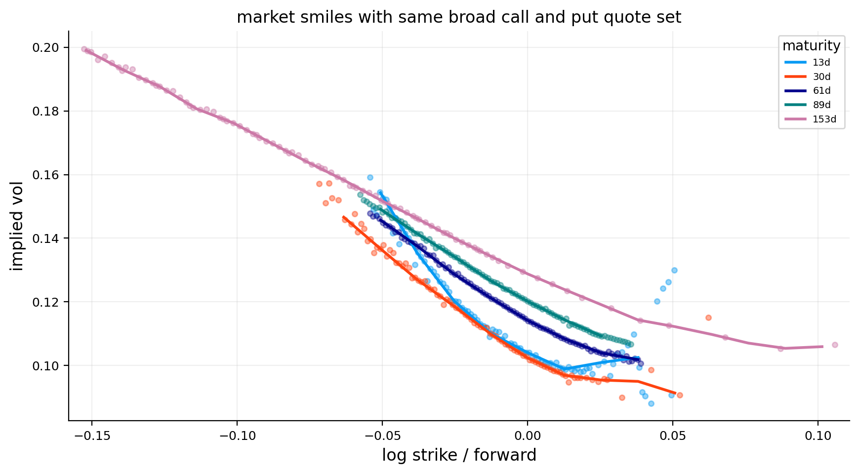
The raw smile plot shows the end-of-2023 SPX skew clearly. Shorter maturities have a steeper left wing: as \(k\) becomes more negative, implied volatility rises quickly. Longer maturities are smoother and less steep.
This is a typical equity-index pattern. Downside crash protection is expensive, especially at shorter maturities where realized jumps matter more. Upside options have lower implied volatility because investors usually don’t pay the same premium for upside convexity as they do for downside insurance.
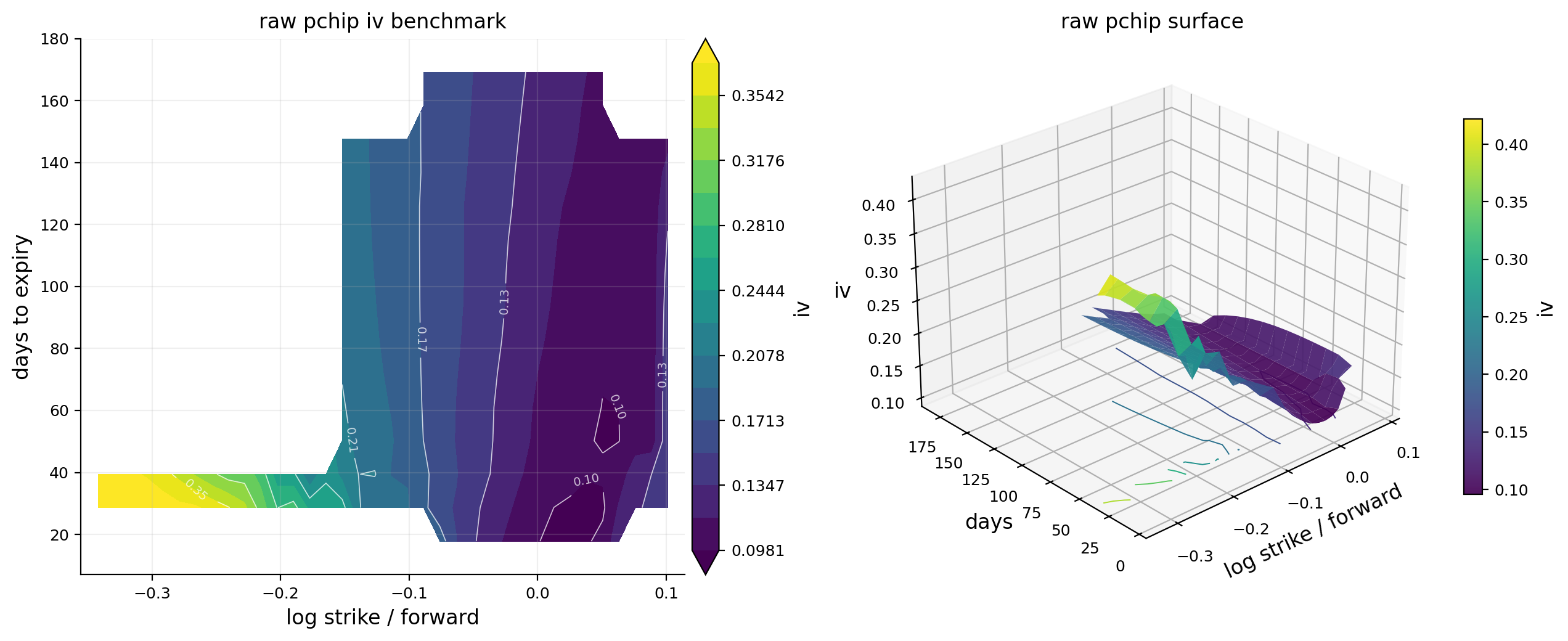
The raw PCHIP surface plot is useful but also shows the limitation. The surface exists only where we have quote support. There are blank or unstable regions away from the dense quote cloud. The 3D view makes the left-wing wall obvious: IV climbs sharply as strikes move below forward.
For teaching, this is the simplest way to see why a volatility surface isn’t just a line. At one maturity, we have a smile. Across maturities, those smiles stack into a surface. The shape in the \(k\) direction tells us about skew and crash insurance. The shape in the \(T\) direction tells us about the term structure of uncertainty.
9) Fitting the Surface on Log Total Variance
Now we move from raw interpolation to a smooth fitted surface. Instead of fitting implied volatility directly, we fit log total variance:
\[
w(k,T)=\sigma_{imp}^2(k,T)T
\]
and:
\[
\ell(k,T)=\log w(k,T)
\]
There are two reasons this is a better target:
Positivity
Total variance must be positive. If we model \(\ell(k,T)\) and then exponentiate, we automatically get:
This avoids negative fitted variances, which can happen if we fit raw variance with a flexible smoother.
Better maturity behavior
For short maturities, IV can move a lot because \(T\) is small. Total variance often behaves more smoothly than volatility itself because it accumulates variance through time. A one-month implied vol and a six-month implied vol aren’t directly comparable in variance units unless we multiply by time.
For example, 20% IV for one month has total variance:
\[
0.20^2\times\frac{1}{12}=0.00333
\]
while 20% IV for six months has total variance:
\[
0.20^2\times\frac{1}{2}=0.02000
\]
Same IV, different total uncertainty. Fitting \(w(k,T)\) respects that difference.
9.1 Total variance and calendar-arbitrage intuition
Total variance is also tied to no-arbitrage logic. For the same strike/moneyness region, longer maturities should generally contain at least as much total uncertainty as shorter maturities. In a simplified setting, this means:
\[
\frac{\partial w(k,T)}{\partial T}\ge 0
\]
where \(w(k,T)=\sigma^2(k,T)T\).
This doesn’t mean implied volatility itself must always rise with maturity. IV can fall while total variance rises. For example:
1-month IV: 30%, total variance \(0.30^2\times\frac{1}{12}=0.0075\),
6-month IV: 20%, total variance \(0.20^2\times\frac{1}{2}=0.0200\).
The 6-month IV is lower, but total variance is higher. That can be perfectly reasonable. A short-term event can make front IV high while longer maturities have lower annualized IV. But the longer option still contains more total variance because it spans more time.
This is why fitting log total variance is cleaner than fitting IV directly. It aligns the fitted object with maturity accumulation. It doesn’t guarantee no calendar arbitrage by itself, but it makes the target more natural.
In local-volatility work, this point becomes critical. Dupire’s numerator is closely related to how option prices and total variance evolve with maturity. If fitted total variance wiggles downward because of noisy quotes, local variance can become negative even if IV levels look visually plausible.
10) Tensor-Product Cubic B-Splines
The smooth surface is represented with B-spline basis functions in both directions. In the log-moneyness direction, define basis functions:
The coefficients \(\beta_{ij}\) form a matrix \(B\) of size \(n_k\times n_T\). The tensor-product structure means each basis component is local in both strike and maturity. One coefficient affects a patch of the surface, not the entire surface.
This is important because volatility surfaces have local shape. The left wing can be steep while the right wing is flat. The short maturities can be curved while long maturities are smoother. A global polynomial would struggle with that because changing one coefficient can distort the whole surface.
For a quote \(m\) at \((k_m,T_m)\), the fitted value is:
In matrix form, if \(X\) is the design matrix and \(\beta\) is the vectorized coefficient matrix, then:
\[
\hat{\ell}=X\beta
\]
This gives us a standard weighted regression problem, but with a special smoothness penalty.
10.1 Why tensor-product splines are a good compromise
A volatility surface has two axes, but the axes behave differently. The strike direction captures skew and smile curvature. The maturity direction captures term structure. A tensor-product spline lets us control both directions separately.
If \(B_i(k)\) is local in strike and \(A_j(T)\) is local in maturity, then the product:
\[
B_i(k)A_j(T)
\]
is active only in a local patch of the surface. This gives flexibility without turning the fit into a high-degree global polynomial.
For example, suppose the front-end downside wing is unusually steep on a stress date. We want the fit to bend in the short-maturity, low-strike region without forcing the entire six-month surface to bend the same way. Tensor-product B-splines can do that because the coefficient controlling that region is local.
The number of basis functions controls flexibility. More basis functions mean the surface can follow local details. Fewer basis functions mean the surface is smoother but less adaptive. The penalty terms then control how much the coefficients are allowed to bend across neighboring basis functions.
This two-layer design is powerful:
Basis size controls maximum flexibility.
Penalty strength controls how much of that flexibility we actually use.
That is more stable than simply choosing a very small basis or a very large basis with no penalty.
11) Penalized Weighted Least Squares
The fitted coefficients solve a penalized weighted least-squares problem:
\(y_m=\log(\sigma_m^2T_m)\) is observed log total variance,
\(x_m\) is the spline basis row for quote \(m\),
\(w_m\) is the observation weight from quote quality,
\(D_k\) applies second-difference penalties across log-moneyness,
\(D_T\) applies second-difference penalties across maturity,
\(\lambda_k\) controls smoothness in the strike direction,
\(\lambda_T\) controls smoothness in the maturity direction.
The second-difference penalty is the discrete version of penalizing curvature. If the coefficient surface bends too much, the penalty increases. A high \(\lambda_k\) makes the smile smoother across strike. A high \(\lambda_T\) makes the term structure smoother across maturity.
There is a real tradeoff here:
If \(\lambda\) is too small, the surface follows noise and derivatives become unstable.
If \(\lambda\) is too large, the surface is too flat and misses real skew/curvature.
For local volatility, smoothness matters more than visual closeness. A tiny wiggle in IV can become a huge spike in \(\partial_{KK}C\). So we fit two surfaces:
Visual surface: closer to market IV, useful for plots and shape summaries.
Dupire surface: smoother, slightly less close to quotes, but safer for derivatives.
This separation is one of the strongest design choices in the project. We don’t pretend one fit is best for everything.
11.1 The normal equations behind the fit
The penalized objective can be written compactly. Let \(W\) be the diagonal matrix of observation weights, \(X\) the spline design matrix, \(y\) the vector of observed log total variance, and \(P\) the combined penalty matrix:
\[
P=\lambda_kP_k+\lambda_TP_T
\]
where \(P_k\) penalizes bending across strike coefficients and \(P_T\) penalizes bending across maturity coefficients. Then the objective is:
Taking the derivative with respect to \(\beta\) and setting it to zero gives:
\[
(X^\top WX+P)\beta=X^\top Wy
\]
So the fitted coefficients are:
\[
\hat{\beta}=(X^\top WX+P)^{-1}X^\top Wy
\]
This equation is helpful because it shows exactly how smoothing works. The data term \(X^\top WX\) asks the surface to match quotes. The penalty term \(P\) adds curvature resistance. If \(P\) is zero, we get ordinary weighted least squares. If \(P\) is very large, the surface becomes very smooth because bending coefficients becomes expensive.
In practice, we solve the linear system rather than explicitly inverting the matrix. That is numerically safer.
11.2 How the two penalties change the financial surface
The strike penalty and maturity penalty have different financial meanings.
The strike penalty controls how aggressively the smile can bend. A low \(\lambda_k\) allows sharp skew changes and local wiggles across strikes. That can help match far-wing quotes, but it can also create unstable densities because \(C_{KK}\) becomes noisy. A high \(\lambda_k\) makes the smile smoother, but it can underfit real crash-risk pricing.
The maturity penalty controls how quickly the term structure can change. A low \(\lambda_T\) allows the surface to jump between expiries. That can match event-specific expiries, but it can create unstable \(\partial_TC\). A high \(\lambda_T\) makes maturity evolution smoother, but it can blur real event risk.
For SPX, event risk is usually less concentrated than single-stock earnings, so stronger maturity smoothing is acceptable. For BTC, event and liquidity effects can be sharper, so the secondary library settings use different smoothness parameters.
A good surface fit therefore isn’t the one with the smallest RMSE. The best derivative surface is the one that balances:
That is why the Dupire candidate selection includes invalid local-vol nodes, extreme ratios, and density problems. We choose smoothing based on the downstream task, not only the in-sample fit error.
The Dupire surface is selected from a small grid of smoothness pairs \((\lambda_k,\lambda_T)\). For each candidate, we check both fit error and local-volatility stability. The candidate table reports:
weighted RMSE,
hard invalid share,
negative density share,
extreme local-vol-to-implied-vol ratio share,
total flagged share,
median absolute deviation of local vol from implied vol,
a selection score.
The best candidate uses \(\lambda_k=90\) and \(\lambda_T=130\). It has the lowest weighted RMSE among the candidate set, about 0.00549, and the lowest total flagged share, about 4.52%. More smoothing increases the weighted RMSE and doesn’t reduce invalid nodes enough to justify the worse fit.
The visual and Dupire fit table shows the expected tradeoff:
visual weighted RMSE: about 0.00503,
Dupire weighted RMSE: about 0.00549,
both use 5,554 quotes and 33 maturities,
both have p95 absolute IV error around 0.0186.
So the smoother Dupire surface pays a small fit-error cost for more stable derivatives. That’s exactly what we want. If a smoother surface had much worse p95 error, it would be too detached from market quotes. Here the loss is modest.
The grid check also shows both fitted grids are finite across supported nodes, and the JAX-vs-NumPy surface evaluation check has max absolute difference 0.0. That means the automatic-differentiation version of the spline is numerically consistent with the NumPy evaluation used elsewhere.
12.1 Why visual fit and Dupire fit are both needed
It might seem inefficient to keep two fitted surfaces, but they serve different purposes.
The visual fit should be close enough to the market to explain the surface shape. If a trader looks at the 30-day smile, the visual fit should represent the quote cloud clearly. Residuals should be small in the liquid center, and the wings should follow the broad market pattern.
The Dupire fit should be safe enough to differentiate. Local volatility cares about:
not only about \(\sigma(k,T)\). A small oscillation that barely changes IV RMSE can completely change \(\partial_{KK}C\). So a slightly smoother fit can be much better for Dupire even if it is a little worse visually.
This is a common pattern in quantitative finance. The estimator used for visualization isn’t always the estimator used for risk. A visually detailed surface can overfit microstructure noise. A risk surface needs to be more regularized.
The output confirms this tradeoff. The visual fit has lower weighted RMSE, but the Dupire fit is only slightly worse and is selected for lower derivative stress. That is the right kind of compromise.
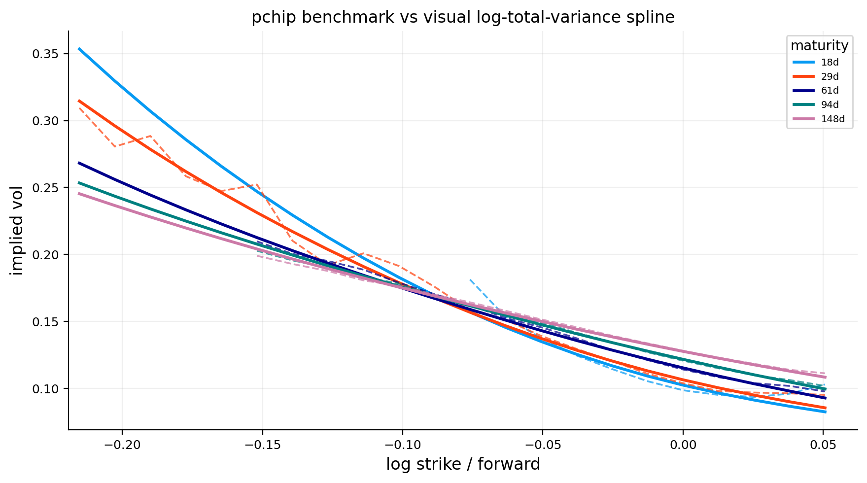
The PCHIP-vs-spline plot compares raw market smiles with the smooth visual log-total-variance spline. The smoother curves track the broad market shape but don’t chase every local wiggle.
The most obvious feature is the steep downside wing. At short maturities, the fitted IV at \(k\approx -0.20\) is much higher than ATM IV. Across longer maturities, the smile becomes flatter, but the left wing remains above the center. This is the persistent equity-index skew.
The fitted surface doesn’t exactly match every raw point. That’s a feature, not a bug. If we force the surface through every noisy quote, the first derivative and second derivative become unreliable. The goal is not perfect quote interpolation. The goal is a statistically defensible surface that keeps the economically meaningful shape and filters microstructure noise.
13) Residual Diagnostics
After fitting the surface, we study residuals:
\[
e_m=\sigma_{mkt,m}-\hat{\sigma}(k_m,T_m)
\]
A residual near zero means the fitted surface matches the market quote well. A positive residual means the market quote has higher IV than the fit. A negative residual means the fit is above the market quote.
Residual diagnostics matter for two reasons:
They show whether the surface is systematically biased in a region.
They reveal where quote quality or surface smoothness is causing trouble.
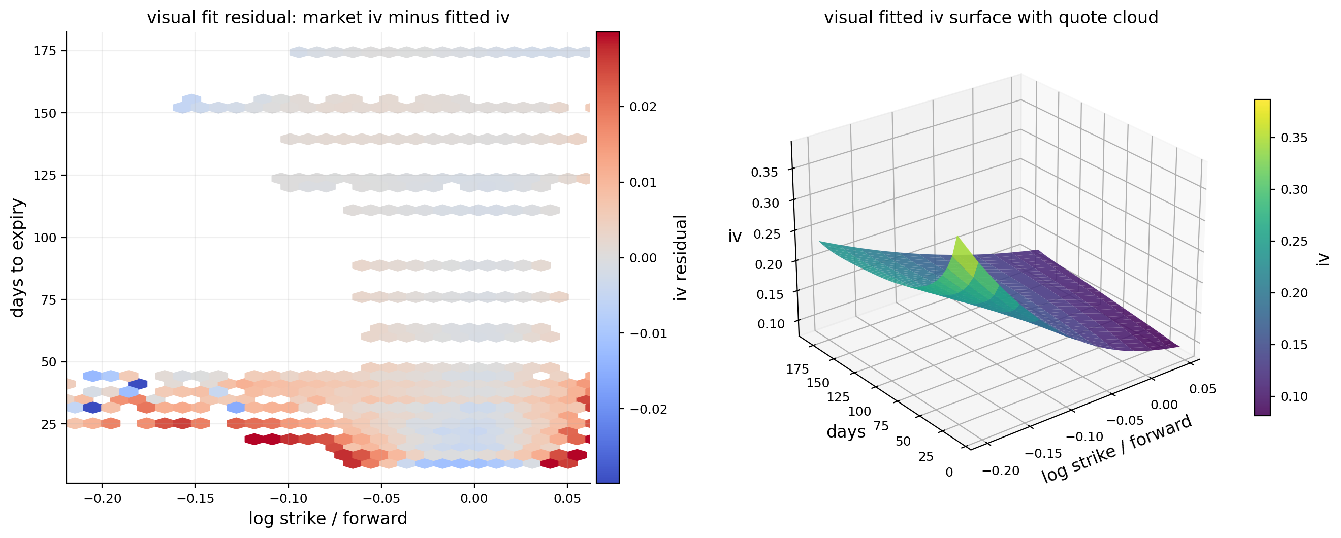
The residual heatmap shows market IV minus fitted IV across log-moneyness and maturity. Most of the dense central region is close to zero, which is good. The strongest residuals are in the far downside wing and near sparse parts of the surface.
The largest residual table makes this very clear. Many of the worst residuals are around strike 3,400 on 2023-12-29, with \(k\approx -0.343\) and maturities around 26 to 44 days. Market IV is around 38% to 45%, while the fitted surface is above 50% or 60%. These are deep downside strikes. The model is smoothing the wing upward relative to some individual quotes.
This shouldn’t be interpreted as the whole fit failing. It means the far-left wing contains difficult points: some puts and calls disagree, spreads can be large, and smoothness constraints pull the wing into a coherent shape. For local vol, we’d rather have a slightly biased wing than a jagged wing that creates negative densities.
display(pd.DataFrame([fit_metrics(fit_visual, q_main, "visual"), fit_metrics(fit_dupire, q_main, "dupire")]))q_fit["maturity_bucket"] = pd.cut(q_fit["dte_days"], bins=[7, 21, 45, 90, 180], labels=["7-21d", "21-45d", "45-90d", "90-180d"], include_lowest=True)fig, axes = plt.subplots(1, 2, figsize=(12.6, 4.5))bucket_names = [x for x in q_fit["maturity_bucket"].cat.categories if (q_fit["maturity_bucket"] == x).any()]vals = [q_fit.loc[q_fit["maturity_bucket"].eq(x), "residual_visual"].dropna().to_numpy() for x in bucket_names]axes[0].boxplot(vals, labels=[str(x) for x in bucket_names], showfliers=False)axes[0].axhline(0.0, color="black", lw=0.9)axes[0].set_title("visual-fit residuals by maturity bucket")axes[0].set_xlabel("maturity bucket")axes[0].set_ylabel("iv residual")q_fit["k_bin"] = pd.cut(q_fit["k"], bins=np.linspace(-0.40, 0.40, 17), include_lowest=True)rb = q_fit.groupby("k_bin", observed=False).agg( k_mid=("k", "median"), mean_residual=("residual_visual", "mean"), q25=("residual_visual", lambda x: np.nanquantile(x, 0.25)), q75=("residual_visual", lambda x: np.nanquantile(x, 0.75)),).dropna()axes[1].plot(rb["k_mid"], rb["mean_residual"], marker="o", lw=2.0)axes[1].fill_between(rb["k_mid"], rb["q25"], rb["q75"], alpha=0.20)axes[1].axhline(0.0, color="black", lw=0.9)axes[1].set_xlim(max(float(rb["k_mid"].min()), limits_main["k_lo"]), min(float(rb["k_mid"].max()), limits_main["k_hi"]))axes[1].set_title("visual-fit wing bias by log-moneyness")axes[1].set_xlabel("log strike / forward")axes[1].set_ylabel("iv residual")plt.tight_layout()plt.show()display(q_fit.assign(abs_residual=lambda x: x["residual_visual"].abs()).sort_values("abs_residual", ascending=False)[["date", "expiry", "option_type", "strike", "k", "dte_days", "iv_mid", "fit_iv_visual", "fit_iv_dupire", "residual_visual", "residual_dupire", "iv_uncertainty"]].head(12))
fit
date
quote_count
number_of_maturities
rmse
weighted_rmse
mae
median_absolute_error
p95_absolute_error
mean_residual
residual_std
k_min
k_max
min_dte
max_dte
0
visual
2023-12-29
5554
33
0.010989
0.005030
0.004965
0.002258
0.018665
0.001035
0.010941
-0.344795
0.117917
9.333333
174.333333
1
dupire
2023-12-29
5554
33
0.011624
0.005491
0.005490
0.002750
0.018626
0.000829
0.011594
-0.344795
0.117917
9.333333
174.333333
date
expiry
option_type
strike
k
dte_days
iv_mid
fit_iv_visual
fit_iv_dupire
residual_visual
residual_dupire
iv_uncertainty
2404433
2023-12-29
2024-01-25
put
3,400.000000
-0.342951
26.333333
0.453259
0.618881
0.627676
-0.165622
-0.174417
0.012389
2404964
2023-12-29
2024-01-30
call
3,400.000000
-0.343128
31.333333
0.419128
0.578432
0.587752
-0.159304
-0.168623
0.500000
2404965
2023-12-29
2024-01-30
put
3,400.000000
-0.343128
31.333333
0.423619
0.578432
0.587752
-0.154813
-0.164133
0.014764
2405269
2023-12-29
2024-02-01
put
3,400.000000
-0.343818
33.333333
0.418148
0.567007
0.576614
-0.148859
-0.158466
0.008424
2405852
2023-12-29
2024-02-07
call
3,400.000000
-0.344244
39.333333
0.385966
0.533230
0.543225
-0.147265
-0.157260
0.500000
2404432
2023-12-29
2024-01-25
call
3,400.000000
-0.342951
26.333333
0.475398
0.618881
0.627676
-0.143483
-0.152278
0.500000
2405753
2023-12-29
2024-02-06
put
3,400.000000
-0.344106
38.333333
0.397564
0.538062
0.547987
-0.140498
-0.150423
0.006863
2405853
2023-12-29
2024-02-07
put
3,400.000000
-0.344244
39.333333
0.394289
0.533230
0.543225
-0.138941
-0.148936
0.009881
2406131
2023-12-29
2024-02-12
put
3,400.000000
-0.344795
44.333333
0.377801
0.511296
0.521563
-0.133495
-0.143762
0.008351
2405268
2023-12-29
2024-02-01
call
3,400.000000
-0.343818
33.333333
0.466613
0.567007
0.576614
-0.100394
-0.110001
0.312205
2404072
2023-12-29
2024-01-23
call
3,700.000000
-0.257632
24.333333
0.309178
0.403774
0.401167
-0.094595
-0.091988
0.500000
2403708
2023-12-29
2024-01-18
call
5,300.000000
0.102142
19.333333
0.156919
0.068783
0.065167
0.088136
0.091751
0.005993
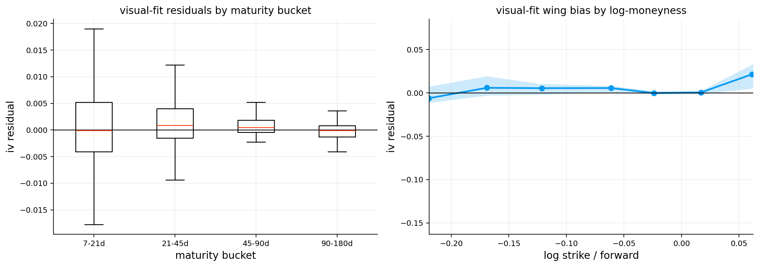
The residual boxplot by maturity shows that most residuals are tight around zero in all maturity buckets, but the short end has wider tails. That’s natural. Short-dated options are more sensitive to small price errors because \(T\) is small. A few cents or index points of price noise can produce a big IV difference.
The wing-bias line shows how residuals behave across log-moneyness. The central region is relatively well behaved. Bias becomes more visible in the wings, especially where quote support becomes thinner.
A useful way to think about the tradeoff is:
The middle of the surface is quote-rich and highly liquid, so the fit can be close. The wings are quote-poor and derivative-sensitive, so the fit has to be more conservative.
This is exactly why we keep support masks and separate visual and Dupire fits. A surface can be used for interpretation inside support, but we should be careful about reading too much into extrapolated or very far-wing nodes.
14) Surface Shape Features: ATM Level, Skew, Curvature, and Term Slope
Once we have a fitted surface, we can summarize its shape with economically meaningful features. We evaluate IV at three log-moneyness points:
These features translate the surface into financial language. ATM IV measures general uncertainty. Downside skew measures crash-protection premium. Curvature measures how smile-shaped the distribution is. Term slope measures whether near-term or longer-term uncertainty is more expensive.
The shape table for 2023-12-29 is economically rich.
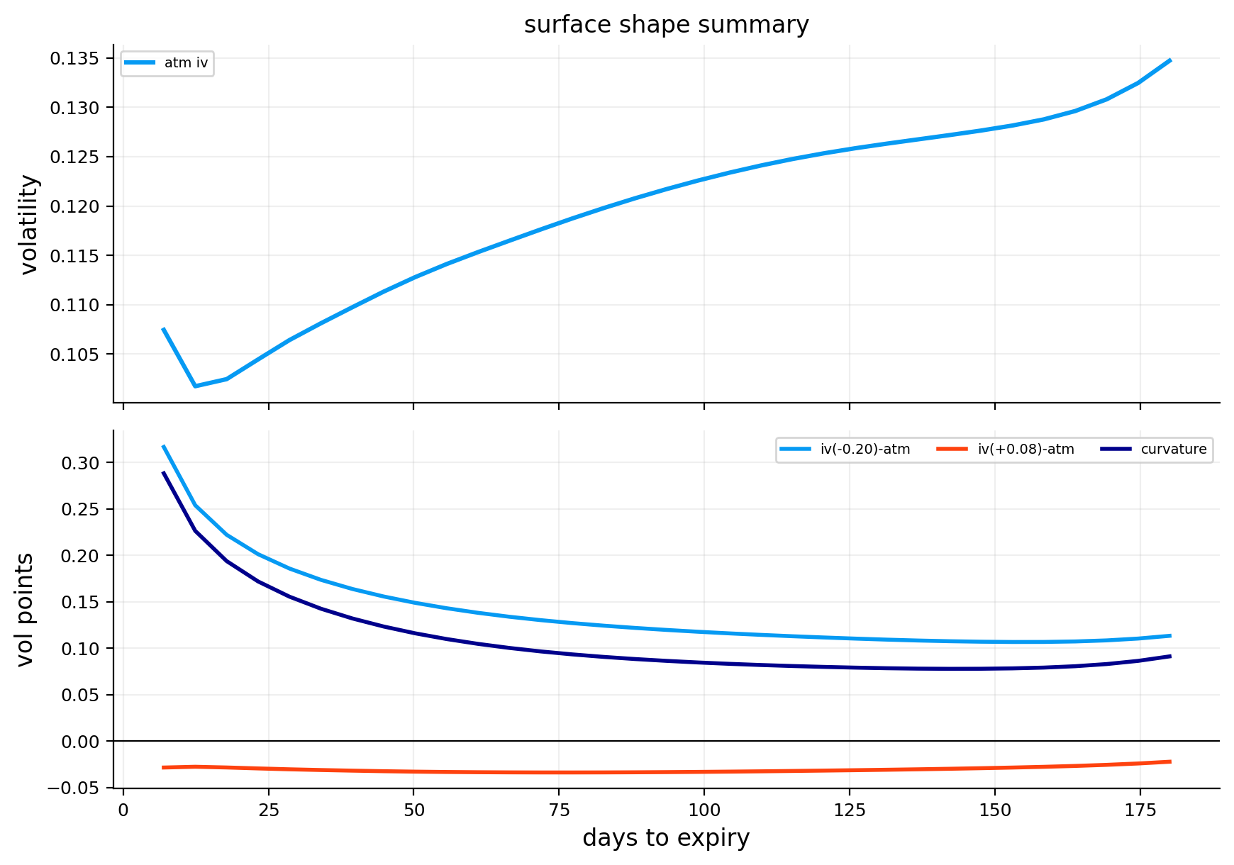
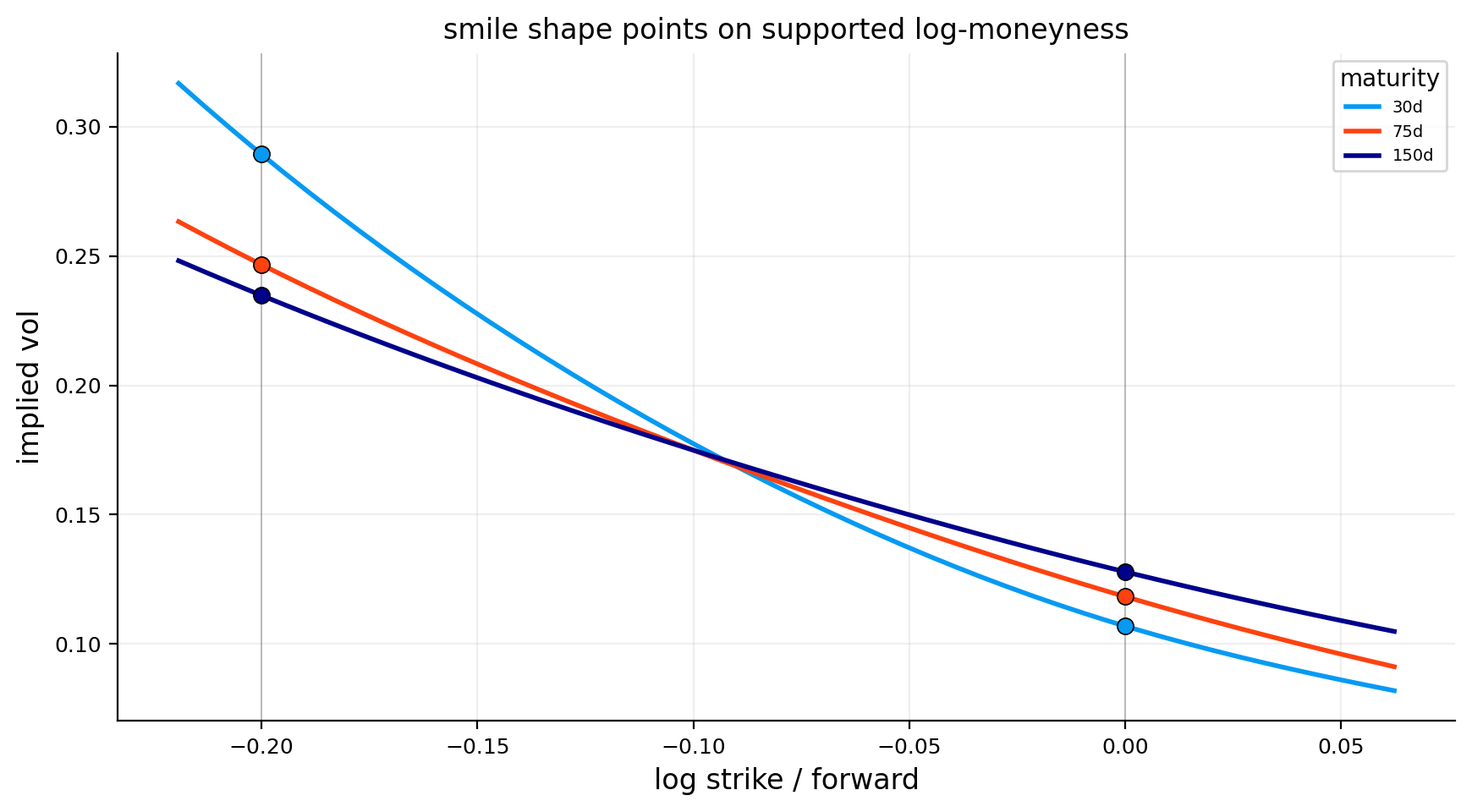
At 7 days, ATM IV is about 10.74%, but downside skew is enormous at about 31.68 vol points. That means the \(k=-0.20\) left-wing point is priced around 42% IV. Upside skew is negative, around -2.84 vol points, so upside calls are cheaper in IV than ATM options.
As maturity increases, the downside skew falls:
around 18.59 vol points at 28.6 days,
around 13.03 vol points at 71.9 days,
around 11.34 vol points at 180 days.
This is a classic short-dated crash-skew structure. Near-term deep downside protection is very expensive because short-dated crashes are discontinuous and hard to hedge. Longer-dated protection is still expensive, but the skew is smoother because more time allows uncertainty to spread across scenarios.
The ATM term structure is mildly upward-sloping. ATM IV rises from around 10.7% at 7 days to about 13.5% at 180 days. That tells us short-term realized-vol expectations were calm at the end of 2023, while longer maturities still priced some medium-term uncertainty.
The shape-point smile plot reinforces the same reading: all maturities slope downward from left to right, and the short maturity has the steepest left wing. This is not symmetric volatility. It is strongly downside-asymmetric volatility.
15) Surface Derivatives from Log Total Variance
For local volatility and surface-aware Greeks, we need derivatives. Since we fit:
The \(-1/(2T)\) term appears because IV is total variance divided by time. Even if total variance rises smoothly, the volatility level can change sharply near short maturities because of the division by \(T\).
The code rescales these derivatives into intuitive units:
slope for a 1% log-moneyness move: \(0.01\,\partial_k\sigma\),
curvature for a 1% squared move: \(0.01^2\,\partial_{kk}\sigma\),
term change for 30 calendar days: \((30/365.25)\,\partial_T\sigma\).
This scaling makes the derivative plots readable. Instead of showing abstract derivative units, we show approximate IV changes for practical moves.
15.1 Interpreting derivative units with a concrete move
The raw derivative \(\partial_k\sigma\) can be hard to read because \(k\) is a log variable. A one-unit move in \(k\) would be enormous. So we scale it to a 1% log-moneyness move.
If:
\[
\partial_k\sigma=-0.80
\]
then a 1% increase in log-moneyness gives approximately:
\[
\Delta\sigma\approx -0.80\times 0.01=-0.008
\]
That is a decrease of 0.8 vol points. If the current IV is 12%, it moves to about 11.2% for that local move.
For curvature, the scaled quantity is:
\[
\partial_{kk}\sigma\times(0.01)^2
\]
This tells us the second-order change for a small squared move in log-moneyness. It is usually much smaller than slope, but it matters a lot for gamma and density because second derivatives enter both option convexity and local-vol calculations.
For maturity, the scaled quantity:
\[
\partial_T\sigma\times\frac{30}{365.25}
\]
means “approximate IV change from extending maturity by 30 calendar days.” This is much easier to interpret than raw annualized derivative units.
Show code
k_plot_lo =max(limits_main["k_lo"], -0.22)k_plot_hi =min(limits_main["k_hi"], 0.08)k_shape_plot = np.linspace(k_plot_lo, k_plot_hi, 48)shape_marks = np.array([shape_k_down, shape_k_atm, shape_k_up], dtype=float)shape_marks = shape_marks[(shape_marks >= k_plot_lo) & (shape_marks <= k_plot_hi)]fig, ax = plt.subplots(figsize=(8.8, 4.9))for n, day inenumerate([30, 75, 150]): tau = day / ann_days y = iv_points(fit_visual, k_shape_plot, np.full_like(k_shape_plot, tau)) ax.plot(k_shape_plot, y, lw=2.0, color=lab_colors[n], label=f"{day}d")iflen(shape_marks): mark_y = iv_points(fit_visual, shape_marks, np.full_like(shape_marks, tau)) ax.scatter(shape_marks, mark_y, s=48, color=lab_colors[n], edgecolor="black", linewidth=0.6, zorder=4)for x in shape_marks: ax.axvline(x, color="black", lw=0.7, alpha=0.22)ax.set_title("smile shape points on supported log-moneyness")ax.set_xlabel("log strike / forward")ax.set_ylabel("implied vol")ax.legend(title="maturity")plt.tight_layout()plt.show()
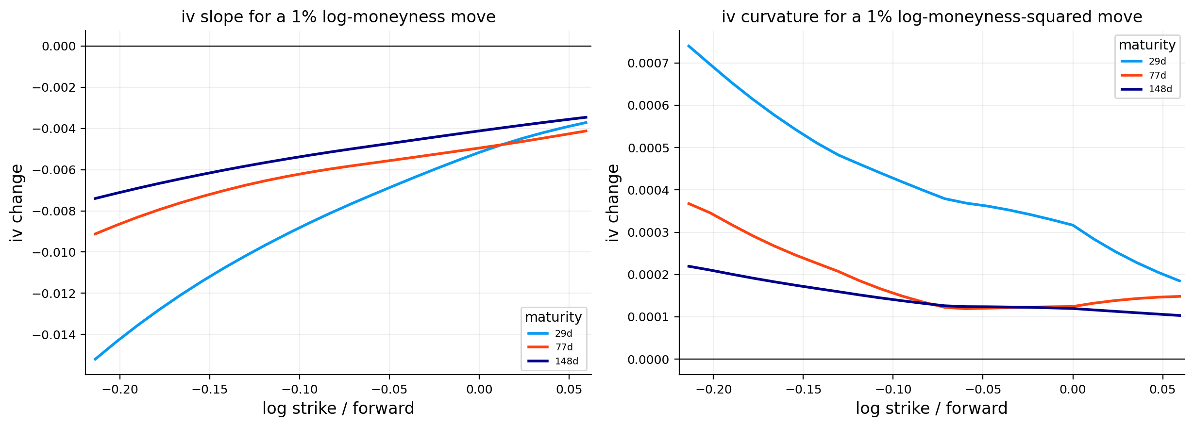
The derivative plots show the anatomy of the surface.
The slope plot is negative across most of the supported range, especially in the downside region. This means IV decreases as we move from downside strikes toward upside strikes. The front maturity has the strongest slope because the short-dated smile is steepest.
The curvature plot is positive in much of the downside/middle region and declines toward the right wing. Positive curvature means the smile bends upward, not just slopes downward. This is what makes the surface a smile/skew rather than a straight line.
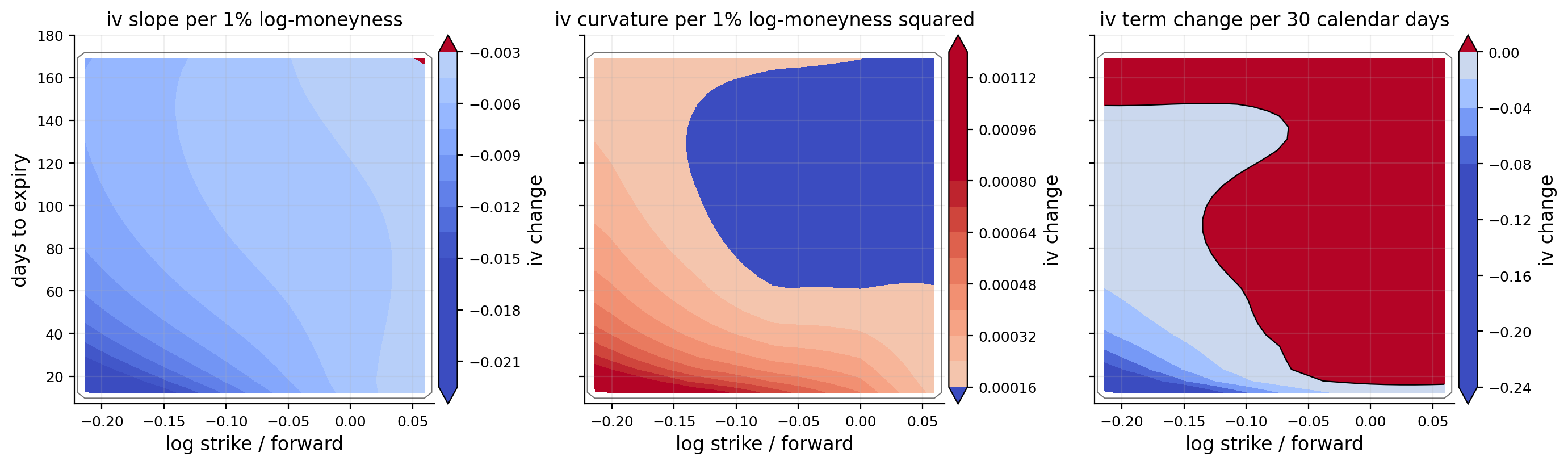
The contour maps add the maturity dimension. The slope map shows that the strongest negative slope sits near short-to-medium maturities and lower strikes. The curvature map shows where the surface bends most. The term-change map shows how IV changes when maturity increases by about one month. On this date, the term structure is not uniform: some strike regions gain more IV with maturity than others.
These derivative maps are not only descriptive. They are the bridge to Dupire and Greeks. If the derivative maps were jagged or filled with sign flips, local volatility would be unstable. Here the derivative fields are smooth enough to continue.
16) Dupire Local Volatility Theory
Now we move from an implied-volatility surface to a local-volatility surface. The local-vol model assumes the underlying follows:
\(\sigma_{loc}(S_t,t)\) is volatility as a deterministic function of spot and time,
\(W_t\) is Brownian motion.
This is different from Black-Scholes. In Black-Scholes, volatility is constant. In local volatility, volatility changes depending on where the underlying is and how much time has passed.
The key Dupire result is that if we know a smooth, arbitrage-free surface of call prices \(C(K,T)\), we can recover the local variance at strike and maturity:
This is the time-and-carry part. \(\partial C/\partial T\) measures how the call price changes as we extend maturity. The \(qC\) and \((r-q)K\partial_KC\) terms adjust for rates, dividends, and forward drift.
where \(f_Q(K,T)\) is the risk-neutral density of \(S_T\) at strike \(K\). A valid option surface must be convex in strike, so this second derivative should be nonnegative. If it becomes negative, the surface implies negative probability density, which is economically impossible.
So Dupire is extremely sensitive. It divides one derivative expression by another. Small noise in the option surface can turn into large local-vol spikes.
16.1 Deriving the intuition from the pricing PDE
The Dupire formula is easier to understand if we start from the idea that option prices must be consistent with a diffusion model. In a local-vol world, the risk-neutral dynamics are:
\[
dS_t=(r-q)S_tdt+\sigma_{loc}(S_t,t)S_tdW_t
\]
A derivative price \(V(S,t)\) satisfies the backward pricing PDE:
That is the usual option-pricing PDE written in spot-time variables. Dupire flips the problem. Instead of asking how the option price changes as current spot changes, we look at the whole surface of option prices across strikes and maturities. The call price \(C(K,T)\) contains information about the distribution of \(S_T\) under the risk-neutral measure.
The second strike derivative gives the density:
\[
\partial_{KK}C(K,T)=D(T)f_Q(K,T)
\]
The maturity derivative tells us how the distribution evolves through time. Combining those relationships gives the forward equation version of the pricing PDE, and solving it for \(\sigma_{loc}^2(K,T)\) gives Dupire.
So the formula is not magic. It says: if the whole cross-section of option prices is produced by a diffusion with state-dependent volatility, then the local variance needed at each strike/maturity is determined by how call prices curve across strike and evolve across maturity.
A simple example makes Dupire easier to understand. Suppose downside puts are very expensive, so the left wing of implied volatility is steep. The market is saying: “if the index falls, volatility is likely higher.” A local-vol model translates that into a state-dependent volatility function where \(\sigma_{loc}(S,t)\) is higher at lower spot levels.
That is why local volatility often sits above implied volatility in the downside region. Implied vol is an average volatility over paths ending at a strike. Local vol is more like the instantaneous volatility the process needs at that future spot state to reproduce the entire option surface.
This distinction matters:
Implied volatility is quote-by-quote average volatility.
Local volatility is a model-implied instantaneous volatility map.
They are related, but they aren’t equal. A high local-vol-to-IV ratio means the surface requires strong state-dependent volatility in that region.
16.2 Local volatility and path dependence of the calibration
A local-vol model is calibrated so that it matches today’s vanilla option prices. That doesn’t mean it predicts future implied volatility dynamics correctly. It gives a diffusion process whose one-time marginal distributions match the current option surface.
Mathematically, vanilla prices tell us about the distribution of \(S_T\) for each maturity \(T\). The local-vol function is one way to build a Markov diffusion whose transition densities match those distributions.
This is why local vol is often called a static arbitrage calibration model. It matches today’s surface across strikes and maturities, but it doesn’t include stochastic volatility as a separate risk factor. If tomorrow’s entire implied-vol surface jumps up while spot barely moves, a pure local-vol model doesn’t naturally explain that as a new volatility state variable. It has to be recalibrated.
For this project, that limitation is acceptable because we’re using local volatility as a surface diagnostic and risk tool, not as a full trading model. The useful question is:
What kind of state-dependent volatility is implied by today’s option surface if we force a local-vol diffusion to match it?
That answer is still informative, especially when we compare local vol to implied vol and measure where the ratio becomes extreme.
16.3 Reading Dupire through total variance intuition
Dupire is implemented through differentiated call prices, but it is useful to connect it back to total variance because that is the object we fit. In a simplified zero-rate, zero-dividend setting, the local variance can be written in terms of the total implied variance surface:
\[
w(k,T)=\sigma_{imp}^2(k,T)T
\]
A common form of the local variance expression is:
We don’t use this formula directly in the main implementation because rates, carry, and price differentiation are handled through the JAX call-price calculation. But the formula is very useful for intuition.
The numerator \(\partial_Tw\) says local variance needs total variance to increase with maturity. If total variance decreases with maturity, the numerator can become negative. That is one reason calendar arbitrage is dangerous for Dupire.
The denominator contains strike derivatives \(\partial_kw\) and \(\partial_{kk}w\). This tells us why skew and curvature matter. A steep skew changes the denominator. Strong curvature changes it too. If the denominator becomes very small, local variance explodes. If the denominator becomes negative, local variance becomes invalid.
This formula also explains why fitting \(w\) or \(\log w\) is better than fitting raw IV for a Dupire project. Local volatility is naturally connected to total variance dynamics. The fitted object, its maturity derivative, and its strike derivatives all enter the economic interpretation.
For example, if downside total variance rises sharply as \(k\) becomes more negative, then \(\partial_kw\) is strongly negative and \(\partial_{kk}w\) may be positive. The local-vol denominator changes, and the final local vol can become much higher in the downside region than implied vol alone suggests. That is exactly the SPX crash-skew translation we observe later.
This is also why a visually tiny wiggle can be dangerous. The wiggle might barely affect \(w\) itself, but it can change \(\partial_{kk}w\) a lot. Derivatives magnify high-frequency noise. Smoothing is therefore not a cosmetic choice. It is a mathematical requirement for local volatility.
17) No-Arbitrage Diagnostics for Local Volatility
Before trusting local volatility, we check whether the fitted price surface behaves like a valid option surface.
Three conditions are especially important:
17.1 Total variance shouldn’t decrease with maturity
For a fixed moneyness region, total variance usually shouldn’t move downward sharply as maturity increases:
If total variance decreases with maturity, longer options can become cheaper in a way that allows calendar arbitrage.
17.2 Call prices should decrease with strike
A higher-strike call should be cheaper than a lower-strike call:
\[
\frac{\partial C}{\partial K}\le 0
\]
If this fails, one could buy the cheaper lower-strike call and sell the more expensive higher-strike call for arbitrage.
17.3 Call prices should be convex in strike
The second strike derivative should be nonnegative:
\[
\frac{\partial^2 C}{\partial K^2}\ge 0
\]
If this fails, the implied risk-neutral density is negative somewhere.
The quality output is encouraging. Inside the supported grid:
supported grid share is about 78.7%,
fitted IV finite share is 100%,
total variance maturity violation share is 0%,
call price strike monotonicity violation share is 0%,
negative density share is 0%,
total flagged share is about 4.52%.
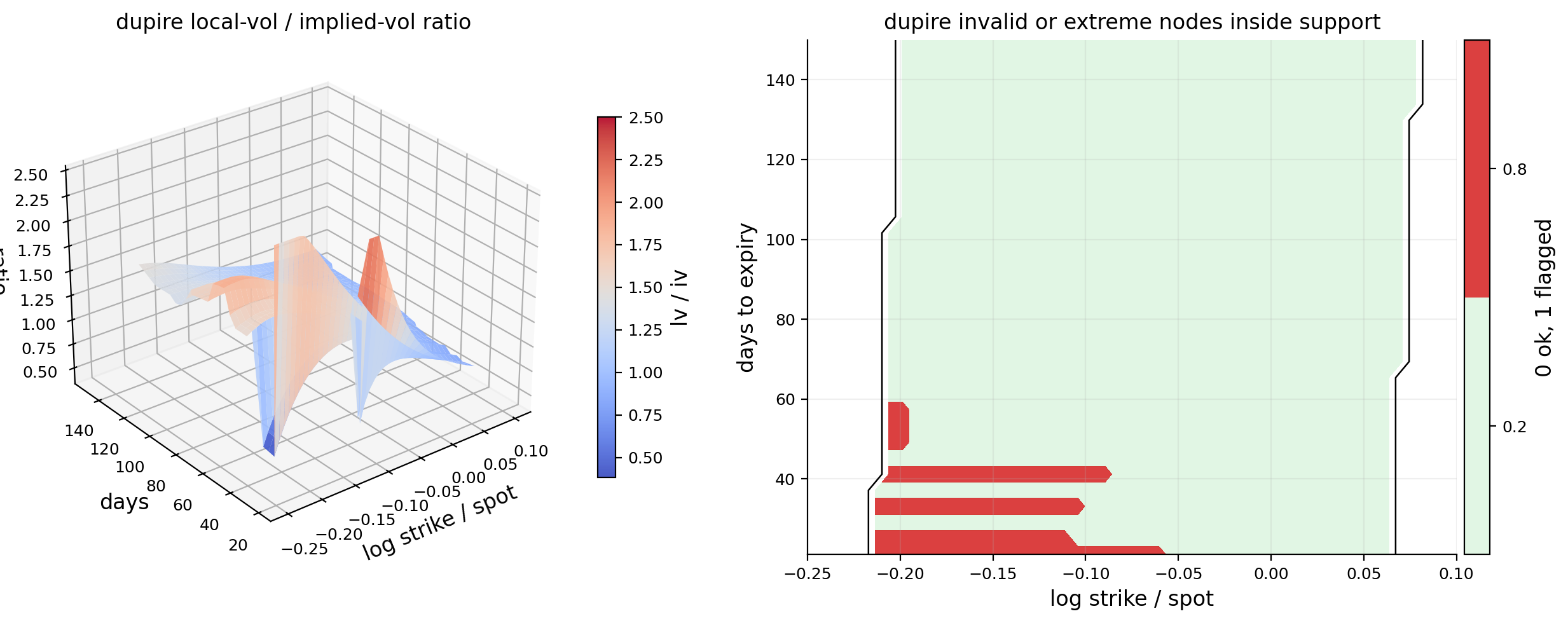
The remaining flagged nodes mostly come from hard invalid local variance or extreme local-vol-to-IV ratios, not from negative density. That means the surface is mostly arbitrage-consistent, but Dupire still finds a few regions where derivatives become too aggressive.
17.4 Why local volatility can fail even when IV looks smooth
A fitted IV surface can look smooth to the eye and still produce invalid Dupire values. The reason is that local volatility is based on derivatives of prices, not just levels of IV.
The conversion from IV to call price is nonlinear:
A small wave in \(\sigma(k,T)\) can become a larger wave in \(C_{KK}\), especially in low-vega or short-maturity regions. If \(C_{KK}\) becomes too small, the Dupire denominator becomes tiny. Dividing by a tiny number creates huge local vol. If \(C_{KK}\) becomes negative, the model implies negative density.
This is why the project flags nodes where:
local variance is negative,
density is negative,
the local-vol-to-IV ratio is extreme,
the node sits on a grid boundary,
the node is outside quote support.
The support mask is especially important. A local-vol value outside quote support is mostly an extrapolation artifact. We can plot it for visual continuity, but we shouldn’t interpret it as market information.
downside local-vol premium: about 24.61 vol points,
upside local-vol premium: about -5.15 vol points,
Dupire stress: about 0.1566.
This is a strong local-volatility effect. The downside region requires much higher local volatility than the ATM region. That matches the surface shape: SPX left-wing IV is much higher than ATM IV.
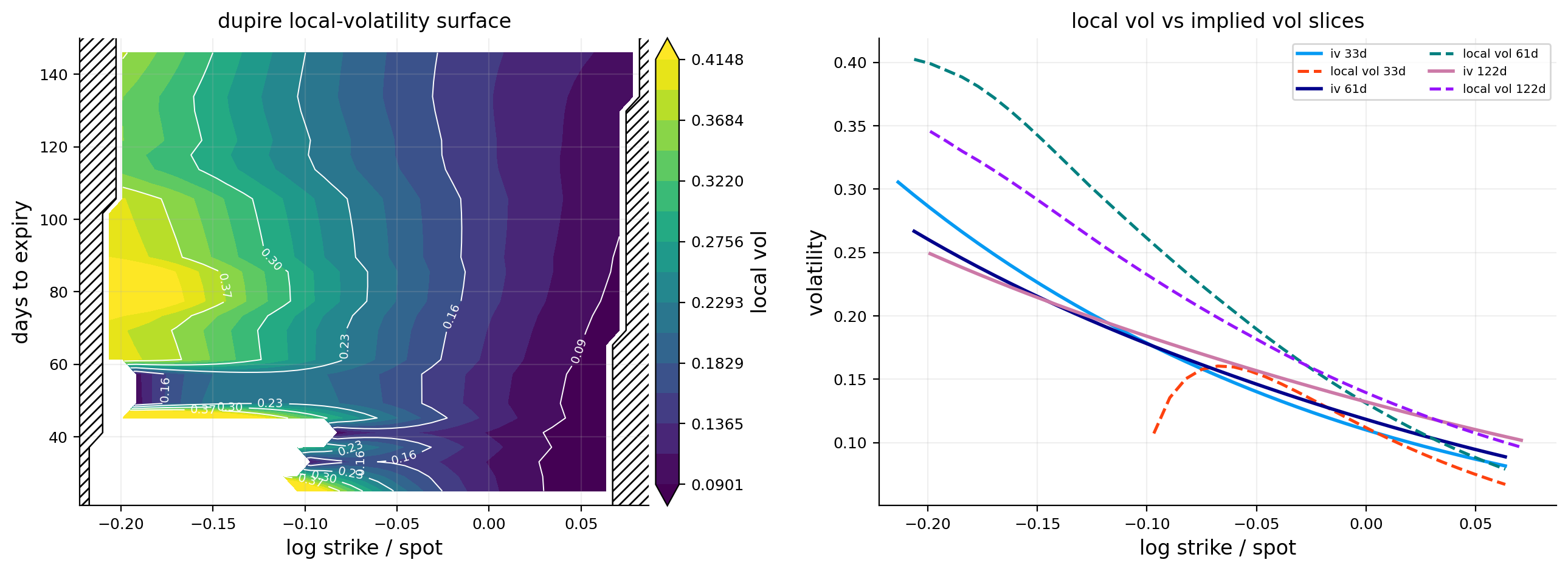
The local-vol surface contour shows high local volatility on the downside side of the grid and lower local volatility toward the upside. The slice plot shows that local vol and implied vol are not the same. Local vol can be above IV in the downside and deviate strongly at different maturities.
The local-vol-to-IV ratio plot is a good way to see where the model is doing more than simply restating IV. A ratio near 1 means local vol is close to implied vol. A ratio far above 1 means the local-vol process needs stronger instantaneous volatility than the average IV suggests.
This is one of the main conceptual payoffs of the project: the skew isn’t only a static price pattern. Under a local-vol model, it becomes a state-dependent volatility process.
18.1 Local vol is most useful when compared, not read alone
A local-volatility number by itself can be hard to interpret. Saying local vol is 25% at one node isn’t very meaningful unless we compare it with the implied vol at the same node, the ATM local vol, and nearby maturities.
The ratio tells us whether local vol is unusually high relative to the average volatility embedded in the option price. The premium tells us whether downside states require more instantaneous volatility than ATM states.
For SPX, the downside premium is the cleaner economic statistic. It says the local-vol process needs higher volatility when the index is lower. That is exactly the state-dependent volatility intuition behind equity skew.
The ratio is more of a stability diagnostic. If the ratio is 1.2 or 1.3 in a structured region, that can be meaningful. If it is 5 or 10 in a sparse region, that is more likely a derivative artifact. So we don’t celebrate extreme local-vol ratios. We flag them.
The invalid-node diagnostic plot shows that flagged nodes are not spread randomly everywhere. They concentrate in regions where the surface is most derivative-sensitive, especially near edges or short maturities.
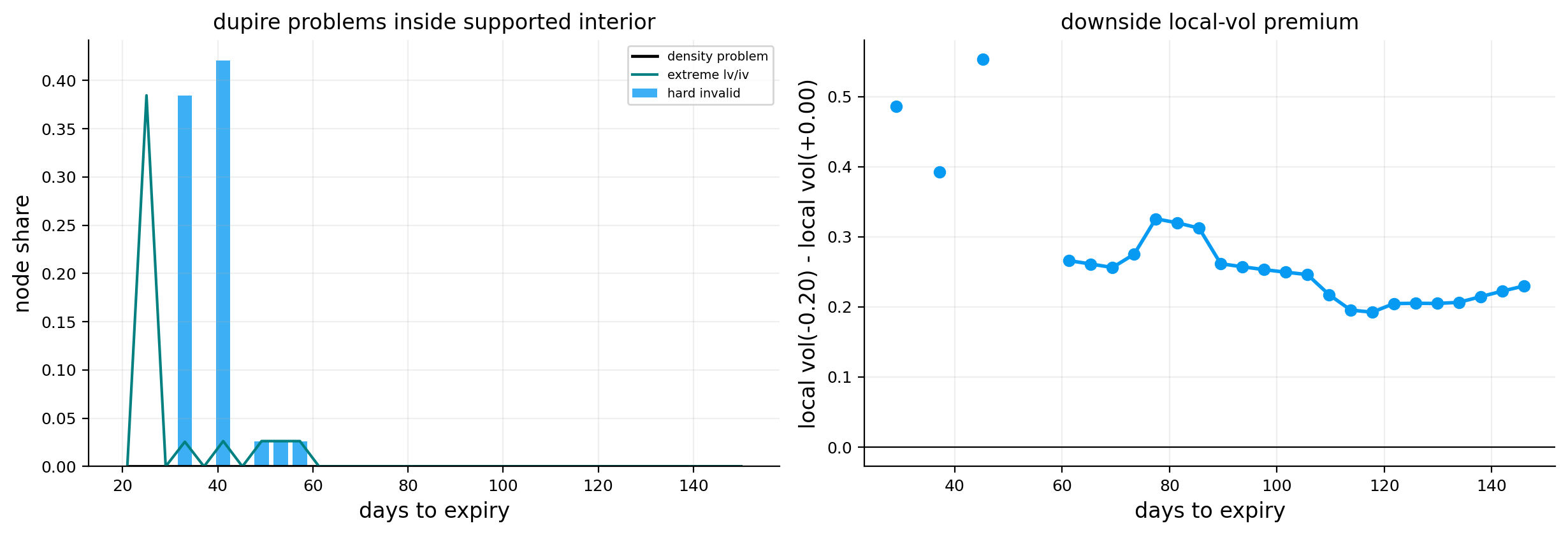
The invalid-by-maturity chart is also useful. Some maturities have small spikes in hard-invalid share, while most maturities are clean. This means the local-vol surface is broadly usable but shouldn’t be treated as perfectly reliable at every node.
The downside local-vol premium line stays positive across maturities. This means:
\[
\sigma_{loc}(k=-0.20,T)>\sigma_{loc}(k=0,T)
\]
for the plotted maturities. Economically, the local-vol model says future downside states have higher instantaneous volatility than ATM states. That is the local-vol translation of the market’s crash-risk pricing.
The key caveat is that local vol is a deterministic volatility model. It can fit the option surface, but it doesn’t mean real-world volatility actually follows this deterministic map. Stochastic volatility, jumps, and volatility risk premia can all create the same implied surface. So local vol is a powerful calibration object, but not a complete truth about the market.
19) Historical Surface Fitting Across All Dates
After understanding one date, we fit the visual and Dupire surfaces across all valid dates. This turns the project from a single-day calibration exercise into a time-series study of volatility-surface behavior.
This matters because many option-surface workflows fail on difficult dates. A model that only fits calm days is not useful. Here the surface fitter handles both the 2022 stress period and the 2023 low-vol period.
The date-level fit summary shows average quote count around 4,749 per date, with a minimum around 3,598 and maximum around 5,714. This is dense enough to estimate a surface every trading day.
19.1 What we gain from a historical surface panel
A single-day local-vol surface is a calibration object. A historical panel turns the same machinery into a research dataset. Once we fit every date, we can ask questions like:
when is downside skew highest?
when does local-vol stress rise?
do curvature and Greek model risk move together?
is surface movement mostly level-driven or shape-driven?
does BTC have the same surface-factor structure as SPX?
This is the difference between “I can fit today’s surface” and “I can study surface regimes.” The second is much more valuable.
The historical panel also tells us whether the methodology is robust. If the fitter succeeds only on the main date, we don’t know much. If it succeeds on 505 consecutive SPX dates through 2022 and 2023, that is a stronger test. Those years include very different regimes: high inflation shock, aggressive rate hikes, equity drawdowns, and later the low-vol end-of-2023 rally.
The zero skipped dates are therefore not a small detail. They show that the filters, weights, basis dimensions, and smoothing settings are stable enough for a real panel study.
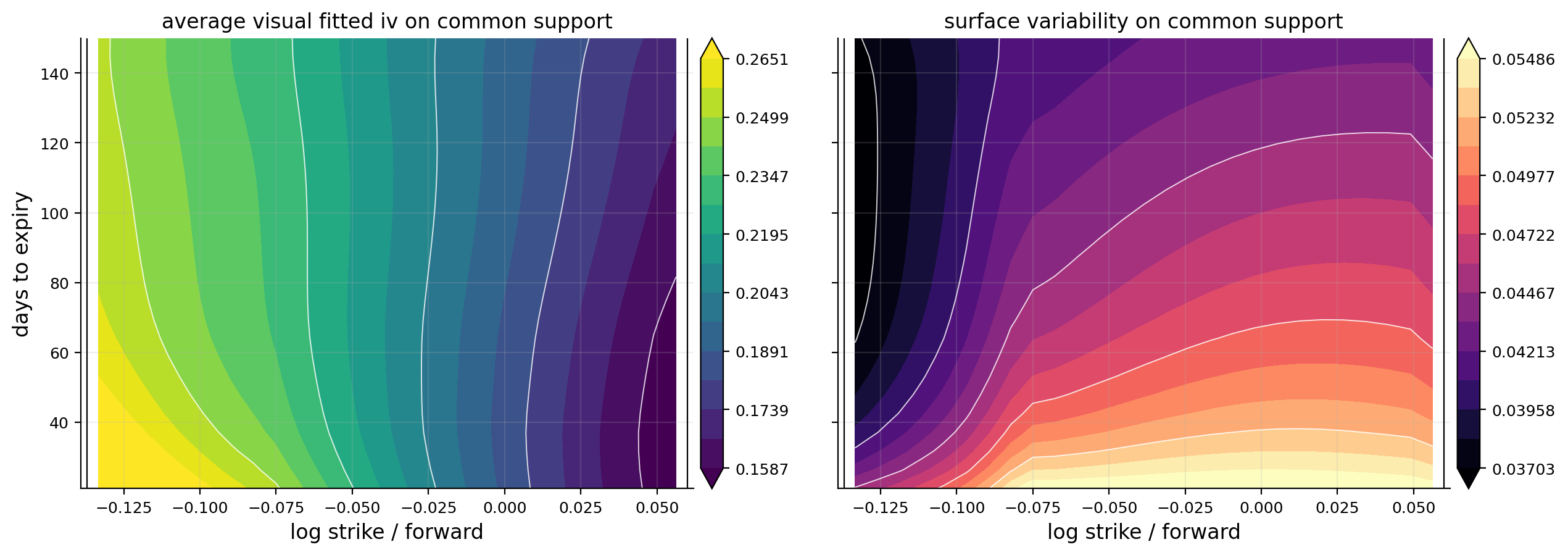
To compare surfaces through time, we need a common grid. A node is kept if it has enough support across dates. The common-node output keeps 675 nodes out of 1,225, or about 55.1% of the grid, using an 85% support threshold.
This is conservative. We don’t want PCA or historical averages to use nodes that exist only on a few dates. The kept log-moneyness range is roughly:
\[
-0.133 \le k \le 0.056
\]
This is narrower than the single-date surface because it requires common support across many days. That means we lose the far downside tail in the historical PCA, but we gain comparability.
The average-IV grid shows the usual SPX structure: higher vol on the downside and lower vol near the right side. The surface-volatility grid shows where the surface changes most through time. Variability is not uniform. Some regions of the smile move much more than others, especially the downside and medium maturities.
This is exactly why PCA is useful later. Surface changes are high-dimensional, but they are structured. Most days don’t produce random independent movement at every grid node. The whole surface tends to move through a few dominant modes.
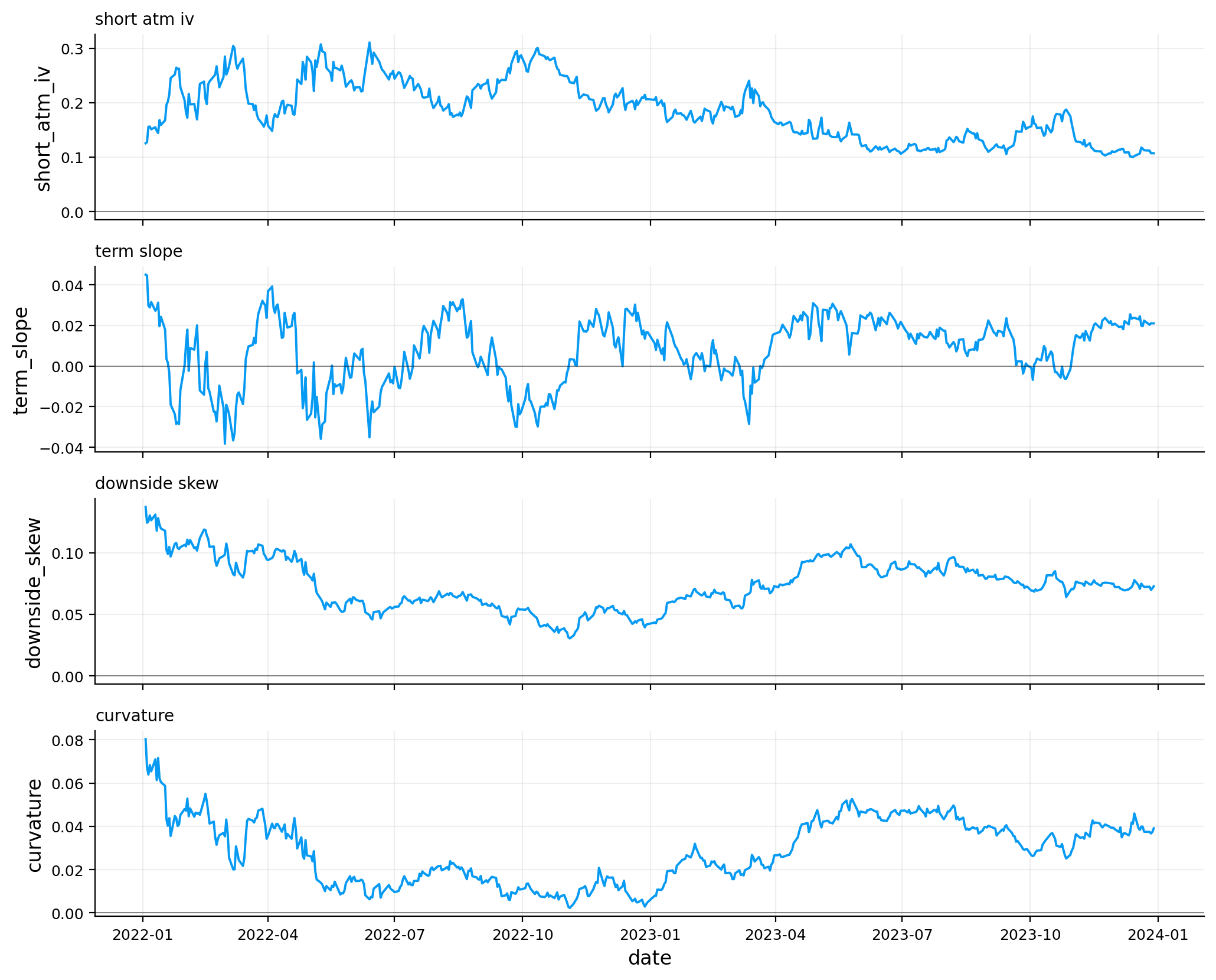
The feature table compresses each daily surface into interpretable quantities. The summary statistics show:
mean short ATM IV: about 18.65%,
mean medium ATM IV: about 18.89%,
mean long ATM IV: about 19.39%,
mean term slope: about 0.74 vol points,
mean downside skew: about 7.41 vol points,
mean upside skew: about -4.52 vol points,
mean curvature: about 2.88 vol points,
mean smile asymmetry: about 11.93 vol points,
mean Dupire stress: about 0.0967.
The 5% to 95% range is more informative than the mean. Short ATM IV ranges from about 11.04% at calm points to about 27.80% in high-vol regimes. Downside skew ranges from about 4.20 to 10.63 vol points, so crash-protection premium never disappears, but it changes a lot.
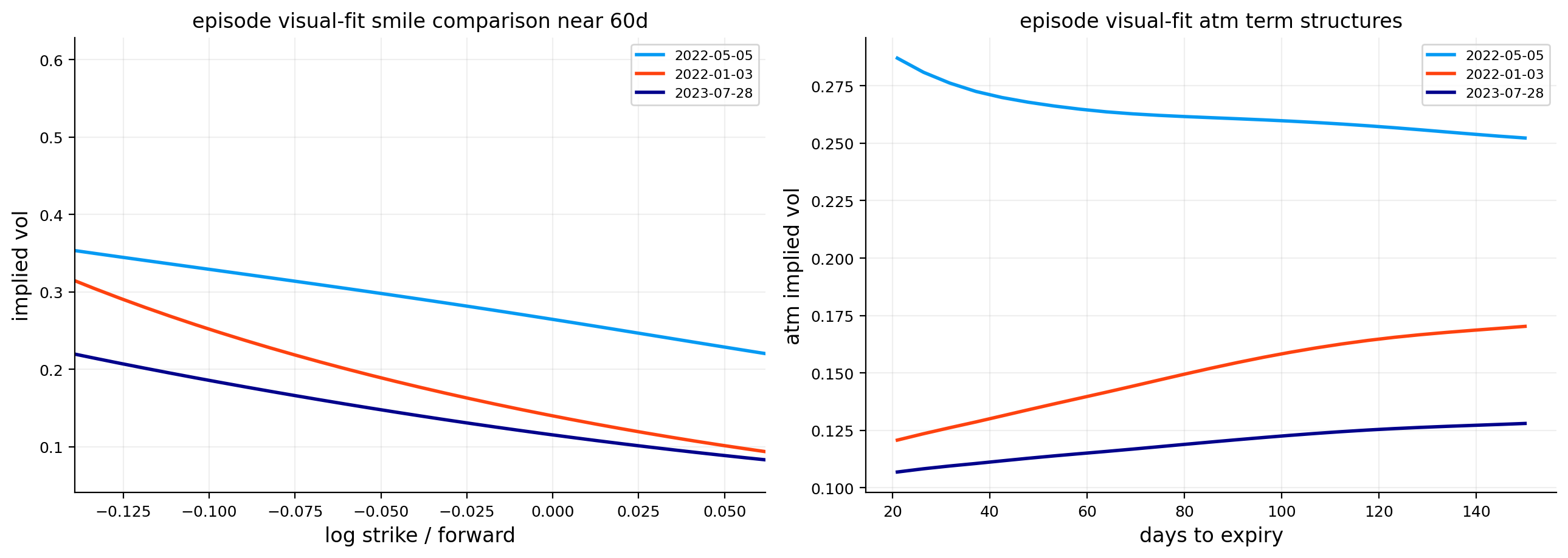
The time-series plots show the regime story. Early 2022 has high and unstable short ATM IV, strong downside skew, and high curvature. Through 2023, ATM vol compresses, skew becomes smoother, and term structure changes as near-term uncertainty falls.
The term slope can turn negative during stress. A negative term slope means short-term IV is above longer-term IV. This usually happens when markets price immediate risk. In calmer periods, term slope becomes positive because longer maturities contain more accumulated uncertainty.
21.1 Economic meaning of the four main shape features
The historical features are more than descriptive statistics. Each one corresponds to a market pricing story.
ATM IV is the general level of option-implied uncertainty. When it rises, the market is paying more for volatility across the center of the distribution. It usually rises during equity stress, macro uncertainty, liquidity shocks, or fast realized-volatility regimes.
Downside skew is the premium for left-tail protection. A high downside skew means downside options are expensive relative to ATM options. In SPX, this often reflects institutional hedging demand. Investors buy puts for crash protection, and dealers charge higher implied vol for supplying that convexity.
Curvature tells us whether the smile is strongly bowl-shaped. High curvature means both wings are far from the center, or the downside wing is extremely elevated. This is closely connected to gamma correction because curvature changes how quickly IV changes as spot moves.
Term slope tells us whether risk is front-loaded. A negative term slope means short-dated options are more expensive than longer-dated ones. That usually signals immediate event risk. A positive term slope means uncertainty is priced more gradually across time.
These four features turn a high-dimensional surface into a small set of interpretable market-state variables.
The phase plot compares medium ATM IV and downside skew, with color representing Dupire stress. This gives a compact market-state map.
A point with high ATM IV and high downside skew means the market is pricing both broad uncertainty and strong crash asymmetry. A point with low ATM IV but still meaningful skew means the market is calm overall but still pays for left-tail insurance.
The rolling relationship between downside skew and Dupire stress is not constant. Sometimes skew and stress move together strongly. Sometimes the relationship weakens or even changes sign. That makes sense because Dupire stress is not just skew level. It also depends on curvature, local-vol-to-IV ratios, invalid nodes, and surface smoothness.
For example, a surface can have high skew but be smooth and arbitrage-consistent, producing moderate Dupire stress. Another surface can have lower skew but more awkward curvature or maturity behavior, creating more local-vol stress.
This is a useful distinction. Skew is a shape feature. Dupire stress is a derivative-stability feature. They are related, but they aren’t the same statistic.
23) PCA of Volatility Surface Changes
Now we analyze how the entire surface changes through time. Let \(\sigma_t(k_i,T_j)\) be the fitted IV on the common grid. We study daily changes:
PCA is not an economic model by itself. It is a statistical compression tool. The economic interpretation comes after we map the principal components back onto the volatility surface.
23.1 Why we apply PCA to changes instead of levels
We apply PCA to surface changes rather than raw surface levels because levels are highly persistent. If we used levels, the first component would mostly separate high-volatility dates from low-volatility dates. That is useful, but it doesn’t fully answer how the surface moves.
This is closer to a risk-management question. If we own an option book today, what kinds of surface moves might hit us tomorrow?
A broad upward move in IV is a level shock. A left-wing-only move is a skew shock. A front-end move is a term-structure shock. PCA identifies these directions statistically from the data instead of forcing us to define them manually.
The covariance matrix of flattened surface changes is:
The eigenvectors of this covariance matrix are the surface-shock patterns. A large eigenvalue means that shock direction explains a lot of historical movement.
PC1 explains about 92.55% of surface-change variance,
PC2 explains about 4.75%,
PC3 explains about 0.94%,
the first three explain about 98.25% in total.
This tells us that SPX surface changes are highly structured. Most day-to-day movement is a broad level factor. The whole surface often moves up or down together.
PC1 is the level shock. The PC1 shock map is mostly one sign across the surface, so a positive PC1 score corresponds to a broad IV increase. The top positive PC1 date is 2022-05-05, and high positive PC1 dates cluster in the volatile 2022 period. That fits the economic interpretation.
PC2 is more shape-like. It changes one region of the surface differently from another, often looking like a skew or term-structure rotation. PC3 is smaller and more localized, often closer to a term-structure or curvature adjustment.
The top-score table also gives a sanity check. PC1 positive extremes occur on dates with elevated short ATM IV, while PC1 negative extremes occur when the surface falls sharply. PCA is capturing real volatility regimes, not numerical noise.
fig, ax = plt.subplots(figsize=(10.2, 4.4))for i, arr inenumerate(pc_shocks[:3]):for day in [35, 75, 120]: idx =int(np.argmin(np.abs(tau_safe_grid * ann_days - day))) ax.plot(k_safe_grid, arr[idx], lw=1.6, label=f"pc{i +1}, {day}d")ax.axhline(0.0, color="black", lw=0.8)ax.set_title("pca shock cross-sections mapped back to iv units")set_supported_xlim(ax, k_safe_grid, common_node_mask)ax.set_xlabel("log strike / forward")ax.set_ylabel("approx iv change")ax.legend(ncol=3, fontsize=7)plt.tight_layout()plt.show()
The PCA shock cross-sections are especially useful because they translate abstract PCA components back into IV units. For each component, we can see how a one-standard-deviation score moves different strikes and maturities.
The main lesson is:
PC1 mostly moves all strikes in the same direction.
PC2 changes the relative behavior of downside versus upside or short versus longer maturities.
PC3 is smaller and more localized.
This is similar to yield-curve PCA, where level, slope, and curvature often dominate. For volatility surfaces, the language is slightly different: level, skew/rotation, and curvature/term-structure modes.
The episode comparison uses dates selected from extreme PC1, high downside skew, high curvature, and high Dupire stress. The 60-day smile comparison shows how different episodes reshape the same surface region. The ATM term-structure comparison shows whether stress is concentrated in the front end or spread across maturities.
This is one of the best practical uses of surface PCA: it turns thousands of surface nodes into a few regime factors that can be monitored over time.
This creates an extra channel. When spot moves, the option doesn’t only move because \(S\) entered the Black-Scholes/Black-76 formula. It also moves because the option slides across the volatility surface.
\(\sigma_S\) and \(\sigma_{SS}\) come from the surface slope and curvature.
This formula shows why surface-aware gamma can differ a lot from flat-vol gamma. If skew is steep, \(\sigma_S\) is meaningful. If curvature is strong, \(\sigma_{SS}\) is meaningful. The project uses JAX automatic differentiation so these terms are handled directly rather than manually approximated.
24.1 Connecting surface-aware Greeks to vanna and volga
The surface-aware gamma formula contains terms that option traders usually think of separately:
This is why the surface-aware calculation is richer than simply “using a different volatility.” It embeds skew dynamics into the Greek.
If skew is steep, \(\sigma_S\) is large. If smile curvature is strong, \(\sigma_{SS}\) is large. Then vanna, volga, and vega terms become important. If the surface is flat, \(\sigma_S\approx 0\) and \(\sigma_{SS}\approx 0\), so surface-aware Greeks collapse back toward flat-vol Greeks.
This gives a useful sanity check: surface-aware Greek corrections should be largest when skew and curvature are largest. The later correlation table confirms exactly that.
A simple example: suppose you hold a downside put. If SPX falls, the put moves deeper in the money, but it also moves into a higher-IV part of the skew. A flat-vol delta only captures the first effect. A surface-aware delta captures both the price movement and the volatility re-marking caused by sliding along the skew.
That is why surface-aware Greeks are closer to how option desks think about risk. Traders know that spot down often comes with vol up. A flat-vol Greek framework misses that interaction unless vanna/skew adjustments are added separately. Here we get the adjustment directly from the fitted surface.
total Greek PnL RMS about 2.93 index points for a 1% spot shock,
relative Greek PnL RMS about 0.78% of the option price reference.
These are not tiny differences. A delta difference of 0.06 means a hedge can be off by six deltas per 100 option units just because we treated volatility as flat. In liquid index options, that is meaningful.
The delta correction plot is positive across a large part of the downside region. This means surface-aware delta is higher than flat-vol delta in those regions. The gamma correction changes sign across moneyness and maturity, reflecting the interaction between skew, curvature, and option convexity.
The correction maps show that model risk is localized. It isn’t uniform across the surface. The largest corrections sit where surface slope and curvature are strongest. This is exactly what the formula predicted.
We compute the same Greek-risk measures across all 505 fitted dates. The full run succeeds on all dates using JAX.
The first rows in 2022 show much higher Greek model risk than the latest main date. Total Greek PnL RMS is around 5.8 to 6.2 index points in early January 2022, compared with about 2.93 on 2023-12-29. This matches the broader regime: 2022 had steeper skew, higher IV, and more unstable surface shape.
The correlation table is one of the strongest results in the project:
total Greek PnL RMS correlation with downside skew: about 0.908,
gamma PnL RMS correlation with downside skew: about 0.925,
gamma PnL RMS correlation with curvature: about 0.979,
gamma PnL RMS correlation with short ATM IV: about -0.707.
The gamma-curvature relationship is almost direct. This makes sense mathematically. Gamma correction includes surface curvature terms, so when the smile bends more sharply, the flat-vol gamma becomes less reliable.
The high positive relationship with downside skew also makes sense. Stronger left skew means the option surface moves more aggressively as spot changes, so surface-aware delta and gamma diverge more from flat-vol Greeks.
The scatter plot between downside skew and total Greek PnL RMS shows a strong upward relationship. Higher skew means larger surface-aware Greek risk. The color dimension, Dupire stress, adds another layer: local-vol stress and Greek model risk are related but not identical.
25.1 How the Greek-risk PnL scaling works
The Greek-risk metrics translate differences in delta and gamma into approximate PnL units under a 1% spot shock. If the spot shock is:
\[
\Delta S = 0.01S
\]
then the delta correction PnL is approximately:
\[
\Delta \text{PnL}_{\Delta}=\big(\Delta_{surf}-\Delta_{flat}\big)\Delta S
\]
RMS is useful because positive and negative corrections don’t cancel. If some options have positive correction and others have negative correction, the average could look small even though the risk is large. RMS measures typical magnitude.
The relative Greek PnL RMS divides by a reference option price. That makes the metric comparable across regimes where option prices are very different. A 5-index-point correction is more serious for a cheap option than for an expensive one.
26) Secondary Application: BTC Option Surface Through the Library
The final section repeats the same surface workflow on BTC options using the packaged library. This is not just a smaller repeat. BTC options are structurally different from SPX options, so this is a good stress test for the framework.
For reproducibility, the BTC option data comes from the btc_optionsdx folder, BTC spot data from the btc_yfinance folder, and rates from the us_treasury_yields folder inside the repo’s data/ directory. Each folder explains how to rebuild the local dataset from the source/raw files.
The BTC market differs from SPX in several ways:
BTC trades every day, so calendar time is more natural than trading-day time.
Deribit-style option chains can have very wide strikes and extreme moneyness.
Volatility levels are much higher than SPX.
The surface can be rougher because crypto options have different liquidity patterns.
Carry is not a dividend yield in the equity-index sense. It comes from parity, funding, and crypto market structure.
The main BTC date is 2024-03-22. We have:
120,736 surface-ready quotes,
1,017 quotes on the main date,
6 expiries on the main date,
JAX used for Dupire and Greeks with no fallback.
The dataset is smaller and rougher per date than SPX. That matters for surface fitting because the maturity dimension is much thinner.
26.1 Why BTC is a hard but useful secondary test
BTC options create a very different surface problem from SPX. SPX skew is heavily shaped by institutional crash protection, index-option supply/demand, and equity risk premia. BTC options reflect crypto leverage, speculative positioning, funding conditions, event risk, and a market that trades continuously.
This changes the interpretation of the same math. For SPX, left-wing skew usually means downside crash insurance. For BTC, both upside and downside tails can be important because crypto can gap violently in either direction. A call wing can become expensive during a speculative rally, while a put wing can become expensive during liquidation risk.
The BTC chain also has fewer expiries on the main date, only 6. That makes the maturity dimension weaker. With fewer maturities, a 2D surface fit has less information about \(\partial_T\). Since Dupire depends on \(\partial_TC\), BTC local vol can be more fragile even if strike slices look reasonable.
So this secondary section is not just “same code, different ticker.” It asks whether the full surface pipeline can handle a market with:
higher volatility level,
wider strike range,
rougher quote structure,
fewer maturity points,
different carry interpretation,
stronger jump and event risk.
26.2 Carry and rates in BTC options
For BTC, the role of carry is different from SPX. SPX carry is tied to interest rates and dividends. BTC doesn’t pay dividends, but crypto option parity can still imply a forward different from spot. That difference can reflect funding, basis, collateral conventions, liquidity, and market demand.
We can still use the same formal relationship:
\[
F_T=S_0e^{b(T)T}
\]
but the economic interpretation of \(b(T)\) changes. In SPX, \(q(T)=r(T)-b(T)\) can be read roughly as an implied dividend yield. In BTC, reading it as a dividend yield would be wrong. It is better to call it implied carry.
This is why the library pipeline is useful. The mathematical pricing functions can use the same forward/discount framework, while the interpretation is adjusted to the asset class. We don’t need a separate option-pricing universe for crypto, but we do need to avoid importing equity-index intuition blindly.
The BTC date uses far wider moneyness support than SPX. That makes the surface visually more dramatic, but it also means extrapolation risk is higher. A log-moneyness value near \(-0.79\) is an extremely deep downside region. Quotes there can be informative about disaster pricing, but they can also be sparse and noisy.
The BTC cleaning report shows how much filtering is needed:
raw rows: 258,234,
after positive price filter: 218,710,
after bid/ask/spread filter: 196,404,
after DTE filter: 136,262,
after moneyness filter: 121,361,
final rows: 121,361.
The largest removal happens at the DTE filter, which removes over 60,000 rows. That means a large part of the BTC raw chain sits outside the maturity window we want. Another 14,901 rows are removed by the moneyness filter, which is expected because crypto option chains often include very far strikes.
The BTC fit summary is much worse than SPX in absolute IV-error terms:
visual RMSE about 0.0396,
Dupire RMSE about 0.0542,
visual weighted RMSE about 0.0144,
Dupire weighted RMSE about 0.0251.
This shouldn’t surprise us. BTC implied vols are much higher and the surface is more extreme. The main-date log-moneyness range runs from about -0.79 to 0.54, much wider than the SPX main surface. A few deep strikes produce residuals of 20 to 50 vol points.
The pchip-minus-spline comparison has RMSE about 0.0423, which confirms the smooth spline differs meaningfully from raw interpolation. In BTC, smoothing is not just cosmetic. It’s necessary to avoid chasing very noisy local quote behavior.
27) BTC Local Volatility, PCA, and Surface-Aware Greeks
The BTC local-vol summary is surprisingly clean on the main date:
hard invalid share: 0%,
extreme ratio share: 0%,
negative density share: 0%,
median local-vol-to-IV ratio: about 1.015,
median absolute local-vol-to-IV deviation: about 0.029,
ATM local vol: about 77.23%,
Dupire stress: about 0.0145.
This is very different from the SPX main date. SPX has strong downside skew and local vol sits far above IV in downside states. BTC on this date has very high volatility level, but local vol is close to implied vol across much of the supported region. High volatility level doesn’t automatically mean high Dupire stress. Stress comes from the shape and derivatives of the surface, not only from the level.
BTC PCA is also concentrated:
PC1 explains about 90.09%,
PC2 explains about 5.78%,
PC3 explains about 2.12%,
the first three explain about 97.99%.
So even in BTC, surface changes are dominated by a broad level factor, with smaller shape factors after that. The difference is that the scores are measured in a different volatility scale. BTC IV changes are large in absolute vol points, but the factor structure is still low-dimensional.
The highest BTC Greek-risk dates have total Greek PnL RMS around 11.5 to 12.9 for a 1% spot shock. The number is larger than SPX partly because BTC spot is high and BTC option vol levels are much higher. The important comparison isn’t only the dollar/RMS number. It’s where risk concentrates: the dashboard shows delta and gamma corrections are still strongest where surface shape bends and where the smile moves most aggressively.
The final BTC dashboard puts the full library pipeline in one view: quote coverage, smooth surface, local vol, smile comparisons, residuals, local-vol ratio, PCA variance, PCA shocks, and Greek corrections. This confirms that the same machinery works outside SPX, but the interpretation changes. For SPX, the dominant story is downside crash skew and equity-index local-vol premium. For BTC, the dominant story is extremely high volatility with a rougher but sometimes locally cleaner surface.
27.1 Reading BTC results without forcing SPX intuition onto them
The BTC local-vol result has low Dupire stress on the main date even though ATM local vol is around 77%. That is an important distinction. High volatility is not automatically unstable local volatility. A surface can be high but smooth.
The SPX main date has lower IV level but stronger local-vol-to-IV distortion because the downside skew is very steep. BTC has much higher IV level, but on this selected date the local-vol ratio is close to one in the supported region. That means the surface shape is not forcing strong state-dependent volatility beyond the already high implied-vol level.
The residual table still shows very large errors in extreme BTC strikes. Deep BTC options can be very hard to fit because their quotes can be wide and the market can price tail scenarios aggressively. The smoother surface chooses stability over exact far-tail quote matching.
The PCA result also tells us that BTC surface changes are mostly level-driven, with PC1 above 90%. That is similar to SPX, but the economic meaning is different. A BTC level shock can reflect broad crypto risk repricing, leveraged liquidation pressure, ETF/news events, or macro liquidity changes. It is not the same as SPX crash insurance, even if the PCA math is the same.
The final dashboard should be read as a compact model audit. Quote coverage tells us where data exists. The 3D smooth surface shows the fitted IV object. Local vol tells us the implied state-dependent volatility. Residuals show where the fit misses. PCA shows how the surface moves historically. Delta/gamma corrections show how much flat-vol Greeks miss once skew is allowed to move with spot.
27.2 SPX versus BTC: same machinery, different market story
The contrast between SPX and BTC is one of the best parts of the project.
Dimension
SPX surface
BTC surface
Main economic story
downside crash insurance
high crypto volatility and wide tails
Typical IV level
lower
much higher
Maturity support
many expiries on main date
fewer expiries on main date
Skew interpretation
institutional put demand, equity crash premium
two-sided crypto tail risk and funding/liquidity effects
Local-vol stress
driven by steep downside skew
low on selected date despite high vol level
PCA structure
PC1 level dominates
PC1 level also dominates
The shared result is that both markets have low-dimensional surface movements. PC1 dominates in both SPX and BTC. The difference is what that level shock means. In SPX, a level shock often reflects equity-risk repricing and hedging demand. In BTC, it can reflect crypto-wide leverage, liquidation risk, ETF/news events, and broader risk appetite.
This is why we always separate mathematics from market interpretation. The same PCA equation applies to both markets. The same Dupire formula applies to both markets. But the economic reading of the fitted surface depends on the underlying market.